The iPhone Clock app is one of those pieces of software most people interact with on autopilot: set an alarm, check a timer, perhaps start a stopwatch, then get on with the day. That familiarity makes a small alarm-setting quirk especially amusing. The hour and minute wheels in the new-alarm interface initially look as if they scroll forever. Push them rapidly enough, though, and they eventually reach an endpoint: 4:39 in the standard 12-hour display, or 16:39 when using 24-hour time.
It is a charmingly peculiar destination for a component designed to represent the hours and minutes of every day. More importantly, it is not a practical restriction on when iPhone users can wake up, remember an appointment or be reminded to take the laundry out. The oddity concerns how the picker behaves when it is continuously and aggressively scrolled, not the set of usable alarm times.
The discovery circulated widely in mid-2025, in part because it is the kind of detail hiding directly in a default app that has existed since the original iPhone era. Everyday use never asks anyone to spin an alarm wheel through an extreme number of values, so there is little reason for the average person to encounter it naturally.
How to see the 4:39 endpoint
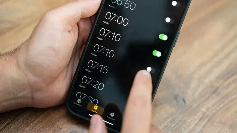
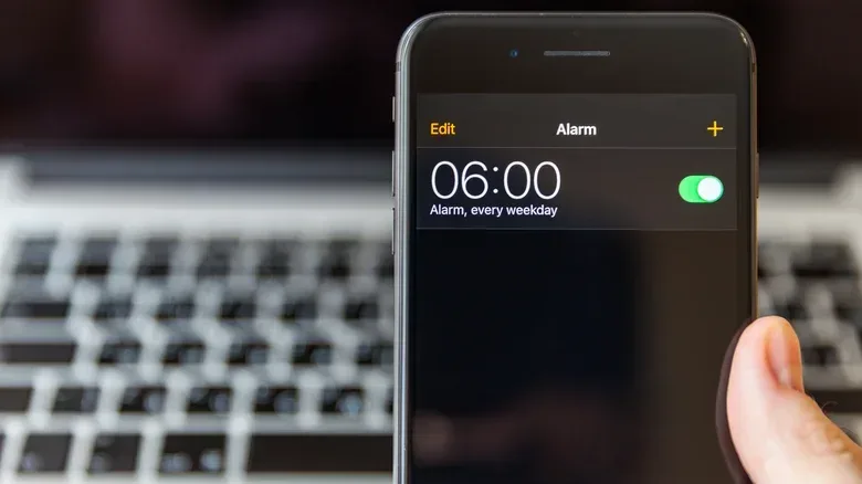
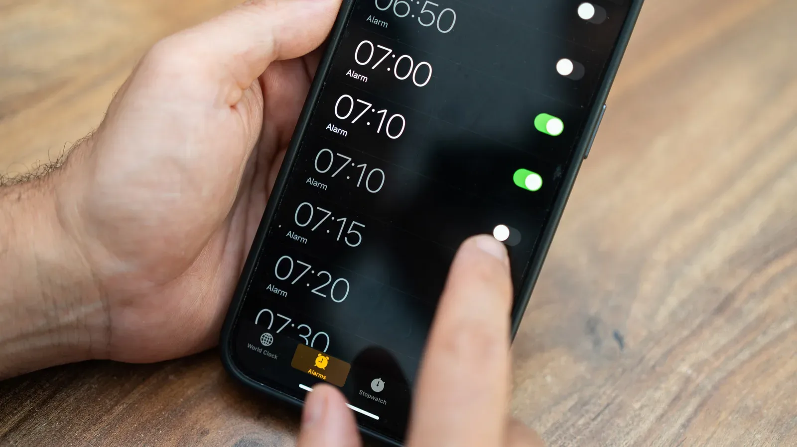
To find the curiosity, open Clock, choose Alarms, tap the + button to add an alarm, then quickly scroll the hour and minute selectors. After several fast swipes, the picker arrives at 4:39, or 16:39 for people using 24-hour time.
The key word is quickly. A normal alarm-setting routine involves moving directly to a desired time, not trying to run the selection wheels far beyond any reasonable morning schedule. That is why the interface can appear endlessly circular even though this particular rapid-scrolling behavior has a visible stopping point.
It is also worth separating the visual result from the task at hand. An alarm picker is the control used to choose a time; it is not necessarily a literal map of every possible alarm state exposed in every way the app handles input. Reaching a curious endpoint while forcefully flicking a picker therefore should not be read as evidence that the Clock app only understands part of a day, nor as a warning that later alarms are unavailable.
Why 4:39? There is no confirmed explanation here
The number is specific enough to invite theories and arbitrary enough to make every theory sound a little suspicious. Apple has not provided an explanation for why the picker reaches this point. Online discussion has proposed that the behavior could relate to a table-view-style interface implementation, but that remains speculation rather than a confirmed technical account.
That uncertainty matters. Software users are often good at spotting repeatable odd behavior, but seeing a result does not automatically reveal the internal reason for it. A user interface can involve a presentation layer, touch and motion handling, accessibility behavior, value formatting and underlying selection logic. Without a documented explanation, declaring one of those layers to be the cause would turn a neat observation into an unsupported diagnosis.
Related coverage includes The iPhone Clock App’s 4:39 Alarm Picker Limit, Explained.
The sensible reading is also the least dramatic: the 4:39 result is an idiosyncrasy of the Clock app’s alarm selection interface. It is interesting precisely because it is so obscure, not because it changes the app’s essential function. Anyone encountering it can safely treat it as an interface Easter egg of sorts—though not necessarily an intentional one—and return to setting an alarm normally.
The Clock icon itself is a working clock
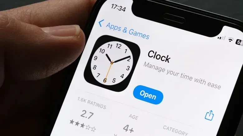
The alarm picker is not the only understated Clock detail. Look at the app icon on the Home Screen and it is doing more than displaying a generic clock illustration. The hands show the current time, including a moving seconds hand. Apple introduced that live icon behavior in iOS 7.
That makes the icon an unusually functional piece of app artwork. Most icons are static identifiers: useful for locating an app, but not for conveying live information. The Clock icon is different. At a glance, it can provide the time before the app is even opened.
There is a further visual variation on devices running iOS 26.1 or later. In its normal state, the icon’s seconds hand moves with a smooth sweeping animation. Enable Low Power Mode and the motion changes to one distinct step per second, resembling the movement of a traditional quartz clock.
Low Power Mode is a setting intended to reduce power use, and the change here is visual: it does not add an audible tick. It is a small example of an operating system adjusting presentation while retaining the same basic function. The icon still communicates the current time; it simply does so with a less fluid seconds-hand animation.
For users, this is mostly a detail to appreciate rather than a setting to chase. Low Power Mode has broader battery-related implications beyond the icon, so it should be chosen for those reasons. Still, it provides a nice visual cue that the phone is operating differently.
A useful Stopwatch gesture hiding in plain sight
The Clock app also includes a more practical feature that is easy to miss: in Stopwatch, swipe across the display to switch between digital and analog faces. The digital face presents elapsed time in numbers, while the analog face uses a conventional clock-like presentation.
Unlike the 4:39 alarm behavior, this is a documented capability in the iPhone user guide. It is a good reminder that a gesture-based interface can keep legitimate controls out of sight until someone knows to try a swipe. The function does not change the measurement itself; it changes how that measurement is displayed.
For timing a game challenge, a speedrun practice segment, a tabletop round or a home task, digital readouts are usually the clearest option when precise elapsed time is the priority. The analog view is more about presentation and preference. Either way, it avoids the need to fetch another stopwatch app for a simple change of style.
Turning an iPhone into a bedside clock with StandBy
For a much larger clock display, iPhone users can connect the device to power and place it on its side to enter StandBy. The mode can display widgets, photos or a clock. Swiping left or right changes the available clock styles.
This is the feature to use when the goal is not merely checking the time from the Home Screen but making the iPhone readable from a bedside table. StandBy is also where Night Mode becomes relevant. In lower-light surroundings, Night Mode gives the display a strong red tint intended to be less intrusive in a dark bedroom.
That is a practical distinction from the Clock icon or alarm wheel: StandBy is about viewing information at a distance, while the other features are small pieces of interface behavior. A red-tinted display may be preferable when the phone is close to a sleeping person’s line of sight, although whether it feels comfortable will vary with the room and the user.
Users who expect the phone to remain visibly clock-like should also check whether Always-On Display is enabled in Settings. Not every older iPhone includes Always-On Display, so behavior can vary by device. A MagSafe charger with a kickstand is a convenient fit for the upright, charging setup, but it is not presented as a requirement for accessing the Clock app itself.
Small design details are still part of the product
The iPhone Clock app’s 4:39 endpoint is ultimately a trivia-worthy anomaly, not a secret alarm limit. Yet it sits beside a handful of genuinely useful details: a live clock icon, a Low Power Mode animation change on iOS 26.1 and later, a swipe between Stopwatch faces, and a bedside-friendly StandBy display.
Together, they show how much behavior can be tucked into software that seems completely familiar. The practical lesson is not to endlessly spin every settings wheel in search of a hidden numerical omen. It is to distinguish between an unexplained UI quirk and features that can improve everyday use. In this case, the former makes for a fun discovery; the latter may make the phone a better clock.
For more Apple-related context, see our coverage of Apple’s iPhone Duo retail push.