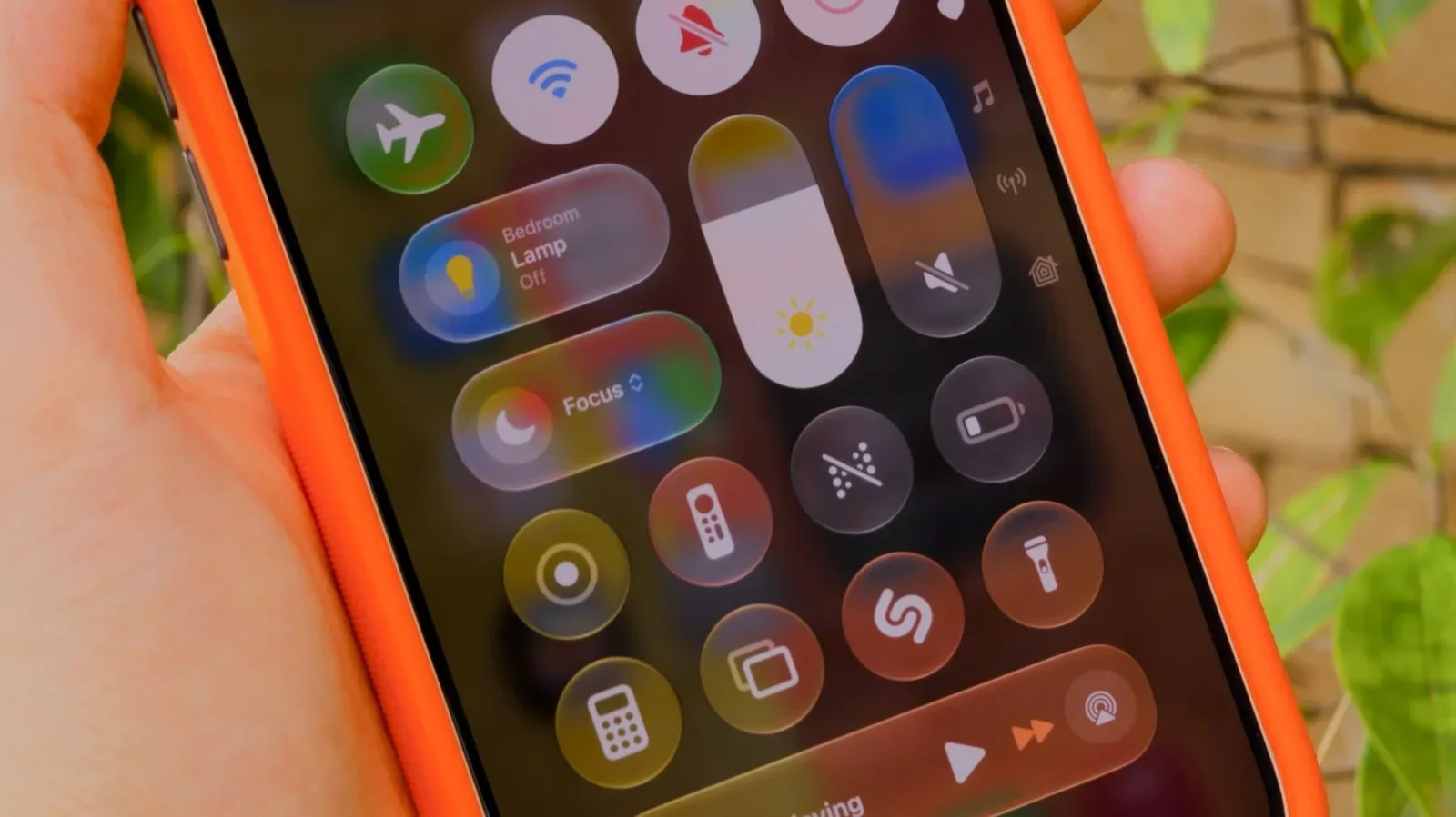
Apple’s Liquid Glass look has always invited a split-screen reaction: one group sees a sleek, glossy interface with depth and motion, while another sees a layer of visual frosting standing between them and the text, icons, menus, and notifications they need to read. In iOS 27, Apple is offering more room between those positions. The operating system introduces a slider intended to let iPhone owners tune the strength of the Liquid Glass effect rather than being confined to the earlier Clear or Tinted-style choices.
That change matters for more than decoration. An interface is the route to everything on an iPhone, from messages and maps to a quick session with a mobile game. If transparency and shifting backgrounds make a control harder to parse at a glance, the issue is practical as well as aesthetic. Conversely, someone who enjoys the layered, reflective appearance no longer has to settle for a more opaque setting simply because the alternatives were too rigid.
The new control is part of iOS 27, whose public release arrived in September 2026. It is supported on iPhone 11 models and later, meaning owners of those phones can use the broader appearance adjustment after updating. The update also arrives after Apple had already made a prior attempt to answer visibility concerns through iOS 26.1’s Tinted Mode, which lowered transparency and raised contrast. iOS 27 takes the personalization concept further by making the result less binary.
Where to find the Liquid Glass control
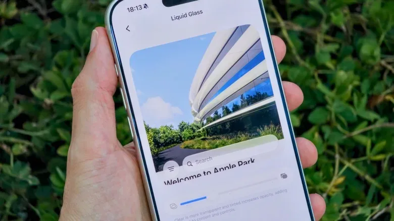
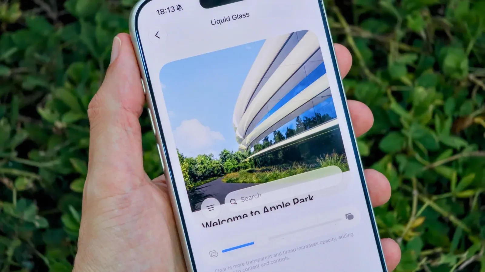
The iOS 27 adjustment is located in the Settings app. From there, open Appearance, then choose Liquid Glass. Instead of relying only on fixed presentation options, that screen contains a slider for the overall effect.
- Open Settings on the iPhone.
- Tap Appearance.
- Open Liquid Glass.
- Move the slider until the interface has the level of translucency that suits you.
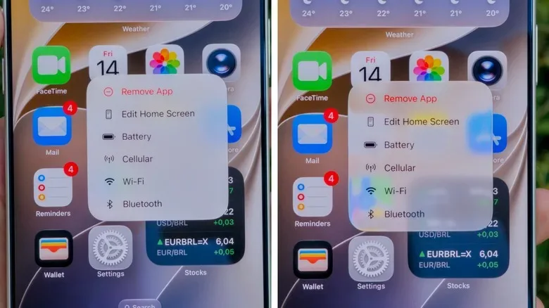
Moving the control toward the left keeps the presentation more glass-like, preserving more of the transparent, glossy quality associated with Liquid Glass. Moving it right pushes the design toward a denser, more opaque appearance. A midpoint setting is available for users who want to retain some visual depth without going all-in on either extreme.
Apple includes a preview on the same settings screen, so the adjustment can be judged without repeatedly leaving Settings and opening other apps. That is a useful bit of friction removal: readability is highly personal, and a preview makes it easier to evaluate whether a chosen level is comfortable before committing to it.
Why a slider is a more meaningful change than it sounds
Clear and Tinted options established a basic choice: favor the glass effect, or tamp it down. But the space between those choices is where many people actually live. A user may like a transparent panel over a calm wallpaper yet find that same treatment distracting when notifications arrive over a detailed image. Another person may want heavier opacity in everyday navigation but still appreciate a trace of the newer visual style.
A continuous slider acknowledges that contrast and legibility are not one-size-fits-all concerns. Wallpaper selection, ambient lighting, eyesight, screen brightness, color sensitivity, and personal preference can all alter how an interface feels. A setting that is comfortable during daylight may be less successful late at night; a homescreen that looks sharp with a simple background can become noisy with a busy one.
Related coverage includes iOS 27 Lets You Fine-Tune Liquid Glass on iPhone.
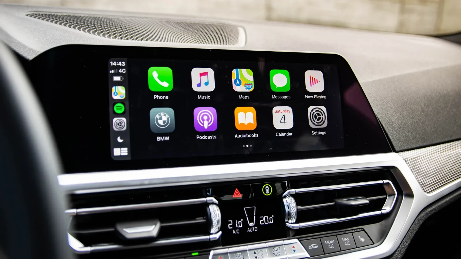
For players, the benefit is similarly straightforward. Mobile games are often launched in short windows—on a commute, during a queue, or between other tasks—and the phone’s system UI is constantly nearby. Notifications, quick settings, menus, and the Lock Screen are all part of the surrounding experience. Greater clarity in those moments can be as welcome as visual polish. Readers interested in the hardware and software ecosystem around their play spaces may also want to see why Apple CarPlay’s changing role in new cars has become a larger discussion.
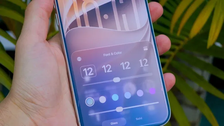
The Lock Screen is adjusted separately
One important limitation is that the Liquid Glass slider in Settings does not also govern the Lock Screen’s glass intensity. That Lock Screen option remains separate. Anyone changing the main interface slider should therefore not assume every surface of iOS will mirror the new setting automatically.
This separation may be helpful for people who use their Lock Screen differently from the rest of the phone. The Lock Screen is built around quick glances at the clock, alerts, and widgets, while the broader interface has to support longer periods of navigation. A user can treat those as distinct visual environments rather than forcing a single intensity level onto both.
It also means that users seeking consistency should check both locations. If the system UI is set for higher opacity but the Lock Screen still feels too transparent—or the other way around—the answer may not be further movement of the main Liquid Glass slider. The Lock Screen setting must be reviewed on its own terms.
Reduce Transparency is the stronger option
The iOS 27 slider is designed for tuning Liquid Glass, not for people who would rather largely eliminate transparency effects. For that use case, Apple continues to offer a more aggressive accessibility setting: Reduce Transparency.
To find it, go to Settings, open Accessibility, select Display & Text Size, and switch on Reduce Transparency.
- Open Settings.
- Choose Accessibility.
- Select Display & Text Size.
- Enable Reduce Transparency.
That option is better understood as a readability-first measure than a stylistic tweak. Where the Liquid Glass slider allows a spectrum from more transparent to more opaque, Reduce Transparency is intended for users who find the broader effect unwelcome or difficult to use. It is the more forceful choice for minimizing the glassy presentation.
There is no universally correct configuration. Someone attracted to the dimensional look may keep the slider toward the glassier side. Someone who primarily wants labels, notifications, and controls to stand out may lean toward opacity. And someone who wants the effect reduced as much as possible has the Accessibility toggle. The point of iOS 27’s change is that the middle ground is finally a real destination rather than an awkward compromise.
Update status and beta caution
The Liquid Glass slider requires iOS 27, so an iPhone must be updated before the setting becomes available. Compatibility extends to the iPhone 11 line and newer models. For people on compatible hardware, that makes the added customization broadly available rather than exclusive to the newest devices.
iOS 27 had been available to developers and beta participants before its September public rollout. Apple’s beta program can give users access to upcoming changes earlier than the wider release cycle, but beta software can contain bugs. That trade-off is especially worth remembering on a primary phone used for communication, authentication, travel, work, or gaming accounts.
For most users, the practical process is simple: update to iOS 27, open Appearance’s Liquid Glass menu, and use the on-screen preview to find a comfortable position. If no degree of gloss or translucency works, move to Accessibility and enable Reduce Transparency instead. Liquid Glass may remain a divisive design language, but iOS 27 gives it a needed volume knob rather than asking everyone to accept the same visual setting.