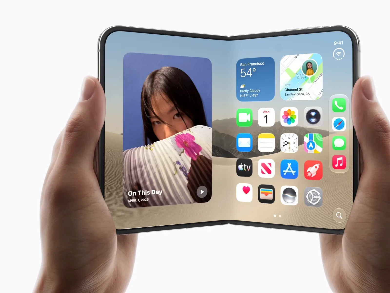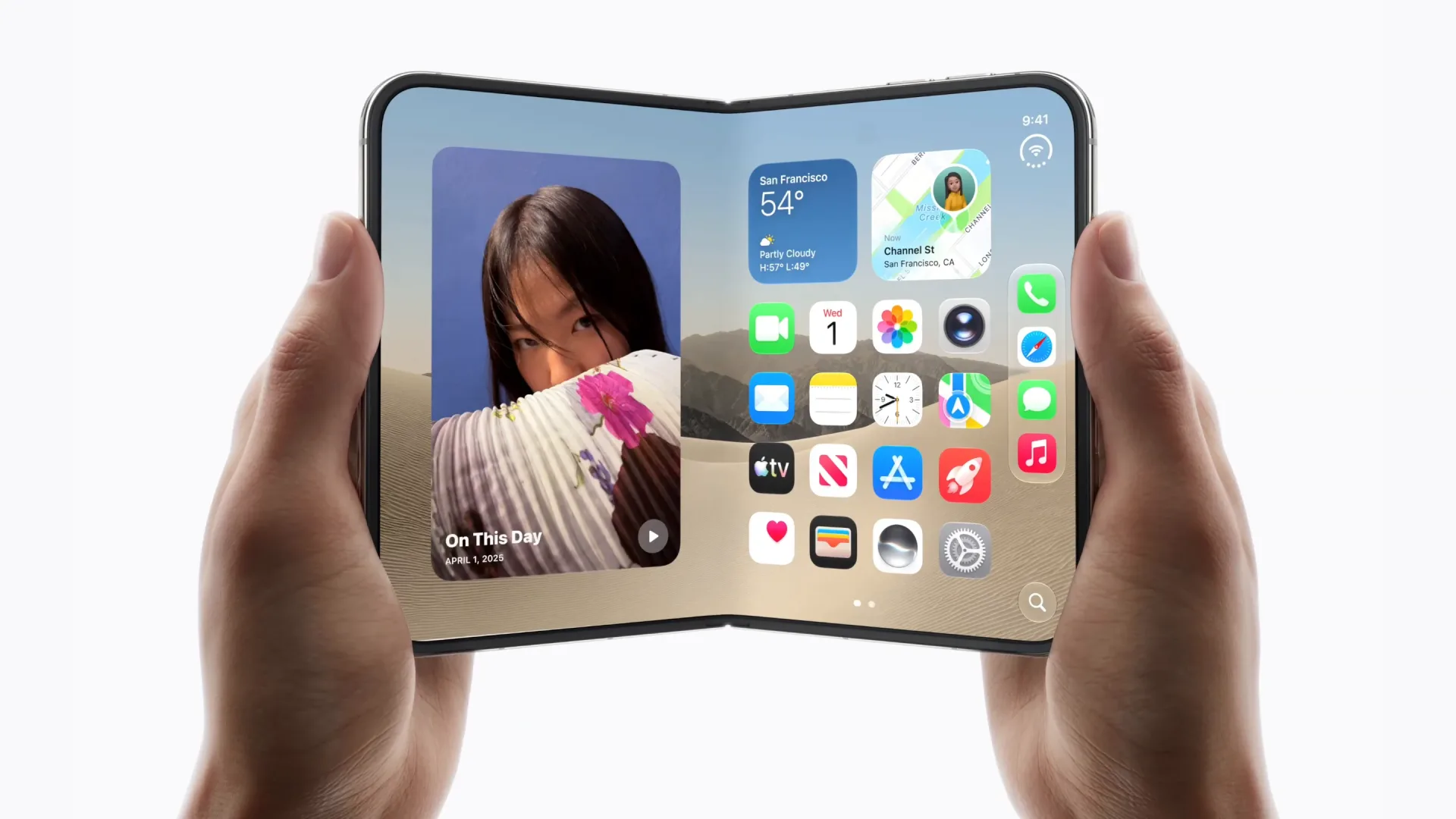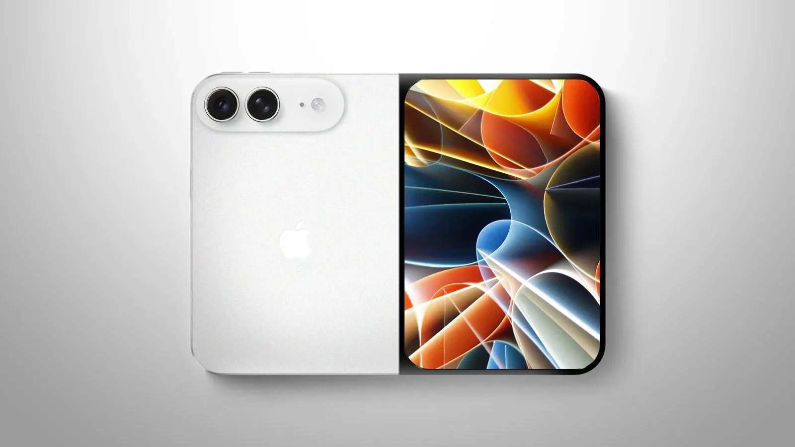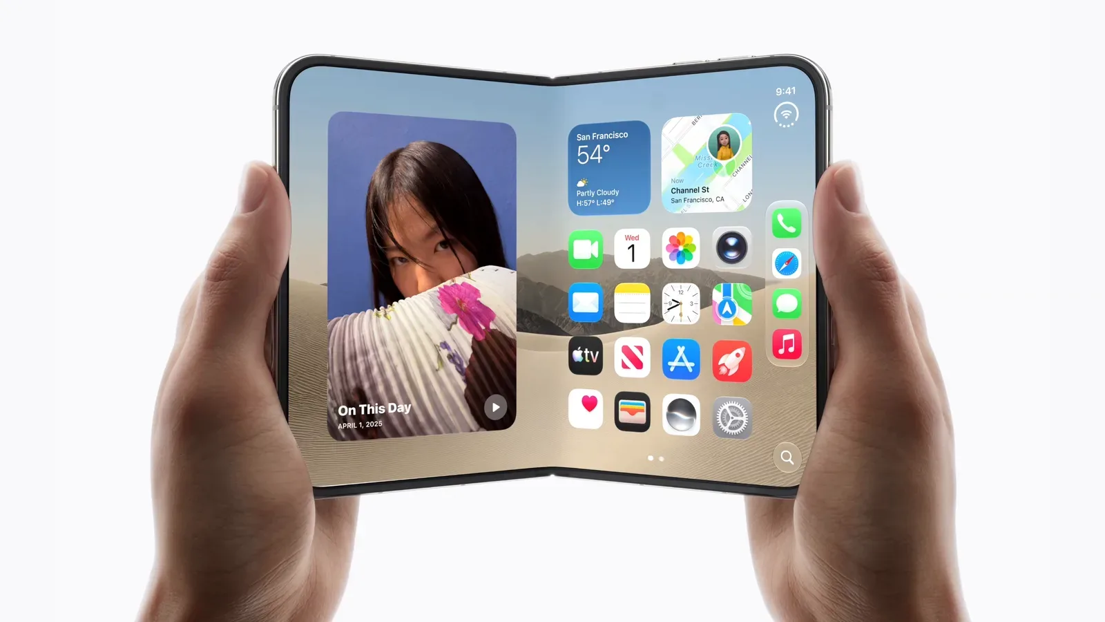
Apple has outlined the design thinking behind the iPhone Duo, its foldable phone due to launch on October 23 after pre-orders open October 16. The headline hardware facts are already substantial: this is a $1,999-and-up device with two displays and a hinge. But the more revealing details concern the effort to make that arrangement feel ordinary rather than mechanically impressive.
That is an unusually important distinction for a foldable. A second display is easy to describe; a coherent experience across a closed and open state is much harder to achieve. Apple executives John Ternus, industrial-design vice president Molly Anderson and human-interface-design vice president Steve Lemay frame the Duo around a deceptively simple ambition: offer more room when needed without turning the object in a pocket or bag into a fundamentally different kind of thing.
The physical reference point was not an existing gadget but a notebook. The software reference point was continuity: opening the device should feel like expanding what is already in a user’s hands, rather than jumping from one product mode to another. Taken together, those ideas explain why the hinge, dimensions, animation and placement of controls are being treated as parts of the same design problem.
A notebook is the hardware metaphor
Anderson identified familiar notebooks as a key inspiration for the iPhone Duo. The appeal is not nostalgia for paper. It is the established mental model: a notebook has a compact closed form, opens to provide more working area and is designed to be carried. That makes it a useful starting point for a device attempting to reconcile pocketable dimensions with an expanded display.
Apple’s stated question was how to provide space while preserving a compact feel. For potential buyers, that wording matters because it defines the promise in terms of use rather than raw display real estate. The Duo is not being presented simply as a phone with an extra panel; it is being positioned as a device whose available space changes while its identity remains stable.
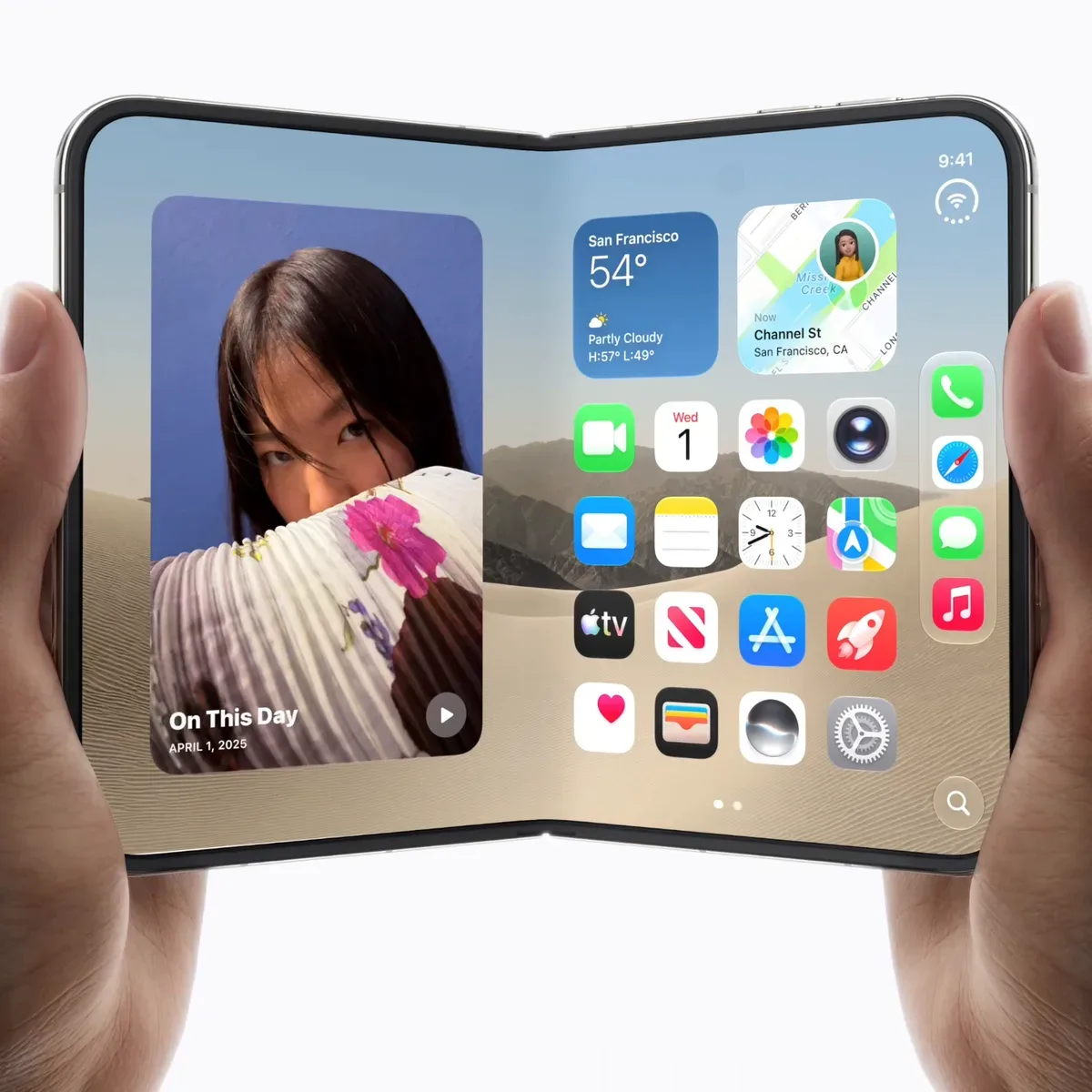
Its proportions are derived from the international A-series paper system. A-series formats are built around a consistent aspect-ratio relationship, so sizes preserve their proportions as the paper is divided or scaled. Apple says the Duo retains the same proportions whether it is open or closed. The practical design intent is clear even without further measurements: its two configurations are meant to look related, rather than like a conventional narrow phone that becomes a visibly unrelated mini-tablet when unfolded.
That is a subtle choice, but foldables are full of subtle choices. A device can contain a large screen and still feel awkward if its shapes, balance and carrying behavior seem disconnected between states. By grounding the form in a familiar paper standard, Apple is signaling a preference for geometric continuity. Whether that produces a better result in everyday use will depend on factors not detailed here, including the eventual dimensions, weight and durability, so those questions remain open.
The hinge is a behavior, not just a joint
The most technical disclosed hardware detail is the Duo’s custom variable torque profile. Torque, in this context, is the rotational resistance users feel as they move the hinge. A variable profile means that resistance is not necessarily identical at every point of travel.
Apple says the hinge is tuned to open easily at first, then becomes biased toward staying open and lying flat. That description points to a specific interaction goal. The opening motion should not demand an awkward amount of force, yet the fully opened device should settle with confidence rather than feeling as though it wants to fold itself back up.
For a product with two screens, this mechanical behavior has direct software implications. The open position is not merely the widest angle the hardware can reach; it is the position in which the interface is meant to become a larger, unified workspace. If the hinge is reluctant at the beginning, opening becomes a chore. If it is insufficiently stable at the end, interacting with the larger display could feel unsettled. Apple’s explanation suggests it designed the resistance curve around those two moments.
There is also a broader lesson here for gaming and tech audiences accustomed to reading spec sheets: a hinge cannot be meaningfully reduced to the fact that it exists. The way it starts moving, where it naturally settles and how it supports the open form all shape whether people use the expanded display regularly. The Duo’s variable-torque approach is therefore part of the device’s interface, even though it is a physical component.
One expanding interface instead of a mode switch
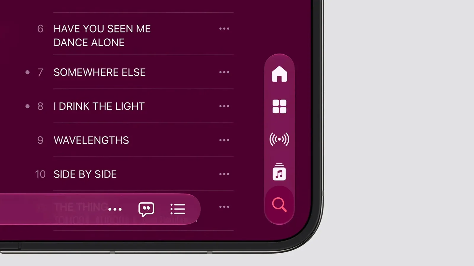
Lemay’s description of the software is even more direct. The central objective was for unfolding to feel like an expansion of the device already being used. Apple sought to preserve the location and recognizability of controls so a person does not have to hunt for a button again after opening the phone.
This is an interface-continuity principle. It means that the transition between screen states should preserve a user’s understanding of where they are, what they were doing and how to act next. In a game analogy, it is the difference between a map enlarging around the player and being kicked back to a separate menu with a new control layout. Both may provide more information, but only one maintains momentum.
The transition animation is designed to reinforce that continuity by making the internal display appear to grow beneath the external display. Animation can sound cosmetic, but it can communicate a change of state. Here, the intended message is that the same interface is gaining room. It is not a claim that the outer screen literally stretches into the inner one; it is a visual explanation of the relationship between the two states.
The restraint implied by keeping controls recognizable is significant. More room creates opportunities to rearrange an interface, introduce extra panels or give every function a new home. Apple’s declared preference is to avoid making the user relearn basic navigation simply because the device has opened. That does not tell us exactly which apps will change layout or how every feature will behave, but it establishes the design criterion against which those choices should be judged.
The intended result, in Lemay’s terms, is one cohesive experience rather than two products awkwardly joined together.
That phrasing captures the central risk for any dual-display device. Hardware can fuse two surfaces together, while software still leaves them feeling separate. If a task loses context when the Duo opens, if familiar controls disappear, or if the larger display creates needless steps, the physical transformation becomes a mode switch with extra ceremony. Apple is explicitly trying to prevent that outcome.
Mac, iPad and iPhone influences — without a declared replacement plan
Lemay named the Mac, iPad and existing iPhones as influences on the Duo interface, characterizing the mix as their “greatest hits.” The phrase should not be overread as a list of specific Mac or iPad features, because none were detailed. What it does establish is that Apple does not view the Duo’s software as belonging solely to the phone lineage.
That makes sense conceptually. A closed foldable phone emphasizes quick, portable interaction. An opened device presents more room, bringing questions usually associated with larger screens: how content is arranged, how tools remain accessible and how people maintain focus while moving through an app. The Mac and iPad are relevant reference points for those broader-screen questions, while the iPhone remains the foundation of the product’s identity and portability.
For developers, the stated philosophy supplies a useful warning against treating the internal display as a blank excuse to duplicate everything. The most promising uses, by Apple’s own framing, would preserve a task as the available canvas increases. An app may have room to reveal more context, but it should not make people feel they have arrived somewhere alien merely because they opened the hinge.
None of that guarantees a uniform approach across third-party apps. Apple itself expects developers to find uses its designers have not anticipated. That is an acknowledgement that new hardware categories often become defined partly by the software built after launch, not only by the functions demonstrated on day one.
Developers may determine what “Duo” becomes
Lemay said some developer ideas could become major concepts that influence the wider foldable market and alter the product’s own direction. It is a notably open-ended expectation. Apple has given a strong account of the foundation — compact closed form, larger open space, stable controls and a continuous transition — but it is not claiming that the company already knows every worthwhile use of that foundation.
That uncertainty is productive rather than evasive. A larger display can change what an app chooses to prioritize, but developers must decide what extra space is actually useful. More information is not automatically better information. In a game-adjacent context, expanded room might be valuable for maps, communication, inventories, guides or creation tools, but any such implementation would need to avoid overwhelming the primary activity. Those are possibilities, not announced iPhone Duo capabilities.
The same practical test applies outside games. A successful foldable experience must answer a simple question in each moment: what does opening the device make easier? If the answer is merely “it makes everything bigger,” the extra screen can become expensive excess. If it reveals relevant context while keeping the person anchored in their task, the change in size can be meaningful. That tension is explored in our look at whether the iPhone Duo is a travel power-up or an expensive inventory slot.
What buyers can actually take from the design briefing
The disclosed material does not answer every purchase question. It does not provide a complete technical specification, app compatibility rundown or durability assessment. Those omissions should remain omissions until Apple supplies them. But the interview does make the product’s priorities unusually legible.
- Compactness is part of the premise: the notebook comparison and proportional design indicate that the closed form is not being treated as an afterthought.
- The hinge has been engineered for a particular rhythm: easy initial opening, then an open-state bias intended to keep the device flat.
- Continuity is the software test: controls should remain findable and the visual transition should make the expanded screen feel connected to the outer display.
- The platform is expected to evolve: Apple is leaving room for third-party developers to establish patterns that may matter beyond launch.
The iPhone Duo will be available to pre-order on October 16, launches October 23 and starts at $1,999. At that price, the question is not simply whether a phone can fold. Apple’s design team is asking buyers to see folding as a way of carrying a familiar device that can make more room for the same task. The notebook-inspired proportions, variable-torque hinge and expanding-interface concept are all parts of its attempt to make that proposition feel natural.