Apple CarPlay is designed to keep familiar iPhone functions within reach of a vehicle’s infotainment display, putting navigation, music, calls and compatible messaging tools in a larger, driving-oriented interface. Its default presentation emphasizes big labels and prominent icons, which is a sensible starting point when information needs to be understood quickly. But the stock arrangement is not necessarily the best arrangement for every driver.
A few settings can make CarPlay less like a freshly installed phone and more like a dashboard built around the information that matters most. That may mean making text easier to read, moving a preferred map app to the first screen, choosing a less distracting wallpaper, or trimming down a widget stack so a useful control is not buried under several less relevant cards.
Some changes are made directly in CarPlay using the vehicle screen or its physical controls. Others live on the paired iPhone. The split is worth remembering: display appearance is generally adjusted in the car, while the app lineup and widget arrangement are managed through the iPhone’s CarPlay settings. Available options can also differ depending on the vehicle’s screen size, the installed apps and the iOS version in use.
Start with the display theme
CarPlay normally favors a dark appearance. That choice makes practical sense at night and in dim cabins, when a bright screen can be harsh or distracting. Yet a permanently dark interface may not suit every situation, particularly in strong daytime conditions where some drivers find a lighter presentation more legible.
To review this setting, open Settings in CarPlay, then go to Appearance. From there, select the theme that works best for the cabin. Choosing Automatic allows CarPlay to move between light and dark presentations based on ambient lighting conditions, offering a hands-off compromise for people who drive in varied conditions.
The important part is not treating dark mode as a universal rule. The useful setting is the one that lets key labels, map guidance and media information remain easy to parse without turning the center display into a miniature sun. Automatic mode is likely the most convenient option for many cars, but a fixed light or dark mode can make sense if a particular display, cabin layout or personal preference calls for it.
Change wallpaper, icon styling and text size
CarPlay’s background can also be changed inside its own Settings app. Go to Settings > Wallpaper to select from Apple-provided designs. These options include different colors and pattern treatments, allowing a modest visual refresh without affecting the underlying layout.
There is an important limitation: CarPlay does not support using a personal photo from the iPhone’s gallery as its wallpaper. The available choices are Apple-designed options rather than custom images. That restriction keeps the feature focused on restrained presentation instead of opening the door to a dashboard wallpaper that could be visually busy, overly bright or simply baffling to a passenger who discovers a giant vacation selfie behind the map.
Icon styling has its own menu. Visit Settings > Customize Icons to choose a dark icon package or clearer icons associated with Apple’s Liquid Glass visual direction. The visual difference may seem minor, but it can matter in a glance-based interface: an icon treatment that looks cleaner to one driver may appear too faint or too busy to another.
For a more functional change, open the Accessibility area in CarPlay Settings and adjust text size. Larger text can improve readability, especially when the vehicle screen is positioned farther away or when the default labels feel cramped. This is one of the most practical customizations because it changes how comfortably a driver can identify information, not merely how the dashboard looks.
A sensible order for appearance tweaks
- Set Appearance to light, dark or Automatic based on visibility in your normal driving conditions.
- Choose one of the built-in wallpapers that keeps the interface visually calm.
- Compare the available icon styles and settle on the clearest one.
- Increase text size through Accessibility if labels are difficult to read at a glance.
These settings are best approached as readability controls first and decoration second. CarPlay is not a desktop wallpaper showcase, and that is very much to its credit.
Put the right apps on the first CarPlay page
The most significant personalization happens on the iPhone, not the vehicle display. On the iPhone, open Settings > General > CarPlay, choose the relevant vehicle, then tap Apps. This is where the CarPlay app order can be tailored to match how the system is actually used.
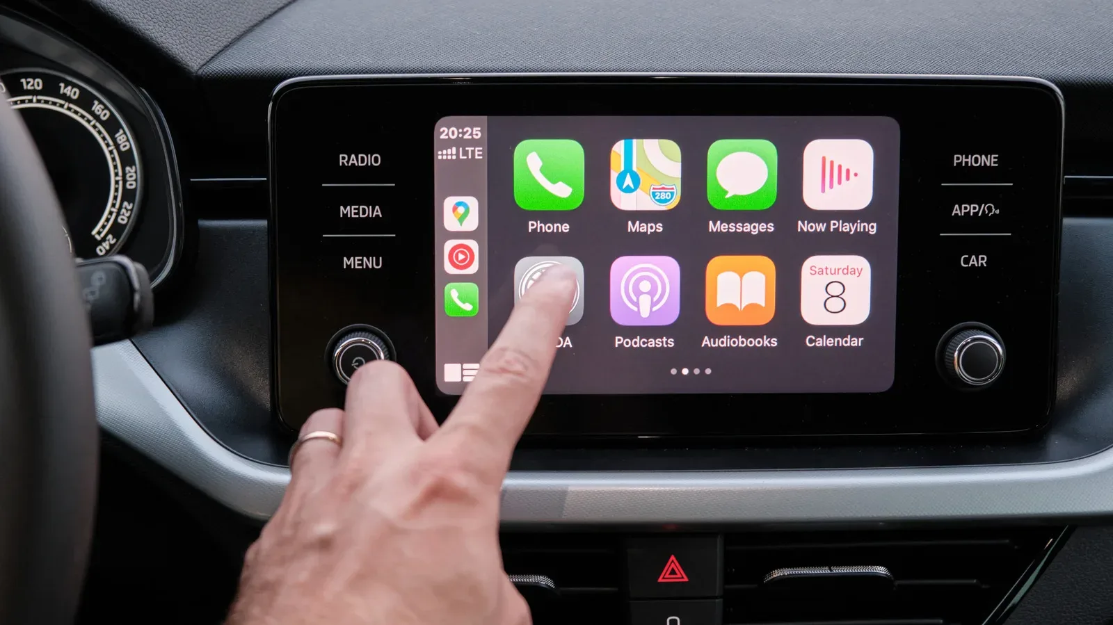
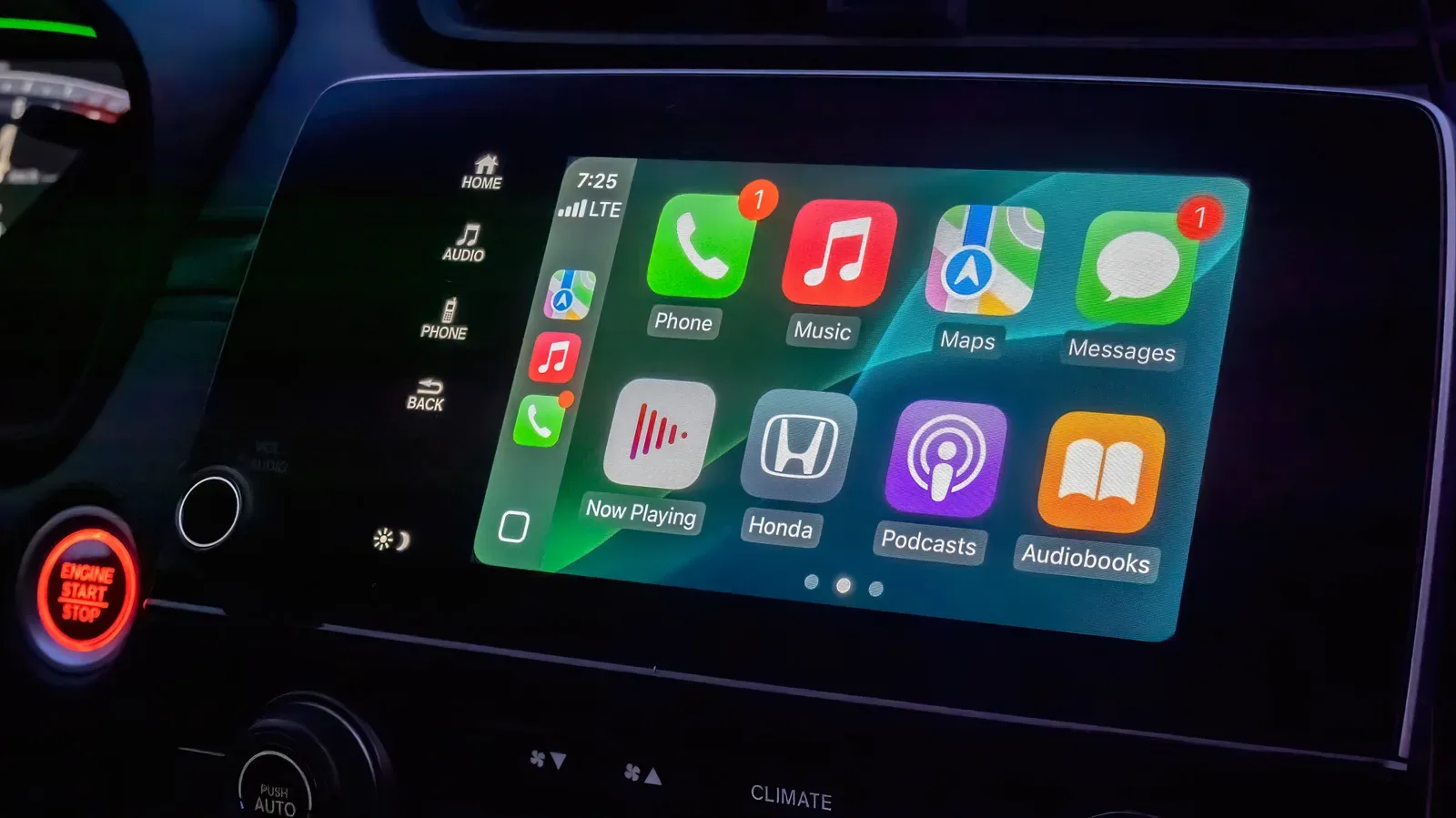
Use the reorder handles to move frequently used apps toward the top of the list. Those top positions feed the earliest places in CarPlay’s app grid, helping put navigation, audio and other essentials within easier reach. The exact number of apps that fit on each page depends on the vehicle’s display, so there is no universal perfect cutoff. A wider screen may show more items at once; a smaller one may make first-page priorities even more important.
Apps that are not useful in the car can be removed using the Remove control. A few default apps cannot be removed. Rather than fighting an immovable resident of the dashboard, move it toward the bottom of the list so it occupies less valuable real estate.
For many people, the ideal first page is intentionally boring: the primary navigation app, the usual music or podcast service, a phone control and perhaps one other frequently needed tool. Every additional option makes the screen more comprehensive, but it can also make a simple task take an extra search. A customized CarPlay grid should reduce that hunt.
The best CarPlay layout is not the one with the most apps visible. It is the one that makes the next necessary action obvious.
This organization also helps drivers who switch among several audio or mapping apps. If one app is routinely used for commuting and another for longer trips, their relative placement can reflect that routine. The aim is not to declare one service universally superior; it is to make the preferred choice appear first in the environment where it will be used.
Use iOS 26 widgets without building a card maze
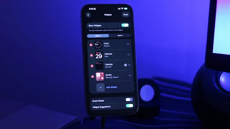
Widgets reached CarPlay with iOS 26, extending the familiar iPhone concept to the vehicle display. They occupy a separate page that can be reached by swiping right from the main dashboard. Depending on the width of the infotainment screen, CarPlay may show one or multiple widget stacks at a time.
By default, CarPlay can surface widgets it considers relevant, including options such as a clock, calendar, media controls and weather. That is a useful baseline, but it is only a starting point. A stack filled with items that are technically informative but rarely needed is still a stack that takes too long to navigate.
To manage widgets, return to Settings > General > CarPlay on the iPhone, select the vehicle and tap Widgets. Confirm that Show Widgets is enabled. From there, widgets can be added to stacks and rearranged so the important items appear in a more logical order. The specific widget selection is influenced by the compatible apps installed on the phone.
There is a straightforward safety-minded argument for restraint here. If a preferred media widget is always the first card in a stack, it is easier to find than if it sits behind an assortment of information that is seldom used while driving. The same applies to calendar and weather cards: they may be helpful for some routines, but they should earn their place near the front through real usefulness, not because they arrived there by default.
Build widget stacks around a purpose
Instead of treating every available widget as an invitation, organize each stack around a broad need. One stack might prioritize media and playback information. Another could focus on time-sensitive planning, such as the clock and calendar. The exact setup will vary, but a deliberate grouping is easier to remember than a random sequence of cards.
- Open the vehicle’s CarPlay configuration on the iPhone.
- Tap Widgets and turn on Show Widgets if it is off.
- Add only widgets that have a clear use during a normal drive.
- Move the most useful cards toward the beginning of each stack.
- Revisit the order after a few trips if a card is consistently ignored.
CarPlay’s widget page is a welcome expansion, but it is most valuable when it reduces choices rather than multiplying them. A stack should feel like a compact shortcut panel, not a vertical scavenger hunt conducted while waiting at a light.
Keep the setup focused on the road
Whether CarPlay is connected by cable or wirelessly, its value comes from bringing compatible iPhone features into a vehicle-friendly interface and avoiding the need for a separate phone mount. Customization should support that goal. Prioritize clear text, familiar app positions and only the widgets that genuinely save time.
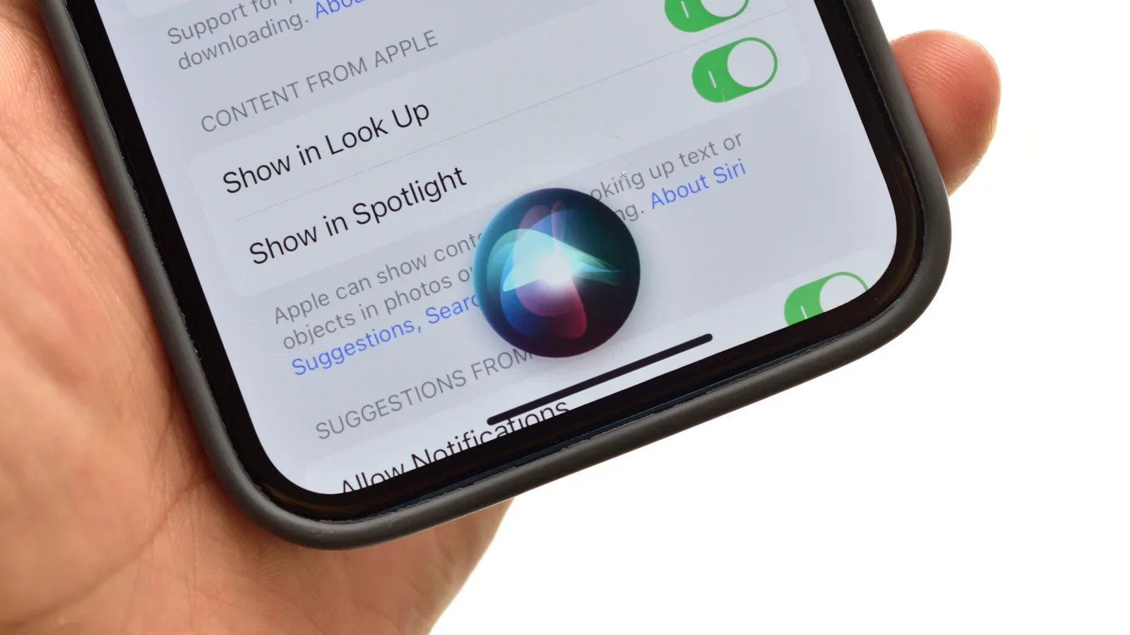
Voice interaction may become more central as Apple develops Siri further in iOS 27, which has been described as receiving a substantial overhaul. Until then, the core display decisions remain useful regardless of how often voice commands are used: a well-ordered screen means fewer taps and less visual searching.
For more Apple platform context, see our coverage of potential iOS 27 changes for HomeKit and Apple TV controls. CarPlay customization may be a smaller piece of the wider Apple ecosystem, but it has an unusually immediate benefit: it can make a familiar dashboard feel calmer, clearer and better suited to the way its owner actually drives.