A modern display can make an older game look either too hard-edged or strangely soft. A Nintendo 64 image scaled across a large panel may expose uneven pixel boundaries, while a Dreamcast or GameCube game can lose atmosphere when every texture and interface element is rendered with maximum sharpness. The answer is not automatically the most elaborate CRT preset or the strongest sharpening filter. The useful question is what you want the image to communicate while you play.
Filters, emulator texture options and shader presets are related, but they are not interchangeable. Some blend or resample the picture, some alter textures before the final image is assembled, and shader chains can add several display effects in sequence. Treat the process like visual calibration: establish a clean, readable baseline, change one thing, inspect more than one scene, and keep the result only if it improves the way you actually play.
The real choice is readability versus character
A clean image prioritizes information. Menu lettering, HUD icons, thin geometry and color boundaries remain easy to distinguish, even if the result looks less like an old television. A stylized image prioritizes character. Scanlines, phosphor-mask patterns, glow, blur, curvature and altered contrast can make a flat-panel presentation feel more like a display from the original era, but every extra layer can also hide or soften information.
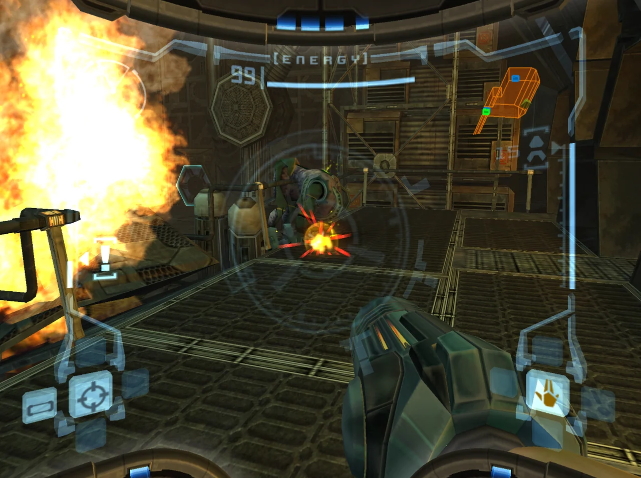
Neither goal is universally correct. Someone viewing a low-resolution game from a short distance may prefer crisp sampling. Someone playing a polygonal console game on a large television may find mild softness more comfortable. A player revisiting Metroid Prime may value readable visor information above a convincing screen texture, while a player watching Super Mario 64 from across a room may welcome a gentler image. Decide which compromise matters before choosing a preset.
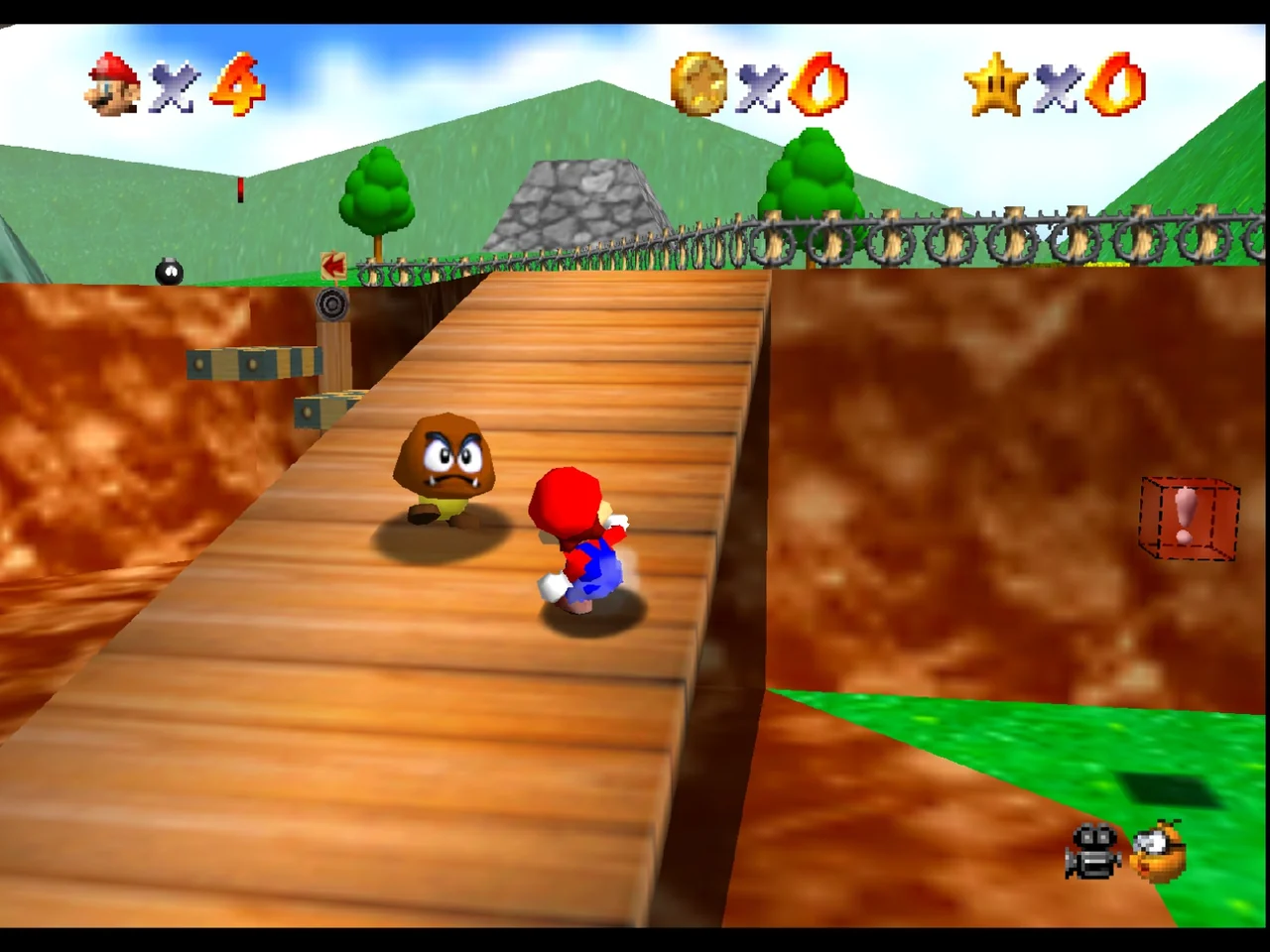
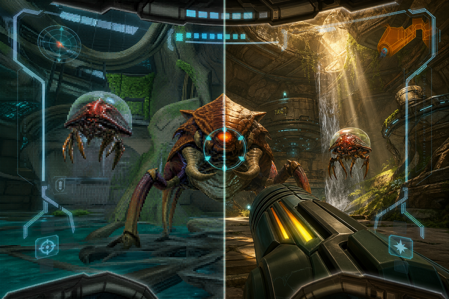
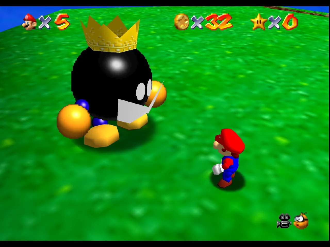
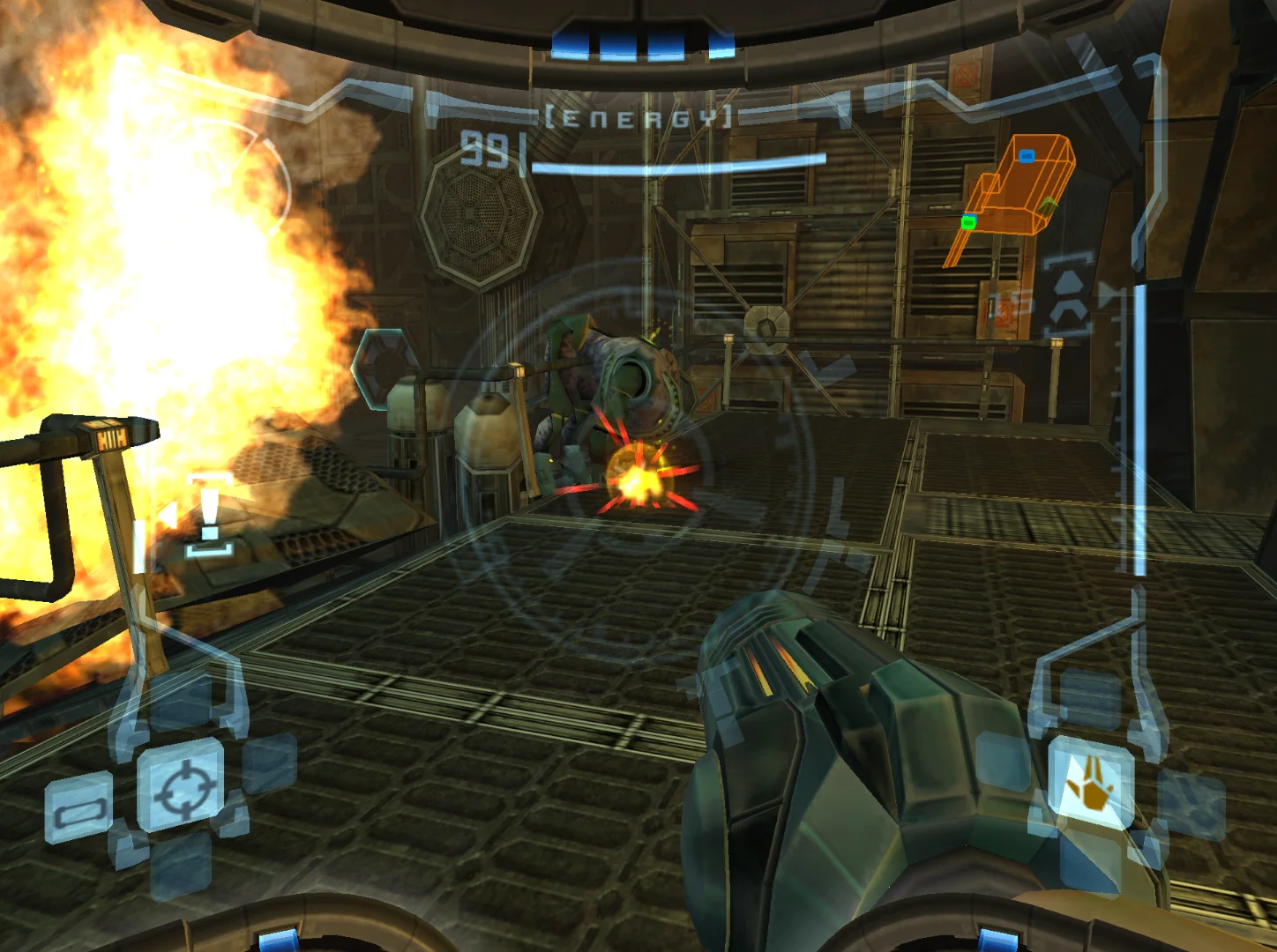
The supplied screenshots are unmodified gameplay examples from the referenced game libraries. They show Super Mario 64 on Nintendo 64, Sonic Adventure on Sega Dreamcast and Metroid Prime on Nintendo GameCube. They are not emulator-interface captures or before-and-after shader comparisons.
- Choose a primary goal: clean edges, reduced harshness, restrained display texture or a pronounced CRT-style presentation.
- Judge the image while playing, not only from an attractive paused scene.
- Keep a neutral configuration available so visual preference does not become a troubleshooting problem.
Shader, filter and texture option are different layers
A basic scaling filter changes how neighboring source pixels are sampled as the image is enlarged. Bilinear filtering blends neighboring pixels and generally appears softer. Nearest-neighbor sampling keeps boundaries hard, although non-integer scaling can produce uneven pixel sizes and sampling artifacts. Integer scaling instead enlarges source pixels by whole-number multiples, which can make a pixel grid more consistent when the output display allows it.
An emulator core may also expose texture-filter choices. Those settings can affect textures before a frontend shader processes the completed frame. The Mupen64Plus Libretro documentation describes bilinear modes and separate texture-filter choices, including a three-point mode intended to produce a less smooth result than ordinary bilinear filtering. Changing a core texture option is therefore not the same as applying a full-screen CRT effect afterward.
A shader is a processing chain. One pass receives the output of an earlier pass, and the final result reaches the display backbuffer. A preset may use several passes for blur, resampling, scanlines, mask patterns, geometry or glow. RetroArch supports CG, GLSL and Slang formats, with Slang recommended when available for the selected renderer. Compatibility and visible controls can therefore vary by core, renderer and build.
Because these layers compound one another, a soft core texture option followed by a blur-heavy shader may make text muddy. A sharpen filter placed after a strong blur may restore edge contrast while also emphasizing halos. Start by identifying which layer you are changing, then avoid using several controls to solve the same problem at once.
- Set aspect ratio and scaling before judging a shader.
- Treat core texture filtering, video filters and shader presets as separate controls.
- Check whether the chosen shader format is supported by the active renderer.
- Do not assume a preset behaves identically across every core or game.
Start from a readable baseline
Before adding visual character, make the frame geometrically sensible. Confirm that the game is using the intended aspect ratio rather than stretching a 4:3 composition into a wide rectangle. Use integer scaling when it fits your display and your priority is a stable pixel grid. If integer scaling leaves large borders or is unsuitable for the output resolution, a non-integer presentation may still be practical, but inspect thin lines and small text for uneven sampling.
Begin with no shader or the least processed option that gives you a usable picture. Keep bilinear filtering off or on according to the kind of softness you want, rather than enabling it automatically. On a Nintendo 64 title, the core’s own filtering behavior may already contribute substantial softness. On a later 3D console game, an additional full-screen blur may be more noticeable in interface elements than in large environmental surfaces.
RetroArch documents a live shader workflow through the running game: open the Quick Menu, select Shaders, then use Load Shader Preset. The surrounding interface can differ between versions and menu drivers, so do not treat every visible label as universal. The important habit is to make a change while a known test scene is available, then compare it with the neutral state before saving anything.
A baseline is not a claim that the original hardware looked mathematically identical to the emulator output. It is a reference point. Without one, a chain of effects can slowly become difficult to evaluate because each new adjustment is judged against the previous adjustment rather than against a clear, readable image.
- Confirm aspect ratio before comparing softness or sharpness.
- Use integer scaling where practical, especially when evaluating scanline or pixel-grid effects.
- Load a shader while a game is running, then compare with the unprocessed state.
- Save only after checking text, HUD elements, motion and dark areas.
Smoothing: when softness helps and when it erases detail
Smoothing is useful when hard sampling makes diagonal edges or low-resolution textures look excessively brittle. Bilinear-style filtering blends neighboring samples, reducing the appearance of isolated jagged transitions. This can make a large, flat-panel presentation less distracting, particularly when the source resolution does not map neatly to the display.
The tradeoff is lost separation. Small lettering can become less distinct, thin lines can fade into nearby colors, and texture boundaries can look washed together. Smoothing also does not automatically solve uneven scaling. A non-integer enlargement can still distribute source pixels unevenly, even if the boundaries are softened enough to make the problem less obvious.
Super Mario 64 is a useful test because its broad color fields and polygonal surfaces reveal both sides of the decision. Mild smoothing can reduce an overly clinical appearance around geometry and textures, but excessive blur can make edges around Mario, platforms or level architecture harder to read. Test a moving character against a contrasting background rather than judging only a static sky or wall.
Three-point filtering is another example of why labels require context. The Mupen64Plus documentation presents it as a less smooth alternative to standard bilinear filtering, not as a universal image-quality upgrade. The appropriate setting depends on whether you are trying to reduce harsh transitions, preserve source characteristics or prepare the image for another display effect.
- Use smoothing when hard edges are the problem, not simply because the option exists.
- Inspect small lettering and thin geometry after enabling it.
- Compare a character in motion against a contrasting background.
- Do not use blur to hide an aspect-ratio or scaling mistake.
Sharpening: recover definition without creating halos
Sharpening increases perceived edge definition after an image has become too soft. Used lightly, it can give menus, interface icons and large forms more separation. It is best understood as corrective processing, not a guarantee that the game has gained detail. Sharpening cannot recreate information that was never present in the source image or that a previous blur removed completely.
Too much sharpening produces recognizable warnings. Bright or dark halos may appear along high-contrast edges, polygonal outlines may become jagged, and texture seams or compression noise can draw attention away from the scene. Flat colors and geometric surfaces make these artifacts particularly easy to spot. A setting that looks impressive on a title screen may become tiring during movement.
Super Mario 64 can expose exaggerated edge treatment around simple shapes and strong color transitions. Sonic Adventure supplies a different test: fast movement through high-contrast scenery can make ringing and unstable-looking edges more distracting. If sharpening seems to improve a paused scene but makes motion look busier, reduce it or return to the baseline.
Sharpening is also easy to misuse after stacking effects. A blur-heavy CRT preset followed by aggressive sharpening may create a cycle of softening and artificial edge enhancement. If the image is too soft, first identify whether bilinear scaling, a core texture option or a shader pass is responsible. Correct that source where possible instead of compensating with a stronger final effect.
- Use mild sharpening only when the baseline is genuinely too soft.
- Look for halos around bright objects and dark interface lines.
- Test movement, not only paused screens.
- Avoid sharpening as a substitute for correct scaling or resolution choices.
Scanlines: a display cue, not a complete CRT simulation
Scanlines darken or separate horizontal bands, adding one recognizable cue associated with older displays. They can reduce the uniformly flat appearance of a modern panel and may make a low-resolution image feel less exposed. Their effect depends heavily on output size, scaling and strength. A pattern that looks restrained at one resolution can become a prominent grille at another.
Scanlines alone do not recreate every characteristic of a CRT. They do not automatically reproduce a particular tube’s glow, phosphor behavior, geometry, color response or motion characteristics. Treat them as one ingredient. If the result makes text appear striped or causes dark scenes to lose information, the effect is stronger than the game’s content can support.
Sonic Adventure is a useful visual check because speed and contrast change quickly. Strong horizontal bands can compete with scenery, character silhouettes and interface elements during movement. Use a scene with both bright and dark surfaces, then check whether the scanline pattern remains a subtle texture or becomes the main thing you notice.
Integer scaling is often useful for scanline-oriented processing because the source rows map more consistently to the output. Some presets handle non-integer scales better than others, so this is a preference and compatibility guideline rather than a promise of identical results. If the pattern breaks up, shifts in prominence or makes horizontal detail hard to follow, return to the scaling baseline before adjusting strength.
- Treat scanlines as a restrained display cue.
- Check the effect at the actual viewing distance and output resolution.
- Test fast movement and dark scenes.
- Prefer a stable scale when evaluating horizontal-line effects.
CRT-style presets: choose the character you actually want
A CRT-style preset may combine several ingredients: scanlines, phosphor-mask patterns, blur, bloom, halation, curvature, interlacing behavior and resampling. These parts serve different visual purposes. Blur can soften transitions, a mask can create a repeating subpixel pattern, curvature changes the screen geometry, and bloom or halation can spread bright areas into their surroundings. Calling all of these effects simply scanlines hides the actual tradeoff.
A lightweight CRT preset is usually the better starting point for someone who wants a little display character without making every interface element a visual obstacle. Libretro’s CRT documentation includes lighter CRT-oriented choices for modest hardware or lower-resolution displays, while CRT-Geom offers configurable variants aimed at different performance, geometry and broadcast-style characteristics. The right choice depends on the output and the amount of adjustment you are willing to do.
CRT-Royale is a more advanced example. Its documentation exposes extensive controls for mask types, bloom, scanline behavior, curvature, halation, refractive diffusion and resampling. That breadth is useful for deliberate experimentation, but it makes the preset a poor first stop for someone who only wants a readable picture. More controls also mean more opportunities to change several visual variables without knowing which one caused the problem.
Metroid Prime demonstrates why atmosphere and readability can pull in opposite directions. Dark environments can benefit from gentle display texture, but a heavy mask, glow or curvature effect may reduce separation in shadows or make visor information less immediate. Check color-coded interface elements, small text and dark corners before deciding that a more elaborate preset is better. No shader exactly reproduces every CRT, and no shader should be treated as a guaranteed latency improvement.
- Choose a lightweight preset if your priority is quick readability.
- Use complex presets when you are prepared to understand and adjust their components.
- Check dark areas, interface colors and small text in addition to bright scenes.
- Do not describe a CRT-style effect as an exact hardware reproduction.
A controlled one-change-at-a-time setup
The safest workflow is deliberately slow. First establish aspect ratio, scaling and the core’s relevant texture options. Then view a repeatable test scene containing a character, background geometry, interface information and both bright and dark areas. Record the baseline mentally or with a configuration copy. Only then load a shader or alter one parameter.
Make one change and spend enough time moving through the scene to notice whether it helps. If you enable smoothing, do not also change sharpening, scanline strength and curvature in the same pass. If the result is promising, adjust one parameter slightly and compare again. RetroArch’s shader documentation supports live parameter adjustment in compatible workflows, and adjusted parameters can be saved as a new preset rather than overwriting the original.
Use per-game or per-core saving with care. RetroArch can save shader changes globally, for a core, for a content directory or for an individual game. A global change is convenient but can make unrelated systems look wrong. A game-specific preset takes more organization, but it is the most precise choice when Super Mario 64, Sonic Adventure and Metroid Prime need different compromises.
If readability falls, undo the last change or reload the neutral preset. Do not keep adding compensating effects. A clean rollback is more useful than a complicated chain whose behavior you can no longer explain. Save a successful experiment only after checking several types of scene and confirming that it remains comfortable during ordinary play.
- Baseline first; shader second.
- Change one setting or parameter at a time.
- Compare motion, interface elements, bright areas and dark areas.
- Save per game or per core when a global look would be too broad.
- Keep the neutral configuration available for rollback.
Game-by-game visual tests and decision paths
For Super Mario 64, prioritize polygon boundaries, texture transitions and the 4:3 composition. A clean or lightly softened presentation is a sensible starting point. If sharpening is used, keep it restrained and watch for halos around simple geometric shapes. If scanlines are the goal, evaluate them against menus and large flat colors rather than assuming the effect is successful because the title screen looks nostalgic.
For Sonic Adventure, prioritize motion clarity and contrast. Fast traversal can expose excessive scanline strength, bloom or edge ringing sooner than a quiet scene. A moderate filter or lightweight CRT treatment may preserve character without turning high-contrast scenery into a busy pattern. Do not infer a universal Dreamcast setting from one supplied screenshot; the result depends on the active core, renderer, scaling and preset.
For Metroid Prime, prioritize visor information, color separation and dark-environment readability. A subtle CRT treatment may add atmosphere, but heavy blur, mask patterns or glow can obscure the interface cues that help the player understand the scene. A clean baseline with carefully limited processing is often the safer decision when the game’s presentation relies on small colored indicators and shadow detail.
These are decision paths, not rankings. Choose clean and readable if text and interface clarity matter most. Choose lightly softened if hard sampling distracts you. Choose sharp but restrained if the baseline looks muddy. Choose scanlined if you want a modest display cue. Choose full CRT-style processing only if you accept lower clarity in exchange for stronger visual character. In every path, preserve a way back.
- Super Mario 64: inspect geometry, texture softness and 4:3 proportions.
- Sonic Adventure: inspect fast movement, contrast and edge stability.
- Metroid Prime: inspect visor information, color separation and dark areas.
- Choose the path that matches your priority, not the most dramatic screenshot.
How to know when the stack has gone too far
Multiple effects can cancel one another while still making the image worse. A smoothing filter may soften the frame, a blur-heavy CRT preset may soften it again, and a sharpening pass may then add halos without restoring the original detail. Scanlines and a strong mask can further reduce small text. The resulting picture may look processed without being more useful or more faithful to any specific display.
Common warning signs include menus that require squinting, HUD icons that merge into nearby colors, thin geometry that flickers or disappears, dark scenes losing separation, bright edges surrounded by rings and scanlines becoming more noticeable than the game. These problems are not proof that shaders are bad; they indicate that the selected intensity, order or combination does not suit the current output.
Performance is another reason to stay measured. Blur passes require additional pixel lookups, and more elaborate CRT chains can require more processing than lightweight choices. A preset that is visually attractive but unsuitable for the renderer or hardware is not a practical baseline. Use a simpler option or remove layers until the image and operation are both dependable.
The best final image is the one you can read without thinking about the processing. Save the configuration when it improves play, not merely when it produces the strongest retro effect. If you later change display resolution, core, renderer or game, repeat the visual checks instead of assuming the old balance will carry over.
- Watch for muddy text, halos, lost shadow detail and distracting scanlines.
- Do not solve blur with unlimited sharpening.
- Prefer a simpler chain when performance or compatibility is uncertain.
- Recheck the image after changing core, renderer or output resolution.
Smoothing, sharpening, scanlines and CRT-style shaders are tools for different visual intentions. Start with correct aspect ratio and sensible scaling, establish a readable baseline, and then add one controlled change. Super Mario 64, Sonic Adventure and Metroid Prime make useful test cases because they expose different weaknesses: geometry and texture transitions, fast contrast changes, and dark interface-heavy scenes.
A good preset is not the most elaborate one and it is not a promise of exact CRT reproduction. It is a configuration that preserves the information you need while adding only the character you want. Save successful changes at the narrowest useful scope, keep the neutral setup available, and treat rollback as part of the design rather than a sign that the experiment failed.