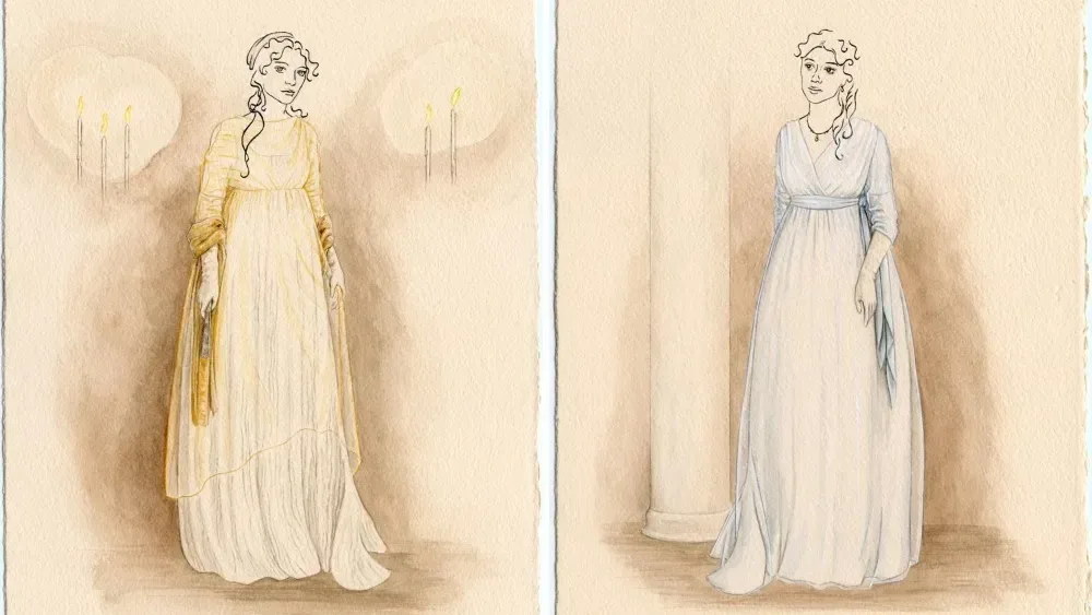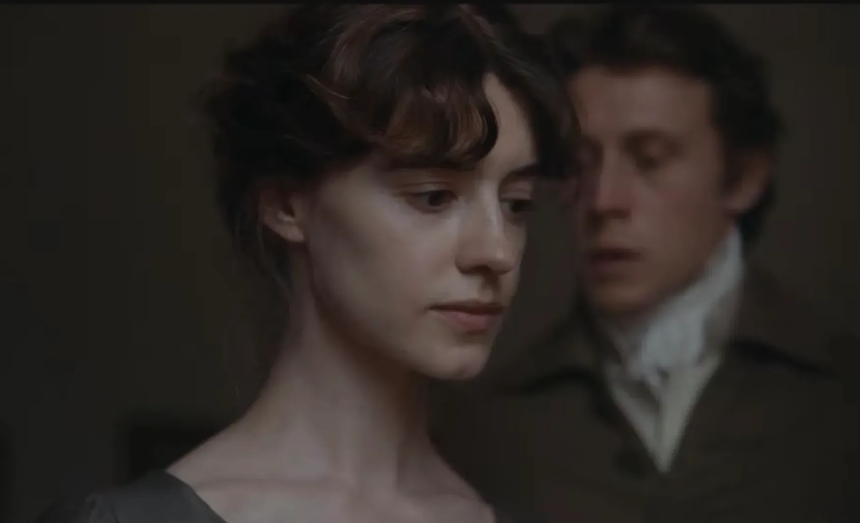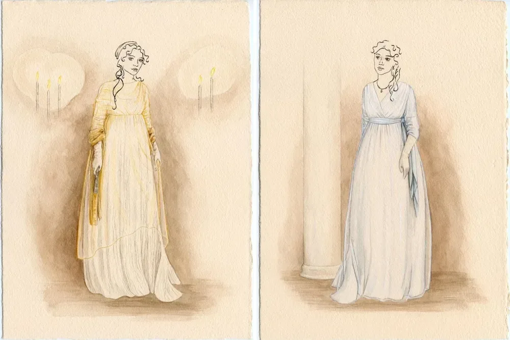
Costume designer Grace Snell is approaching Georgia Oakley’s new Sense and Sensibility as a story told in distinct visual chapters. Her wardrobe for the Jane Austen adaptation, starring Daisy Edgar-Jones as Elinor Dashwood and Esmé Creed-Miles as Marianne Dashwood, moves between a private country life and the pressures of London society. The result, by design, is not simply a collection of pretty period outfits: it is clothing intended to communicate kinship, loss, social presentation and the changing circumstances around the Dashwood sisters.
Snell’s central idea is wonderfully specific. The sisters borrow from one another, take inspiration from one another, and wear garments that have visibly been altered or given further use. Rather than treating every costume as a pristine museum object, the design aims to make clothes feel lived in. It is a small visual decision with a big storytelling purpose: family intimacy can be shown through what characters wear without requiring the script to spell it out.
Two settings, two social worlds
Snell separates the film’s wardrobe into country and city phases. The Barton Cottage material is shaped by Devonshire, its landscape, weather, sets and seasonal changes. It is also where the connection among the Dashwood sisters is most private. In this portion of the story, clothes can function as personal objects: things worn around family, repurposed within a household and carried through daily life.
London changes the terms. In a city setting, presentation becomes more public, and the palette shifts with it. Snell has described the transition as a move into a different social register for Elinor and Marianne. That distinction matters in an Austen story, where the way a person is perceived can carry real weight. A costume need not announce every feeling outright; a controlled color, silhouette or degree of polish can tell viewers that the characters have entered a space with different expectations.
That approach puts costume design in its proper place within period filmmaking. Wardrobe is not separate from production design, location or performance. Snell’s method treats the environment as an active influence, with the country and London sections shaped by their respective conditions rather than by a single static “period” look.
The Dashwoods’ clothes are part of their relationship
The shared-clothing detail is the clearest expression of Snell’s priorities. At the beginning of this version, Marianne is 19, Elinor is 16 and Margaret is 13. Their age differences give the costume department room to show hand-me-downs, borrowing and reinterpretation. An item can originate with one sister but acquire a fresh identity when another wears or changes it.
This is more meaningful than a continuity trick. Garments gain a biography when they are repaired, restyled or passed between people. Snell’s team reworked some fabrics to give the clothes that sense of history. Viewers may not identify each alteration on a first viewing, but the accumulated effect can make the family feel materially connected. The wardrobe becomes evidence of a household rather than an arrangement of isolated character looks.
Snell’s inspiration included early-2000s family photographs, particularly their suggestion of ease among siblings. That contemporary reference point was not used to turn Austen into a modern-day story. Instead, it informed the emotional texture of the costumes: how people who know one another deeply might relax in their clothing, mirror each other’s choices, or test out an idea first seen on a sister.
Related coverage includes Grace Snell Builds a More Intimate Wardrobe for ‘Sense and Sensibility’.
There is a practical accessibility in that decision, too. Period drama can sometimes present characters as remote figures, impeccably arranged behind a layer of historical formality. Snell wanted to reduce that distance and make the people onscreen feel more recognizable, while keeping the film firmly within its historical setting. The target is emotional immediacy, not anachronism.
Historical construction, modern emotional cues
The film sits in the transition between the Georgian and Regency eras, a period Snell characterizes as unusual because fashion was moving rapidly toward the simpler styles widely associated with Austen. That changing fashion language offered a useful challenge. The costumes draw from historically appropriate paintings and archival garments, but Snell also looked to family images from the 2000s and runway styling from the 1980s and 1990s.
Those mixed inspirations describe a design philosophy rather than a claim that all of the references appear literally onscreen. The historic material provided foundations; the later references helped Snell shape an atmosphere that contemporary audiences might instinctively read as intimate, youthful or expressive.
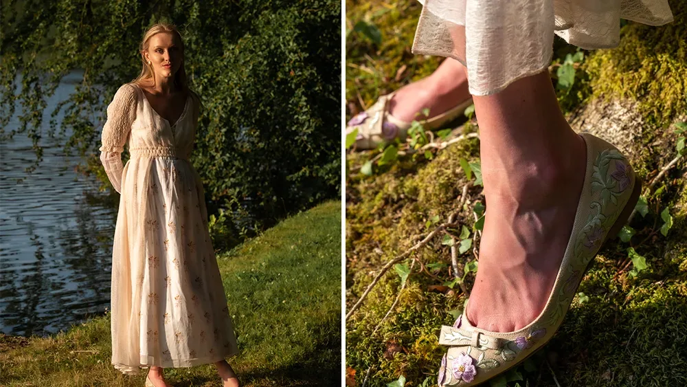
Crucially, the production did not abandon historical craft in pursuit of that feeling. Snell studied historical dress at university and worked with a dress historian for three weeks of research. She has emphasized accuracy in the fabrics, construction techniques and hand sewing used for the costumes. In plain terms, the production sought period-appropriate methods for making the clothes even where the final styling carried a modern sensibility.
Historical accuracy in this context does not mean that every creative decision must reproduce an artifact exactly as it survives in an archive. It means the materials and processes are informed by the period. Modern styling, meanwhile, concerns the visual impression created through combinations of garments, color, texture and character presentation. Snell’s work is interested in holding both ideas together: credible construction underneath a more immediate emotional read on screen.
That balancing act is especially relevant to adaptations. An adaptation has to serve the text, but it also has to communicate with an audience that may not already know the conventions of a specific era. A wardrobe that is technically faithful yet emotionally opaque would miss part of the opportunity. Snell’s stated goal is to preserve the period while opening a path into the characters’ family life.
Color as story information
Color is another deliberate narrative tool in the film. The story begins during mourning, leading Snell toward a range of black shades rather than a single flat use of black. That distinction is important visually. Variations in tone and texture can maintain the emotional gravity of mourning while allowing characters to remain individually legible within the frame.
For the London section, Elinor and Edward are both placed in shades of blue, reflecting the disappointment surrounding their circumstances. It is an example of color coding used with restraint. The blue is not presented as a universal signal that must be decoded mechanically; within the design, it is a shared emotional note linking two characters in a particular phase of the narrative.
Brighter colors are reserved more carefully, principally for supporting figures. This is a useful way to establish hierarchy and contrast without turning the screen into a historical color chart. If the Dashwoods’ palette is organized around mourning, constraint and disappointed expectation, strategically vivid supporting characters can underscore the emotional atmosphere around them.
Costume color in film is often at its best when it works before viewers consciously notice it. The aim is not to make every outfit a puzzle. Snell’s choices suggest a more integrated approach, where color supports character relationships and mood alongside performance, setting and scene construction.
A new adaptation without treating an earlier film as a template
Snell enters this project as an Austen admirer and acknowledges the scale of designing a new version of such a widely loved novel. Her previous-period-film experience was limited: this is her first period film, and the sheer number of garments, along with leading the costume team, made the work a significant undertaking. She has identified self-doubt as the biggest challenge she had to overcome.
The 1995 adaptation directed by Ang Lee remains an important reference point for many viewers, including Snell, who has expressed admiration for its costume designers Jenny Beavan and John Bright. But it was not used as a design blueprint for this production. That is a significant creative boundary. A beloved earlier adaptation creates expectations, but repeating its visual language would do little to articulate what Oakley’s version wants to say about the Dashwood family.
Instead, the costume direction returns to the novel and to the new film’s emphasis on sisters. The outcome will inevitably invite comparison—Austen adaptations do—but comparison is not the same as imitation. This wardrobe is built around its own country-to-city structure, its own mourning palette, and, most notably, its own attention to clothing as a shared family resource.
The broader appeal of that perspective is easy to see. Austen’s plots may be historical, yet the tensions around money, family loyalty, public expectation and private feeling remain intelligible. Clothes are a particularly effective route into those tensions because they are both outward-facing and personal. They are what a character brings into the room, and what remains in the family wardrobe after the room empties.
For another look at how television productions use design and performance to turn familiar material into a major viewing event, see how live musicals evolved into event television. Snell’s work points toward a related principle: a recognizable form becomes compelling when its makers locate a specific human detail inside it.
In this case, that detail is a borrowed garment. A reworked fabric, a sister’s influence, and a dress with a prior life can say as much about the Dashwoods as any elaborate display of wealth or fashion history. Snell’s costumes are poised to make that quiet evidence of affection visible, keeping the period texture intact while letting the family at the center feel close enough to touch.