Not every returning character in a major remake needs a dramatic reveal. Sometimes the meaningful test is whether the game remembers the person running one of its strangest little side attractions.
That is why the reappearance of The Legend of Zelda: Ocarina of Time’s Bombchu Bowling Alley Operator has become a small but very real point of interest around Nintendo’s recent hands-on preview for the new remake. Attendees specifically went looking for her, and she is indeed present. For a character associated with an optional bowling venue rather than the main quest, that attention says something useful about what players retain from an older game: not just plot milestones, bosses, or famous locations, but compact character designs with a strong mood.
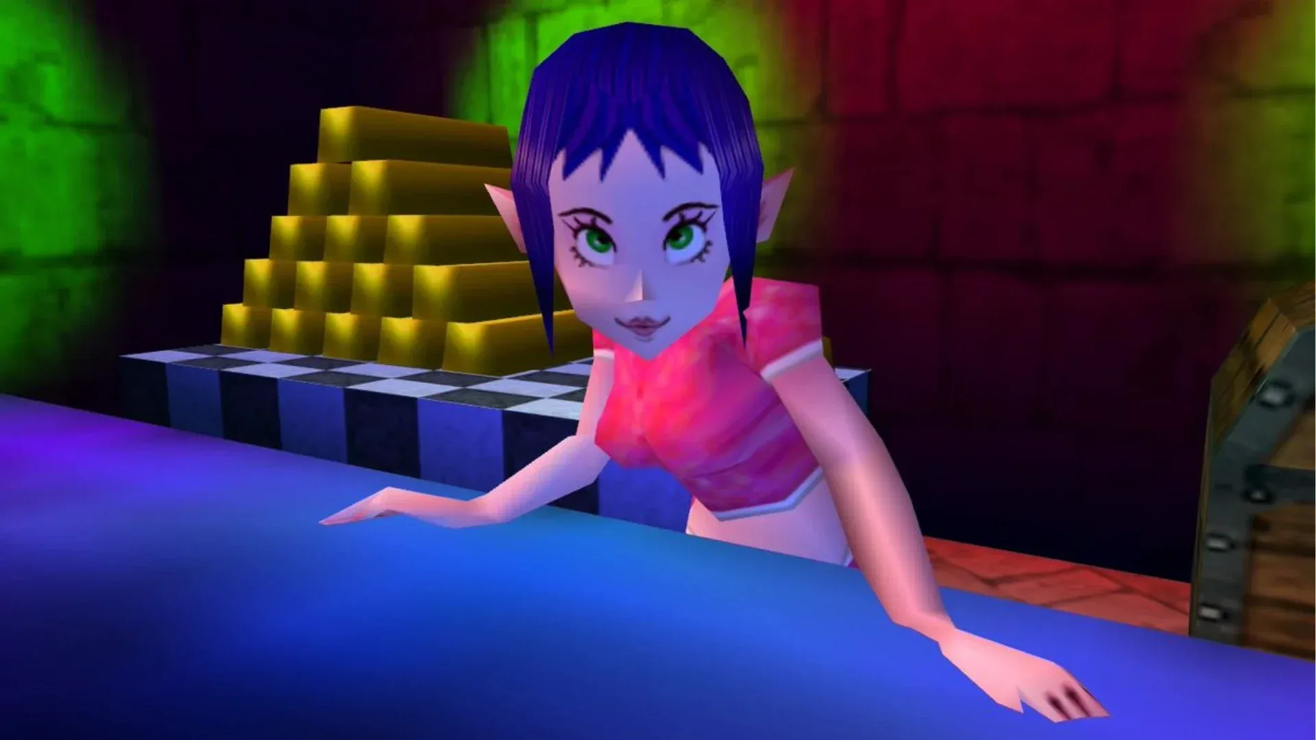
The operator has always been an unusually memorable resident of Hyrule. In the original Nintendo 64 game, she presides over Bombchu Bowling while apparently resting amid the attraction’s relentlessly playful atmosphere. Her look does a huge amount of work with a small number of visual ingredients: a cropped top, a blue pixie cut with side-swept bangs, prominent lips, and an expression that reads as self-possessed even while her eyes are closed. The Nintendo 3DS version kept that core appeal intact.
The remake gives her a more detailed wardrobe and a more contemporary edge. Her revised knit crop top uses richer pink and purple tones, while black wrist cuffs and dark nail polish push the design toward goth styling. It is an understandable approach. Those additions give the operator a clearer visual identity and make her connection to a bomb-themed recreational business feel less like a delightful non sequitur. She looks more plausibly like someone who would run a Bombchu course for fun.
But the early reaction also captures a tricky truth about remaking stylized games: adding detail is not automatically the same as adding personality.
The old model’s economy was part of the performance
When people say an older polygonal character had more “expression,” they are not necessarily claiming the hardware itself was better. They are describing how visual economy can sharpen an impression. Visual economy is the use of a limited set of shapes, colors, and facial cues to communicate a character quickly. On Nintendo 64 hardware, artists had comparatively few tools to devote to subtle materials, dense geometry, or naturalistic facial motion. A silhouette, a color contrast, and a bold makeup-like accent therefore mattered enormously.
The Bombchu Bowling Operator is a particularly good example of that principle. Her original face and styling were not realistic, but they were decisive. The design did not ask players to inspect tiny details in order to understand her vibe. The attitude arrived immediately. That is why a character with little narrative importance can linger in memory beside much larger figures from Ocarina of Time.
The new design has more components to read: fabric texture, cuffs, nails, deeper color variation, and a more fully realized figure. None of those choices are inherently wrong; in fact, they are coherent choices for an updated version. Yet a more detailed rendering can redistribute attention away from the few graphic features that once carried the whole performance. The sharper old makeup and highly simplified expression may have landed with more force precisely because there was so little else competing with them.
Related coverage includes Ocarina of Time's Bombchu Bowling Operator Returns With a Goth Edge, but Fans Miss Her Original Spark.
This is not just nostalgia refusing to accept a revision. It is an issue of stylization, meaning the intentional shaping of visual elements into a particular artistic language rather than an attempt to reproduce reality. The original operator’s appeal comes from stylization: exaggerated face design, strong color blocking, and a pose that carries a certain sleepy confidence. A remake can preserve the same clothes and approximate colors, then still change the overall feeling if the expression, facial proportions, or emphasis shift.
Faithfulness is more than checking whether a character exists
For remake audiences, “faithful” is often used as though it has one obvious meaning. It does not. There is basic factual faithfulness: the Bombchu Bowling Alley Operator is still in the game and recognizable as the same character. The preview material clears that bar. There is also aesthetic faithfulness: does the design retain the emotional shorthand that made the original version feel distinctive? That question is more subjective, and it is where the split reaction begins.
The updated operator appears to have been treated as more than background scenery. The black accessories, darker nails, and newly textured top suggest an effort to expand a compact classic design rather than replace it with something unrelated. That matters. It shows that the remake has not ignored the character’s cult appeal or flattened her into a generic shopkeeper.
At the same time, the concern is that the new face reads as less animated than the original’s. Older low-poly models often had a kind of accidental graphic intensity: limited features were arranged in ways that could feel bolder than a smoother, more polished reinterpretation. A modern character model has more room for nuance, but nuance is not necessarily what a player wants from a design remembered for its instant, theatrical punch.
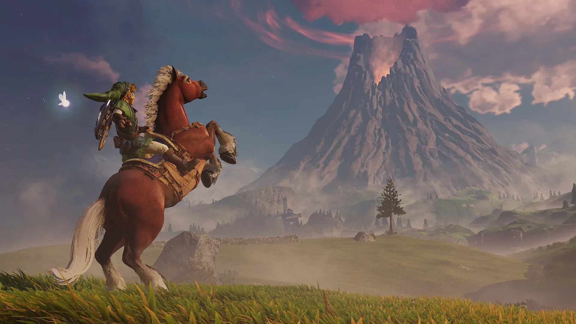
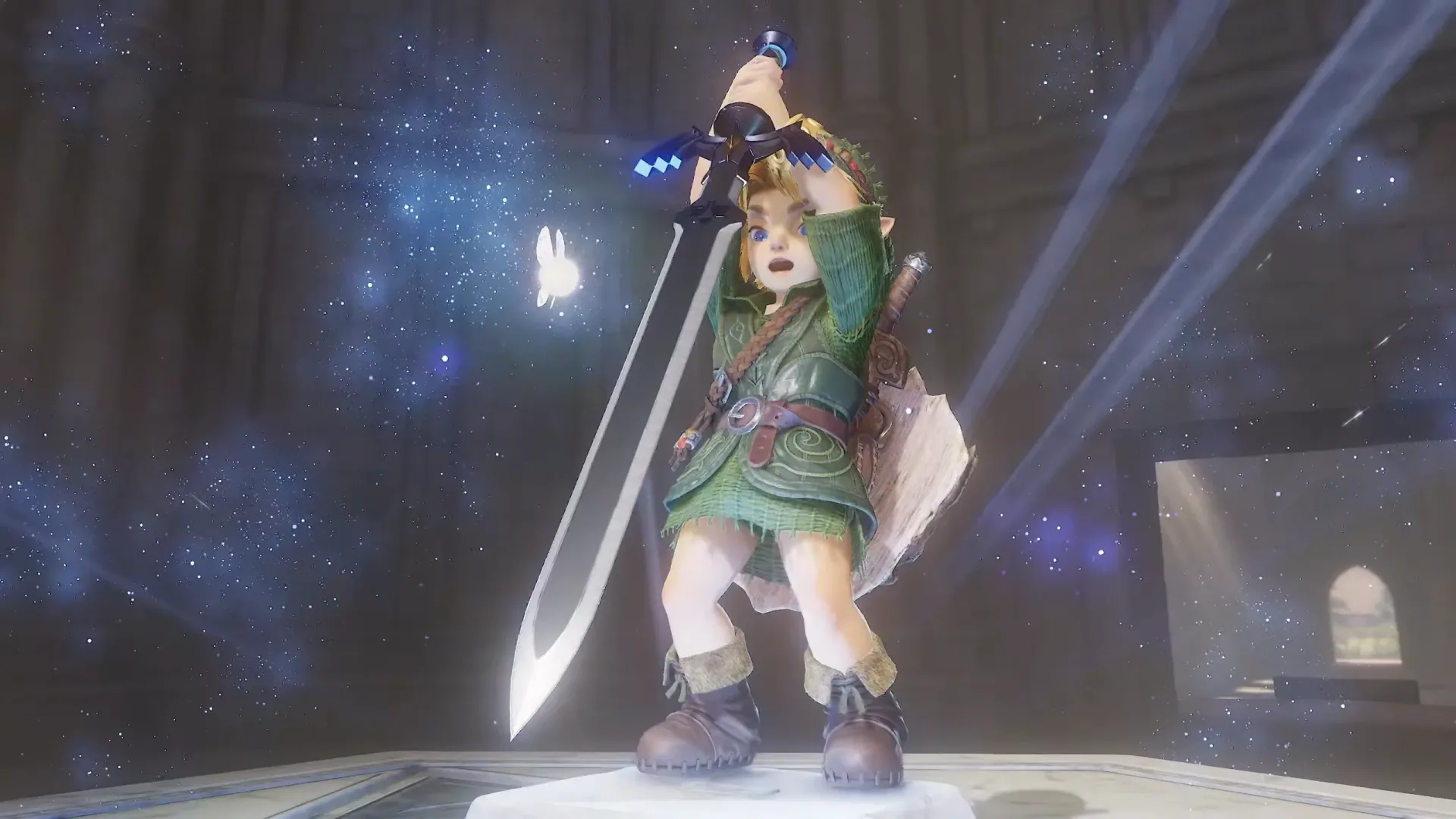
Link’s own updated appearance has prompted similar comparisons: recognition can coexist with the feeling that a revised model does not strike in exactly the same way. That does not mean the remake has failed. It means this kind of project carries a nearly impossible dual obligation. It must make familiar characters look newly considered while also preserving reactions people formed decades earlier, often from a handful of pixels and polygons.
Why a side character can become a remake litmus test
The operator’s renewed visibility is also a reminder that remake scrutiny does not stay confined to headline characters. Fans tend to inspect minor NPCs, shop interiors, obscure animations, and optional diversions because those details reveal how the remake team understands the original game’s texture.
The Bombchu Bowling Alley is useful in that regard because it is not a solemn story beat. It is a compact slice of Hyrule that feels slightly odd, mechanically specific, and visually playful. A side activity like this helps make a game world feel inhabited by people with their own strange businesses and personal styles. Preserving its operator is therefore about more than completing a checklist. It is about retaining the tonal variety that lets an adventure world be grand one minute and wonderfully silly the next.
It also illustrates the difference between a character’s narrative importance and their cultural footprint. Narrative importance describes what a character does for the plot. Cultural footprint describes how strongly a character persists in player memory, discussion, art, jokes, or affectionate debate. The bowling operator may not drive Ocarina of Time’s story, but her cultural footprint has plainly outgrown her role. Her presence was a destination for preview attendees.
That is a practical lesson for any remake: allocate attention beyond the central cast. Players may forgive a side character for remaining simple. They are less likely to forgive a redesign that makes a beloved oddball feel anonymous.
More detail, different priorities
The most balanced reading of the redesign is not that one version has “good graphics” and the other has “bad graphics.” They are pursuing different priorities. The original uses blunt, high-contrast iconography. The remake uses wardrobe detail and a more layered look. The former may communicate attitude more instantly; the latter may better support the idea of a character with a fuller personal style.
There is room to appreciate both. The deeper pinks and purples, black wrist cuffs, and dark polish make the new operator feel intentionally styled rather than merely upgraded. Yet it is equally reasonable to prefer the old model’s bolder expression and concentrated visual confidence. In an art direction discussion, that is a meaningful distinction, not a nitpick about whether a favorite NPC has enough polygons.
For players awaiting more of the remake, this is not evidence of a broad verdict on the final game. It is one design comparison from preview attention, not a comprehensive assessment of the project. But it is a revealing one. It shows the fine-grain standard a remake inherits when revisiting a game as visually iconic as Ocarina of Time: players want evolution, but they want the odd little sparks to survive the upgrade.
The operator’s return accomplishes the most important baseline task. She is there, still attached to the wonderfully specific business that made her famous. Whether the updated design ultimately becomes as beloved as the Nintendo 64 original may depend less on its added details than on whether players feel that unmistakable old attitude when they walk back into the alley.
For more on the business choices and direction shaping major games beyond Hyrule, see our coverage of Activision’s plan for a new Call of Duty sub-franchise.