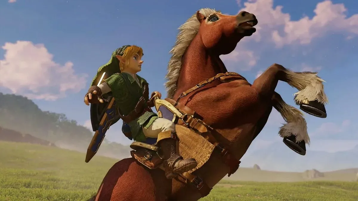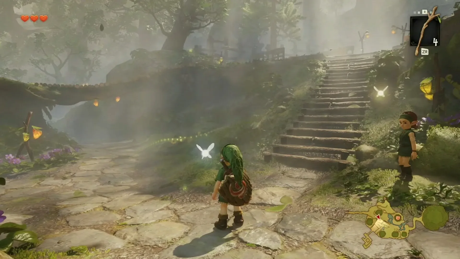
For a game that has lived in players’ memories as much as it has lived on cartridges, The Legend of Zelda: Ocarina of Time presents a peculiar remake challenge. People do not merely remember what the Nintendo 64 game looked like. They remember what it felt like to see Hyrule Field for the first time, to peer down a dungeon corridor, to enter the chaotic belly of Jabu-Jabu, or to meet one of the series’ famously unusual Great Fairies.
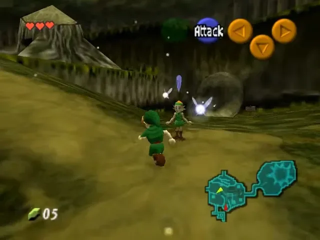
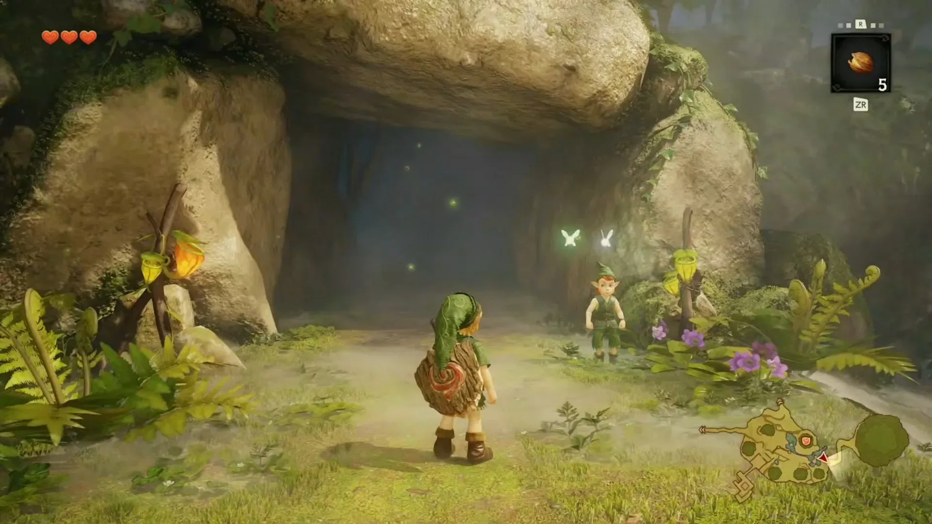
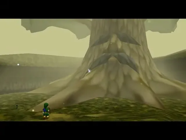
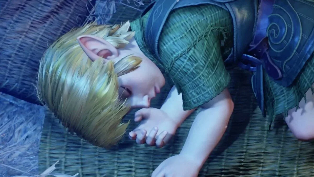
New material shown during a Zelda Direct has made that challenge much easier to study. After only a single image had previously been available, the presentation offered an extended slice of early gameplay plus a fuller trailer. Together, those videos appear to show portions of most of the game’s major landmarks and story beats. A 25-image comparison between the original game and the new footage makes the technological distance especially clear, while also revealing where the remake seems intent on protecting the odd, unmistakable personality of the 1998 classic.
The remake is scheduled to arrive for Nintendo Switch 2 on November 5, 2026. There is still plenty that cannot be judged from selected trailer and gameplay material alone: structure, controls, pacing, performance, dungeon revisions, and the exact scope of mechanical changes all require more information. But the footage does offer a useful first look at the visual philosophy behind bringing one of Nintendo’s defining Nintendo 64 adventures into a far more detailed generation.
Comparison is more complicated than matching camera angles
A direct frame-for-frame comparison sounds simple until a remake changes the way a scene can be viewed. The original Ocarina of Time was built around fixed camera behavior, deliberate framing, and the Nintendo 64’s technical limits. The new game appears to use a free camera in at least some circumstances. That means an image of Castle Town, for example, may be showing a place that is recognizably the same while presenting it from an angle that was impossible, or simply unused, in the original.
That distinction matters. Visual remakes are often judged on pixels alone: more foliage, more lighting, more characters, more geometry. Yet camera freedom changes how a location reads. A town square can feel denser or grander when the player is allowed to look upward, around corners, and across rooftops. A small room can appear less theatrical when it is no longer locked to the framing that once sold its scale. The comparison set reportedly includes a few moments that are not exact one-to-one matches, an understandable limitation when the newer footage does not recreate every original shot.
Rather than treating those mismatches as flaws, they underline how development priorities have shifted. The original used composition as a practical tool, carefully selecting what to show and what to hide. A modern remake has the resources to let environments carry more of that responsibility themselves. It can populate a sightline with physical details instead of relying as heavily on a painted backdrop, a fogged horizon, or a strategically angled wall.
Hyrule Field looks built for the horizon
Perhaps the clearest example is Hyrule Field. The original game conveyed a vast kingdom with a world that was revolutionary in its day, despite obvious limits on draw distance and environmental complexity. The remake footage includes a large, open-looking vista across the field, a kind of panoramic reveal the Nintendo 64 game did not really offer.
It is an immediately understandable modernization. Expansive landscapes have become a familiar visual language for Zelda after games such as Breath of the Wild, and a grand overlook makes a strong trailer image. At the same time, it changes the initial impression of the journey. Original Hyrule Field felt broad partly because players crossed it on foot, waiting for nighttime danger and slowly learning the routes between destinations. The new view can communicate the scale at a glance.
Neither approach has to displace the other. The old field was an ingenious translation of an imagined fantasy countryside into the hardware of its era. The remake’s horizon can instead make that imagined scale more literal. The intriguing question is whether the new presentation preserves the original’s sense of distance, uncertainty, and discovery once the player is actually moving through it—not merely looking at it in a cinematic reveal.
More detail does not automatically mean less strange
The strongest sign of continuity may be the remake’s treatment of the game’s eccentric spaces and characters. Ocarina of Time is revered, but it is not a uniformly solemn legend. It has an awkward humor and an unmistakably dreamlike quality. Shops, towns, fairy fountains, and dungeons can move from charming to bizarre in seconds. A highly polished remake could easily smooth those edges away in the name of realism or prestige.
Instead, the Great Fairy appears to remain close to her established original design. That is a meaningful choice. The Great Fairy has always been one of the game’s most memorable visual encounters, in part because the design is so specific and so unabashedly strange. Keeping that identity intact suggests the new artwork is not simply attempting to make every element more conventionally attractive. Fidelity here is not about copying a low-polygon model; it is about recognizing which creative decisions are essential to the game’s character.
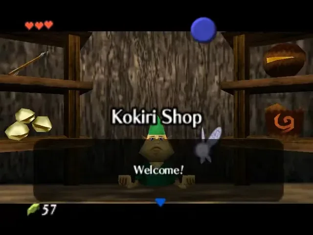
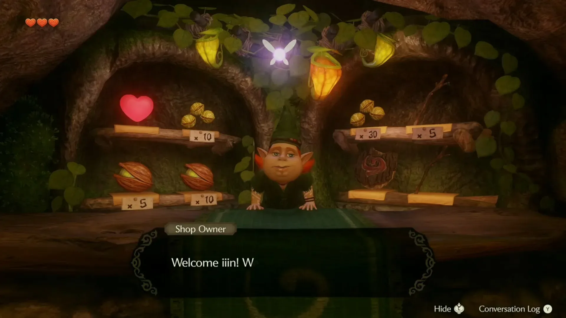
There is humor, too, in the way remade spaces alter old visual gags. One early comparison involves a counter that Link can now apparently see over properly. The original’s proportions and perspective could make such interactions feel delightfully awkward. Greater environmental scale and a more flexible viewpoint may erase some accidental comedy, even as they add practical believability. That trade-off is part of what makes remake comparisons worthwhile: improved technology can preserve intent, but it can also quietly rewrite the quirks players grew fond of.
Dungeons may be prettier—and much more intimidating
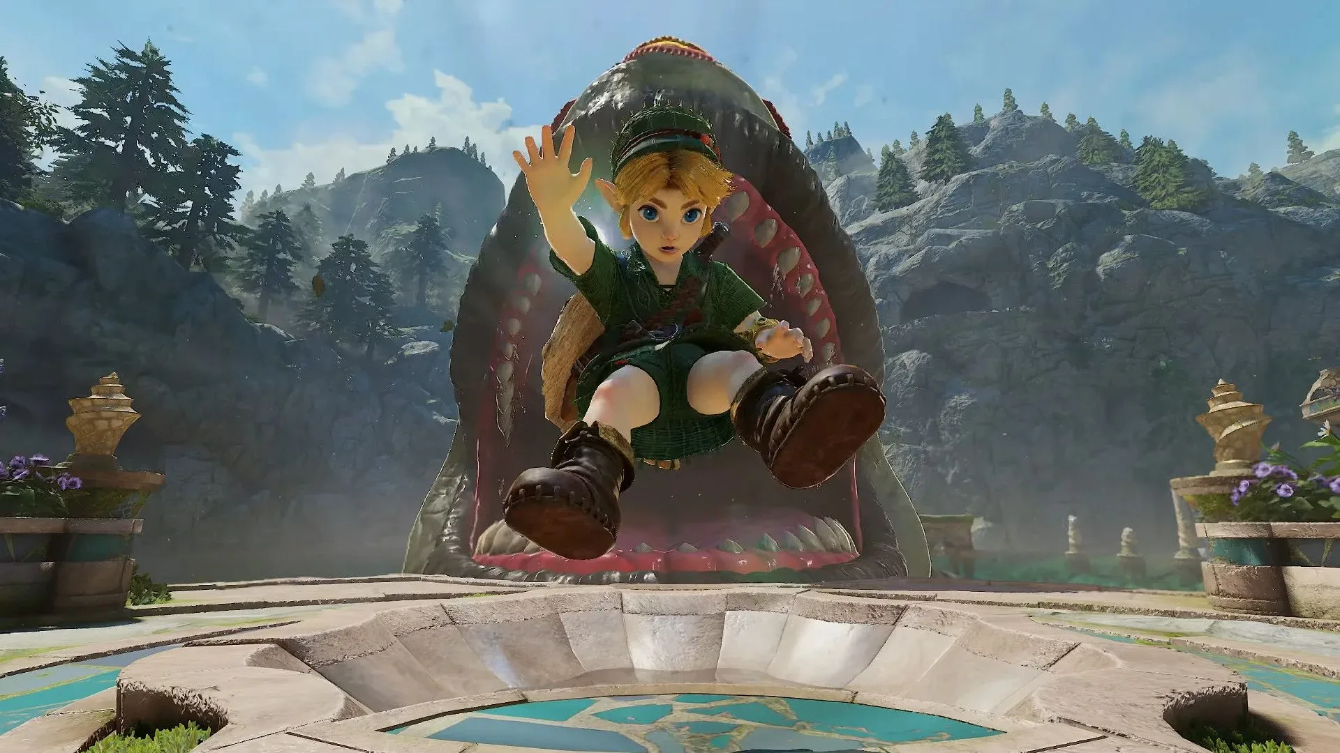
Jabu-Jabu’s interior was always supposed to be gross, organic, and disorienting. Modern texture work, lighting, geometry, and environmental animation have obvious potential to make that premise much more convincing. They also have the potential to make navigation feel more overwhelming. The new footage’s apparent treatment of the dungeon invites a simple reaction: its insides could be a nightmare in a far more literal visual sense than before.
That does not necessarily mean the dungeon design itself has changed. A location can retain its original routes and puzzles while feeling entirely different when fleshy surfaces, depth, shadow, and movement are rendered with greater detail. This is one area where the remake must balance atmosphere against readability. Ocarina of Time’s dungeons depend on players being able to identify doors, ledges, interactable objects, and pathways. If every chamber becomes richly organic spectacle, visual clarity becomes as important as visual fidelity.
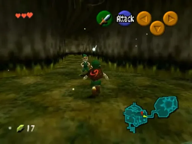
The same goes for the famous hallway sequence highlighted in the footage. It was a striking technical showcase on Nintendo 64 hardware, one of those moments that announced the game was trying something players had not seen before. Its underlying trick may no longer be a technological flex in 2026, but that does not make it disposable. A remake can preserve the surprise even when players understand the trick, perhaps by making the space feel uncanny in a new way rather than merely more detailed.
Swimming signals a potentially important mechanical update
Among the clearest gameplay-related observations from the new material is that Link can swim. That is a notable change because swimming has implications beyond animation. Depending on its implementation, it could affect traversal, environmental design, timing, exploration, and the way familiar water-heavy locations are approached.
What has not been established is how extensive that ability will be. Footage confirms the basic observation, but it does not by itself explain whether swimming is unrestricted, tied to a particular age or item, used only in certain areas, or accompanied by changes to existing puzzles. It is best treated as a confirmed visible feature with unanswered design questions attached.
For longtime players, that uncertainty is part of the fun of studying the remake. Ocarina of Time’s systems are extraordinarily familiar, which makes even a single new movement option feel consequential. A modest adjustment can ripple outward through a game whose routes, dungeons, and item progression have been discussed for decades.
A remake arrives with the original’s legacy intact
The visual leap from Nintendo 64 to Nintendo Switch 2 is naturally dramatic, but the comparisons are more interesting when they show what has survived the jump: the silhouette of a location, the mood of a transition, an intentionally peculiar character design, or the identity of a classic dungeon. The remake has more technology at its disposal, yet its success will likely rest on whether it understands why the older game’s constrained presentation made such a durable impression.
That original release remains a central artifact of the Nintendo 64 era, and players keeping classic games in circulation know how much of their appeal exists beyond raw graphics. For practical advice on sharing older titles while protecting the physical collection around them, see how to lend retro games without losing track of discs, manuals, and saves.
For now, the 25 comparisons provide a snapshot of a remake caught between reverence and reinvention. Hyrule appears broader, towns can be viewed more freely, Jabu-Jabu looks primed to be more unsettling, the Great Fairy retains her singular presence, and Link’s swimming suggests that visual renewal may not be the only change. The fuller picture will come closer to launch, but the footage already makes one thing plain: this is not just an old Hyrule with sharper textures. It is a fresh attempt to make a landmark adventure feel as visually startling as it once did.