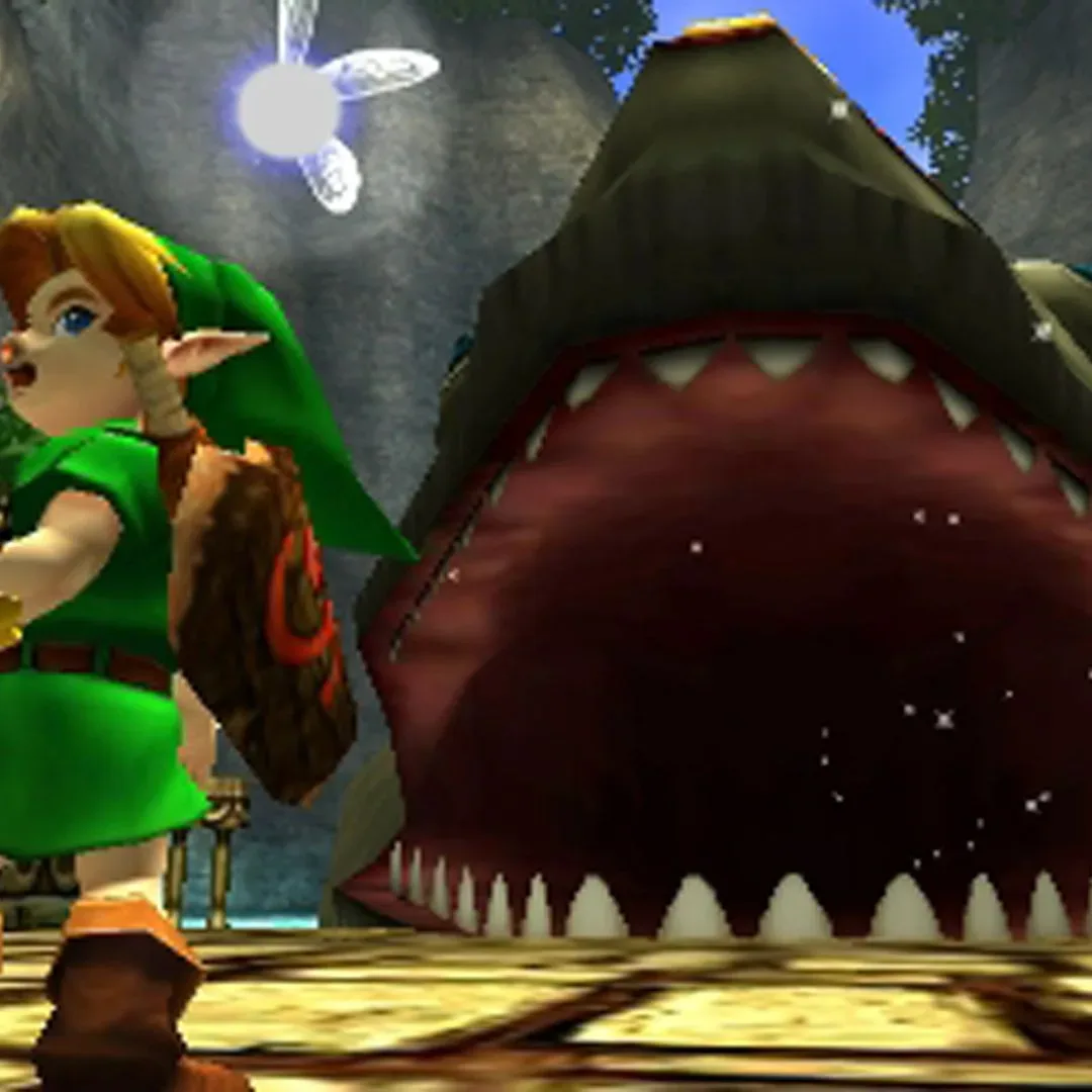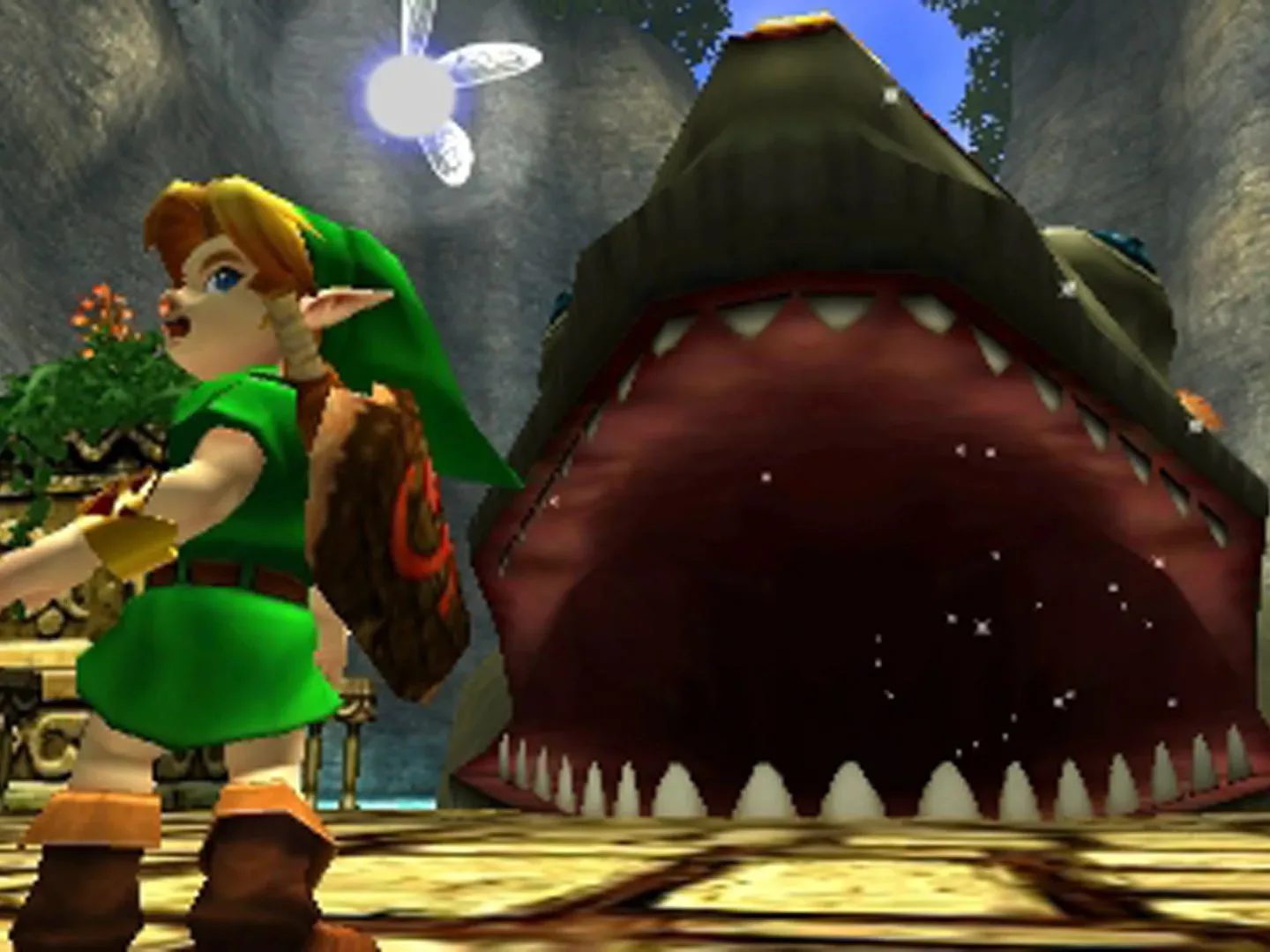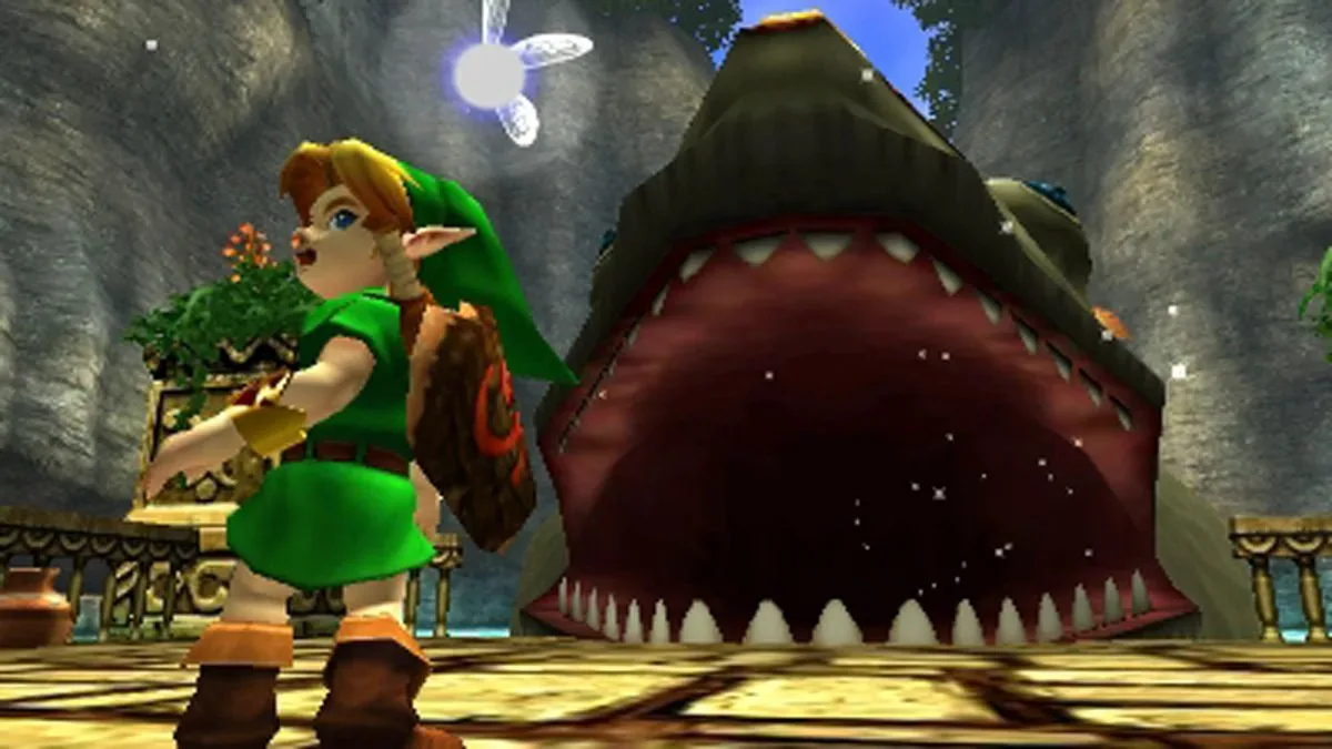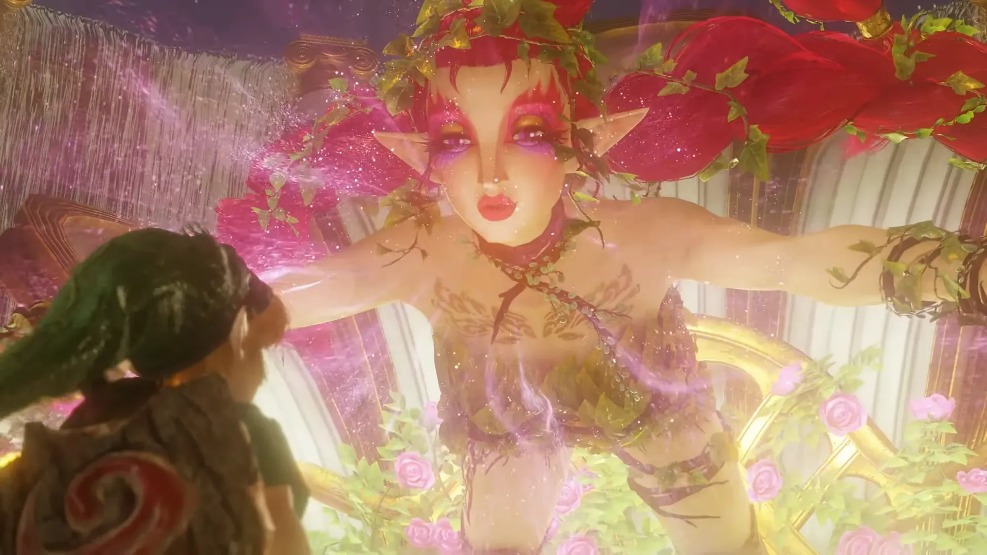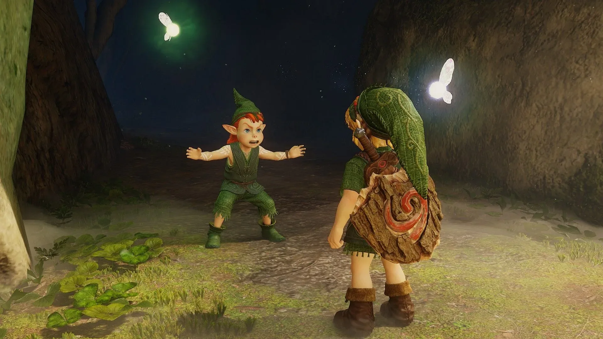

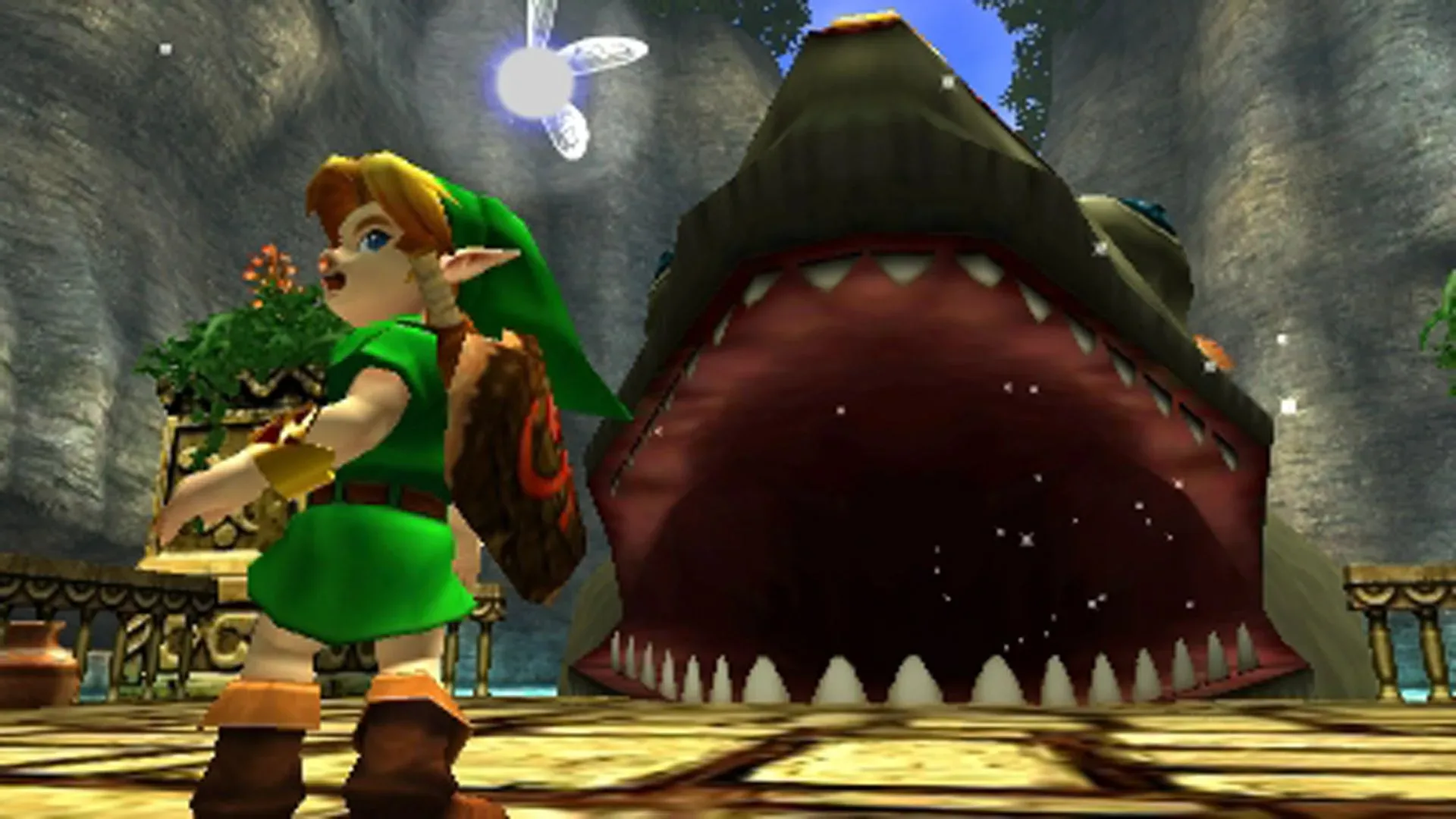
Navi may be one of the most instantly recognizable companions in The Legend of Zelda, but the fairy hovering beside Link was not always intended to be a tiny orb of light with wings. Yoshiaki Koizumi, a designer on The Legend of Zelda: Ocarina of Time, previously explained that the first idea was closer to the familiar, human-like fairy image: a “cute girl.” Nintendo 64 hardware constraints changed that concept, resulting in the compact, faceless guide that became central to the game’s look and play.
It is a revealing example of an old game-development reality: technical limitations do not only decide texture detail or frame rate. They can redirect the design of characters, interfaces and even the way players understand a game world. In Navi’s case, the eventual design was not simply a reduced version of a more elaborate companion. It became a visual solution that matched an important gameplay role.
From fairy character to luminous icon
Koizumi’s description is straightforward. “Usually, if you were to make a fairy, you would make a cute girl, but that wasn’t possible with the Nintendo 64 system, so I just made a ball of light with wings,” he said in a 2011 discussion.
The earlier 2D Zelda games had already established fairies with a more traditionally girlish, Tinker Bell-like presentation. A human-like Navi therefore fits the series’ visual language at the time. But making such a character function in a 3D game would have involved more than placing a small model next to Link. The companion needed to be visible during exploration and combat, move convincingly through a changing 3D space, and communicate a targeting function at a glance.
For more context, explore Black Lightning’s 50th Anniversary Special Brings Jenny Isabella Back to Jefferson Pierce.
Koizumi did not provide a detailed technical breakdown of precisely which Nintendo 64 resources prevented the original concept. It would be speculation to declare that one individual feature—animation, artificial intelligence, memory, polygon count or another element—was the sole obstacle. What his account does establish is the larger point: the system could not support the fairy design he first had in mind, so the team chose a ball of light with wings.
That compromise has an elegant clarity. A glowing sphere is readable against much of the game’s world, and it does not require the player to parse facial expressions, clothing or detailed motions while also controlling Link. Its glow marks it as magical; its wings preserve the fairy identity. The lack of a face also means Navi can remain visually uncomplicated while carrying out a very practical job.
Navi was built into Z-targeting, not added beside it
That job is crucial. Koizumi was a key architect of Ocarina of Time’s Z-targeting system, and Navi functions as the cursor rather than a generic on-screen marker. Z-targeting is the system that lets the player lock onto a target, helping orient movement and action in a 3D environment. Instead of presenting that information as an abstract reticle alone, the game embeds it in a character from its fantasy world.
Related coverage includes Ocarina of Time's Navi Was Once Envisioned as a 'Cute Girl'.
Koizumi said he did not want to use a simple marker. “I was a designer, so I didn’t want to use such a simple marker. I wanted to make something else, so I came up with a fairy. After all, it was The Legend of Zelda,” he explained.
That is the key to why Navi’s final form feels so inseparable from the game. Her design was not only an aesthetic decision about what a fairy should look like. It was interface design—meaning a visual tool that helps a player understand and operate a game’s systems. The player sees a fairy, but the fairy also signals where attention should go. The same object ties fiction and function together.
A generic marker could have performed the mechanical task. A fairy can perform it while making the tool feel native to Hyrule. When design works this way, an interface does not need to vanish entirely to feel immersive; it can become part of the world’s storytelling language. Navi’s luminous simplicity supports that goal particularly well. A detailed human-like companion might have drawn more attention to herself as a separate character. The final design points attention outward, toward the thing Link is targeting.
Constraints can produce a more focused design
It is tempting to frame old hardware limits as purely restrictive, especially when looking back from systems capable of rendering far more complex characters. Navi’s history suggests a more useful interpretation. The limitation removed one option, but it also encouraged a form that was compact, legible and well suited to a targeting cursor.
This does not mean every constraint automatically improves a game. Nor does it prove that a human-like Navi would have been less effective; that version was not realized. The evidence supports a narrower conclusion: once the original concept was not possible on Nintendo 64, the replacement gave the team a distinctive way to communicate a core system. The result became an enduring visual identity rather than a temporary-looking technical substitute.
There is also a difference between a character designed for dialogue and a character designed to carry a constantly active gameplay signal. Navi does offer guidance and has a voice in the game, but her movement and position are inseparable from the player’s moment-to-moment actions. The bright orb shape can communicate location and selection quickly. A more detailed figure could still have been memorable, but it would have faced competing demands: being a character in her own right while staying clear enough to operate like a cursor.
Why the alternate Navi remains so striking
The notion of a human-like Navi is striking because the existing version feels definitive. Her small floating light, wings and famous prompts have become a shorthand for Ocarina of Time itself. It is difficult to separate the character from the targeting system because the final game makes them one and the same.
The design also illustrates why early 3D game development could create such memorable visual shorthand. When a team has fewer resources to spend on detail, it must decide what information matters most. Navi’s silhouette and glow communicate “fairy,” “magic,” “guide” and “targeting aid” without needing an elaborate model. Those qualities work at a distance and during busy scenes—conditions where detailed character work might not be the most useful answer.
Reports around an upcoming remake indicate that Navi retains the iridescent spherical form, albeit with a smoother appearance than the original’s more visibly angular presentation. That continuity is notable. Even if modern hardware could support the earlier human-like concept, changing it now would mean replacing a design that has long done double duty as companion and game-language icon.
A small fairy with a large design role
The story behind Navi is ultimately less about imagining a radically different version of the game than understanding the one players received. Her design emerged from a collision of series tradition, Nintendo 64 limits and a designer’s refusal to settle for a conventional UI marker. That combination produced a fairy who is at once a fictional companion and a functional part of the player’s controls.
Koizumi’s comments also add context to another early-development detail: Ocarina of Time originally had a jump button before its development direction changed, decades before a remake added one. Together, these details underline how much iteration can sit behind game elements that later feel inevitable. Controls, icons and characters are all subject to practical trade-offs, and their final forms can be shaped as much by what a platform cannot do as by an initial creative wish.
For Navi, the limitation led to a ball of light with wings. In hindsight, that was enough to make her unmistakable.