Mario has survived castles, ghosts, deep water, outer space and a frankly alarming number of Bowser-related workplace incidents. Yet the newest topic of conversation around Nintendo’s mascot is not a power-up, a kart, or a fresh rescue mission. It is a pocket.
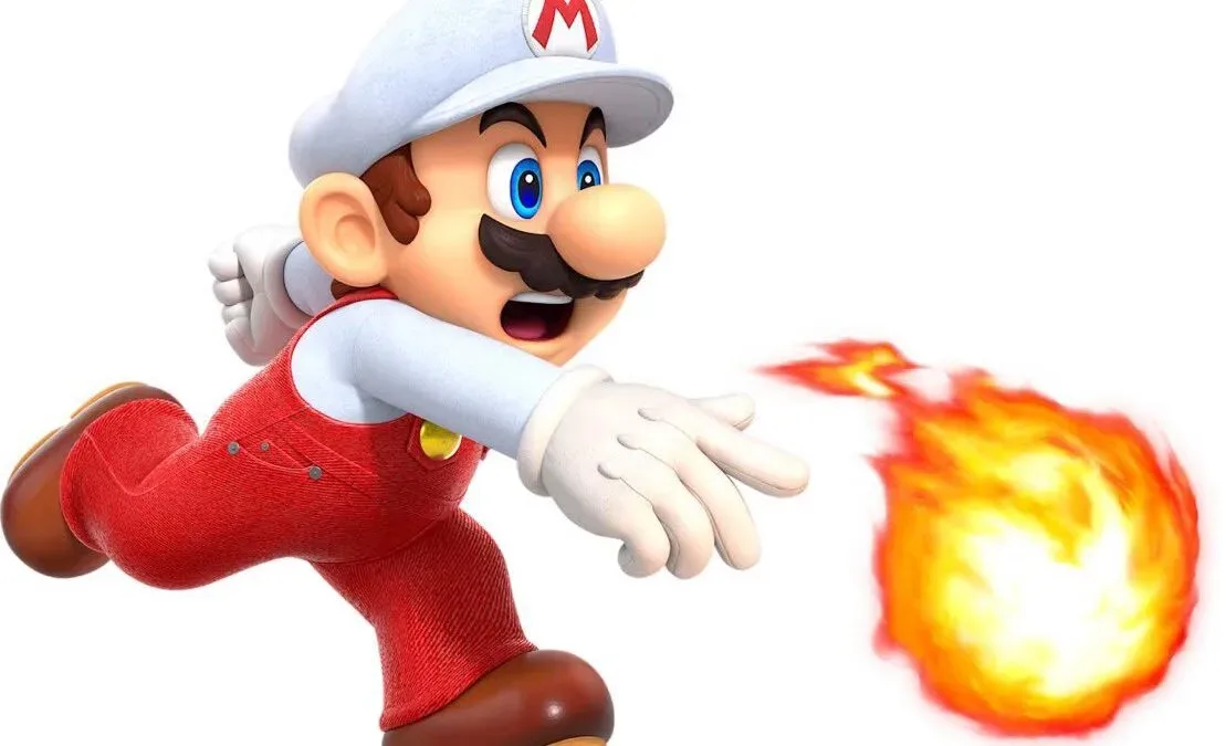
Following this month’s two Nintendo Direct presentations, fans noticed that Mario artwork appearing on Nintendo websites seems to have been refreshed. The revisions are modest, but close observers have focused on a new or more pronounced small pocket detail on his overalls. The Super Mario logo also appears to have received a more glossy, beveled treatment in the updated presentation.
There is no indication in the observed changes that Mario has gained a gameplay inventory, a new ability, or any kind of official key-storage protocol. This is a visual-model discussion, not evidence of a new game mechanic. Still, it is exactly the sort of tiny adjustment that becomes conspicuous once fans have spent decades looking at the same silhouette: red cap, blue overalls, yellow buttons, white gloves, improbable mustache.
A small alteration to an unusually familiar design
Mario’s design is among the most instantly recognizable in games, which makes even a minor art revision feel larger than it objectively is. The broad color blocking and rounded proportions have remained central to his identity through changes in technology and rendering style. When Nintendo alters material texture, seams, logo sheen, or the depth of an overall pocket, viewers can compare the difference against a character design they already know almost by muscle memory.
The feature drawing attention is not simply that Mario has pockets. His overalls have long been depicted with pocket shapes. What looks different in the refreshed renders is the sense of dimensionality: the pocket area appears less like a flat graphic placed on the fabric and more like part of a garment with thickness and a little flexibility. That distinction is subtle, but it changes how the overalls read next to Mario’s smooth, highly stylized face and limbs.
In 3D character art, this is the difference between painted detail and modeled detail. Painted detail is visual information conveyed primarily through color, shading, or a texture applied across a surface. Modeled detail has actual shape in the character geometry, producing clearer edges and more natural changes in light and shadow. A render can combine both approaches, and it is not possible from these observations alone to establish the exact production method Nintendo used. The practical point is visual: the pocket appears to have more depth than fans are used to seeing.
Why promotional renders matter
Official renders are not the same thing as in-game footage. They are polished images used in marketing, web pages, product material and brand presentation. Companies may update them independently of a game release, and a model improvement in a render does not automatically predict what a future playable Mario will look like.
That caveat matters here. Mario did appear in a Mario Kart World update around the Direct activity, while Kirby, Samus and Zelda were prominent across the presentations. Rumors about a new 3D Mario circulated, but the pocket observation itself offers no confirmation of a new 3D entry, its timing, or its visual direction. It is better understood as a quiet maintenance pass on Nintendo’s current character imagery unless the company provides further context.
Related coverage includes Mario’s Official Renders Appear to Add a New Overall Pocket Detail.
That does not make the change meaningless. Promotional art is part of the way a character remains consistent across an enormous range of places. A refreshed model can establish a reference for future artwork, packaging, social posts, merchandise and other public-facing material. Seemingly tiny details—fabric grain, button shine, stitching, pocket depth—can become part of that reference even if most players never consciously catalog them.
The long-running push and pull between cartoon and texture
Mario’s modern visual identity has repeatedly balanced clean cartoon shapes against increasingly detailed materials. The overall fabric and other clothing details have varied as 3D hardware and rendering techniques have changed, including across the era after Super Smash Bros. Melee. More convincing fabric can make a character feel tangible, but too much realism can clash with intentionally simple features such as Mario’s smooth skin, circular eyes and exaggerated proportions.
That tension is likely why the revised pocket has attracted notice. It occupies a narrow middle ground. It adds a bit of physical credibility to the overalls without fundamentally changing the character into a realistic person. The silhouette remains Mario’s. The palette remains Mario’s. The pocket just now seems more capable of holding something than it did before—whether that is a coin, a receipt, or the theoretical keys that would be extremely ill-advised to carry while ground-pounding.
Fans notice the details that archives often miss
Official character-art updates can be difficult to track because they may arrive quietly, replacing older images on web pages rather than receiving their own announcement. That makes side-by-side comparisons, saved screenshots and careful attention to official assets useful for distinguishing a genuine revision from differences caused by compression, lighting or an unfamiliar pose.
The same instinct applies to older Nintendo material, where small differences in presentation can matter when identifying versions or preserving a record of them. For players sorting through another kind of Nintendo-era detail, our guide to GameCube memory card housekeeping covers the far more consequential business of freeing blocks without accidentally removing the wrong save.
With Mario’s revised renders, the practical implication is simpler: treat the observation as an art update, not a promise. Nintendo appears to have refined familiar imagery after its recent Directs, and the tiny overall feature is the detail viewers are latching onto. It may never be explained in a presentation, named in a patch note, or acknowledged as anything more than a revised asset.
But for a character who has worn variations of the same outfit through generations of games, a little extra construction around one pocket is enough to start a surprisingly serious conversation about how Nintendo maintains its most famous visual icon.