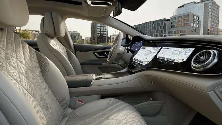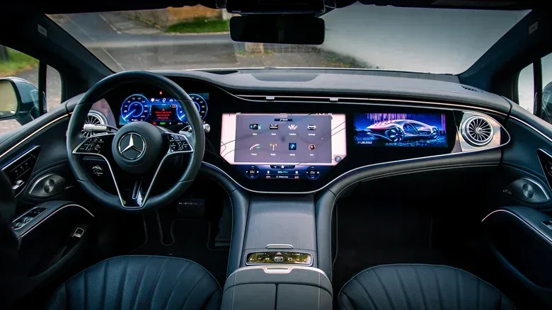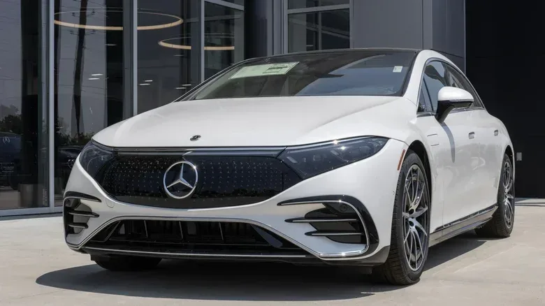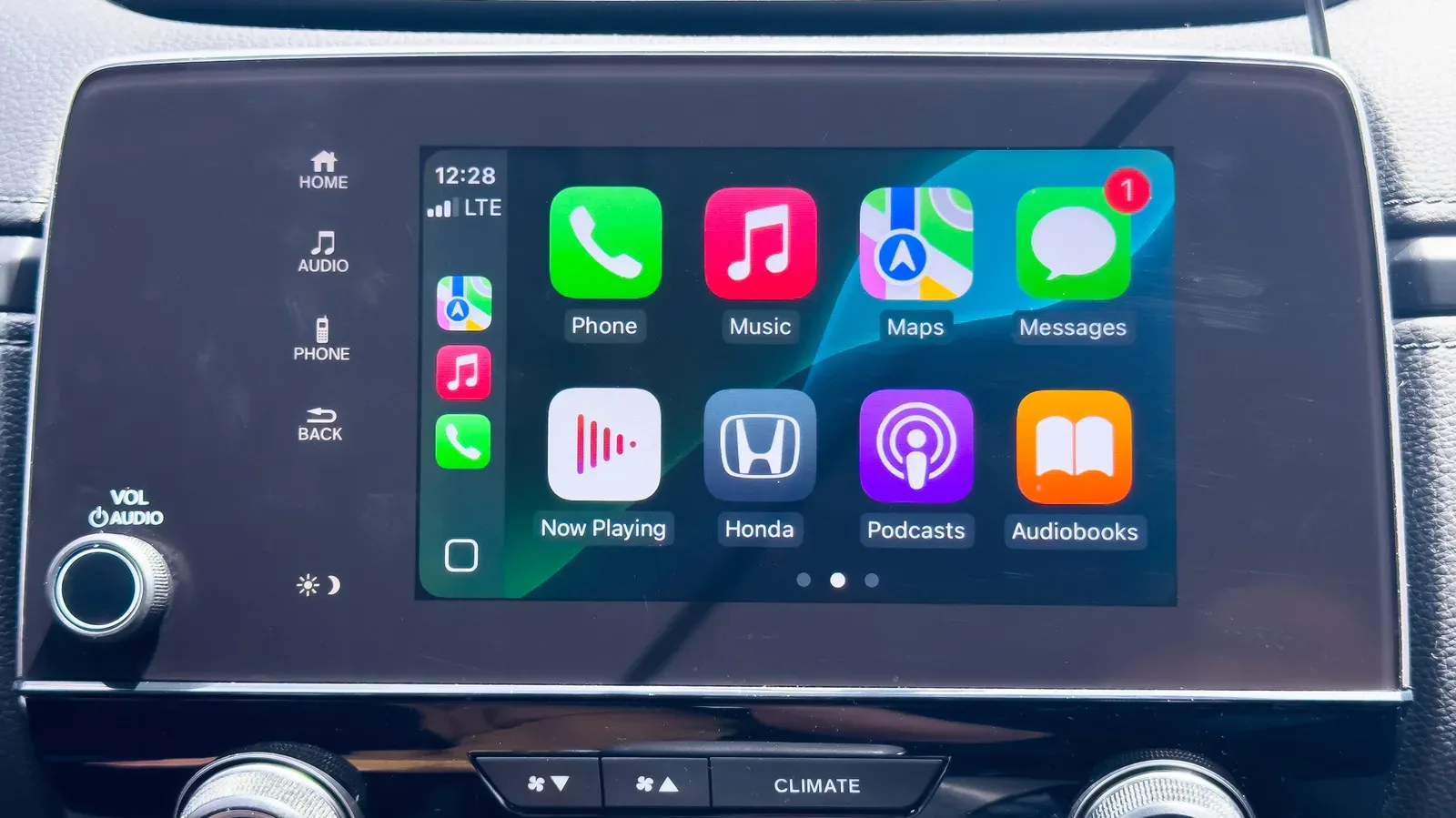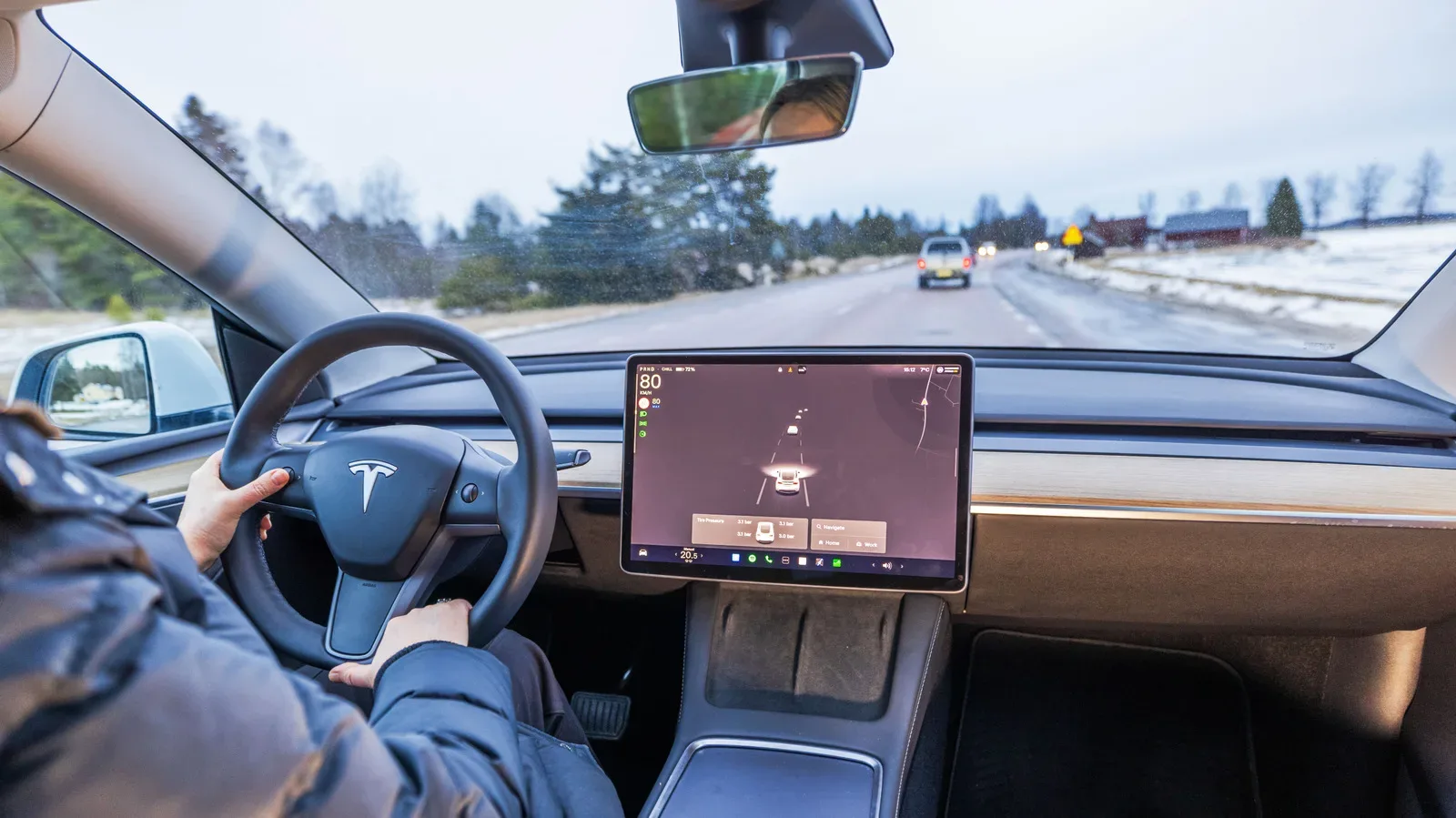

Car dashboards have been steadily evolving from places with knobs, buttons and dials into glassy command centers. Navigation, music, phone integration and reversing-camera views increasingly live on infotainment displays, often with Android Auto or Apple CarPlay in the mix. The Mercedes-Benz EQS 580 4MATIC takes that trend to its logical, slightly sci-fi endpoint: a claimed 56-inch Hyperscreen that stretches across nearly the whole dashboard.
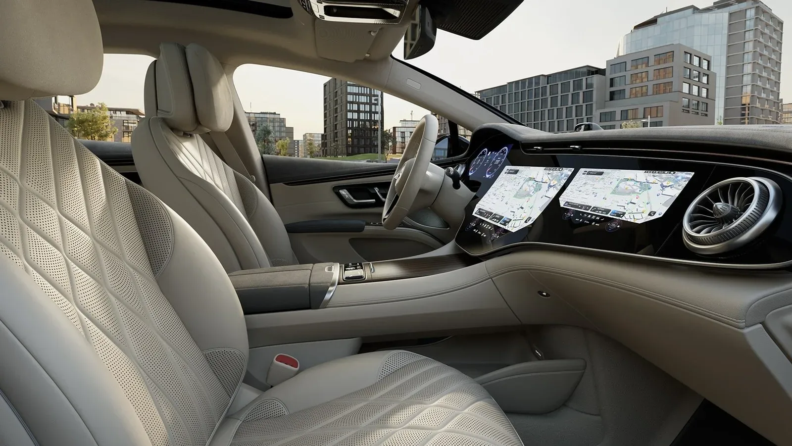
That makes it the largest infotainment screen available in a car on the supplied market comparison. It is not one uninterrupted 56-inch panel in the simple television sense, however. The Hyperscreen combines three separate displays—one ahead of the driver, one in the center and one ahead of the front passenger—beneath a single expanse of dash-spanning glass. Think less “one giant monitor” and more “a triple-screen gaming setup that has been professionally embedded into an electric luxury car.”
The headline size is undeniably dramatic, but the more interesting question is what that glass real estate actually changes for the people inside the car. It can provide separate zones for driver information, central vehicle and media controls, and passenger entertainment or route planning. Yet it also highlights a growing tension in vehicle design: an interface can be large, clever and feature-packed while still being awkward to operate when the road, motion and a steering wheel are part of the equation.
What the 56-inch Hyperscreen actually is
“Infotainment” is the catch-all term for a vehicle’s information and entertainment interface. In practical terms, that may include maps, audio controls, phone-connected apps, camera feeds and vehicle settings. Traditional dashboards distributed those jobs among physical controls and small dedicated displays. A touchscreen-centered cabin gathers more of them into software.
In the EQS 580 4MATIC, the three-display layout gives each front-seat occupant a dedicated area. The driver has an instrument-facing display, the center portion handles the main shared controls, and the passenger receives a display of their own. All three sit behind the same continuous glass surface, producing the visual effect that gives the Hyperscreen its name.
There is a real usability case for the scale. Mercedes says the system can keep a map and media controls visible while also presenting the other controls a driver may need, reducing the need to dig through multiple menu layers. In interface language, a menu layer is simply another screen or level a user must open before reaching a setting. Fewer layers can mean less hunting for a frequently used command.
That goal matters because cars are not desks. A driver cannot comfortably devote the same attention to a settings menu that they could to a phone or computer. The ideal control is not merely the one that looks tidy in a parked vehicle; it is the one that can be found and adjusted with as little visual distraction as possible.
Zero-layer interface: software tries to predict the next move
The Hyperscreen’s answer is what Mercedes calls a zero-layer interface. Rather than requiring the occupant to travel through a long sequence of app screens, the system changes the items it presents based on contextual factors such as the time of day and apps used most often.
Related coverage includes Mercedes-Benz EQS 580 4MATIC Has the Largest Infotainment Screen at 56 Inches.
In plain English, it is an attempt to put likely choices in front of the user before they go looking for them. A map and audio control can remain on screen, while other options shift in response to usage patterns. The theory is straightforward: if the right control is already visible, there is less menu navigation to do.
There is an important distinction between an interface having a prediction system and that system always making the best prediction. The system’s approach may reduce steps when its suggestions line up with the driver’s intentions. But a layout that changes based on habits or context can also demand that the user notice where an option has gone. That does not make the concept inherently bad; it means the success of the approach depends on whether the software stays clear and predictable in the situations that matter.
This is where dashboard design starts to resemble game UI design, only with much higher stakes than briefly opening the wrong inventory tab. An attractive heads-up layout can still fail if a player—or, in this case, a driver—cannot rapidly locate the action they need. Visual spectacle and low-friction access are related, but they are not the same thing.
A genuine front-passenger screen, not just a bigger center display
The passenger-side portion is one of the Hyperscreen’s most practical differentiators. Rather than leaning across toward a shared center display, the front passenger can handle media functions from a screen directly in front of their seat. They can watch YouTube videos without changing the driver’s display, or search for destinations and plan a route before sending it to the main navigation screen.
That division of labor is useful in a very literal sense. One person can concentrate on driving while another handles the administrative work of a journey: finding a destination, reviewing route options or managing entertainment. It is the rare dashboard feature whose most obvious benefit is not “more things to tap,” but “fewer reasons for the driver to tap them.”
Mercedes’ operating system supports seven configurable passenger-seat profiles. A profile lets an individual passenger set defaults for what appears on their screen, rather than forcing every occupant into one generic arrangement. That is a modest but sensible acknowledgement that passengers may want different media or display priorities.
The passenger display also has safeguards intended to limit driver distraction. It works only when someone is sitting in the passenger seat. A built-in sensor can dim or switch off that screen if it detects the driver looking at it. The feature recognizes the central contradiction of a dashboard video screen: it is beneficial precisely because it gives the passenger something separate to use, but it risks becoming counterproductive if it becomes a visual lure for the driver.
Why enormous touch displays remain a usability debate
The EQS approach has obvious advantages: a large map can stay visible, media controls can remain close at hand, and passengers get a genuinely separate interface. Still, the available information does not settle whether a huge touchscreen makes everyday driving easier overall.
One issue is distraction. More display space can mean more information, more options and more movement competing for attention. The passenger-screen sensor is an effort to address that specific concern, but it cannot turn a complex, touch-focused dashboard into a set of controls that can always be used by feel.
That last phrase is crucial. Capacitive controls are touch-sensitive surfaces like those used on many phones and tablets, rather than mechanical buttons that move when pressed. They can support a clean-looking cabin and flexible software layouts. But they generally lack the physical feedback of a knob, switch or button. With conventional controls, a user can often identify an input by its shape and position, then confirm it through tactile resistance or a click. On smooth glass, the user may need to look down to be sure their finger has landed in the correct place.
Some reviewers have found the EQS’s all-capacitive control approach difficult in real-world conditions, despite the zero-layer system’s promise of less menu diving. That criticism should not be confused with a claim that every touch control is unusable. It points to the trade-off: replacing almost every physical control concentrates enormous flexibility in the display, but it also removes a familiar form of tactile certainty.
The steering wheel creates another practical limitation. Because portions of the Hyperscreen sit behind it, the wheel can obscure part of the display from the driver’s position. A smaller center-mounted screen does not face the same particular obstruction. The larger dashboard canvas therefore does not necessarily translate into equally useful visible space for the driver at every moment.
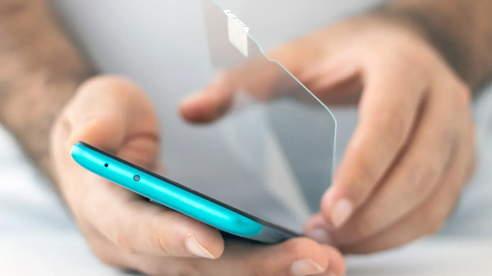
Then there is the most universal touchscreen boss battle of all: fingerprints. A large glossy glass panel offers a correspondingly large surface for smudges. Owners concerned with visibility and presentation may find it worth keeping cleaning needs in mind, much as phone users should watch for a protector becoming scratched or hazy; the basic signs of a screen protector needing replacement illustrate how surface wear can become more than a cosmetic nuisance.
The practical takeaway for screen-first car cabins
The EQS 580 4MATIC Hyperscreen is an extreme example of where modern car interiors are heading. Its size is not just a bragging-rights measurement. The three-screen arrangement supports a dedicated passenger experience, persistent mapping and media views, customizable passenger profiles, and an interface built to surface likely controls without a long menu trek.
At the same time, its scale does not erase the constraints of driving. Large displays can be visually impressive while still demanding attention; touch surfaces can be configurable while still being less intuitive by feel than physical buttons; and a dashboard-spanning design can still have areas partially masked by the steering wheel. The passenger screen’s occupancy requirement and driver-gaze sensor show that the design itself is conscious of the distraction problem.
So the 56-inch Hyperscreen is best understood as both a record-setting infotainment installation and a case study in interface priorities. It makes a strong argument for giving passengers meaningful control and giving maps, media and navigation room to coexist. It also makes the counterargument for retaining some physical controls, particularly for frequent actions that need to be handled quickly and with minimal attention. Bigger screens can expand what a dashboard can do. They do not automatically make every interaction simpler.