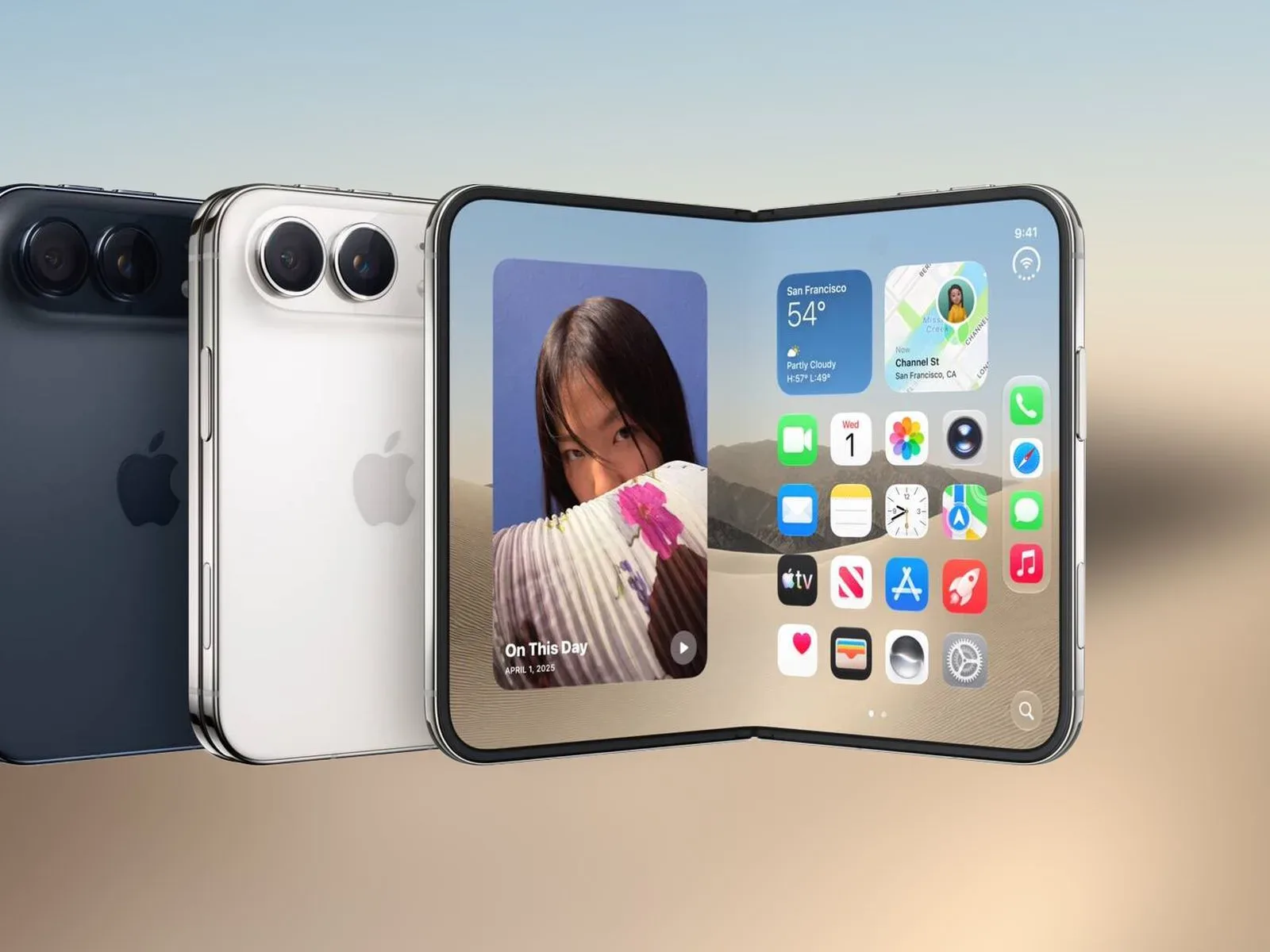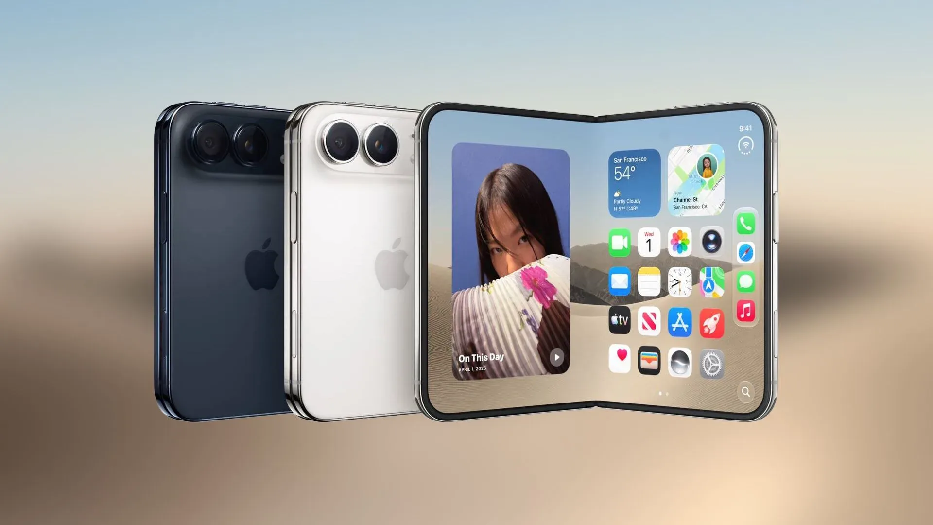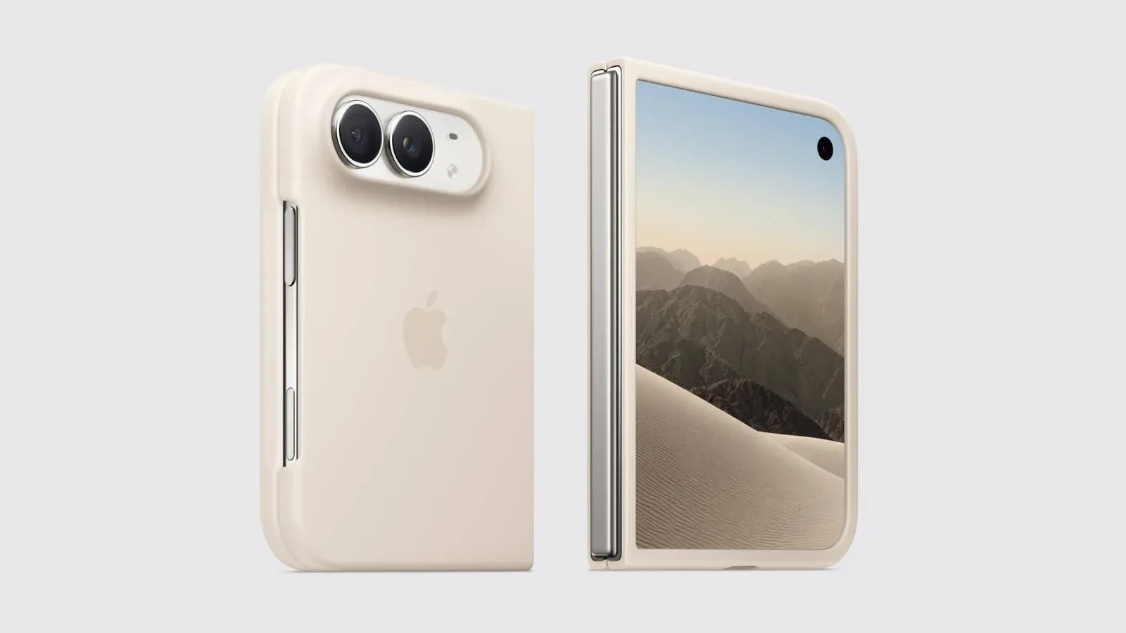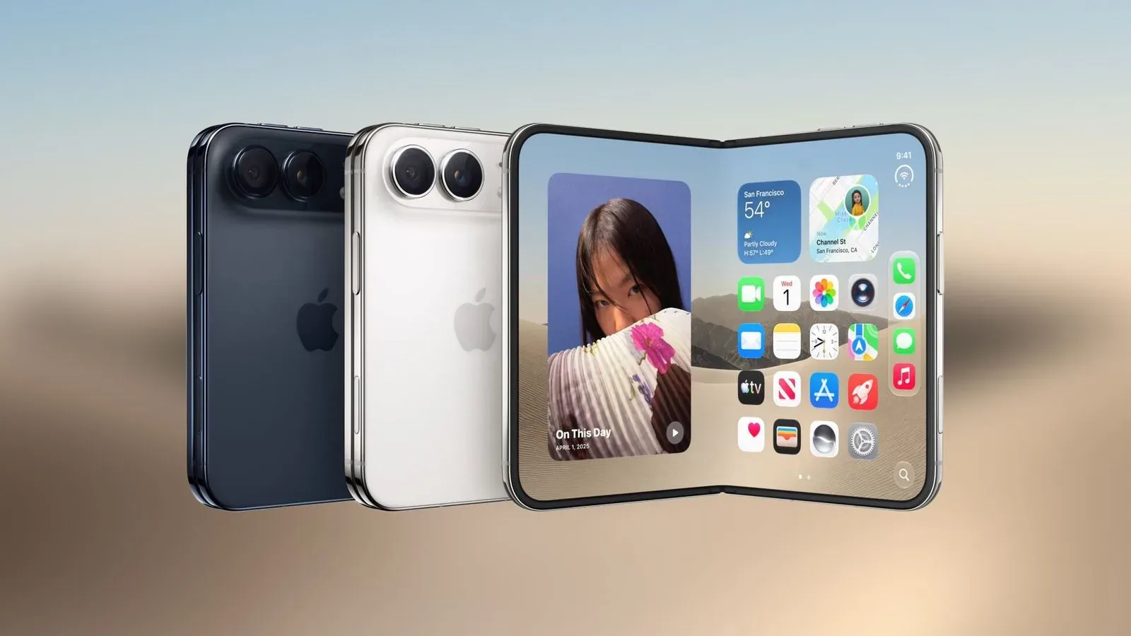
The iPhone Duo may give documents a more book-like presentation when it is unfolded. A newly surfaced video shows Quick Look displaying an Apple Style Guide document across the device’s two halves, with consecutive pages positioned side by side rather than presented as one single narrow page.
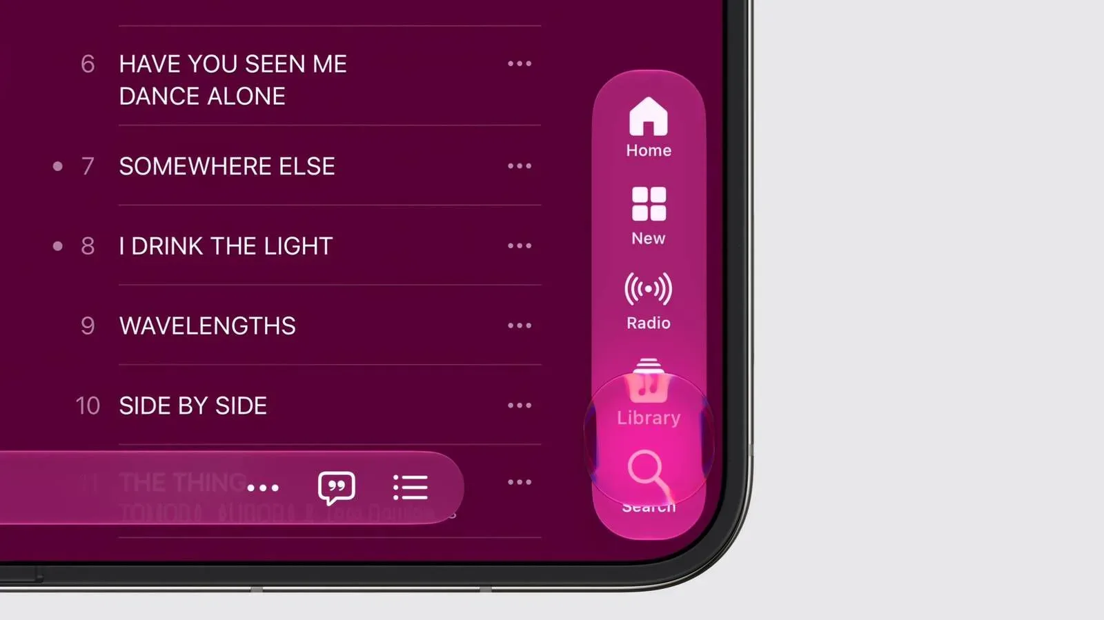
It is a small interface detail with a clear purpose: a foldable screen has more horizontal room than a conventional phone, and a two-page spread is a practical way to use it for documents designed around pages. In the clip, Quick Look’s search, markup and sharing buttons remain arranged along the right side of the interface while the document occupies the broad central display area.
The behavior appears to be tied to the iPhone Duo’s open-book orientation. That distinction matters. The same document does not necessarily need to look or behave identically when the device is closed, held vertically, or used at another angle. The footage is evidence of a possible layout, not a complete explanation of every condition in which it will be available.
What the two-page view appears to do
Quick Look is the iPhone interface used for opening a file preview without necessarily moving into a separate dedicated editing app. In the demonstrated layout, it appears to turn the unfolded Duo into something closer to a digital book spread: one page is visible on the left and the following page is visible on the right.
That differs from simply stretching a portrait phone interface across a larger display. A stretched single-page view can make text larger, but a two-page layout changes how a reader can scan a document. It keeps adjacent pages together, which may be useful when a file’s formatting, headings, images or page-to-page flow were built with a traditional spread in mind.
The visible controls also suggest that the wider layout is intended to preserve normal document actions rather than turn viewing into a stripped-back mode:
- Search can help a reader jump to a word or phrase within a document.
- Markup refers to annotation tools, such as adding notes or drawing on a file.
- Share provides a route to send the document elsewhere or pass it to another app or person.
Keeping those controls on the right leaves the main content area focused on the pages. That is a sensible arrangement in principle, although the clip alone cannot establish how the layout handles documents with unusual page sizes, landscape pages, images, or very small text.
Why Quick Look is a notable place for foldable adaptation
Foldable hardware needs software that treats the extra space as useful workspace, not merely as a larger canvas. Document previewing is one of the clearest cases for an open-book design because the physical shape of the unfolded device resembles the way many people already read a bound document.
A two-page preview also places the hinge between pages rather than through the middle of one page. That is an important design implication. Reading a single page across both sides of a folding display could put text and images near the central fold. Showing one page on each half instead makes the device’s structure part of the presentation, much like the gutter in a printed book.
The visible arrangement is not necessarily an editing-first experience. Quick Look’s role, as shown here, remains previewing and handling a document. Markup means a user can annotate, but the footage does not establish expanded document creation tools, deeper file-management changes, or parity with a desktop publishing workflow. The strongest claim supported by the clip is a more spacious way to inspect compatible multi-page documents.
Part of a wider iOS 27 approach
The apparent Quick Look feature fits with previously detailed iOS 27 adaptations for the Duo. Those include angle-aware layouts and side-by-side multitasking.
Angle-aware layouts are interfaces that respond to how a device is positioned rather than assuming there is only one useful posture. On a foldable, the angle between the two display halves can affect where controls belong and how content is best divided. The newly seen Quick Look spread is specifically associated with the fully opened, book-like position, reinforcing the idea that orientation is central to the software design.
Side-by-side multitasking, meanwhile, is the broader concept of presenting two app spaces or tasks next to each other. Quick Look’s two-page display is not the same thing as running two separate apps, but it applies a similar principle: the screen’s width is being used to put related information next to itself rather than forcing every experience into a tall, single-column phone format.
For prospective users, the distinction is worth keeping straight. Multitasking is about separate working contexts. A two-page Quick Look layout is about one document receiving a layout appropriate to a wider screen. Both can make an unfolded display feel more purposeful, but they solve different problems.
Practical implications for readers
The most immediate benefit is likely to be continuity. When consecutive pages are on screen together, readers can compare material without repeatedly navigating forward and back. That could be helpful for reviewing a style guide, skimming a long report, checking a document’s layout, or keeping the end of one page and the beginning of the next in view at the same time.
It may also make an iPhone-sized foldable feel less like a conventional handset that happens to open wider. A software feature does not change the physical display, but it can determine whether the added area reduces friction in common tasks. Two pages shown as a spread is a specific use of that area with an easily understood visual payoff.
There are limits to what can be inferred. The available material does not state which file formats receive this presentation, whether it can be manually enabled or disabled, whether it changes with text size, or how it behaves when a document is zoomed. It also does not demonstrate performance, accessibility settings, or interaction with external displays. Those details remain unconfirmed.
Still, the appearance of search, markup and sharing controls alongside the spread indicates that the layout is not presented as a static promotional mock-up. It shows a functional Quick Look interface being used to navigate a document, with standard actions still accessible.
What to watch as the Duo approaches release
The iPhone Duo is scheduled for pre-orders at 5 a.m. Pacific Time on Friday, October 16, followed by availability on Friday, October 23. Ahead of that window, the key question is less whether a two-page document view is useful—it plainly has a logical fit for the form factor—and more how broadly iOS 27 applies its foldable-specific layouts.
Quick Look matters because it is a built-in utility rather than a niche app. If the same care extends across common system experiences, the Duo’s unfolded posture could provide concrete everyday advantages. If it is restricted to only a narrow set of circumstances, it will be better viewed as a welcome convenience than a defining workflow feature.
For now, the video offers a focused early look at one adaptive interface: consecutive document pages on opposite sides of an open foldable, with the usual preview tools retained at the edge of the screen. It is a modest addition, but it illustrates the broader challenge for iOS 27—making a changing device shape lead to a meaningfully changing interface.
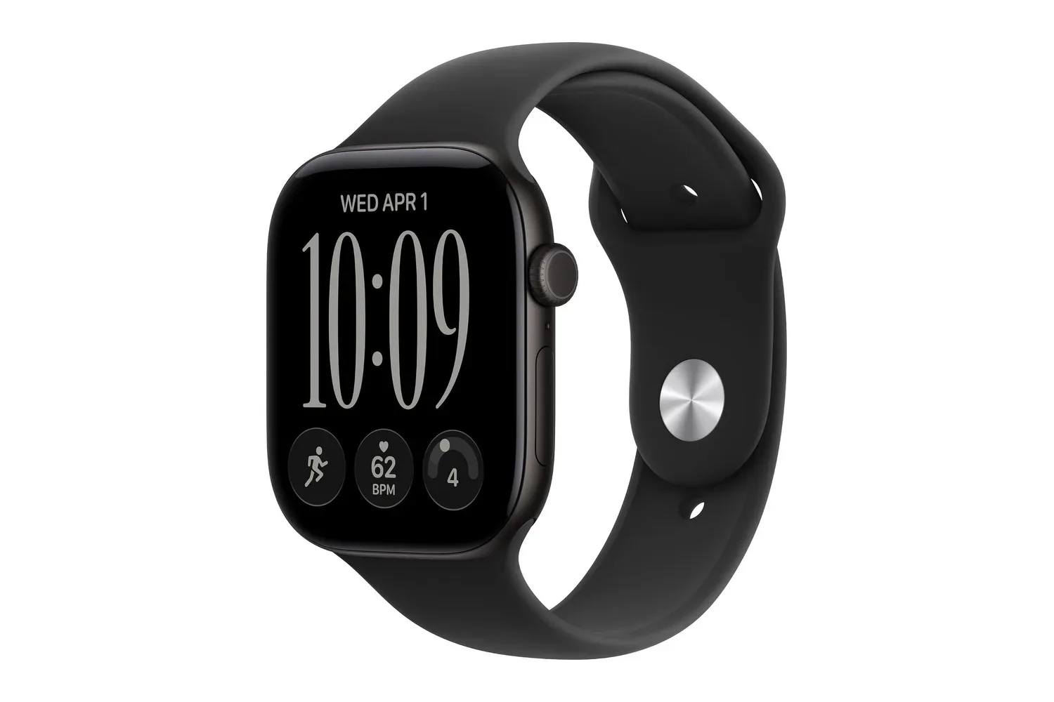
Those wider ecosystem decisions will be worth following alongside other Apple hardware developments, including the Apple Watch Series 12’s iPhone-free connectivity options. For the Duo itself, the Quick Look discovery points toward a software experience designed to recognize when a phone has become a small, open book.