The virtual Apple TV Remote on iPhone is getting a notably more capable interface in the iOS 27 Release Candidate. Two additions have been spotted behind feature flags: a compact app launcher in the upper-right corner of the remote screen, plus a gesture that opens the Apple TV top shelf carousel from the trackpad area.
Neither change turns an iPhone into a new kind of gaming controller, and neither replaces the Siri Remote that ships with Apple TV hardware. But they address the very ordinary, very persistent friction of using a phone as a living-room remote: finding a particular app quickly, then getting back to something already underway without hopping through several screens. For people who use Apple TV for games as well as streaming, that can mean less menu wandering before launching a service, opening an app, or returning to whatever the household left paused.
The iOS 27 RC was released on September 9, 2026. The newly seen controls are not necessarily active for every person running that build, because they are reportedly gated by feature flags. In other words, their presence in the software does not automatically mean every beta or RC user can tap them today. It does, however, provide a clear look at how Apple appears to be broadening the remote from a basic navigation overlay into a more direct front door to the Apple TV interface.
A four-square button for jumping to Apple TV apps
The first new control is a button in the top-right corner of the Remote interface. Its icon uses four squares, an immediately familiar visual shorthand for an app grid or launcher. Selecting it brings up a menu that resembles the Apple TV home screen and allows the user to choose an app and open it directly.
That is a small change with a practical effect. The conventional remote workflow is built around directional navigation: wake the Apple TV, return to the home screen if needed, move across rows of icons, select an app, and wait for it to open. That model is perfectly understandable when holding a physical remote, but it is not always the fastest path on a touchscreen that is already capable of displaying a list of destinations.
By adding an app menu inside the Remote view, iOS 27 appears to make the iPhone’s larger, visual interface do more of the selection work. It should be particularly handy in homes where the Apple TV has accumulated a sizable collection of video, music, sports, and game-related apps. Instead of treating the phone merely as a replica of physical controls, the design can expose a more app-centric shortcut.
There are limits to what can be inferred from the feature as shown. The available details establish that the menu launches apps, but do not spell out whether it can be customized, whether it shows every installed app, or whether it learns from recent usage. Those are questions for Apple’s eventual implementation and release notes, rather than assumptions to attach to a feature-flagged interface.
A downward swipe opens the top shelf
The second addition uses a gesture rather than an always-visible button. Dragging downward from the top edge of the Remote’s virtual trackpad reveals the Apple TV top shelf carousel. That carousel is where the TV interface surfaces watch-list selections and titles that have been started, making it a useful location for resuming an episode or film without manually drilling into its host app first.
On a television, the top shelf can feel like a quick glance at the next thing to watch. Bringing that behavior into the iPhone remote gives the phone a more natural way to reach it. The gesture is also appropriately tied to the trackpad: the user is already in the part of the interface associated with directional movement, so pulling downward to unveil a layer above the main screen follows the broad logic of touch navigation.
For game fans, the benefit is indirect but still relevant. Apple TV setups are often shared screens, and a remote can spend as much time launching entertainment apps as it does opening games. Faster access to watch-list and continue-watching items means fewer interruptions when the television is pulling double duty between a game session, a movie night, and whatever someone else was watching earlier. The update is about better navigation rather than new Apple TV gaming features, but smoother switching is welcome in any shared-screen setup.
It is also worth being precise about what the top-shelf gesture does not promise. The reported behavior concerns the Apple TV carousel and its watch-list and in-progress viewing items. It does not establish any new game library, controller pairing option, Game Center tool, or cloud-gaming capability. The improvement is focused on the remote’s way of reaching existing Apple TV content.
The Remote can return to the iPhone Home Screen
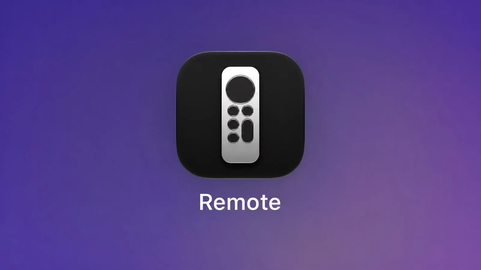
iOS 27 also restores the ability to place the virtual Apple TV Remote on an iPhone Home Screen. That matters because the Remote has been closely associated with Control Center, which is convenient when it is already configured but can be less obvious to anyone who does not remember where the control lives.
For people on the iOS 27 beta, the Remote can be located by swiping down on the Home Screen to search and entering remote. From there, it can again be added to the Home Screen rather than being confined to Control Center. It is an uncomplicated access change, yet it complements the app launcher and top-shelf gesture neatly: a remote that is easier to find now has more reasons to be opened.
That return may be especially helpful for households that use a spare iPhone, or for anyone who wants a dedicated remote tile alongside their streaming and smart-home apps. A Home Screen icon is not revolutionary, but it is visible, repeatable, and much easier to explain than a sequence involving Control Center customization. In the usual rush to start a show, launch an app, or recover a misplaced physical remote, reducing one layer of discovery has genuine value.
What feature flags mean for iOS 27 users
The two new interface behaviors were found in a feature-flagged state and subsequently demonstrated publicly by code researcher pdfu. Feature flags are commonly used to keep unfinished, staged, or selectively enabled functionality separate from the wider software build. Their use here means observers can identify the interface elements without treating them as universally available or permanently guaranteed.
As a result, iOS 27 testers should approach the additions with measured expectations. Searching for the Remote and adding it to the Home Screen is described as available in the beta, while the new launcher and top-shelf gesture may depend on whether the relevant flags are enabled. Apple could activate them more broadly, adjust the design, or hold them back. Until the software reaches its final public form, the sensible reading is that these are promising interface changes in the RC, not a blanket promise for every compatible iPhone at this moment.
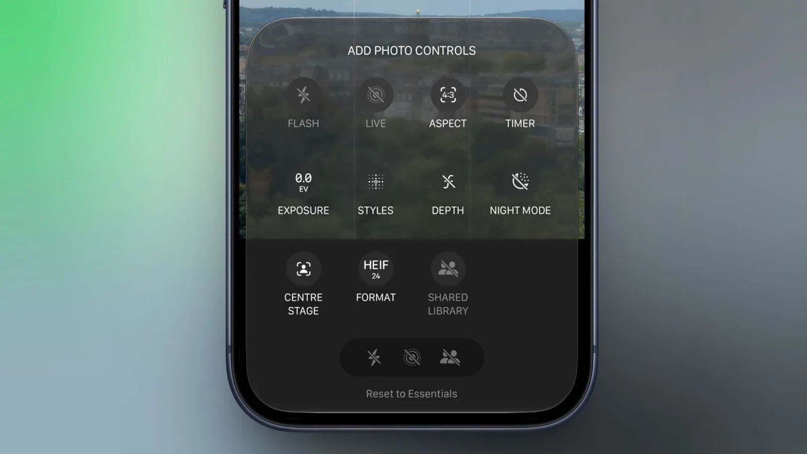
The RC’s broader refinement work has also touched other iPhone tools. For another look at the update’s emphasis on making established controls more configurable, see our coverage of iOS 27 RC custom camera controls. The Remote changes fit that same general pattern: familiar functions are still there, but their routes are being reconsidered for speed and clarity.
Why the redesign is more meaningful than it first appears
Remote apps are easy to overlook precisely because they tend to be most useful during minor annoyances. The physical remote has vanished into a sofa cushion. Someone needs to pause the television from another room. An app has frozen and needs relaunching. A viewer wants to continue something but cannot remember which service hosted it. In those moments, a virtual remote succeeds not through spectacle but through getting the user to the right destination with the least possible detour.
The iOS 27 update attacks two common detours directly. The four-square control shortens the route to an installed app. The swipe-down action shortens the route to top-shelf recommendations and unfinished viewing. The restored Home Screen option shortens the route to the remote itself. Together, those changes create a tidy hierarchy of shortcuts: get to the remote, get to the app, or get to the content already waiting.
That is a sensible direction for Apple TV control on a phone. Touchscreens are not at their best when painstakingly impersonating every button on a small remote; they are strongest when they can combine familiar remote input with contextual choices, search-like discovery, and a display large enough to show several destinations at once. The new iOS 27 Remote design seems to lean further into that advantage without abandoning the trackpad-style interaction that Apple TV users already know.
For now, the important caveat remains the feature-flag status. Still, the interface shown in the iOS 27 RC suggests an Apple TV Remote that is becoming more useful before the show even starts: quicker at finding apps, better at surfacing queued viewing, and no longer dependent solely on Control Center for a spot on the iPhone.