Some of the most durable ideas in games are not born in tidy brand workshops, mapped out years ahead as a franchise bible. Sometimes they arrive under pressure, because a release is close, the cultural moment has changed overnight, and a team has to decide what can responsibly stay in front of the public.
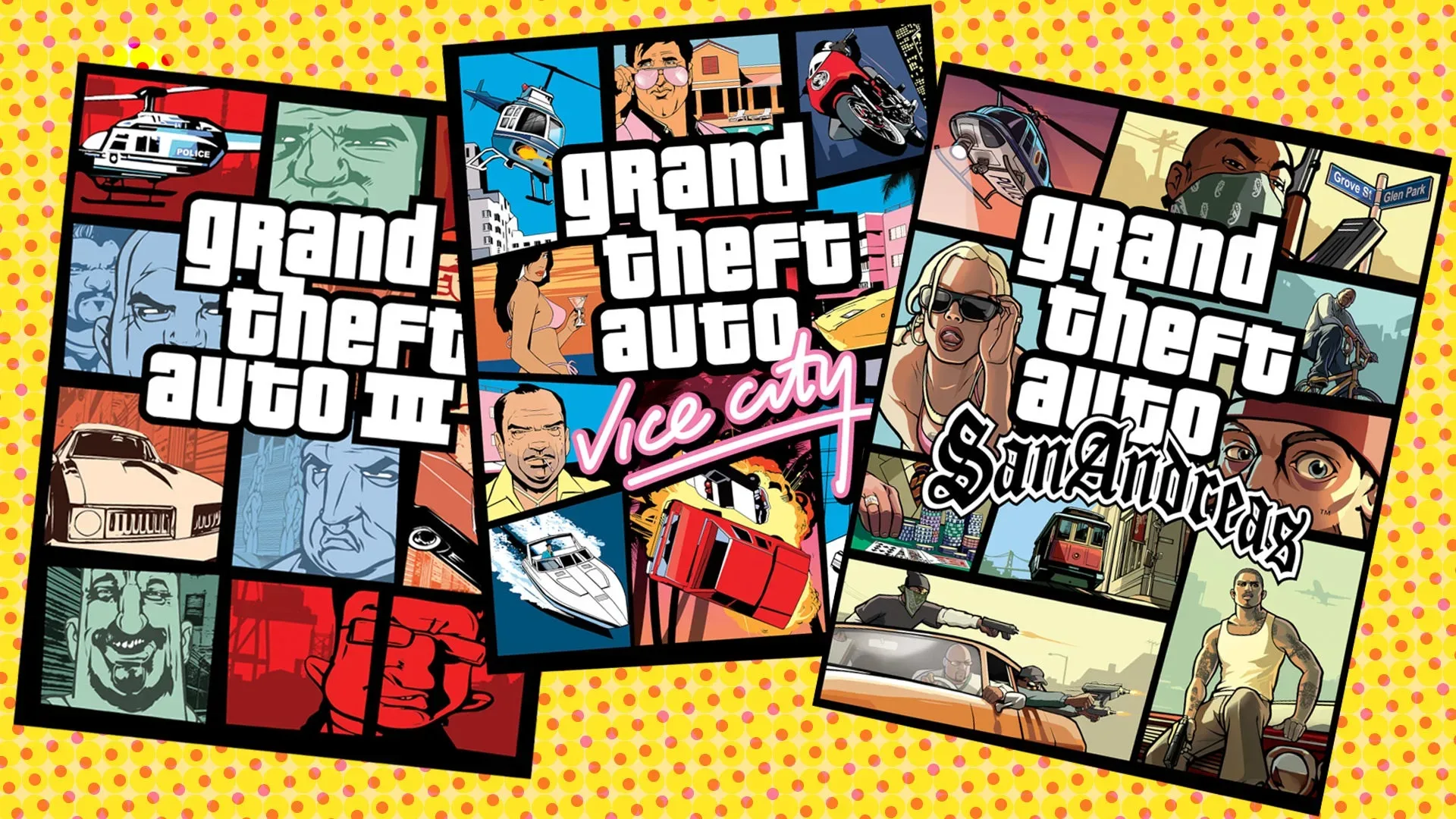
That is the origin story now attached to one of gaming’s most recognizable visual formats: the segmented Grand Theft Auto cover. Former Rockstar vice president and lead writer Dan Houser has said the artwork for Grand Theft Auto 3 was not the intended final cover. Instead, the familiar arrangement of illustrated characters, vehicles and scenes in separate squares was created rapidly after the September 11, 2001 terrorist attacks made the prior design feel inappropriate.
Houser said artist Stephen Bliss completed the replacement in about two evenings. The original cover, as Houser described it, included burning buildings. In the immediate aftermath of 9/11, that imagery was no longer something the team felt comfortable releasing. GTA 3 arrived the following month, leaving very little room for a lengthy redesign process.
The result was not merely a substitute box. The grid-like visual language became inseparable from Grand Theft Auto itself, then continued across subsequent entries as the series grew into a defining name in games.
A rushed solution that became visual shorthand
The cover format is easy to recognize even before a player reads the logo. Separate illustrated panels present people, cars and other pieces of a game’s world as a collage. It offers a snapshot of a sprawling crime-game setting without asking one image to explain everything at once. That matters for Grand Theft Auto, a series associated with ensembles, vehicles, cities, satire and player freedom rather than a single mascot or one fixed action pose.
Houser’s account makes clear that this recognizable format was a practical response to an urgent situation, not the original plan. In design terms, that distinction is important. A visual identity is the recurring set of images, forms and conventions that let people identify a brand. In retrospect, the squares became part of Grand Theft Auto’s visual identity. At the point they were made, however, they were an expedited answer to a specific release problem.
That does not make the design any less consequential. If anything, it illustrates why last-minute work can sometimes endure. A constrained brief can force an idea to be direct: use multiple small illustrations, make the game’s breadth legible, and avoid imagery that had become newly painful and unsuitable. The form was flexible enough to be reused, but distinctive enough to be remembered.
Houser described the outcome as an irony of the situation. A change made because the original art no longer felt acceptable became one of the series’ most imitated and widely understood features. He noted that GTA-style imagery has surfaced in online clips, in the use of the series logo and in tourist-resort T-shirts designed in a similar cover-art spirit.
Related coverage includes GTA 3's Iconic Box-Art Grid Was Reportedly Created in Just Two Evenings After 9/11.
That is the point where a packaging choice becomes something larger than packaging. The cover is no longer only there to sell a disc or represent a particular release; it becomes visual shorthand. A viewer can understand the reference even when it appears outside a game store, outside official marketing, or alongside material that has nothing to do with the original game.
The changes went beyond the cover
The artwork was not the only part of GTA 3 reconsidered after 9/11. Houser said there were a few pieces of content that may have been acceptable under different circumstances but felt like too much in the exact aftermath of the attacks. The team removed or edited material, including a couple of lines of dialogue, following what he characterized as a quick review of the content.
Police-car colors were also changed, a detail Houser had previously discussed in 2011. The supplied account does not establish every alteration, nor does it provide a full list of material considered or cut. That uncertainty is worth retaining. The meaningful point is not to turn an incomplete account into a catalog of alleged changes; it is that the response extended beyond a new cover into selective edits within the game.
For players, this is a useful reminder that a finished game is often the product of decisions made very late in development. Covers, dialogue and incidental visual details can all be part of the final public-facing work. In this case, the decision was shaped by an exceptional and traumatic real-world event, not simply a late marketing preference.
It also shows why historical context matters when people discuss a game’s appearance decades later. Looking only at the finished GTA 3 cover can make the grid seem inevitable. Houser’s recollection argues the opposite: it was contingent. Another cover had been planned; a major event changed what was appropriate; a rapid replacement made under those circumstances acquired a life far beyond its original deadline.
From uncertain reception to a sustained commercial run
The visual pivot occurred while the game and its publisher were under considerable pressure. Houser recalled that Take-Two was close to economic failure in early 2001. He also said the team was struggling to finish GTA 3, despite believing strongly in the game, and that the title drew little apparent interest when shown on the E3 show floor.
The eventual commercial story was not, in Houser’s telling, one giant week that instantly settled everything. The game launched in October 2001 and kept selling through Christmas, into early 2002, and beyond. That steady accumulation is the significant detail. A game can become transformative through sustained demand rather than one easily summarized opening burst.
Houser said the success effectively saved Take-Two and made Rockstar a household name. It is a striking contrast with the earlier uncertainty: a team trying to finish a game, a publisher in a precarious position, an underwhelming trade-show response, and late changes prompted by a crisis. The finished release then became the foundation for an enormously prominent cultural and commercial identity.
There is no need to treat the cover as the cause of that success. The evidence here does not make that claim, and it would overstate what packaging can do. The stronger reading is that the cover became the memorable face of a game whose sales momentum and broader impact gave the design repeated exposure. A visual system achieves true franchise status when audiences keep encountering it over time, across new games, clips, logos, merchandise and references.
Why the grid still matters for GTA 6
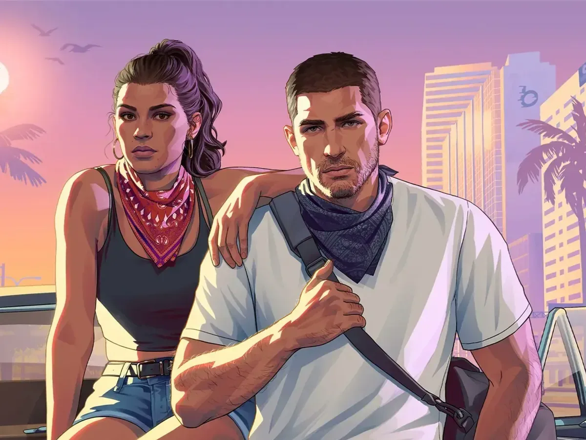
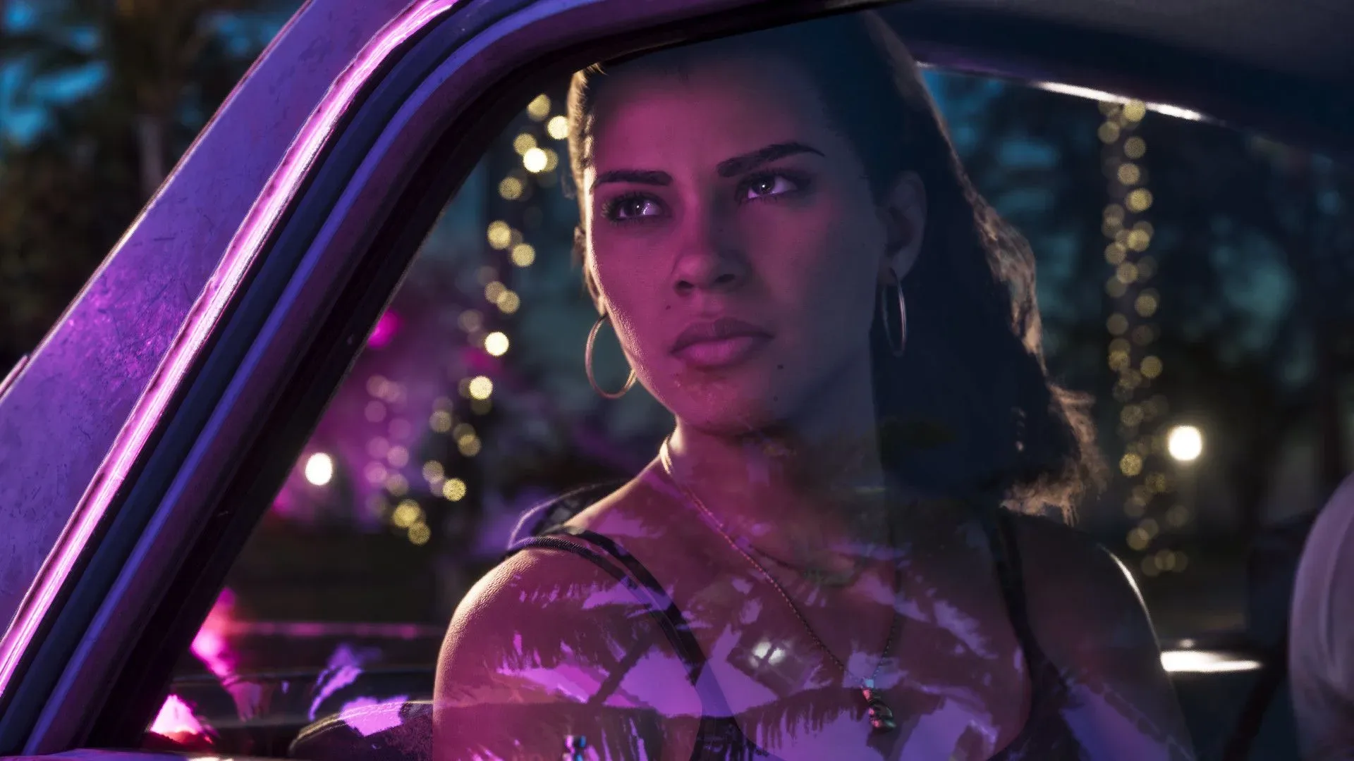
The old solution continues to shape the series’ future. Grand Theft Auto 6 is set to use the famous cover approach when it arrives on November 19 for Xbox and PlayStation. That continuity gives the once-improvised layout a rare status: it is now an inherited convention that helps connect a forthcoming entry to the breakthrough game that established it.
For an audience waiting on the next release, the significance is less about predicting its characters or story than recognizing the role of presentation. The segmented composition signals “Grand Theft Auto” immediately. It promises a world populated by multiple figures and activities, while maintaining a design link to the earlier games. For coverage of the current public build-up around the new title, see GTA 6’s Miami push, sports spectacles and Vice City signage.
There is also a broader creative lesson here, though it should not be romanticized. Tight deadlines and difficult circumstances are not inherently good for artists or developers. The notable aspect of Houser’s account is not that crisis is a desirable method of producing work. It is that teams sometimes make consequential decisions in response to circumstances they cannot control, and those decisions can outlast the moment that produced them.
Grand Theft Auto’s squares are now so familiar that it is tempting to see them as permanent, preordained franchise architecture. The account behind GTA 3 says otherwise. They emerged from a rapid reassessment of material following 9/11, were created in a matter of evenings by Stephen Bliss, and went on to become a visual fixture of one of gaming’s biggest series. The design’s endurance does not erase its context. It makes that context all the more remarkable.