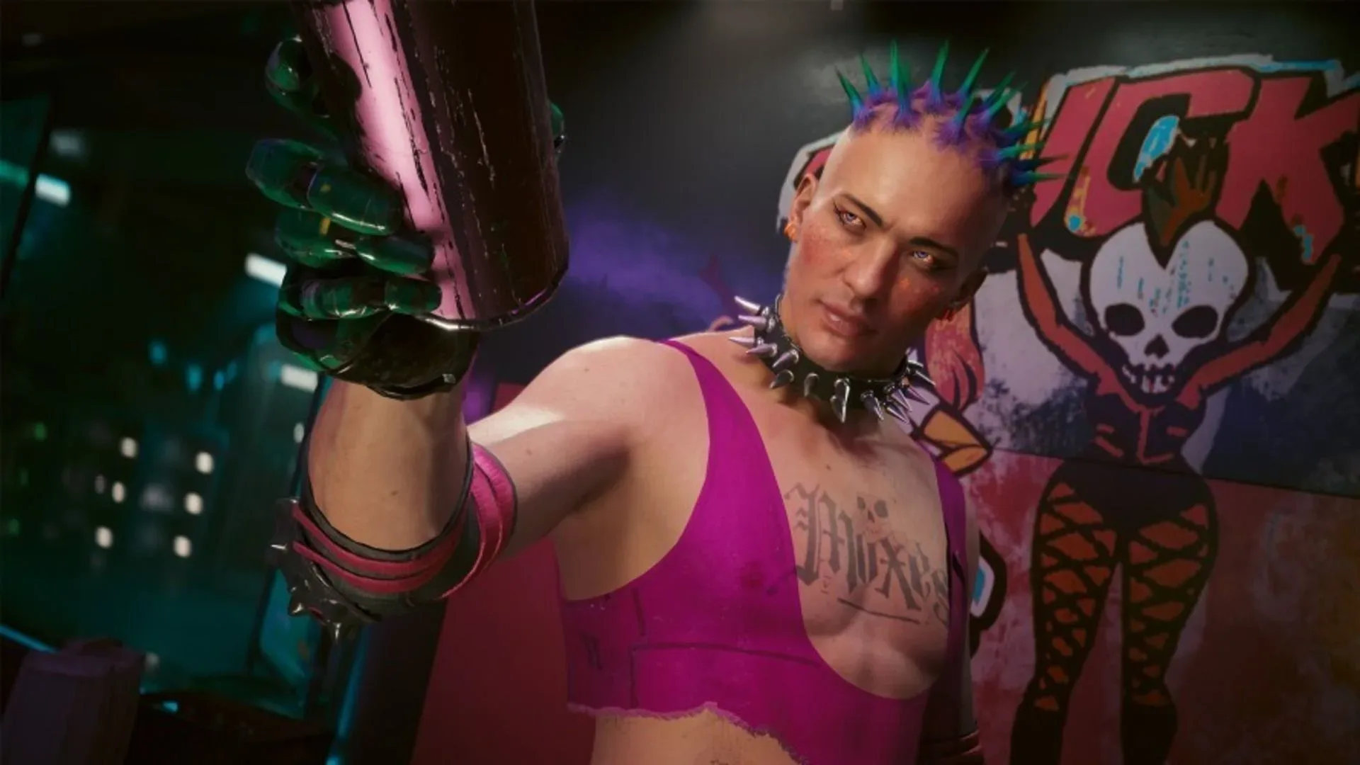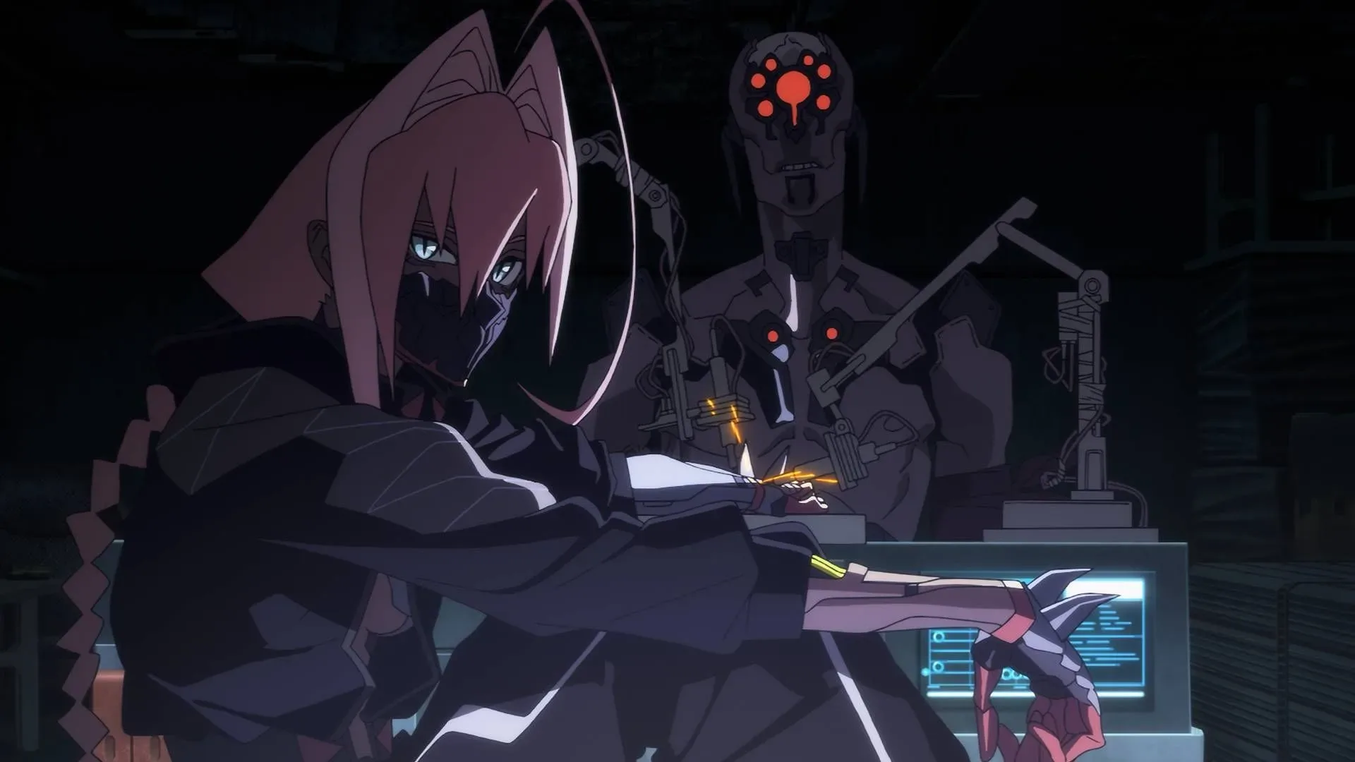
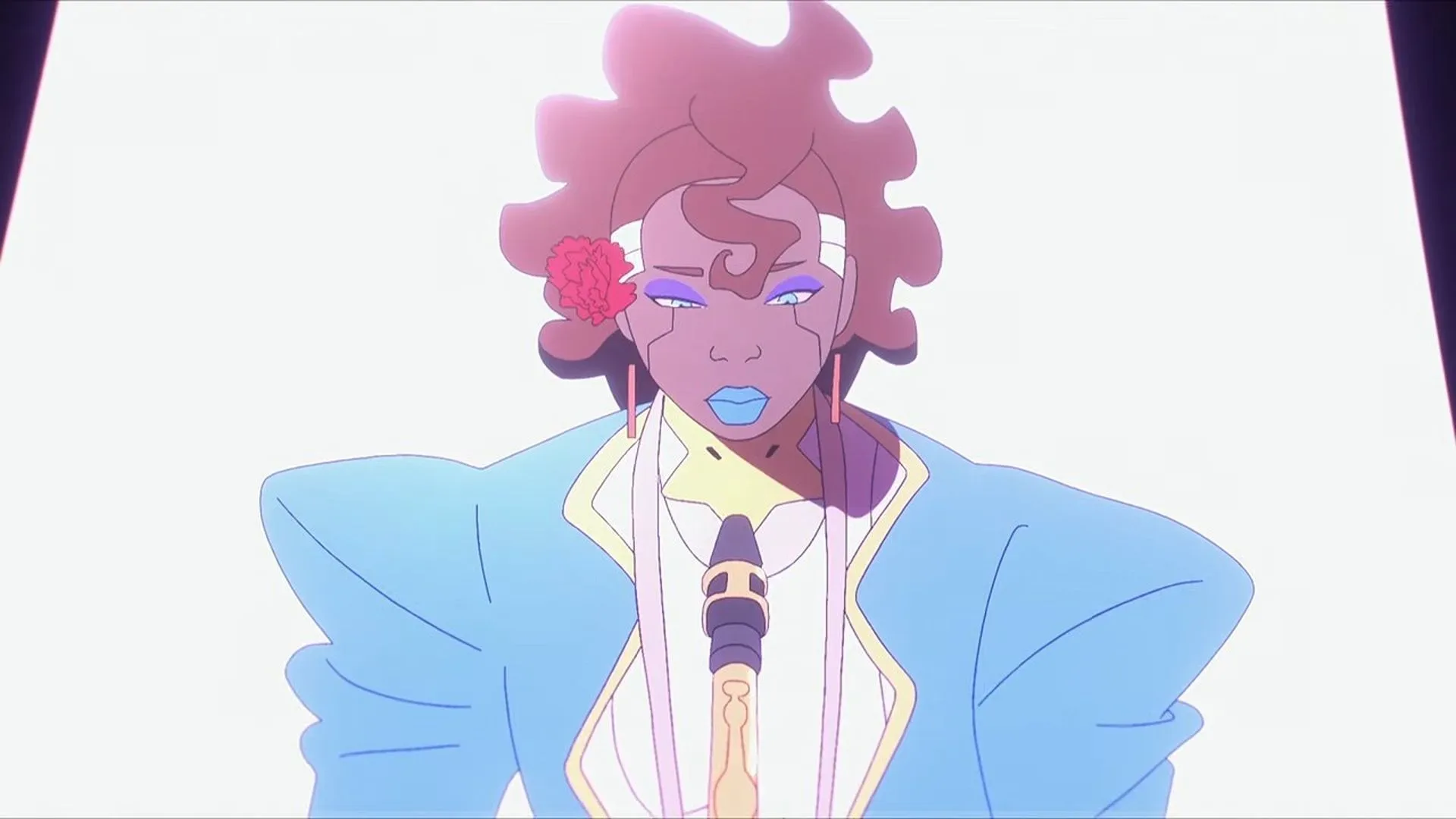
One of Cyberpunk: Edgerunners 2’s more distinctive character designs apparently arrived at the animation studio with an expectation attached: it might be changed.
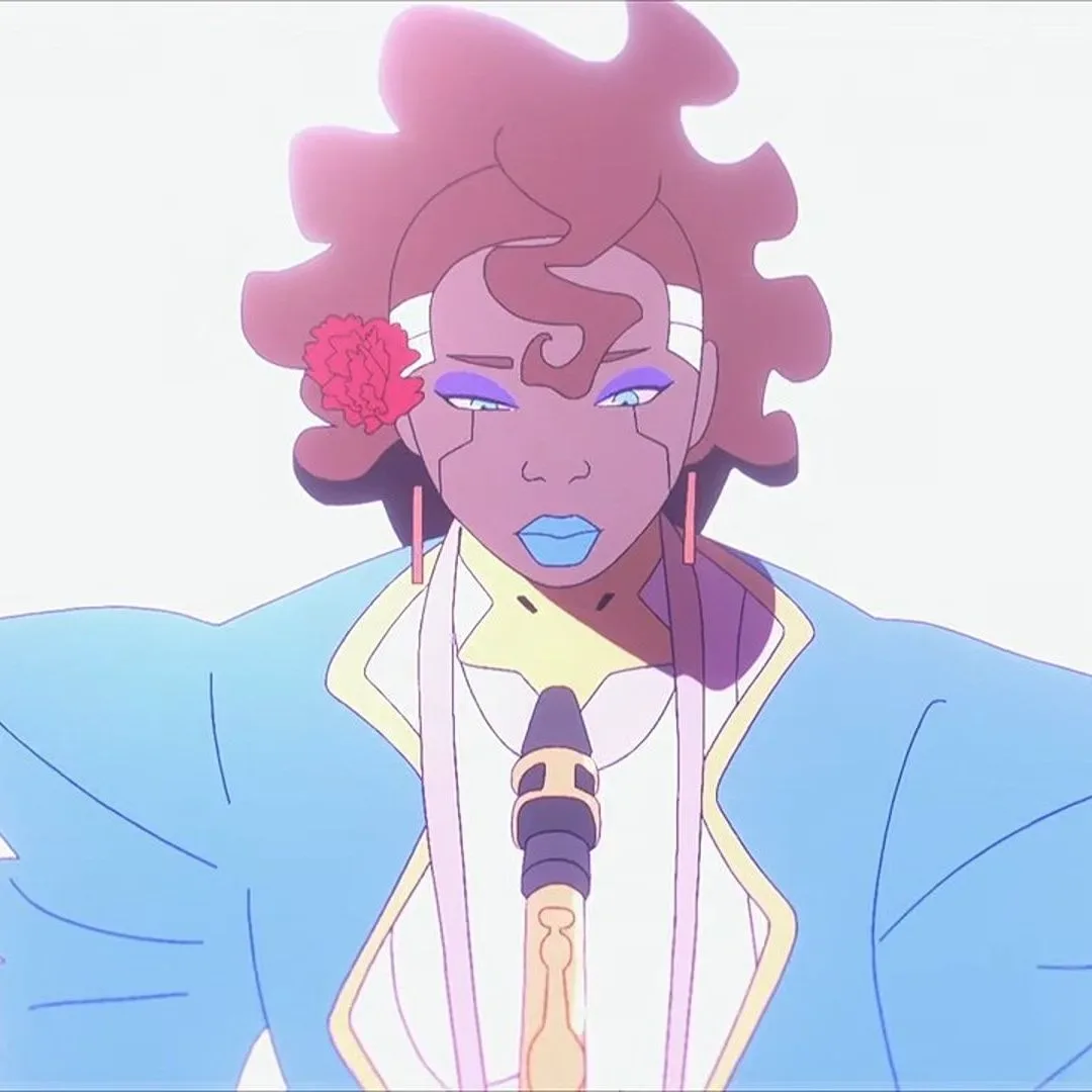
CD Projekt Red executive producer Saya Elder has explained that Avida, a character described as King’s former flame, was among only a small number of characters designed internally by the game developer. The team anticipated that Studio Trigger could ask for a design that read as more conventionally anime. Instead, the studio approved Avida’s appearance without requesting that kind of overhaul.
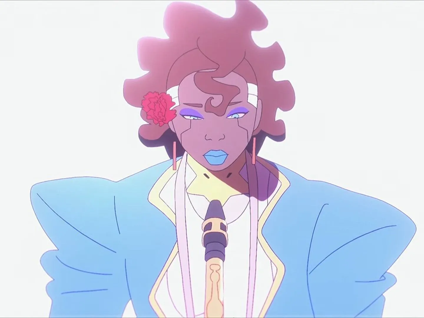
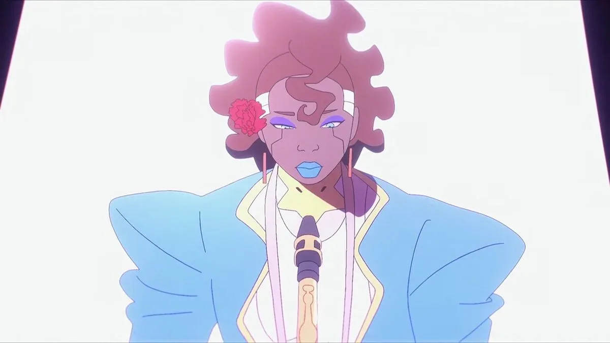
For Elder, that quick acceptance was a welcome surprise. She said the studio’s immediate response was simply that it would use the proposed design. The resulting character retained details that set her apart: Avida is tall and broad-shouldered, wears a suit, and is presented as someone choosing comfort over fashion. Elder also singled out the character’s blue lipstick as a favorite touch.
A design that does not chase the obvious silhouette
That reaction matters because character design is not merely a matter of making someone look appealing in a still image. In animation, a design needs to communicate personality quickly, work in motion, and fit the wider visual language of a production. The concern that Avida could become “more anime” appears to have been less about rejecting animation outright than anticipating a move toward a more familiar visual shorthand.
Avida’s original concept instead seems built around contrast. In a setting associated with highly stylized cybernetic bodies, fashion-forward excess and visibly “chromed-up” residents, a suit-wearing character whose look emphasizes comfort makes a different kind of statement. The broad shoulders, practical clothing and blue lipstick create an identifiable outline without relying on the same cues as other women mentioned from the series, including Rebecca and Talia.
Visual shorthand is the useful term here. It means the immediate signals a viewer gets from clothing, posture, proportions, color and accessories before a character has said much of anything. A sharply tailored suit can suggest control, professionalism or guardedness; an unconventional body shape can make a silhouette memorable; a vivid lip color directs the eye to the face. None of those elements automatically tells audiences who Avida is, but together they give the character a clear visual identity.
Crucially, the creative decision was not framed as Studio Trigger resisting CD Projekt Red’s direction, or CD Projekt Red forcing a design through an animation pipeline. Elder’s account describes a smoother exchange: CD Projekt Red proposed Avida, and Studio Trigger accepted the proposal. For a cross-medium project tied to an established game world, that is a notable reminder that collaboration can preserve an unusual idea rather than sand it down.
Why “more anime” is an imprecise expectation
“Anime” is often used as a catch-all for an enormous range of visual approaches, so it can obscure more than it clarifies. In this instance, Elder’s point is specific: she expected the design to become more typical in style, but it did not. Avida remained close to the concept CD Projekt Red had supplied.
Related coverage includes Cyberpunk: Edgerunners 2's Avida Kept CD Projekt Red's Unusual Original Design.
That distinction is important. The story is not evidence that one visual tradition is inherently less imaginative than another. It is evidence that the people making this particular show saw enough value in Avida’s existing design to keep it. The production choice supports a character who can feel unusual within her own world, not just unusual when compared with a broad and ill-defined idea of animation.
It also shows why a shared world needs room for different kinds of people. Night City can accommodate striking cyberware and extreme personal styling while still making space for someone whose wardrobe looks deliberate, practical and less ornamental. Variety makes a setting more believable: if every resident communicated themselves through the same shape, palette or amount of visible modification, the city would feel smaller no matter how visually loud it became.
The value of an internal character proposal
Only a handful of characters for the project were designed in-house at CD Projekt Red, making Avida a useful example of how responsibility can move between teams. An internal design proposal gives the game studio an opportunity to bring its own understanding of the setting directly into the animated production. The animation studio then has to determine how that proposal functions on screen.
Acceptance “right off the bat” does not mean animation work is effortless or that no refinement occurs in a normal production process. It does, however, indicate that the central idea survived the initial creative handoff. The most visible traits Elder highlighted—the suit, broad-shouldered build and blue lipstick—were not treated as obstacles needing replacement with a safer template.
That is a meaningful outcome for an adaptation or expansion of a game universe. The strongest creative partnerships usually require both consistency and flexibility: consistency so the world remains recognizable, flexibility so a new medium can add faces and styles that the audience has not already seen. Avida’s case suggests the teams found a productive overlap between those needs.
There is a broader industry lesson in that exchange, though it should not be overstated. Long-running creative teams and healthy collaboration can provide a foundation for experimentation, an idea also reflected in recent comments on how established teams can support creative development. Avida is a more narrowly documented example: a team expected pushback on an unusual design, and its partner instead embraced it.
Night City remains available for future stories
The design discussion also arrives alongside another revealing detail about the boundaries of the collaboration. CD Projekt Red had previously declined a request from Studio Trigger to destroy Night City. That decision is practical as well as dramatic: the city is central to the wider Cyberpunk setting, and it remains relevant to a planned sequel.
Keeping Night City intact does not limit every story to a single tone or cast. Rather, it protects a shared setting that can continue to hold new stories, new characters and different visual approaches. Avida’s design is a small but telling part of that principle. A franchise world can preserve its major landmarks while still letting a character make an impression through a suit, a silhouette and a flash of blue lipstick.
What Cyberpunk 2077 players can take from this
Players who have not finished with Cyberpunk 2077 also have a direct connection to the newer animated cast. A 2.5 update is now available and includes nods and references to the Edgerunners 2 crew. The supplied details do not specify which characters, locations or forms those references take, so anyone looking for them should be cautious of overly precise claims until they can verify them in-game.
Still, the update provides a bridge between the game and the animated project. That makes behind-the-scenes information about Avida more than an isolated art-design anecdote: it is part of an ongoing effort to let the game and animation inhabit the same broader space without making them identical experiences.
For viewers, the practical takeaway is straightforward. Avida was not a design that accidentally escaped a round of standardization. CD Projekt Red intentionally developed her internally, expected a more familiar-looking revision, and was pleased when Studio Trigger retained the proposal’s defining character. In a franchise built around bold surfaces and larger-than-life city imagery, it is a promising sign that a strong, specific design can stand out by refusing to look like the expected answer.