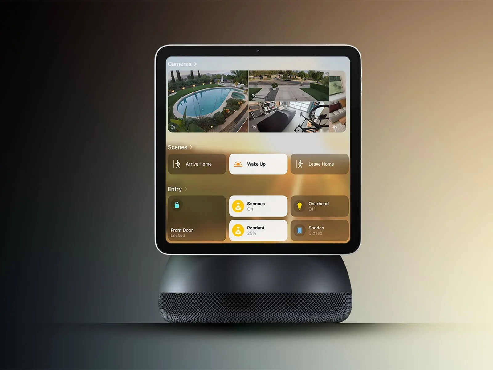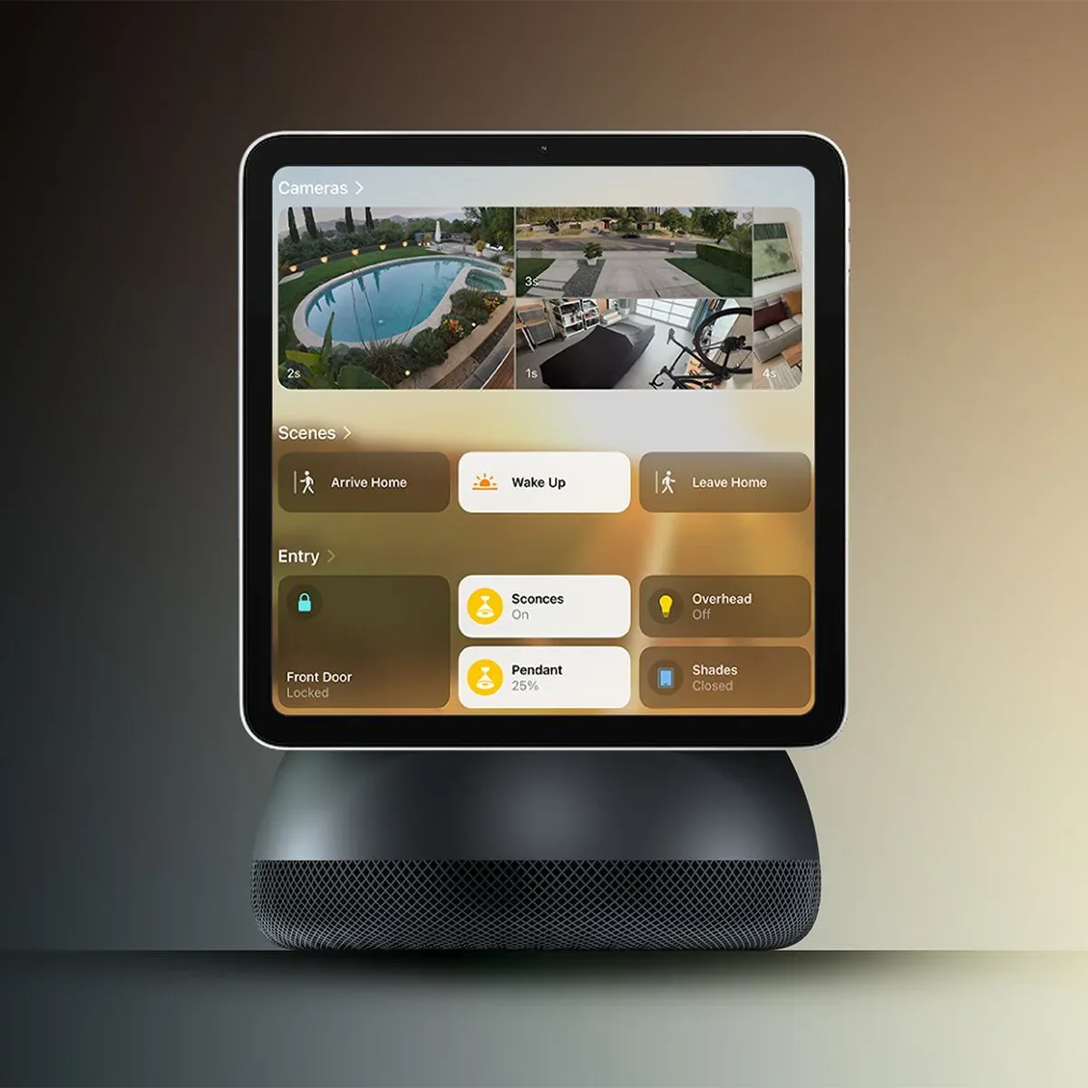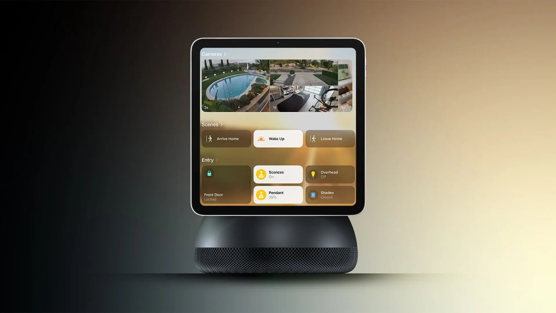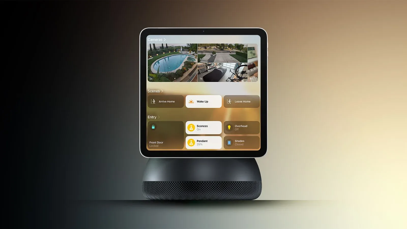
Apple’s long-rumored smart home hub is reportedly taking an unusually nostalgic route for a device aimed at tomorrow’s kitchen counter. The alleged design centers on a square 6-inch display perched above a circular metal speaker base, connected by a polished arm that lets the screen tilt forward or back. The overall silhouette is said to echo the 2002 iMac G4: screen up top, substantial rounded base below, and just enough visual charm to make a household control panel look less like office equipment.
That is the fun headline. The more consequential claim is that Apple may be designing the product as a shared household screen rather than simply an iPad that has been sentenced to live next to the fruit bowl. Reported uses include smart-home controls, video calls, intercom messages, music and podcasts, photo slideshows, videos, recipes and voice-led information requests. Apple is also said to envision several units distributed through a home, which would make its identity system, power arrangement and low-friction interface more important than raw screen size.
All of these details are reported rather than confirmed by Apple. The product, specifications, software behavior and timing could change before any official introduction. Still, the report sketches a clearer picture of the role Apple appears to be pursuing: a fixed, glanceable screen that can respond to the person standing in front of it without making every interaction feel like logging into a tiny family computer.
A desktop-inspired design, scaled down for a room
The countertop model is said to be roughly as thick as an iPhone, with rounded corners, a quarter-inch black border around the display and a gray aluminum finish. It reportedly has no battery, volume controls or power button. Instead, it must remain connected to power through USB-C. Microphones and speakers are housed in the base, while a single front-facing FaceTime camera sits by the display.
Those choices make sense for a device intended to stay put. A battery adds convenience when a product travels, but a home hub is meant to be available at predictable places: perhaps the kitchen, desk, bedside table or a shared living space. Being permanently powered means the device can serve as a clock, photo frame, speaker, intercom endpoint and smart-home dashboard without needing somebody to remember whether it was charged. The trade-off is equally straightforward: its placement will be constrained by a cable and an outlet.
The tilting arm could matter more than it first appears. A display used while standing in a kitchen may need a different angle from one used while seated at a desk. A fixed screen on a counter can easily catch ceiling lights or become awkward to read from across the room. Manual adjustment is a simple answer—less theatrical than motorized hardware, perhaps, but likely more practical for a device meant to be glanced at repeatedly.
The base reportedly includes rings of perforated speaker holes and a rubberized underside to keep it steady on a table. This is a small detail with a large domestic implication. Home hubs tend to occupy spaces where people are constantly setting down mugs, cookbooks, controllers, grocery bags and whatever else has temporarily defeated the concept of a clear surface. A stable, weighty base is not glamorous, but it is an appropriate priority for a screen that will be touched from different angles.
A second model for the wall
Apple has reportedly developed a wall-mounted version under the codename J491. Rather than the countertop model’s round speaker base and arm, this variant is said to place a thin, square base below the display, flush against the wall. The base would still contain microphones and speakers, and this model would also rely on a USB-C power connection.
A wall version would broaden the concept beyond a smart display that lives in one room. It could potentially suit an entryway, hall or kitchen wall where a shared calendar, messages, smart-home controls and household updates are useful at a glance. But the report does not establish how either model would be installed, how cables would be managed, whether they would launch together, or whether Apple will ultimately sell both. For now, the two designs are best understood as reported development directions, not a finalized product lineup.
The core idea: a device that knows who is there
The most technically and socially important reported feature is user recognition. The hub is said to identify a person through voice or facial recognition, then adapt its content and answers accordingly. In practical terms, that could mean different calendars, messages, reminders, photos or suggestions appearing for different people in the same home. A visitor mode is also said to hide personal information.
Personalization sounds obvious until it is placed on a communal screen. A phone is inherently private because it belongs to one person and usually stays with them. A household display is the opposite: it is visible, shared and often situated in a busy room. The value of recognition is not merely that a hub can greet someone; it is that it may avoid showing the wrong person’s messages or reminders at exactly the moment someone else walks past.
The report carries an important caveat. Its facial-recognition approach is said to be less reliable than Face ID. Face ID is Apple’s established biometric authentication system on supported devices; the reported hub implementation should not be assumed to provide the same level of certainty. Apple is said to allow a secondary authentication method through an iPhone, with the phone also operating as a fallback when the hub cannot identify someone correctly.
That fallback is revealing. Recognition systems have to deal with changing light, distance, camera angle, multiple people and ordinary household ambiguity. A smart display that cannot confidently tell who is in front of it needs a graceful way to recover, and using an iPhone could make the correction less cumbersome than repeatedly asking the user to identify themselves aloud. It also suggests that the hub may depend on the iPhone as part of the broader personal experience rather than replace it.
For darker rooms, the device is said to use a Mac-style Edge Light effect around the screen to help the camera recognize a user. This appears to be an illumination aid: light near the display can make a face easier for a front-facing camera to see. It is a practical response to a problem that smart displays encounter in bedrooms, dim kitchens and other spaces where a ceiling light is not always on.
An interface built for glancing, then doing
The reported software borrows from several existing Apple interface ideas. It is said to combine aspects of Apple Watch, Apple TV and iPad design, while retaining the dark visual treatment used for Siri AI elsewhere. Users may be able to choose wallpapers, add iPhone-style widgets and rearrange apps and widgets with a press-and-hold gesture.
This mix fits the job description. A watch-like app grid is compact and quickly scannable. An iPad-like multi-pane layout can make better use of a larger screen when somebody actually opens an app. Widgets are designed to surface small, timely bits of information without requiring a full app launch. Put together, the reported approach implies a product designed for two distinct kinds of attention: the brief glance at a clock, photo or reminder, followed by a deeper interaction when someone wants to read a message, control a device or begin a call.
Slideshows and clocks reportedly play a major role in the idle experience, in a manner compared with the refreshed StandBy-style concept described in the report. One clock is said to have a lava-lamp-like appearance, placing the hour in digital form above the minutes. Swiping upward from the clock or photo display would reportedly open the app launcher.
That arrangement matters because an always-on screen has to justify occupying visual space even when nobody is actively using it. A photo display and clock are familiar, low-pressure modes. They make the device useful from a distance while giving it a less demanding presence than a permanent grid of icons. Whether the result feels calm or distracting will depend on execution, but the reported emphasis on ambient display modes seems deliberate.
Familiar apps, adapted for a shared screen
Reported built-in apps include Calendar, Messages, Photos, FaceTime, Notes, Reminders, Music and Podcasts. The Home Screen is said to use Apple Watch-style app icons, but apps can open into layouts closer to the iPad. Messages, for example, reportedly uses two panes: a conversation list on one side and the selected thread on the other. Similar multi-panel treatment is said to extend to other default apps.
This is a sensible fit for a 6-inch square display, at least in theory. A multi-pane layout reduces the need to continually move back and forth between a list and its contents. On a hub positioned across a counter, fewer navigation steps could be more meaningful than on a device held inches from a user’s face. The question is whether text and touch targets remain comfortable at that size; the report does not provide screen resolution, app behavior details or accessibility options.
Video calling is another natural fit for the reported camera and speaker setup, and intercom messaging would give multiple hubs a particularly clear reason to exist together. A single unit can provide music, recipes and smart-home control. Several units could turn those rooms into a small communications network, provided the recognition and privacy features work reliably enough for a shared household.
There is also an obvious overlap with the broader smart-TV and voice-assistant race, where companies are trying to organize what people watch, hear and control across the home. That tension is visible in products built around living-room screens as well as tabletop devices; our look at voice assistance on Fire TV illustrates why the supposedly simple act of finding something to watch has become part of the platform battle. Apple’s reported hub appears to be approaching that competition from the opposite direction: a small household display that can also play video, rather than a TV interface reaching outward into the home.
What remains unknown before October 13
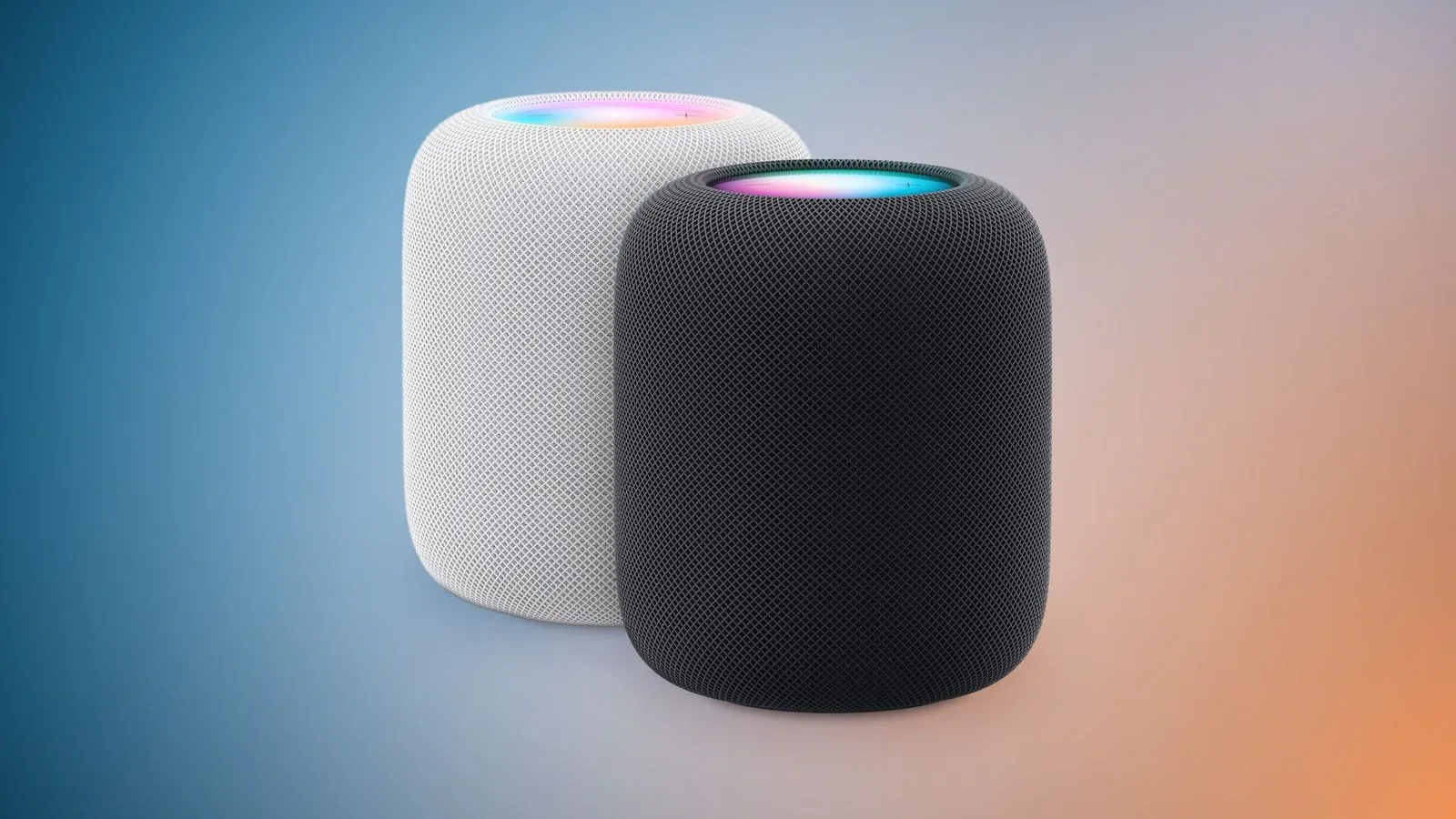
The device is reportedly planned for an introduction on Tuesday, October 13, alongside new HomePod mini and Apple TV models. No price, release date, storage capacity, display resolution, supported smart-home standards, regional rollout, subscription requirements or complete app catalog has been established in the report. Nor is it clear whether the countertop and wall-mounted versions would arrive at the same time.
Those omissions are not minor. A home hub’s usefulness will ultimately hinge on compatibility, reliability and how smoothly it operates among the devices a household already owns. The reported design gives Apple a potentially distinctive visual identity: a diminutive return of the iMac G4’s friendly geometry, now tasked with recipes, reminders and a family group chat. The larger test would be whether that charming screen can make a shared smart-home interface feel personal without becoming intrusive.