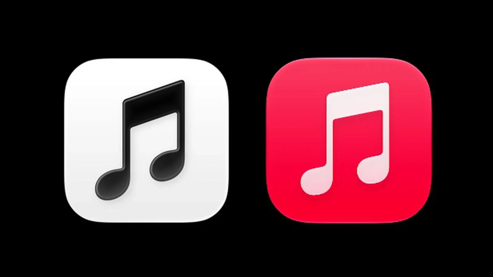
Apple Music appears to be putting its famous red note through a monochrome wash, and plenty of people are not ready to press play on the change.
In iOS 27.2 beta 4, Apple Music is showing a much simpler black-on-white app icon, with an inverted white-on-black version for dark mode. The shift removes the bright red background associated with the service’s beamed eighth note for roughly 13 years. It may be a small square on a phone’s home screen, but it is also a familiar visual shortcut—and the early response suggests that shortcut carried more personality than its size implied.
Critics have called the new look boring, generic, and needlessly drained of charm. The mockery has been particularly pointed: the icon has been described as “emo,” while another reaction framed it as the kind of design associated with a deliberately amateur graphics exercise. Not everyone is mourning the red, however. A smaller group has praised the cleaner approach, with one early observer saying the older color never made much sense to them.
The disagreement is useful because it is not really about whether black and white are good colors. It is about recognition, habit, and the particular job an app icon is expected to do.
What appears to be changing
The reported redesign is broader than simply replacing red with grayscale. The music note is tilted a little further left than before, the lower portions of the note shapes look more oval, and a very light drop shadow sits beneath the bar and notes. A drop shadow is a subtle darker edge or offset shape that gives a flat image a sense of separation from its background. In this case, it is a small adjustment, not a dramatic 3D effect.
Apple also has a “Clear” version of the icon, and the icon can be tinted in different colors in the same way as other compatible icons. That flexibility could make the mark feel more at home among customized home-screen layouts. Yet it also changes the relationship between Apple Music and its traditional red. Instead of color being a fixed part of the service’s identity, the operating system or the user can potentially take over that decision.
The color changes do not appear limited to the icon. Apple has also removed red from Apple Music home-screen widgets and changed the app’s pink-red internal tint to blue. Taken together, those adjustments make this look less like an isolated icon cleanup and more like a visual reorientation for the app.
The apparent move follows a change to the full Apple Music wordmark, which was seen with the launch of Apple Music Hall, Apple’s venue in London. That version used a heavier all-lowercase treatment. Wordmarks and icons serve different purposes: a wordmark is the brand name rendered in a particular style, while an app icon has to remain recognizable at a glance, often without any accompanying text. Altering both can make a brand update feel more comprehensive, even when each individual tweak is restrained.
Why the old red icon inspires such a strong response
The prior Apple Music icon had an unusually direct visual formula: a red field, a white music note, and very little ambiguity about what it represented. Red made it especially easy to locate in a crowded app grid. The new design remains music-themed, but its most obvious differentiator is no longer a fixed brand color. For people who learned to find the service by scanning for red, that is a real practical change, however minor it may sound.
That familiarity can also explain why an objectively modest redesign reads as larger than it is. Home-screen icons become visual muscle memory. People do not necessarily stop to read their labels; they identify a shape, placement, and color, then tap. When one of those cues moves, the experience can briefly feel like finding the kitchen cupboards rearranged. Nothing has disappeared, but the routine has been interrupted.
There is a tension at the heart of the reaction. Minimalism can make a design feel calm, contemporary, and adaptable. It can also make the design feel interchangeable if the removed details were doing important identity work. The early criticism is essentially an argument that Apple Music’s red was not decorative excess. To these users, it was the component that made the icon feel distinctively like Apple Music.
Supporters see the same subtraction differently. A black-and-white mark can be perceived as more focused and less arbitrary, particularly when the core music-note symbol remains intact. The new treatment may also fit a wider interface language in which icons can be displayed in light, dark, clear, or user-tinted modes. That does not settle the aesthetic debate, but it clarifies a possible reason a fixed red identity could give way to something more neutral.
Beta means visible, not necessarily final
One important qualification remains: iOS 27.2 beta 4 is prerelease software. A beta is a version made available for testing before a general release, meaning elements visible there can still be revised. The icon’s appearance in that build is strong evidence of Apple’s current direction, but it is not an ironclad guarantee that every detail will ship unchanged.
Apple could adjust the artwork, reverse the broader color changes, or retain the redesign in a modified form. There is no indication here that a final public rollout is confirmed, and it would be premature to treat the beta icon as a permanent fait accompli. At the same time, Apple has a history of holding to interface and icon decisions even after the first wave of complaints, so the existence of backlash alone should not be assumed to alter the plan.
This is also why the intensity of online reaction should be read carefully. It demonstrates that the redesign has active detractors, not that every Apple Music listener rejects it. Social reactions tend to favor strong opinions, especially when a familiar everyday object has changed. The favorable responses matter too: some users plainly prefer the stripped-back look and consider the removal of red an improvement.
A tiny branding decision with a bigger interface effect
For players and tech users alike, this is a reminder that platform design is part of the daily experience, not merely packaging. The same applies when a console dashboard moves a library shortcut, a launcher changes its visual hierarchy, or a companion app swaps out a recognized color. Functionality may be identical while the emotional response is anything but.
Apple’s broader software design choices have been drawing attention elsewhere as well. Its interface work around connected devices, for example, has included new visual options and room-oriented controls in Apple HomeView’s temperature and humidity sensor update. Apple Music’s new visual direction fits that larger reality: software branding is no longer confined to a logo on a website. It appears in widgets, in-app accents, dark mode, tinting systems, and the instant a user unlocks a phone.
The practical implication for Apple Music users is currently modest. The service is still identified by a musical-note symbol, and users who rely on labels, search, or a consistent app position will have other ways to find it. But for those who navigate visually, the lost red block may create a short period of friction. The addition of tinting may soften that for people who want a particular home-screen palette, while making the icon less consistent from one device to another.
Whether the redesign ultimately earns affection will likely depend on repetition more than first impressions. Familiar interfaces acquire emotional weight because people see them constantly. A new icon starts with the disadvantage of being unfamiliar, especially when it replaces one that was both colorful and distinctive. If Apple keeps this direction, black-and-white Apple Music may eventually feel normal. For now, the beta has made one thing clear: a red square with a white note was doing more branding work than many people realized.