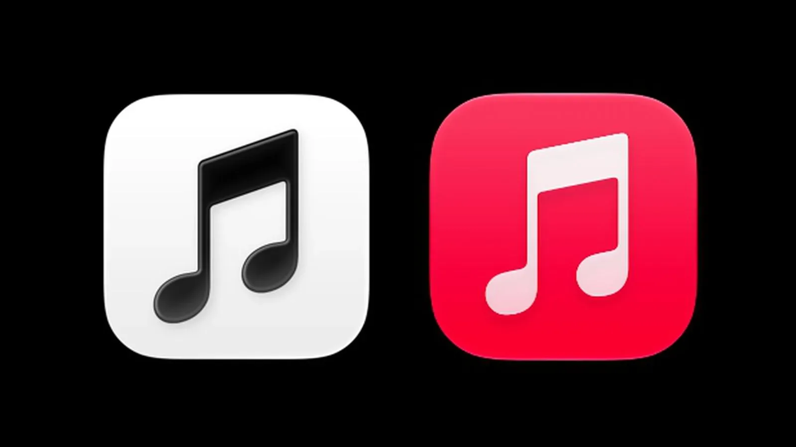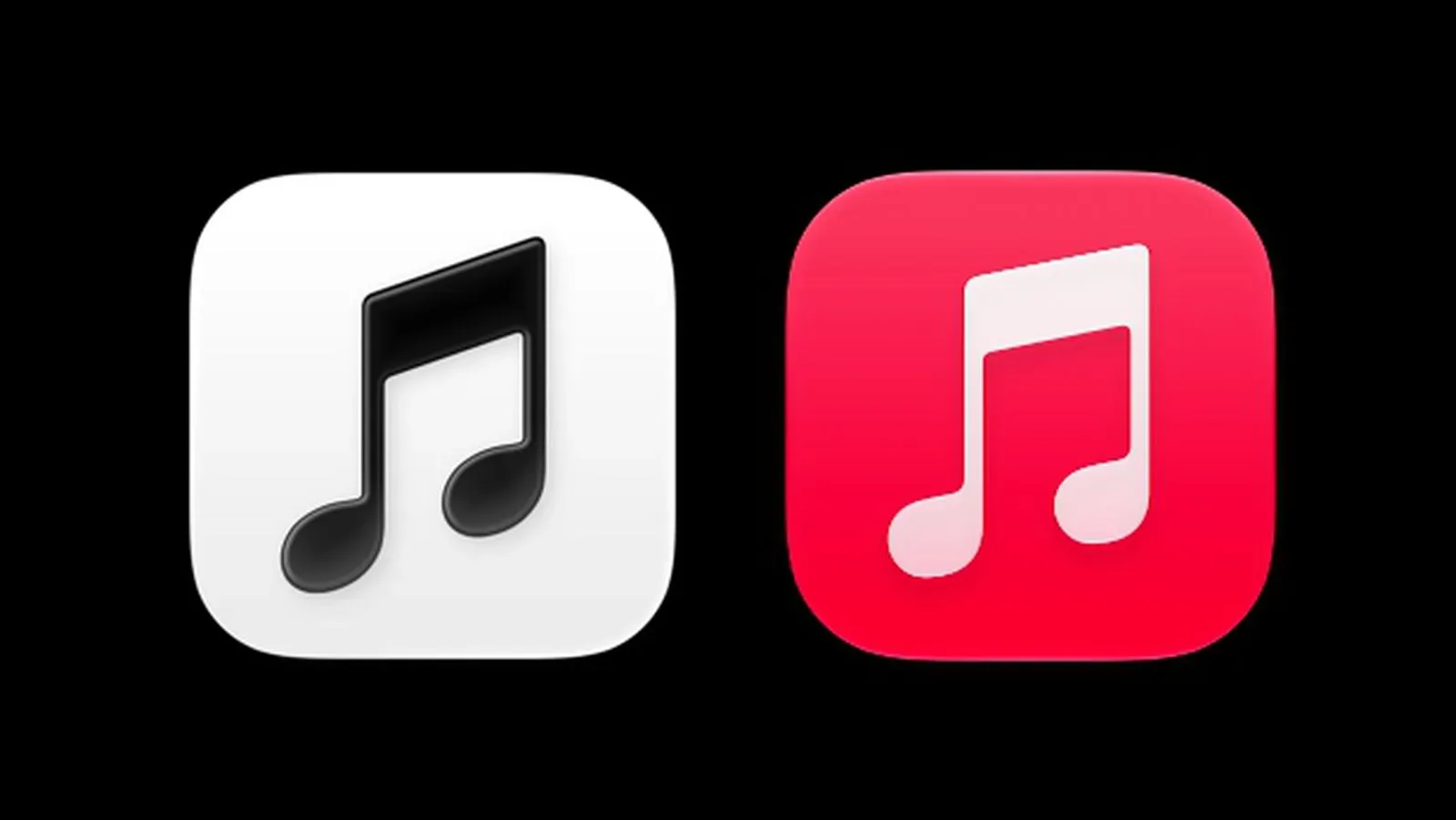
Apple Music is getting a quieter look in the fourth beta of iOS 27.2. The service’s familiar red-and-white app icon has been replaced with a black-and-white version, aligning the app’s home-screen appearance with a newly introduced Apple Music logo.
The change is simple, but highly visible. App icons sit in one of the most repeatedly viewed parts of a phone interface, and a switch from a saturated signature color to monochrome changes how a service is recognized at a glance. Apple Music’s new treatment uses a black logo on a white background in light mode, then flips to a white logo on black when dark mode is active.
A monochrome icon built around system appearance
Light mode and dark mode are interface appearance settings that alter an operating system’s general palette. Light mode commonly emphasizes pale backgrounds and dark text; dark mode reverses that relationship with darker surfaces and lighter text. In Apple Music’s revised icon, the mark follows that same contrast logic rather than keeping one fixed brand color across both settings.
That means the icon is not merely a white tile that happens to contain a dark symbol. It is designed to invert: black-on-white in light mode, white-on-black in dark mode. The approach gives the icon a more system-responsive identity while maintaining strong contrast in each appearance.
For people who organize their home screens around color, this is likely the practical difference they will notice first. The old red accent made Apple Music immediately stand out among more muted apps. The new design is more restrained, designed to blend into an interface where black, white, and shades of gray carry more of the visual hierarchy.
The app icon follows an earlier Apple Music logo refresh
The icon update follows the debut of a refreshed Apple Music logo earlier in the iOS 27.2 cycle. That updated branding has also appeared in promotional material connected to the recent Apple Music Hall announcement. The progression matters: Apple has first established a revised logo and is now applying that visual direction to a core daily touchpoint for the service.
In branding terms, a logo is the identifying mark used across a product’s communications, while an app icon is a compact interface asset intended to be found and tapped on a device. They often overlap, but they solve slightly different problems. Marketing materials have room for surrounding typography, photography, and layout. An icon has to work at a very small size, amid a grid of competing symbols.
By making the app icon monochrome and using the revised logo, Apple is giving the service a more direct visual connection between its promotional identity and its iPhone presence. There is no indication here of a change to Apple Music’s listening features, catalog, subscription terms, or controls. This is a visual identity update.
Why an icon-only change can still feel substantial
On a device, the home screen is a product’s front door. Even users who spend hours inside a music app may only interact with the icon for a second at a time, but they do so frequently. A branding change at that entry point can therefore feel larger than its technical scope.
The former red-and-white design gave Apple Music a strong color association. Moving to black and white shifts emphasis toward shape, contrast, and the updated logo itself. That can be read as a move toward a more neutral, adaptable identity—particularly because the icon changes alongside light and dark mode—though Apple has not detailed the design rationale.
Analysis: The design also reduces the chance that the icon’s appearance clashes with an interface preference. A red icon always remains red regardless of whether a user prefers a pale or dark home-screen environment. A black-and-white icon that reverses with the system setting takes on a more integrated role. The trade-off is that it gives up some of the instant color-based distinction associated with the earlier version.
That trade-off is not automatically good or bad. High-contrast monochrome graphics can be very legible, and the inversion described for the new icon preserves contrast in both modes. But red has long served as a quick visual cue for Apple Music, so regular users may need a little time to adjust to the changed home-screen silhouette and palette.
What iOS 27.2 beta users should expect
The revised icon is present in the fourth iOS 27.2 beta. As with any beta software detail, it is best understood as part of the version currently being tested rather than a guarantee about a final release. The supplied information identifies the design in the beta but does not establish a public release date for iOS 27.2 or describe whether further visual adjustments are planned.
Users who encounter the update should see the black logo against white when their device is set to light mode, and the reversed white-on-black treatment in dark mode. The underlying point is visual consistency, not a newly described playback capability or a newly announced service tier.
It is also worth separating a brand refresh from a functional redesign. A new icon can signal an evolving service identity, especially when it accompanies a new logo and a venue-related promotional campaign, but it does not by itself reveal changes to music discovery, audio quality, library management, or artist tools. Those would require their own explicit product details.
A small home-screen signal for a broader music brand
Apple Music’s icon refresh arrives as the service’s updated logo is being used in more than one context: within iOS 27.2 and in material tied to Apple Music Hall. The black-and-white app mark is therefore less an isolated coat of paint than a compact expression of an identity Apple is now using more broadly.
The update also lands in a wider music-culture moment where brand presentation, artist partnerships, and platform identity frequently intersect. For another recent music-business story, see the report on A$AP Rocky and FERG’s distributor-search exchange.
For Apple Music users, the immediate change is uncomplicated: find a monochrome icon where the red-and-white one used to be. In light mode it presents a black logo on white; in dark mode, a white logo on black. The fourth iOS 27.2 beta makes that branding shift visible every time the app appears on the home screen.