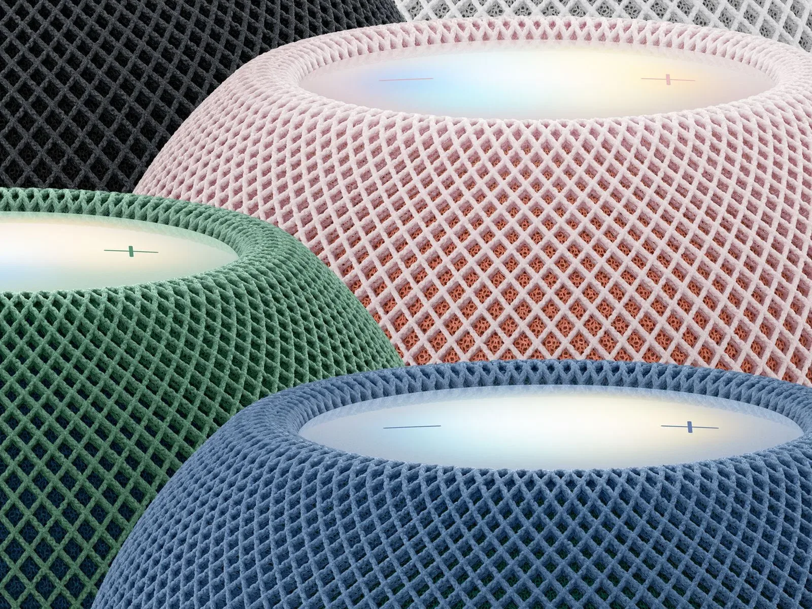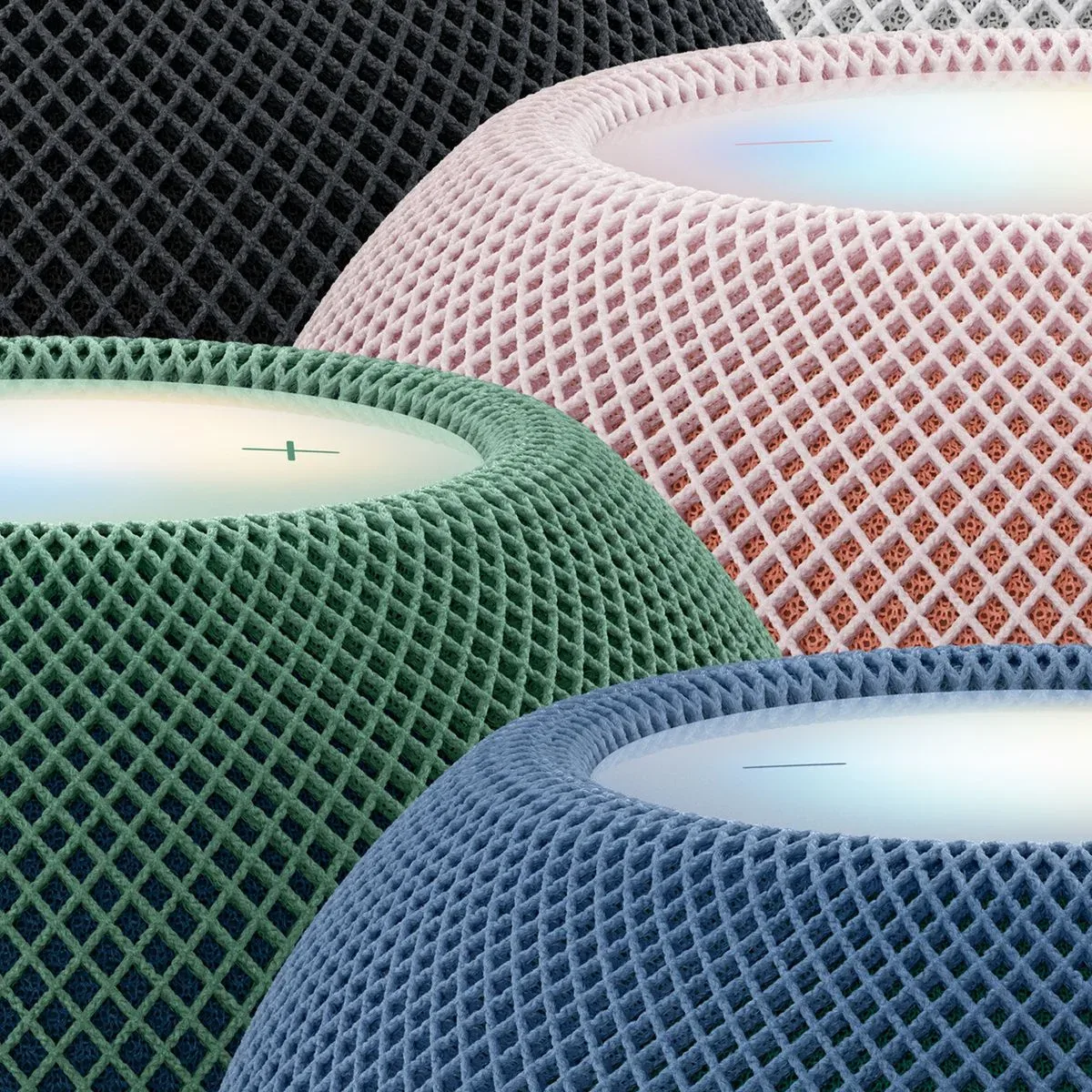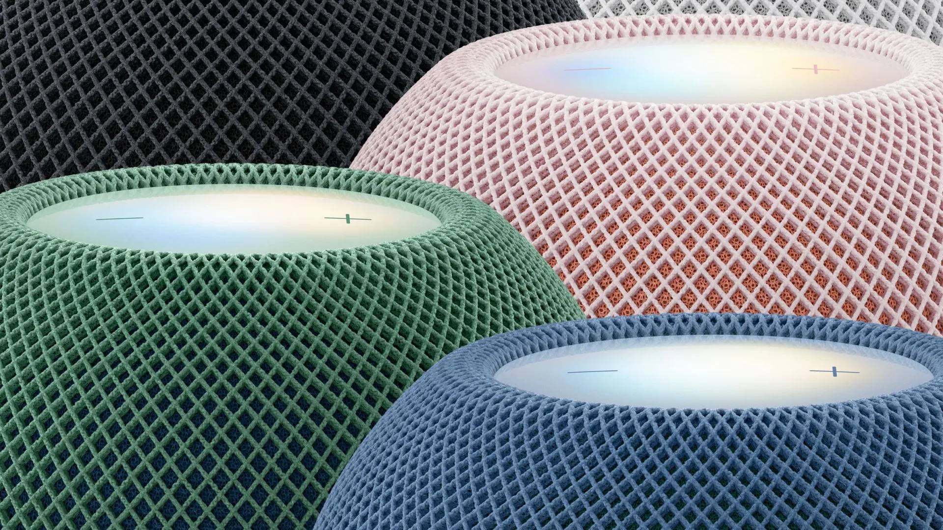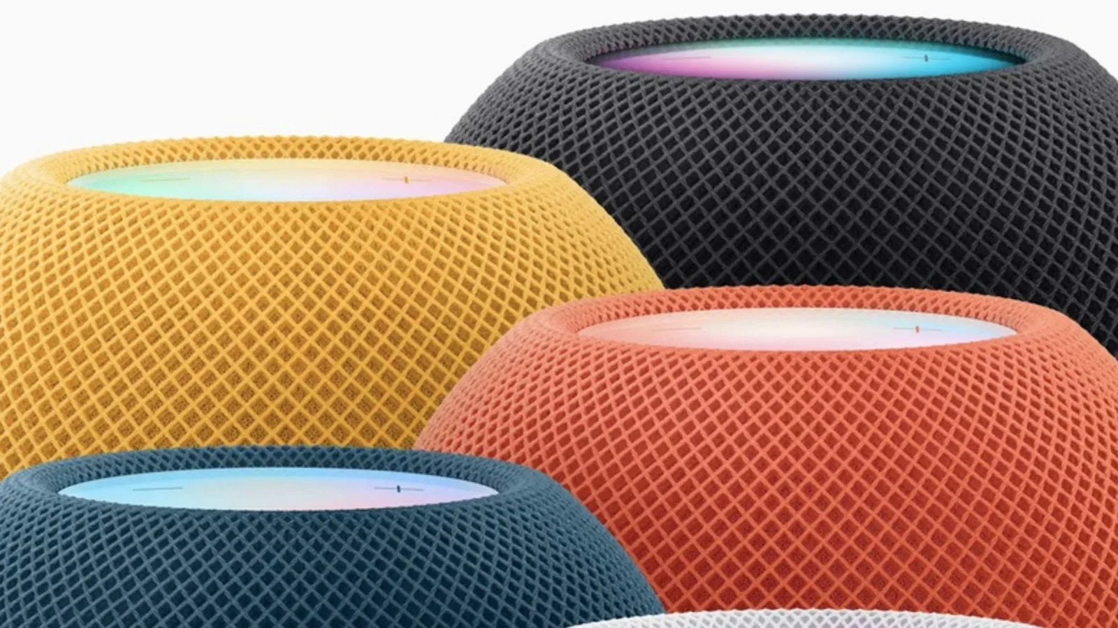

The HomePod mini 2 is nearly here, and a close-up look at its exterior answers a small but surprisingly important design question: the new colors are not simply single shades wrapped around the speaker. Several finishes use two visibly different layers of acoustic fabric, giving the compact smart speaker more depth than the original HomePod mini.
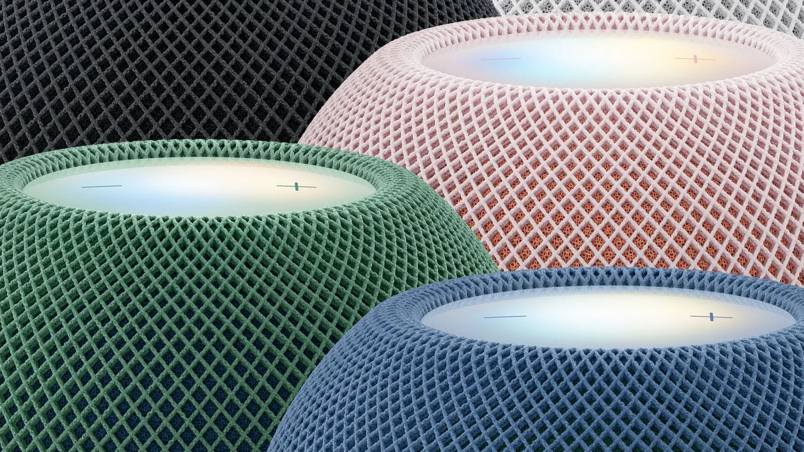
That distinction is easiest to spot on the pink, blue and green versions. The effect comes from the way the outer mesh and the fabric layer beneath it use contrasting colors. It is a cosmetic change rather than a stated audio feature, but it gives each unit a more dimensional appearance when viewed up close or in changing light.
How each HomePod mini 2 color differs
The pink model combines a light-pink outer layer with a coral-toned fabric beneath. Rather than presenting one uninterrupted pastel surface, the material reveals warmer color from below the mesh.
The blue and green models take the idea further by effectively pairing the two colors together. The blue speaker uses blue on the outside and green underneath, while the green speaker reverses that combination: green mesh on the exterior and blue beneath it. They are not identical products with a simple color swap; the layers are intentionally arranged as opposites.
- Pink: light-pink outer mesh with a coral inner layer.
- Blue: blue exterior mesh with green beneath.
- Green: green exterior mesh with blue beneath.
- Midnight and white: a two-tone appearance is present, though more restrained than on the brighter options.
“Acoustic fabric” here means the cloth-like material covering the speaker. It must allow sound to pass through while also serving as the device’s visible exterior. With the HomePod mini 2, the layered construction is part of the finish itself: the mesh lets a second color show through rather than concealing it completely.
A subtle revision to a familiar silhouette
The original HomePod mini also used a mesh-fabric exterior, so this is not a move away from the product family’s established look. The difference is that the earlier model did not have this two-tone treatment. The second-generation design keeps the material language but uses it more deliberately as a visual detail.
That matters because the HomePod mini’s compact form leaves relatively little room for ornamental hardware. There are no large panels or interchangeable faceplates described here; the fabric finish is the dominant visual surface. Changing the relationship between its outer and inner layers is therefore a meaningful way to make the newer model distinguishable without abandoning its recognizable shape.
The bright variants seem designed to make that difference obvious. Pink shifts between a pale exterior and a more saturated coral interior, while the blue and green versions create a cooler, complementary contrast. Midnight and white appear to preserve the same general layered idea without putting the contrast front and center. For someone choosing between finishes, that suggests the bright colors are the most expressive options, while the neutral choices remain comparatively understated.
What buyers can actually take from the close-up
This new material detail should be understood as an appearance change, not evidence of a change in sound performance. A speaker grille or fabric covering is functional because sound travels through it, but the available look at these units only establishes the colors and layering. It does not establish any difference in audio output, smart-home capability, controls, or other specifications between finishes.
In practical terms, the two-tone effect is likely most relevant for placement. A HomePod mini is the kind of device often left in open view on a desk, shelf, bedside table or entertainment unit. In those settings, a finish that looks flat in a product listing can look more textured and colorful in person. The contrasting layers could also make the blue, green and pink versions better suited to spaces where the speaker is meant to contribute to the decor rather than disappear into it.
Conversely, anyone looking for a quieter visual fit may find midnight or white more appropriate, based on their subtler treatment. The important caveat is that the effect depends on close viewing and the lighting around the fabric. The layer beneath the mesh is a detail of construction, not a dramatic color split that turns the speaker into a striped object from every angle.
Why the blue-and-green pairing is the standout choice
The most interesting decision is the reciprocal blue-and-green design. Instead of limiting each product to a tonal variation of its named color, the two finishes share the same pair in opposite positions. This creates a degree of connection between them: blue is not merely blue, and green is not merely green.
It is also a useful distinction for people comparing the options online. Product names alone can imply that each model has a uniform exterior. The close-up makes clear that blue and green are complementary layered treatments, while pink has its own pink-and-coral combination. That is the kind of detail that can be missed in broad promotional imagery but may matter to buyers who are particular about the way fabric, texture and color interact.
The HomePod mini 2 is set to launch the day after the report’s October 29 publication, with Australia and New Zealand reaching that point earlier because of time-zone differences. The close-up footage identifies the fabric colors before retail availability and provides a clearer reference for comparing the five finishes.
Apple hardware design is often clearest in close-up
The HomePod mini 2’s layered mesh is a reminder that product color can be more than a paint choice. On devices dominated by fabric or other textured materials, an outer surface, the material under it and the way light passes through both can all contribute to the final appearance.
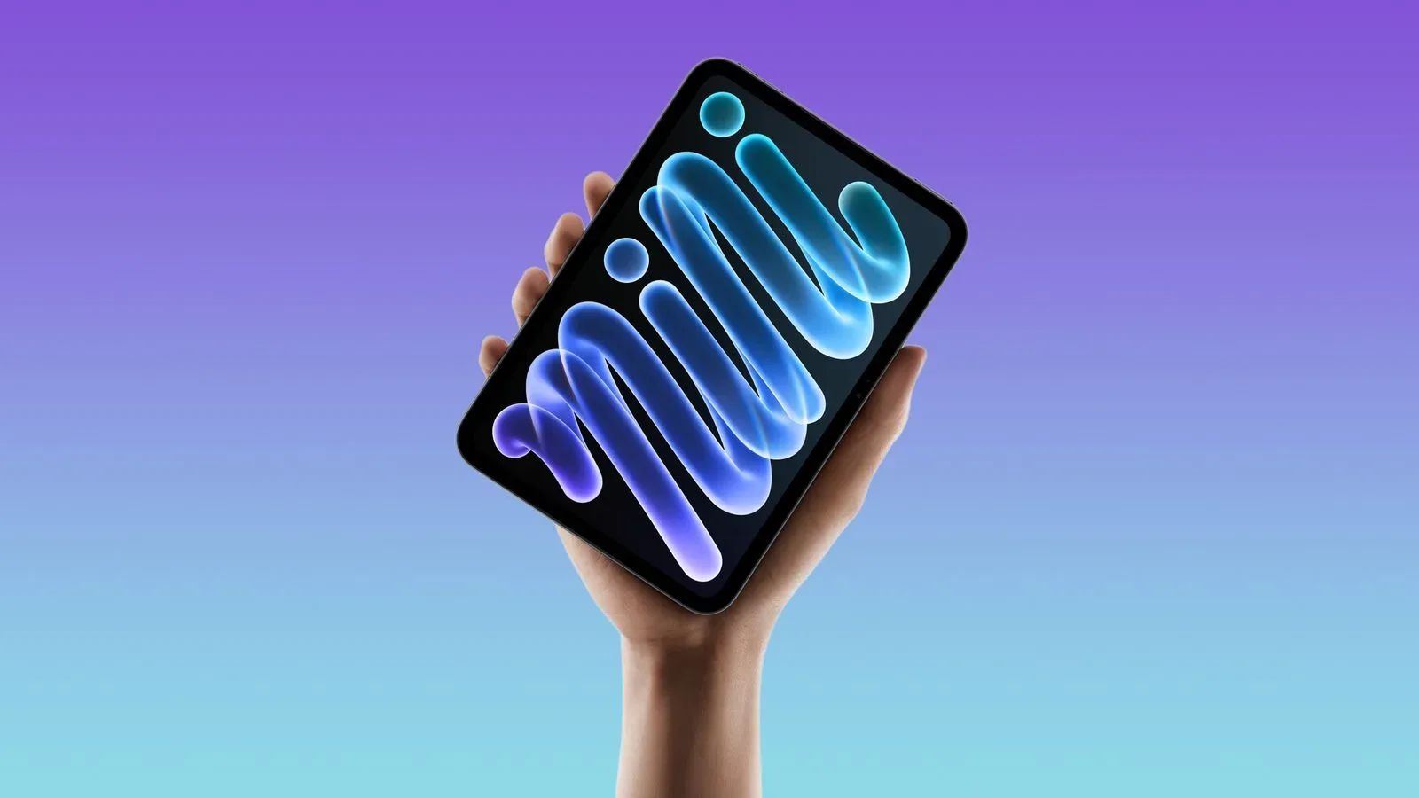
That broader attention to visible panel behavior has also been part of recent Apple-device discussion. For example, the debate around the OLED iPad mini’s 60Hz display and faster pixel response centers on how technical display characteristics affect what users perceive. The HomePod mini 2 situation is much simpler: there is no performance claim attached to the fabric layers. Still, both examples show why a specification sheet or a single front-facing product image may not fully communicate a device’s real-world presentation.
For the HomePod mini 2, the decision comes down to aesthetic preference. The pink, blue and green models place the new two-tone concept at the center of their identity. Midnight and white apply it more quietly. And compared with the original HomePod mini, every version adds a small visual cue that helps identify the new generation while retaining the familiar fabric-covered design.