Samsung’s One UI 9 is putting more of a Galaxy phone’s day-to-day interface in the owner’s hands. Its headline additions may include My Fancam, a video feature designed to keep the user at the center of a clip, but the quieter changes are arguably more practical: a revised set of customization tools for the home screen, Edge Panel, gestures and Quick Panel.
The overall result is less about a single flashy switch and more about reducing friction. A phone can now be arranged around the controls someone reaches for, the visual treatment they prefer, and the shortcuts that make sense in their own routine. Think of it less as swapping a wallpaper and more as tuning a game’s control layout: the underlying game is the same, but where the important actions live can make the whole experience feel more natural.
For people who use Samsung’s Good Lock suite and its Home Up module, One UI 9 adds particularly detailed options. Meanwhile, the Quick Panel—the pull-down area used for system controls—can be reorganized, resized and pared back with substantially more freedom than a fixed grid of buttons permits.
Good Lock and Home Up are the key starting point
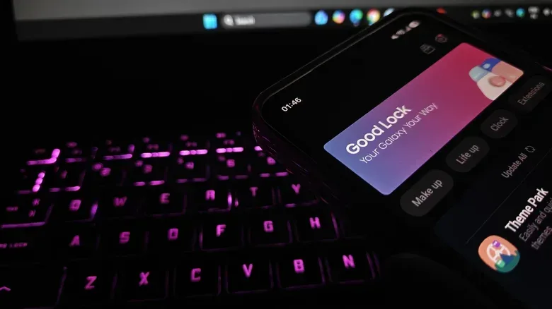
The customization described here is centered on Samsung’s official Good Lock suite and its associated Home Up application. That distinction matters. One UI 9 supplies the platform-level changes, but Home Up is where much of the granular configuration is exposed. Galaxy owners looking for the new options should begin by ensuring they have both Good Lock and Home Up available on their device.
Home Up’s additions include a new Favorites Background setting in its Home Screen area. The name is direct: it controls the backdrop behind the Favorites portion of the home screen. Once the option is enabled, the setting opens controls for blur and shadow effects, image and color changes, and broader visual alterations to that background.
That may sound cosmetic, but visual separation can serve a functional purpose. A background, shadow or blur effect can make a frequently used row of apps easier to distinguish at a glance from the wallpaper and other home-screen elements. The important point is not that there is one universally best look; it is that One UI 9 lets the user decide whether Favorites should blend into the screen or read as its own deliberate zone.
A similar set of choices is available for the Edge Panel through the corresponding Home Up section. The Edge Panel is the part of the interface that provides rapid access to selected items from the screen edge. Giving it comparable background control helps a user keep the visual language consistent—or make the panel intentionally stand apart when it needs to be noticed quickly.
This is a welcome direction for anyone who treats a phone as a tool rather than an unchangeable appliance. Interface personalization often gets dismissed as decoration, but its useful version is about recognition and repeatability. If two frequently used areas are visually distinct, the user may spend less time hunting for them. If a panel is styled to match the rest of the setup, it can also feel less like an intrusive overlay.
Related coverage includes One UI 9 Gives Samsung Users More Ways to Shape Their Phone.
Multi-finger gestures turn touch input into configurable shortcuts
One UI 9 also broadens the gesture options in Home Up. Users can associate particular actions with swipes or pinches performed using two, three, four or five fingers. Examples include setting a two-finger downward swipe to take a screenshot or raise the volume.
A gesture is simply a touch movement that the device interprets as a command. In this case, the new layer is the number of fingers involved. Rather than treating every downward swipe identically, the system can recognize that a two-finger swipe is an intentionally different input from a standard one-finger movement.
The appeal is clear: shortcuts can be placed on actions rather than screen real estate. Someone who frequently captures screenshots might prefer a gesture to locating a control every time. Someone else could favor a gesture for volume changes. One UI 9 provides a range of movements and available actions across two- through five-finger inputs, allowing a setup to be made more personal than a small handful of preset gestures would allow.
There is a practical caveat, even without assuming how any individual gesture behaves in every app: more configurable inputs can also mean more to remember. The best starting point is likely a restrained one. Choose one repetitive task that already interrupts your flow, attach it to a motion that is easy to perform deliberately, and give it time to become automatic before filling every available gesture slot.
That approach makes the feature useful rather than merely novel. A shortcut is only faster if it is dependable in the user’s memory. Assigning distinct movements to a small number of recurring tasks is often more valuable than building an elaborate gesture map that has to be recalled like a cheat-code sheet.
The Quick Panel becomes an actual workspace
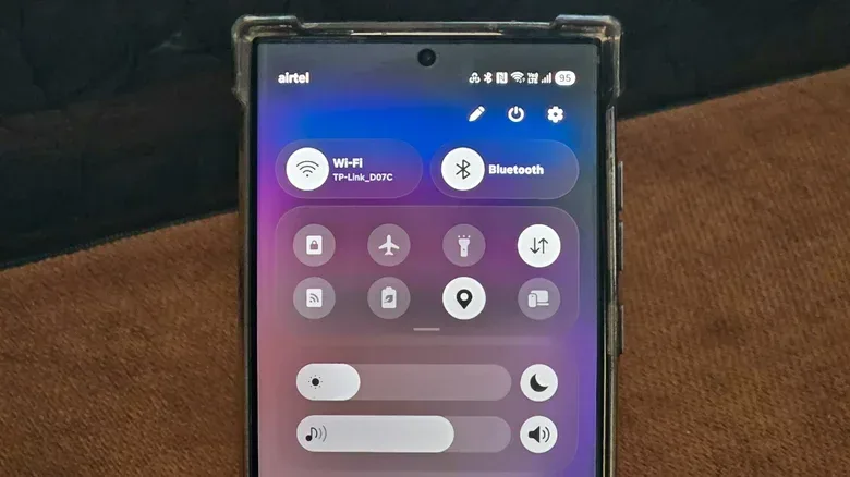
The Quick Panel sees perhaps the most immediately visible One UI 9 change. It is the system-control area reached from the phone interface, home to toggles and other controls. In One UI 9, tapping its Edit icon opens layout tools that make the space far less rigid.
Within the editor, users can drag elements to different positions, resize them by dragging the right corner, or remove them entirely. Removed toggles are not necessarily gone for good: the Add a control option can bring them back so they can be placed elsewhere.
That creates a straightforward workflow. First, remove controls that do not deserve valuable space. Then place the ones used constantly where your thumb or eyes reach them fastest. Finally, expand controls that benefit from greater emphasis and reduce those that are useful but less urgent. It is interface arrangement with the same basic logic as organizing an inventory: priority items go where access is quickest, while rarely used items need not occupy the most prominent slot.
One UI 9 also removes sizing caps for individual Quick Panel elements. In plain terms, the earlier limits on how much an item could be resized no longer apply. This is more than an aesthetic change. Size is a form of priority: a larger control is easier to spot and establishes a clearer hierarchy inside a crowded interface.
The Edit menu also offers Panel Settings > Together, which changes controls from separate panels to a unified shade. A unified shade puts those controls into one combined pull-down space instead of splitting them apart. Whether this is preferable depends on how a person approaches their phone. Users who value having related controls in a single place may favor the unified arrangement, while others may prefer separation if it keeps their most-used functions more distinct.
The meaningful upgrade is choice. Quick settings are typically accessed when the user wants to change something immediately, so a layout that reflects actual habits has a stronger practical case than a one-size-fits-all grid. Samsung’s changes let owners make that decision at the level of placement, scale and grouping rather than only choosing which toggles appear.
How to approach One UI 9 customization without creating a mess
One UI 9 offers enough options to reward a deliberate setup. The temptation is to change every available visual and behavioral setting at once; the more effective route is to identify where the current interface slows you down.
- Start with the Quick Panel. Identify the controls you use most and move those first. Remove anything that constantly occupies space without serving a regular purpose. Use resizing to make visual priority match real-world priority.
- Decide on panel behavior. Use the Together option only if a unified shade makes the controls easier to reach and parse for you. It is a layout preference, not an automatic upgrade.
- Set one gesture for one recurring job. Screenshot capture and volume adjustment are examples of actions that can be assigned to multi-finger gestures. Start small enough that the command becomes instinctive.
- Make visual changes serve clarity. Favorites Background and Edge Panel controls can be used for color, images, shadows and blur. Pick treatments that help important areas stand out, rather than effects that make the screen busier.
- Refine after normal use. A layout that looks impressive in the editor may not be the layout that works best during a rushed day. Keep only the changes that reliably make actions faster or make the screen easier to read.
This sort of tuning has a natural overlap with how players approach game settings. A controller configuration is not inherently “correct” because it is elaborate; it is correct when it helps a player act without thinking about the control scheme. The same principle applies to a phone’s Quick Panel and gesture setup. It is worth considering why interface choices can matter as much as a game’s deeper systems in this look at the systems that help a classic god game retain its sense of life.
Small interface choices can add up
One UI 9 does not need to reinvent Samsung’s interface to change how a Galaxy phone feels to use. A customizable Favorites Background gives a common home-screen area more identity. Edge Panel styling adds another layer of control. Multi-finger gestures can convert repeated taps into personal shortcuts. And the expanded Quick Panel editor lets users decide which controls matter, where they sit and how large they should be.
Not every Galaxy user will want, or need, the deepest Home Up configuration. But people who have felt constrained by a static home-screen treatment or a fixed quick-settings arrangement now have more room to shape the interface around their habits. That is the strength of One UI 9’s customization push: it emphasizes adjustments that can be seen, reached and repeated every day.