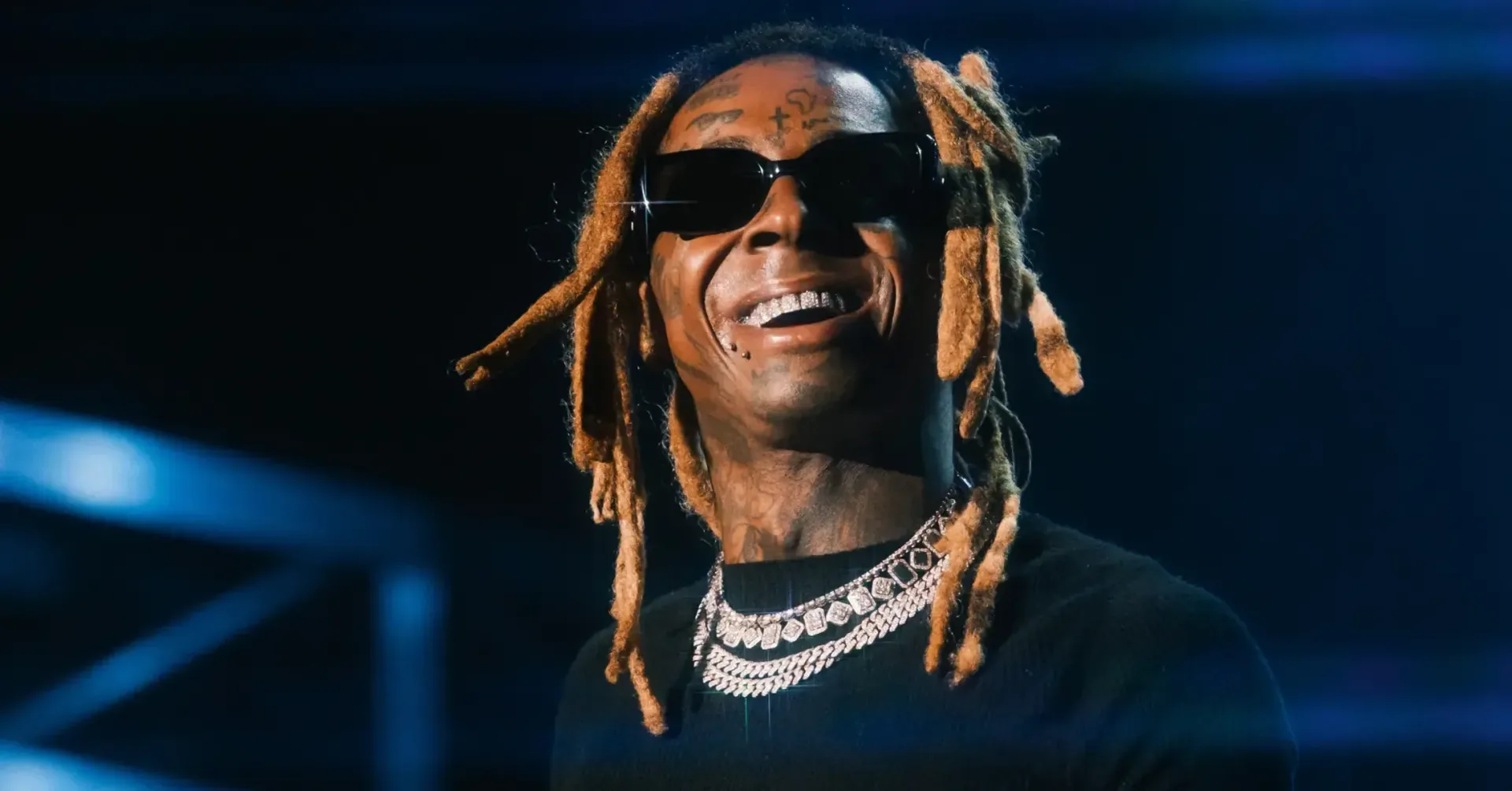
Lil Wayne has recalled an early branding collision between Young Money and one of baseball’s most recognizable visual identities. Speaking on The Joint Venture Show with Craig Carton, Wayne said the New York Yankees sent him a cease-and-desist letter because an early “YM” logo was viewed as too similar to the MLB club’s mark.
The story surfaced while Wayne was discussing a Miami condo he had at age 19. Its door carried the Young Money logo as a gift, he said, before the Yankees intervened. Wayne’s retelling was notably lighthearted: he said he changed the logo, described the Yankees as “legends,” and said receiving the letter made him feel cooler rather than offended.
“They just sent cease and desist. I had to stop using it,” Wayne said, explaining that the “YM” was changed after the Yankees objected to its resemblance to their branding.
That is an important distinction in the way the anecdote should be read. Wayne described receiving a cease-and-desist, not a courtroom case or a reported final legal ruling. A cease-and-desist is a demand that a party stop an activity—in this instance, the use of a logo—because the sender believes that activity conflicts with its rights or brand. It can be a step toward a dispute, but the account here does not establish that litigation was filed.
A small logo, a very recognizable association
The point of contention, as Wayne described it, was the visual similarity between a Young Money “YM” and the Yankees’ famous lettering. Two initials can appear simple on paper, but logos do much more than spell a name. Their shapes, overlap, spacing, proportions and overall presentation can create an immediate association in the minds of fans and consumers.
That association is the practical issue behind Wayne’s memory. Young Money was a Cash Money offshoot, and its logo was part of a larger artist-and-label identity. The Yankees’ mark represents a major sports franchise. When two marks are close enough in look or feel that people might connect them, a brand owner may object—even where the initials themselves are not identical in meaning.
Wayne did not offer a detailed account of the correspondence, the exact prior version of the mark, or the date the exchange occurred. He did make the outcome clear from his perspective: the Young Money logo changed. That makes the episode less a story about an extended public fight and more a compact example of what can happen when an emerging creative brand shares visual territory with a much older, heavily recognized one.
What “brand identity” means here
Brand identity is the set of visual signals people use to recognize a person, group or company. A logo is the most obvious part, but placement and repetition matter, too. A mark on a condo door, an album-era graphic, apparel or promotional material can turn a pair of letters into a recognizable calling card.
For an artist-led collective such as Young Money, that recognition has cultural value. The name identifies the people and music connected to it. The visual mark gives that name a quick shorthand. For a sports organization such as the Yankees, branding has a similarly broad role: it signals the team and carries years of public familiarity. Wayne’s account shows why seemingly small design decisions are not always small once the design begins appearing in public.
There is also a useful creative takeaway: initials are common, but common letters do not automatically produce a distinct logo. The more a new design calls to mind an established mark, the more difficult it can become to separate the two in public perception. Wayne’s response—altering the Young Money look rather than making the disagreement a prolonged feud—was a pragmatic solution based on his own recollection.
Wayne treated the letter as a surreal career anecdote
The most memorable part of the story may be Wayne’s reaction. He did not frame the Yankees’ demand as a personal insult. Instead, he emphasized respect for the franchise and found novelty in receiving correspondence from it. That tone strips the moment of the usual celebrity-versus-corporation drama and turns it into an odd milestone from Young Money’s early rise.
It also reflects a recurring reality of successful artist brands: growth increases visibility, and visibility makes every element of identity more consequential. A logo that begins as an internal symbol or a gift for a home can acquire a wider cultural footprint. When that footprint overlaps with another established identity, the discussion can quickly become formal.
Wayne’s response, at least as he described it, was direct. He stopped using the challenged version and changed the logo. There is no supplied indication of financial terms, an ongoing dispute, or any current issue involving the Yankees and Young Money. The available account is therefore best understood as a retrospective anecdote rather than evidence of a new legal conflict.
Why the story lands beyond sports
The Yankees are central to the story, but Wayne’s public sports loyalties more often point elsewhere. He is a Green Bay Packers fan, and he recently vented online after the Packers lost to the Minnesota Vikings. He criticized the officiating and wrote that he was out on the NFL for the season, though the remarks read as the immediate frustration familiar to many fans after a difficult loss.
That contrast gives the Yankees story some extra irony. The baseball club appears in Wayne’s memories not as a team he was publicly rallying behind, but as the owner of a logo that prompted him to redraw part of Young Money’s identity. His response suggests admiration survived the correction. In his telling, being noticed by such an institution was part of what made the encounter memorable.
The episode also sits comfortably alongside wider conversations about musicians as entrepreneurs, where an artist’s name, collective and graphics can become as important to public recognition as individual releases. For another perspective on how rap artists discuss the relationship between fame and business, see Jay-Z’s reflection on fame and business.
The practical lesson for creators and fan projects
Wayne’s recollection is not legal advice, and it does not provide enough information to judge the particulars of the marks involved. Still, it offers a straightforward design lesson for artists, streamers, small labels, game communities and merch makers: before putting initials or a stylized emblem on public-facing material, consider not only what the design says but what it resembles.
- Letter choice is only the starting point. Two initials may be ordinary; a particular arrangement and style can make them feel strongly associated with someone else.
- Context changes the stakes. A symbol used privately can become more visible when placed on merchandise, promotion, social media or other public materials.
- A formal letter is not necessarily a lawsuit. Wayne’s story concerns a cease-and-desist demand, and the supplied details do not indicate a court case.
- Changing direction can preserve momentum. Wayne says he changed the Young Money logo and moved on, illustrating that a rework can be more useful than turning a design problem into a lasting distraction.
For fans, the story adds an unexpected footnote to an iconic hip-hop visual. The Young Money identity endured, but Wayne says one early iteration had to change because it was too close to a baseball giant’s branding. That is a compact reminder that logos can carry history, rivalry and cultural memory—even when the entire conflict begins with two letters on a door.