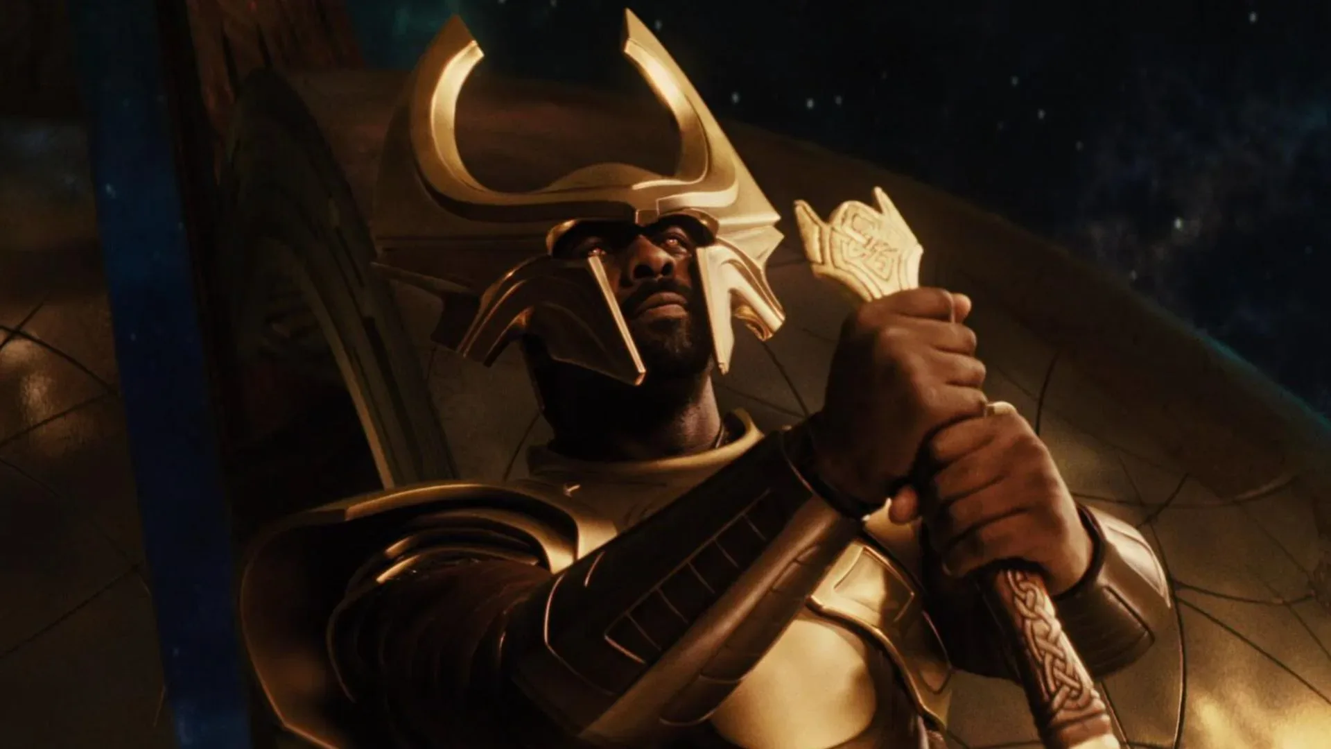
There are superhero movies with signatures you can recognize from a single frame: a particular color grade, a costume silhouette, a skyline, a familiar heroic landing. Kenneth Branagh’s Thor has another, slightly more gravitationally suspicious calling card. The world often leans.
Branagh has revealed that the 2011 Marvel film’s abundant canted, or Dutch, angles were apparently controversial enough that there was at least a conversation somewhere within the wider Marvel operation about what it would cost to make the movie level again. The proposed remedy was described as “horizontalizing” the film. Fortunately for fans of the movie’s committedly off-kilter look, Branagh said the expense attached to such an undertaking proved prohibitive.
It is an amusing behind-the-scenes detail, partly because “horizontalize” sounds less like a post-production process and more like a spell cast by a very budget-conscious sorcerer. But it also highlights a real creative tension in blockbuster filmmaking. A strongly authored visual choice can make a film feel unusual and memorable; it can also be exactly the thing someone else wishes looked more conventional.
For Thor, the diagonals were not an incidental flourish. They are baked into the movie’s identity.
A camera angle that refuses to stand still
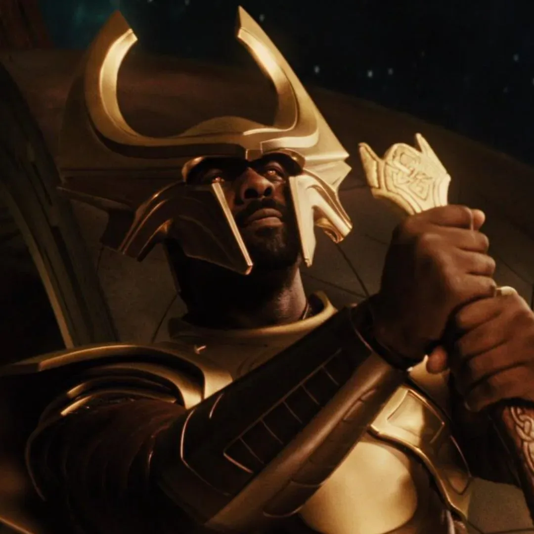
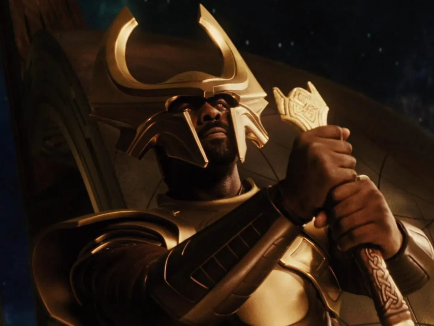
A Dutch angle is created by tilting the camera away from the ordinary horizontal and vertical alignment. Rather than placing walls, horizons, columns, and characters in a stable rectangular arrangement, the image creates diagonals. The result can suggest unease, instability, heightened emotion, fantasy, or a world that is simply operating according to rules other than everyday life.
Thor uses that vocabulary repeatedly. The technique makes shots feel like panels caught in the middle of a dramatic turn, which is appropriate for a film introducing Chris Hemsworth’s God of Thunder to the Marvel Cinematic Universe. Long before the character became an established member of the larger Avengers ensemble, the movie needed to bridge grand mythic material, family conflict, comic-book spectacle, and the comparatively ordinary setting of Earth.
Branagh’s explanation for the approach is straightforward: he was pursuing visual impact in a story about gods. He has tied the decision to classic Thor comic-book runs, where composition often has to communicate scale, movement, and operatic intensity in one still image. In that context, a camera that frequently tilts is less about making a scene look accidentally unbalanced and more about giving it a heightened, illustrated energy.
The visual choice also fits the film’s central contrast. Asgard is not meant to feel like a familiar civic space with slightly fancier architecture. It is a realm of thunder gods, royal disputes, impossible bridges, and enormous stakes. Even when the plot pauses for characters to talk, the framing can remind viewers that they are in a mythic arena rather than a routine superhero setting.
Why “horizontalizing” would not have been a simple correction
The phrase suggests an easy fix: rotate the frame and carry on. In reality, modifying a completed tilted shot can create practical problems. Rotating an image changes the usable shape of the frame. Corners may need to be cropped, enlarged, or rebuilt, and that can affect image quality and composition. Visual effects work, titles, transitions, and any carefully positioned detail can require further attention.
That does not mean every individual shot would necessarily have presented the same challenge. It does mean that changing the visual alignment of a movie defined by such shots could become a broad and expensive reconstruction effort rather than a quick polish pass. Branagh’s recollection that the price ruled out the idea therefore makes sense as a production reality, even before getting to the creative question of whether the film should have been changed at all.
More importantly, flattening the angles after the fact would have altered decisions made during filming. A composition is not merely a camera setting; it is where performers stand, what the audience sees first, how negative space works, and where a line or movement lands in the frame. Turning the entire image toward a conventional horizon might preserve the events of a scene while changing its intended rhythm.
That is the irony of the imagined “horizontalized” version of Thor: it could have been technically straighter but aesthetically less faithful to the original design. The visual slant was not a removable accessory. It was one of the devices Branagh used to put viewers inside the film’s particular version of godly drama.
Distinctive choices age into conversation pieces
Not every viewer responds to Dutch angles in the same way. Their intensity can make them conspicuous, and conspicuous filmmaking choices invite discussion. Yet that discussion is part of why the movie remains visually identifiable. In a franchise whose style has evolved significantly over many releases, Thor occupies a specific place: an early chapter that arrived with a boldly theatrical perspective.
The film helped establish Hemsworth’s take on Thor, but it also presented the character through a filmmaking lens shaped by Branagh’s interest in spectacle and dramatic composition. The approach is easy to notice on a rewatch because it is not trying to hide. The camera’s tilt repeatedly declares that this is a story of outsized personalities and supernatural stakes.
That quality can matter to comic-book adaptations. Source comics have room for visual exaggeration, explosive poses, extreme perspective, and layouts that would be impossible to mistake for naturalistic drama. Film cannot duplicate a printed page exactly, but it can translate some of that sensation through editing, color, costume, production design, and framing. Branagh’s angles were one way of carrying comic-book visual emphasis into live action.
For collectors and fans interested in Marvel’s physical history, these early stylistic differences are also part of the appeal. The MCU did not begin as a single fully settled house style. Its early films had to define different characters and tones, and Thor made an immediately recognizable choice about how its world should look. That makes posters, stills, home-video presentations, and other movie memorabilia tied to this era feel connected to a very specific aesthetic moment.
The same broader fascination with how screen stories are shaped runs through pop-culture coverage such as this look at a key plot device in Reacher season 4, though Thor’s camera-work debate is an especially literal example of form influencing the experience.
Thor’s next battlefield and Branagh’s current screen work
Thor is set to return in Avengers: Doomsday, where he will join the classic Avengers alongside the Fantastic Four and the New Avengers against Doctor Doom. Trailer material has pointed toward a battlefield confrontation between Thor and the new adversary, with catastrophic consequences teased for the God of Thunder.
That future appearance places Thor in a much larger crossover setting than the self-contained introduction Branagh directed. It also gives viewers another reason to revisit the first film and see how emphatically it established the character’s corner of the universe. Whether someone loves every canted shot or finds the effect gloriously excessive, the imagery is difficult to confuse with anything else.
Branagh, meanwhile, appears opposite Ryan Reynolds in the Apple TV action comedy Mayday. The film’s directors have said its Top Gun homage received approval from Tom Cruise. It is another reminder of Branagh’s long-running presence across very different kinds of screen work, from Shakespearean drama and detective stories to Asgardian family conflict and action-comedy territory.
As for that hypothetical flatter version of Thor, it remains an intriguing non-event: a potentially costly revision that never happened. The movie was allowed to keep its diagonal horizons, its comic-book force, and its unapologetically tilted view of the gods. In the end, the budget appears to have protected one of the film’s most divisive and enduring features.