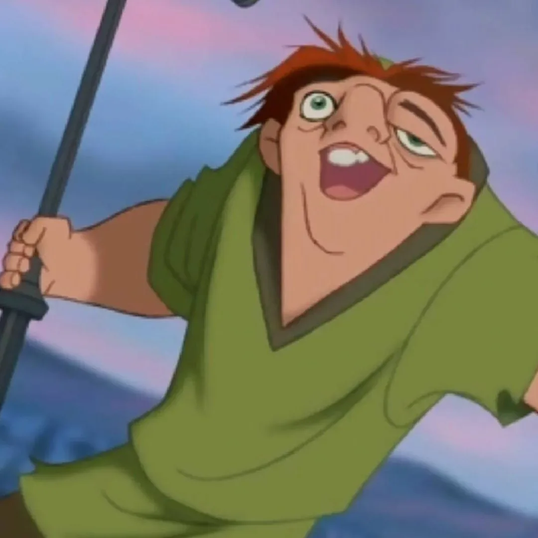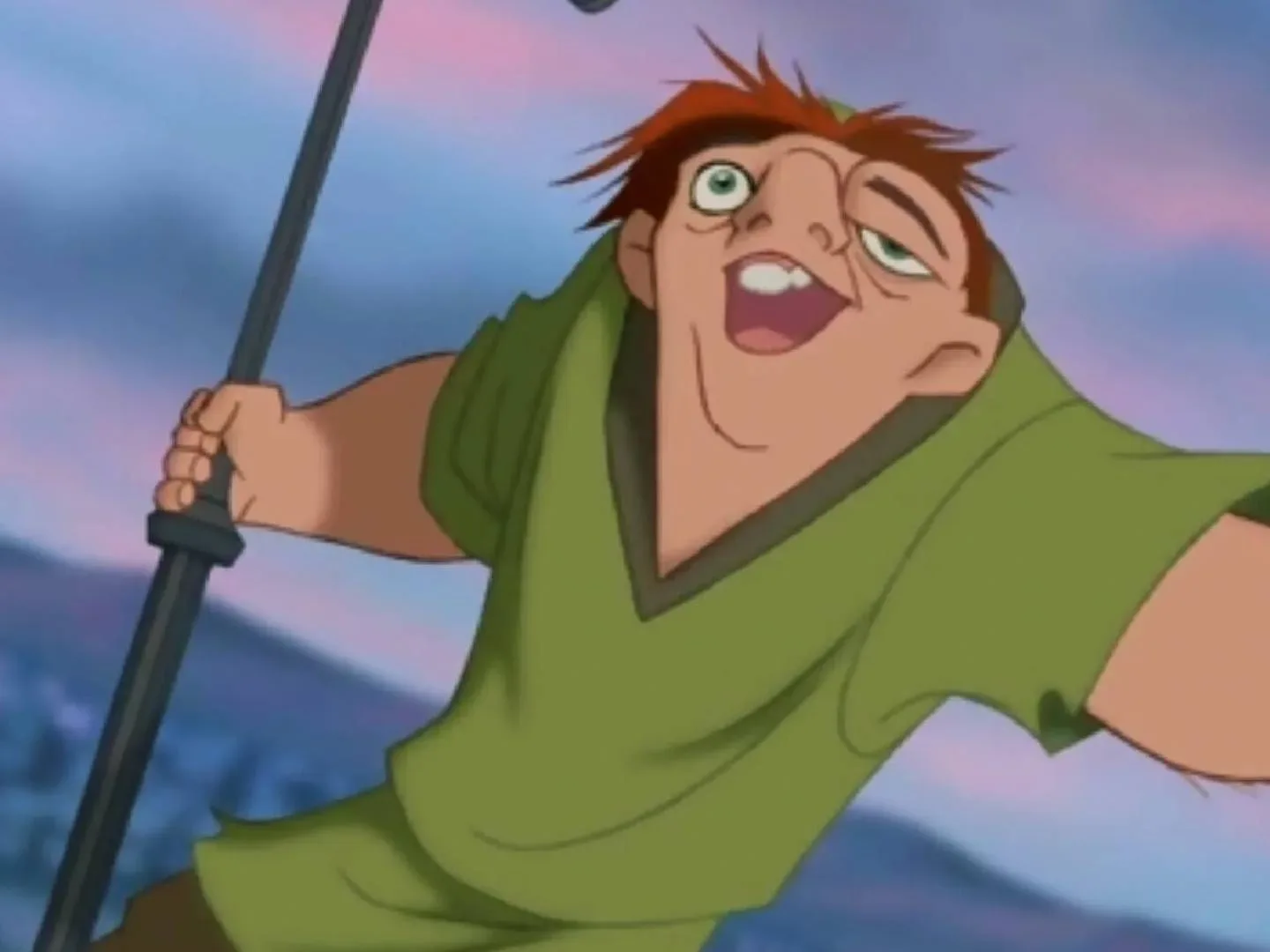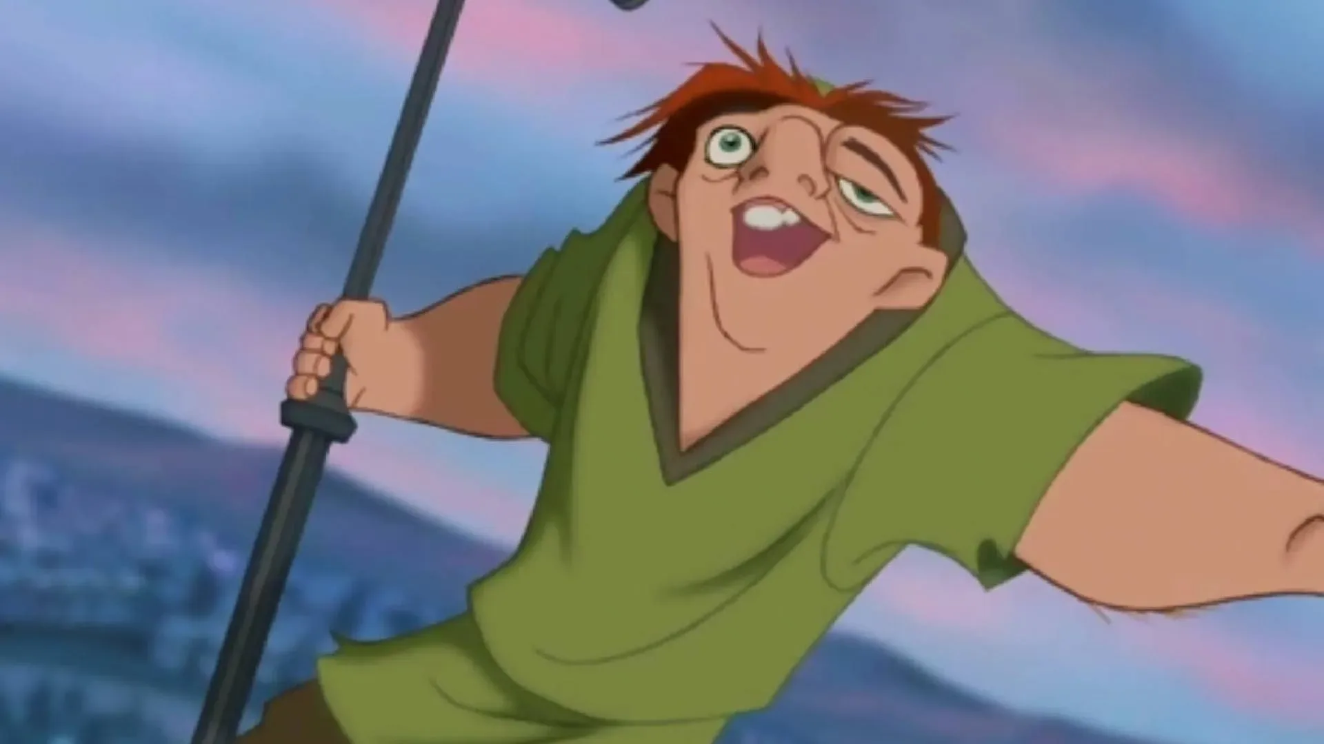
A newly circulated set of side-by-side clips is prompting a familiar but increasingly urgent question for fans of classic animation: why do some Disney Renaissance movies look so different on streaming from the versions people remember seeing in cinemas?
The comparisons place 35mm theatrical imagery and home-video releases beside current digital streaming presentations. In shots from Hercules, The Hunchback of Notre Dame, and other films from the period, the distinction is especially apparent in vivid imagery: lava, firelight, deep reds, and character complexions. The film-originated material appears considerably more saturated in the clips, while the streaming image can look flatter, with paler skin tones and less forceful reds.
That does not automatically make every individual screen grab a definitive verdict on every television, stream, or release. Display settings and compression can affect what a viewer sees. But the comparison has clearly struck a chord because it addresses a specific concern: the colors were not merely decorative choices added after the fact. They were part of how these movies were designed to be experienced in their original format.
The issue is a transfer, not a claim that the animation was always muted
The key term here is transfer: the process of preparing a work made for one medium for another medium. These Disney features were originally presented on 35mm film, also called celluloid. Their eventual digital versions necessarily involve moving imagery from that original film-based presentation into a format intended for modern digital playback.
The concern raised by the comparisons is that this move does not preserve the original relationship between color, brightness, and the screen in quite the same way. The movies were made with their final film presentation in mind. Animators understood the format their work would reach, and the strong colors visible in theatrical and older home-video material were part of that calculation. When that visual information is translated for digital streaming, the effect can be diluted.
In everyday terms, a scene can still contain the same drawing, composition, and story beat while feeling substantially different. A fiery sequence that once looked hot, bright, and threatening can lose some of its intensity if the reds and oranges no longer carry the same punch. A darkly lit scene may retain its outlines but surrender some of its intended mood if the tonal balance is subdued.
That distinction matters for animation. In live action, audiences may notice differences in grain, contrast, or shadow detail. In hand-drawn animation, color can do even more immediate storytelling work. It separates a character from a background, signals danger or warmth, makes a magical setting feel heightened, and gives a scene its emotional temperature. If the balance changes, viewers are not only comparing pixels. They are reacting to a shift in presentation that may alter the movie’s visual language.
Why the clips from Hercules and Hunchback stand out
The circulated examples are effective because they focus on moments where subdued color is difficult to ignore. Flowing lava is supposed to command attention; it is an element built around brightness, heat, and motion. Likewise, red-hooded figures and fire in The Hunchback of Notre Dame depend on heavy color contrast for their impact. When those reds appear reduced next to a film-based image, the comparison becomes intuitive even for viewers unfamiliar with archival or transfer terminology.
Fans responding to the footage have described the older-looking presentations as matching their memories of theatrical screenings. For some, that response is emotional: a recognition that what they remembered was not simply nostalgia exaggerating a childhood experience. Others have framed it as a practical request, arguing that audiences should be able to choose a 35mm-based version through streaming or home media.
“This is what I remember! I thought maybe it was just rose-tinted glasses, but no, these transfers need to be improved!”
Another response singled out the Hunchback fire footage, contrasting a film image that felt intensely warm with a stream that looked unusually cool. The language is subjective, but it captures why color presentation matters: viewers read heat, threat, romance, darkness, and energy through more than dialogue and line work.
What “film-to-digital” means in this debate
It is tempting to reduce the discussion to “film good, digital bad,” but the evidence here supports a narrower and more useful point. The problem being identified is not simply that digital technology exists. It is that a digital version of a film-era production can differ visibly from the material and presentation for which the animation was originally prepared.
35mm refers to the physical film gauge used for theatrical exhibition. A 35mm presentation is not just a file played through a projector; it is a film-based way of showing the work. The side-by-side footage suggests that the character of the original color design is more apparent in those film-derived images and in older home-video releases than in the current streaming material.
Digital streaming, meanwhile, means the version delivered as data to a connected device and then displayed through a modern screen. That route brings convenience and accessibility, but it also means the presentation is dependent on a digital transfer. In this case, the criticism is that the transfer does not always retain the richness fans associate with the original theatrical look.
Those are different questions from whether a movie is available in high resolution, whether an image is clean, or whether a viewer prefers a modern display. A cleaner digital picture can still produce an unsatisfying result if the color relationships are not what audiences expect from the original presentation. Preservation is not merely about ensuring that a title remains watchable. It is also about maintaining the creative choices that gave it its identity.
Why Pixar titles are a different case
The comparison also points to an important dividing line in Disney animation history. Films that arrived with Pixar’s computer-made approach were developed on a computer screen, making the move to a digital viewing environment far less disruptive in this particular respect.
That does not mean every digital presentation of a computer-animated film will look identical on every setup. It means the central mismatch identified in the clips is more closely associated with movies designed for film-era exhibition and later adapted to streaming. A production conceived digitally begins closer to the environment in which it is ultimately distributed online.
For the hand-drawn Disney films in question, the debate is therefore not a rejection of newer animation or computer tools. It is a preservation argument. Fans want the visual intensity of the classic films to remain available rather than being replaced, by default, with a version that appears less vivid than the one created for theaters.
The practical case for viewer choice
The strongest takeaway from the reaction is straightforward: audiences want options. A viewer who values the current streaming presentation should be able to use it. But people who want a version reflecting the 35mm look are asking for a route to that experience, whether through streaming or home media.
That request fits a larger anxiety around digital access. A title can be easy to find and still leave viewers with limited control over which version they are allowed to watch. That tension also appears in conversations about ownership and digital media, including concerns explored in the broader question of what digital access means for audiences. For these animated films, the question is not only whether the movie remains in the catalogue. It is which visual interpretation survives there.
Offering clearly identified versions would also make the choice legible. A service or disc release could distinguish a standard digital presentation from a film-look presentation rather than treating one modern transfer as the only authoritative way to see the movie. The evidence available here does not establish whether such an option is planned. It does establish why viewers are asking for one.
Color is part of the memory—and the work
It is easy to dismiss reactions to older releases as viewers preferring whatever they grew up with. Yet the side-by-side footage gives that instinct something concrete to examine. The richer lava, stronger reds, and warmer complexions are not vague recollections. They are visible differences between presentations.
That matters because classic animation is built from deliberately controlled visual elements. The line art, backgrounds, lighting effects, and palette are all working together. When the palette is softened in conversion, the consequences can be felt throughout a sequence: less menace in a shadowy scene, less heat in fire, less grandeur in an otherworldly landscape.
There is also no need to treat the conversation as an argument against the future. Disney’s upcoming Gatto, directed by Enrico Casarosa, is described as combining 2D hand-painted textures with modern CGI. It follows Nero, a black cat living in a superstitious Venice. A production built with contemporary digital tools should not face the exact same format transition identified with the older film-era titles.
But that makes the preservation concern sharper, not smaller. New works can be designed around present-day viewing technology. The older classics cannot be remade into the conditions of their original release; they can only be transferred with care, and ideally offered in forms that respect how their artists expected color to reach an audience.
The comparison has reopened a worthwhile conversation because it focuses on more than nostalgia. The question is whether the version most people can watch today communicates the same visual choices that helped make these films enduring in the first place. For viewers who remember lava glowing, reds burning, and characters carrying more warmth on screen, the answer appears to be: not always.