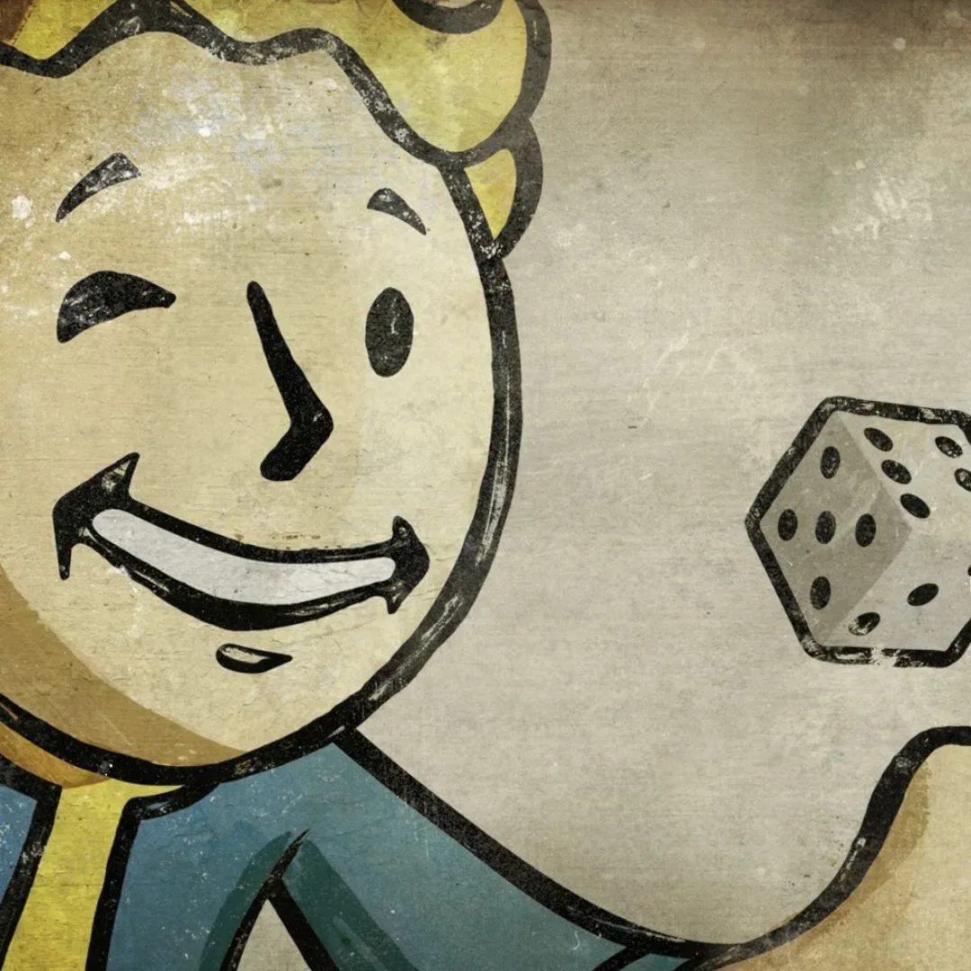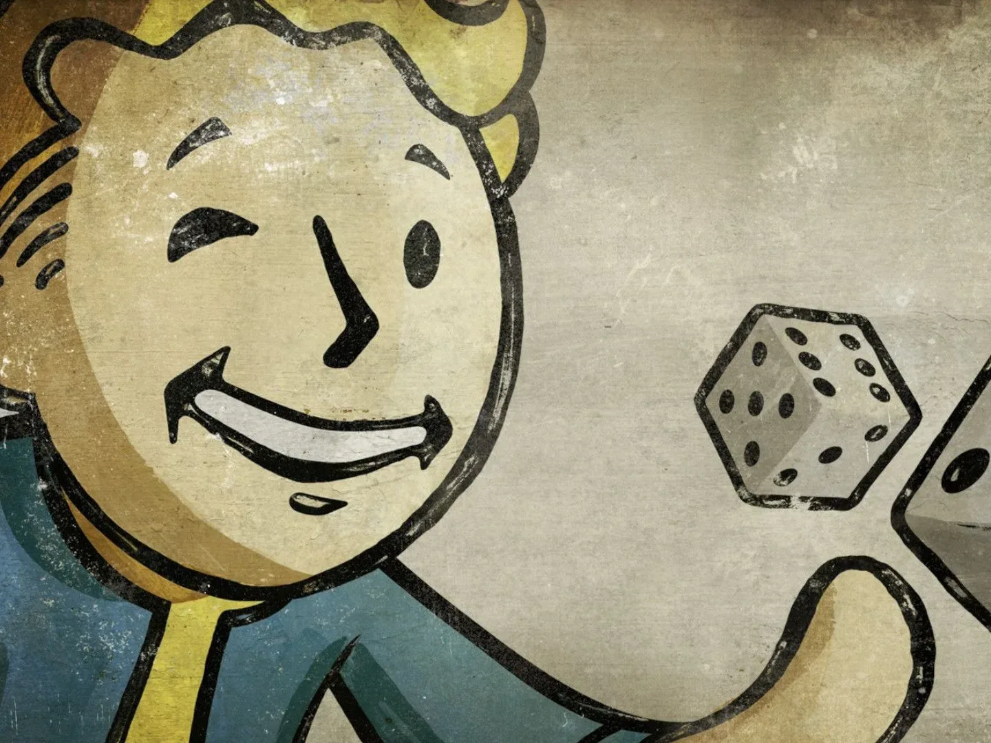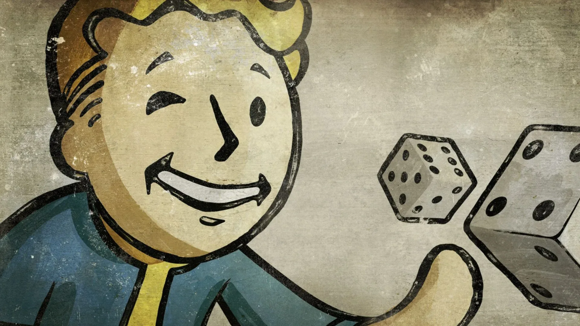
Vault Boy’s thumbs-up is now inseparable from Fallout, but the character began life as a practical answer to a difficult interface problem. In the original 1997 role-playing game, the team needed players to understand a large number of character traits quickly, sometimes in spaces too small for explanatory text. The eventual solution was not a tidy set of abstract symbols. It was a cartoon figure acting out the idea behind each trait.
That decision helped create one of gaming’s most recognizable mascots. It also became one of the points of friction in Fallout’s early relationship with the tabletop system it was initially intended to use. The same development path that gave the game Vault Boy ultimately helped steer it toward the home-grown system that became SPECIAL.
Why Fallout needed so many visual cues
Early Fallout was planned around GURPS, short for the Generic Universal Role-Playing System, a tabletop rules framework published by Steve Jackson Games. The version of Fallout being built with that framework had numerous ways to describe a character: skills, advantages, disadvantages and quirks.
Those terms matter because they represent a classic role-playing-game usability challenge. A system may give players meaningful choice by tracking many separate qualities, but a computer game must also communicate those qualities clearly. A name alone can work in a full character sheet. It is much less useful when the game needs to signal a relevant ability in a compact interface element or brief gameplay message.
Tim Cain, lead on the original Fallout, explained that the team planned an icon for every one of these characteristics. The icons would sit beside names in the interface and could be reused where there was insufficient room for text. In other words, they were meant to be visual shorthand: an immediate signal that could carry a concept without requiring the player to stop and read a label.
That is an entirely sensible goal, but it created a scale problem. Cain estimated that the combined list came to more than 100 icons and may have approached 200. Designing that many symbols is not merely a matter of drawing distinct pictures. Each one has to remain legible at its intended size, make sense beside its associated term and avoid being confused with another symbol.
The limits of an icon-only system
Arlene Summers was tasked with producing the icons for this early version of Fallout. Her work is an important part of the story because it shows how large the original visual-language assignment was before Vault Boy became the answer.
Color could have made the symbols easier to distinguish, but Cain was beginning to lose color vision at the time. He encouraged Summers not to rely on color as the key difference between icons. That approach had a direct accessibility-minded benefit: if a meaning depends on a color distinction, some players may not be able to read it reliably. Yet it also placed more pressure on silhouette, pose and subject matter to do the communicating.
Related coverage includes How Fallout's Vault Boy Solved a Classic RPG Design Problem.
As the number of traits climbed, making every small image recognizably different became harder. The project had reached the point where the original solution—one discrete icon per concept—risked undermining its own purpose. If players cannot tell symbols apart at a glance, they cease to function as useful shorthand.
The issue was not that icons are inherently ineffective. Rather, a large ruleset can exhaust the available visual vocabulary quickly, particularly when its graphics need to work in limited space and cannot lean on color. An abstract mark can communicate a simple, familiar idea well. Hundreds of them, each tied to a slightly different RPG characteristic, ask far more of the player’s memory.
Turning the interface into a performance
Art director Leonard Boyarsky proposed the pivot that changed Fallout’s visual identity. Instead of placing an abstract icon in the Skilldex—the area that displayed a title and description—the game could show a cartoon character performing the action or embodying the attribute under discussion.
The reference point was Monopoly’s Rich Uncle Pennybags. Boyarsky sketched the first version of what became Vault Boy, converting the problem from “how do we invent hundreds of distinct symbols?” into “how would one memorable character demonstrate this concept?”
That is a subtle but powerful redesign. A recurring cartoon figure gives every illustration a shared visual anchor. Players no longer have to learn an unrelated collection of marks. They can interpret facial expression, gesture, clothing and action, using the same character as a consistent guide through the game’s systems.
It also made the dense RPG information feel less clinical. A list of advantages and disadvantages can be intimidating when presented as pure rules language. A cartoon depiction does not eliminate complexity, but it can give the player a quick emotional and visual entry point. The image becomes a cue for the idea, while the adjacent text can supply the precise mechanical meaning.
George Almond further refined the design, and Tramell Ray Isaac produced the final Vault Boy illustrations in volume. Cain said Isaac drew hundreds of them. Their reach extended beyond the Skilldex: the images appeared throughout Fallout’s manual and opening cinematic as well. The design was therefore not confined to one menu; it became a visual thread connecting explanation, presentation and story.
For players, that consistency has a practical consequence. Interface art can become part of how a game teaches itself. When the same character, style and visual logic recur across menus, manuals and cinematics, the game is more likely to feel like a single authored world rather than a rulebook attached to a separate adventure.
The mascot that became a licensing problem
Vault Boy’s origins are especially notable because the character was also caught up in Fallout’s eventual break from GURPS. Steve Jackson Games had objections to the developing game. The objections included violence in the opening cinematic, the game’s small-scale characters and the Monopoly-inspired mascot.
Cain has said Vault Boy was specifically identified as a character that needed to be removed. The team explained the Monopoly reference, but that did not resolve the concern. The character was viewed as a tonal mismatch, and the concern applied to his presence in the cinematic as well as the broader game.
This was more than a disagreement about a single piece of art. Vault Boy had become a solution to a system-design and communication problem, appearing across the game’s materials. Removing him would not simply mean swapping one logo for another. It would mean revisiting a visual approach that had helped the team make a complicated character framework readable.
The developers did not accept the requested changes. Fallout moved away from GURPS and created its own character-stat system, which eventually became SPECIAL. The acronym is one of the original game’s enduring foundations, while Vault Boy became its equally enduring visual counterpart.
There is a useful distinction here: SPECIAL and Vault Boy are not described as having emerged from the same single design brief. One was a home-grown rules framework developed after leaving GURPS; the other grew from the immediate need to represent characteristics clearly. But the licensing dispute joined their histories. Objections to the mascot were among the disagreements surrounding the GURPS arrangement, and the departure created the circumstances in which Fallout’s own stat system took shape.
Why this origin story still matters
Vault Boy’s later presence on mugs, bobbleheads and other merchandise can make him seem like a mascot conceived for branding. His actual origin points somewhere much more specific: the challenge of explaining a crowded RPG system without filling the screen with text or asking players to memorize a vast icon catalogue.
That makes the character’s longevity a reminder that strong game iconography often starts with usability. The recognizable face, upbeat poses and cartoon framing gave Fallout a consistent way to package complicated information. The style could also sit beside a harsher setting, creating a contrast that was memorable enough to become central to the series’ identity.
It is also a reminder to credit the work behind a familiar image. Boyarsky originated the core concept, Almond refined the character and Isaac produced the extensive final illustration set. Summers’ earlier icon work reveals the problem the team was trying to solve before that pivot. Fallout’s visual language was not the product of one flash of inspiration alone; it was the result of artists and designers working through the constraints of a large role-playing system.
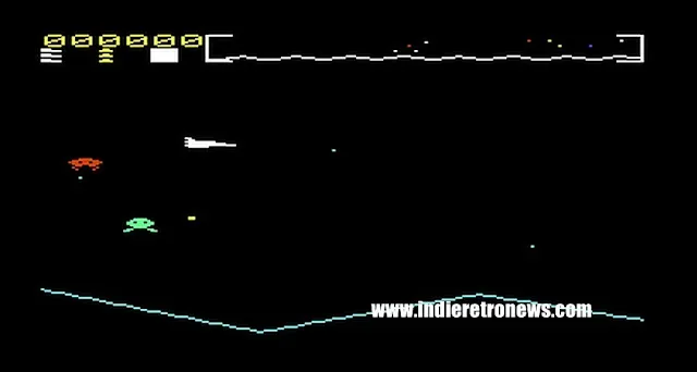
Retro PC games often had to make dense information work within tight technical and visual boundaries, a challenge that remains visible in projects such as this VIC-20 homebrew inspired by arcade design. Fallout’s answer was unusually durable: one cartoon character, repeated often enough and clearly enough to make a complex world feel instantly recognizable.
Vault Boy was therefore not an ornamental extra bolted onto Fallout after the important systems were finished. He was part of the process of making those systems understandable—and, unexpectedly, part of the chain of events that left Fallout with both its mascot and SPECIAL.