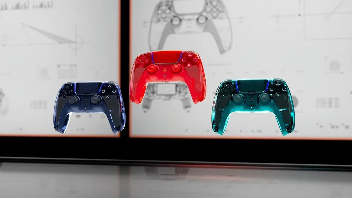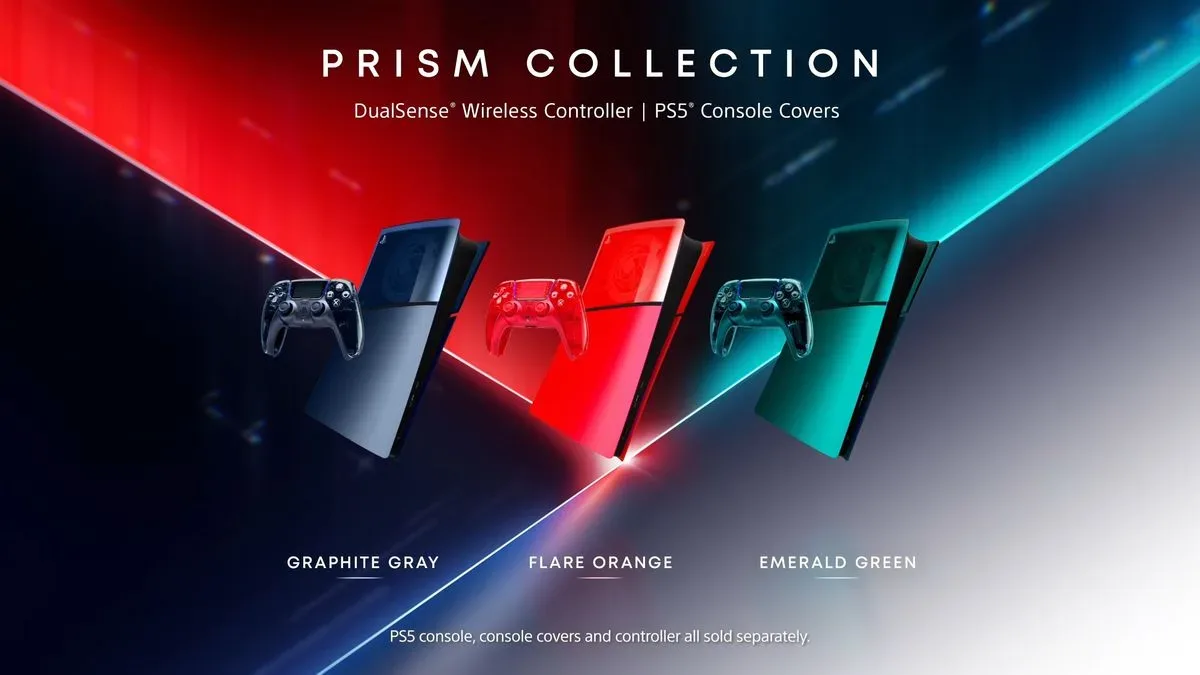

Transparent gaming hardware is making another pass through the living room, and PlayStation is joining in with Prism: a new collection of DualSense controllers and PS5 console covers in translucent, color-forward finishes. The range arrives in three official shades—Graphite Gray, Flare Orange, and Emerald Green—and it is explicitly built around the visual language of late-1990s see-through electronics, reshaped for the sharply sculpted PS5 era.
Pre-orders for the Prism collection are scheduled to open on November 10, 2026. The products are due to release on February 4, 2027. Each DualSense is listed at $84.99 / £74.99, while the console covers are listed at $74.99 / £64.99, matching the pricing cited for other limited-edition DualSense controllers and faceplates.
For PS5 owners who have watched transparent controllers reappear elsewhere in the hardware market, Prism is a direct response to an enduring appetite for colored clear plastic. It is also a useful reminder that a controller does not need new buttons, a new layout, or a new feature set to become a meaningful piece of setup customization. Material finish, color, light reflection, and how much of the device’s inner structure is suggested rather than fully revealed can completely change its character.
What PlayStation’s Prism collection includes
The line consists of two coordinated kinds of PS5 hardware accessories:
- Prism DualSense wireless controllers in Graphite Gray, Flare Orange, and Emerald Green.
- Prism PS5 console covers in the same three named colors.
The appeal is coherent rather than subtle. Instead of treating the controller as a separate splash of color beside a standard console, the collection gives players the option of carrying one translucent color across both the handheld input device and the PS5 exterior. Buyers can also reasonably view each piece on its own: a controller changes the part of the setup that is handled constantly, while a console cover changes the visual presence of the machine itself.
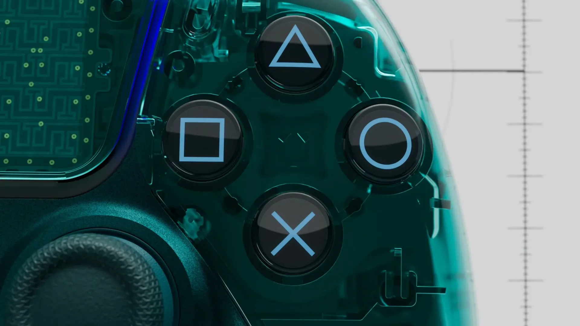
PlayStation describes the controller finish as a high-gloss clear treatment across the rear of the DualSense. The stated intent is to provide a glimpse of the technology that powers the controller while preserving a monochromatic appearance. A metallic finish on the controller’s middle cover is intended to bridge the contrasting surfaces and keep the result aligned with the PS5 generation’s more premium, industrial styling.
That wording matters because Prism is not presented as a fully transparent, bare-internals design. It is a layered aesthetic: clear color and visible suggestion at the back, paired with a metallic central component and the familiar DualSense form. In other words, it is designed to evoke circuitry and construction without abandoning the polished, finished-object look expected from a current console accessory.
Transparent does not mean identical all the way through
Transparency is a broad design term. A product can be entirely clear, frosted, smoky, tinted, or only translucent in selected areas. Prism’s approach belongs to the latter category. The controller makes its clear, glossy statement on the back, while the console covers use transparent panelling only over part of the PS5’s side profile.
Related coverage includes PlayStation Reveals Prism DualSense Controllers and PS5 Console Covers With Transparent Colorways.
The console treatment has a particularly noticeable boundary: the translucent section ends about halfway down the machine, after which the panel becomes solid. That means a PS5’s Blu-ray disc drive, for owners who use one, is not put on display through the exterior panel. The division may be visually deliberate, helping the cover retain a structured two-part appearance rather than turning the console into a single uninterrupted window. But it also gives the collection a slightly playful tension.
Prism is channeling an era strongly associated with physical game discs and visible plastic shell construction, yet its promotional materials focus on the digital version of the console. The cover itself does not turn the console into a literal cutaway or make its disc-drive hardware visible. It is retro transparency filtered through present-day platform hardware design, not a replica of an older device.
Why the late-1990s influence remains so recognizable
Leo Cardoso of PlayStation’s Color, Material, and Finish design team said the group wanted to bring the late-1990s transparent-controller trend back in a modern form that works with the PS5’s industrial design. That is an unusually clear statement of the collection’s purpose: Prism is not merely three new colors, but an intentional return to a specific visual tradition.
The phrase Color, Material, and Finish—often shortened to CMF in product design—refers to a discipline concerned with exactly the qualities Prism foregrounds. Color is the hue itself: gray, orange, or green. Material concerns what the object is made from and how it is perceived. Finish covers surface properties such as gloss, opacity, metallic texture, and reflectivity. These choices influence whether a device reads as playful, technical, restrained, rugged, nostalgic, or futuristic before it is even switched on.
In Prism’s case, the tint provides a strong identity, the translucence creates the throwback signal, the gloss makes that translucent material catch ambient light, and the metallic center seeks to keep the controller from feeling like a simple retro novelty. It is a balancing act. Too much opacity and the transparent premise disappears; too much clarity and the accessory can look visually busy. Too much nostalgia and it risks clashing with the PS5’s white-and-black industrial silhouette. The design team’s stated goal is to land between those poles.
The choice of Graphite Gray, Flare Orange, and Emerald Green also gives the range different moods without changing its core construction. Graphite Gray is the most restrained name in the trio and should suit setups seeking a darker look. Flare Orange is the collection’s conspicuous option, with a name that emphasizes brightness and energy. Emerald Green fits most directly with the familiar language of colored transparent consumer electronics, while still being positioned as a contemporary PS5 accessory.
A hardware trend, not a new controller generation
The resurgence of translucent gaming gear has already been visible around Xbox hardware, including anniversary-focused designs and third-party controllers with retro-oriented aesthetics. Prism extends that visual conversation to PS5 accessories. For players, the practical distinction is important: this is a design collection, not an indication of a new DualSense format or a replacement PS5 console model.
Nothing in the announced details suggests changes to the DualSense control arrangement, new input technology, revised console performance, or different software functionality. The central proposition is visual customization. That does not make it trivial—controllers and console shells are among the most visible pieces of game hardware in a home—but it tells prospective buyers what to evaluate: preferred color, desire for a coordinated setup, appreciation for translucent finishes, and the stated price.
It also means there is no single objectively “best” Prism variant. A buyer who wants the most understated system aesthetic may gravitate to Graphite Gray. Someone building around a vivid desk or TV setup may prefer Flare Orange. Emerald Green may appeal most to people for whom transparency itself is the point. The controllers and covers are matching components, but their value is visual and personal rather than performance-based.
What to consider before pre-orders open
With pre-orders beginning November 10, the basic decision is less about specifications than about planning a hardware refresh around the February 4 release date. A few points follow directly from the announced range:
- Decide whether a controller, covers, or both fit the goal. The DualSense affects the item players touch during every session; covers affect the console’s display presence. The pair is for a unified look, but neither is described as mandatory to the other.
- Choose the color as a setup decision, not only a nostalgia decision. All three use the same Prism concept, so the choice comes down to whether Graphite Gray, Flare Orange, or Emerald Green best fits the room and existing peripherals.
- Recognize the partial-transparency design. The PS5 cover is not described as a wholly clear panel, and the controller’s clear finish is specifically highlighted across its back. Buyers expecting a full internal view should look closely at the design concept rather than assuming complete visibility.
- Budget by component. At the stated prices, the controller and console-cover purchases are separate decisions. A matching combination costs more than either item alone, which makes the distinction between a handheld color change and an all-system visual update relevant.
Collectors of game hardware may also see Prism differently from players who simply need an extra controller. The collection is positioned alongside limited-edition DualSense controllers and faceplates in pricing, and its named colorways and synchronized accessory format give it a defined identity. Still, the announcement provides no reason to make assumptions beyond that positioning about future scarcity, production quantities, or long-term resale value. Its immediate appeal is the look, not a promise of collectibility.
Prism’s place in PlayStation’s current design language
The PS5 has always been a console with a highly distinct outer silhouette, so a console-cover collection has an unusually direct effect on how the machine reads in a room. Prism does not discard that shape. Instead, it uses translucence as an overlay on the existing design, pairing it with solid sections and the controller’s metallic middle panel.
That makes the collection more of a conversation between eras than a pure backward glance. The late-1990s reference supplies the clear-color appeal; the glossy finish and metallic contrast frame it in a current-generation language. Whether that hybrid feels elegantly nostalgic or overly stylized will depend on individual taste, but the intention is easy to understand: bring some of the visual fun back without pretending a PS5 is an old plastic game system.
For a broader look at how older hardware ideas continue to surface in modern gaming culture, see a Halo DS fan project rebuilding a demo that never became a game. Prism is a commercial accessory line rather than preservation work, but both illustrate how strongly unfinished, remembered, and revisited parts of gaming’s past can shape present interest.
For PlayStation, the key move is simple: transparent hardware is back on the menu, now with a PS5-specific interpretation. Prism gives players three translucent colorways, a matching path for controller and console covers, firm pre-order and release dates, and pricing that places the range with the company’s limited-edition accessory offerings. The rest comes down to whether a glossy graphite, orange, or emerald glimpse of hardware history belongs in a modern PS5 setup.