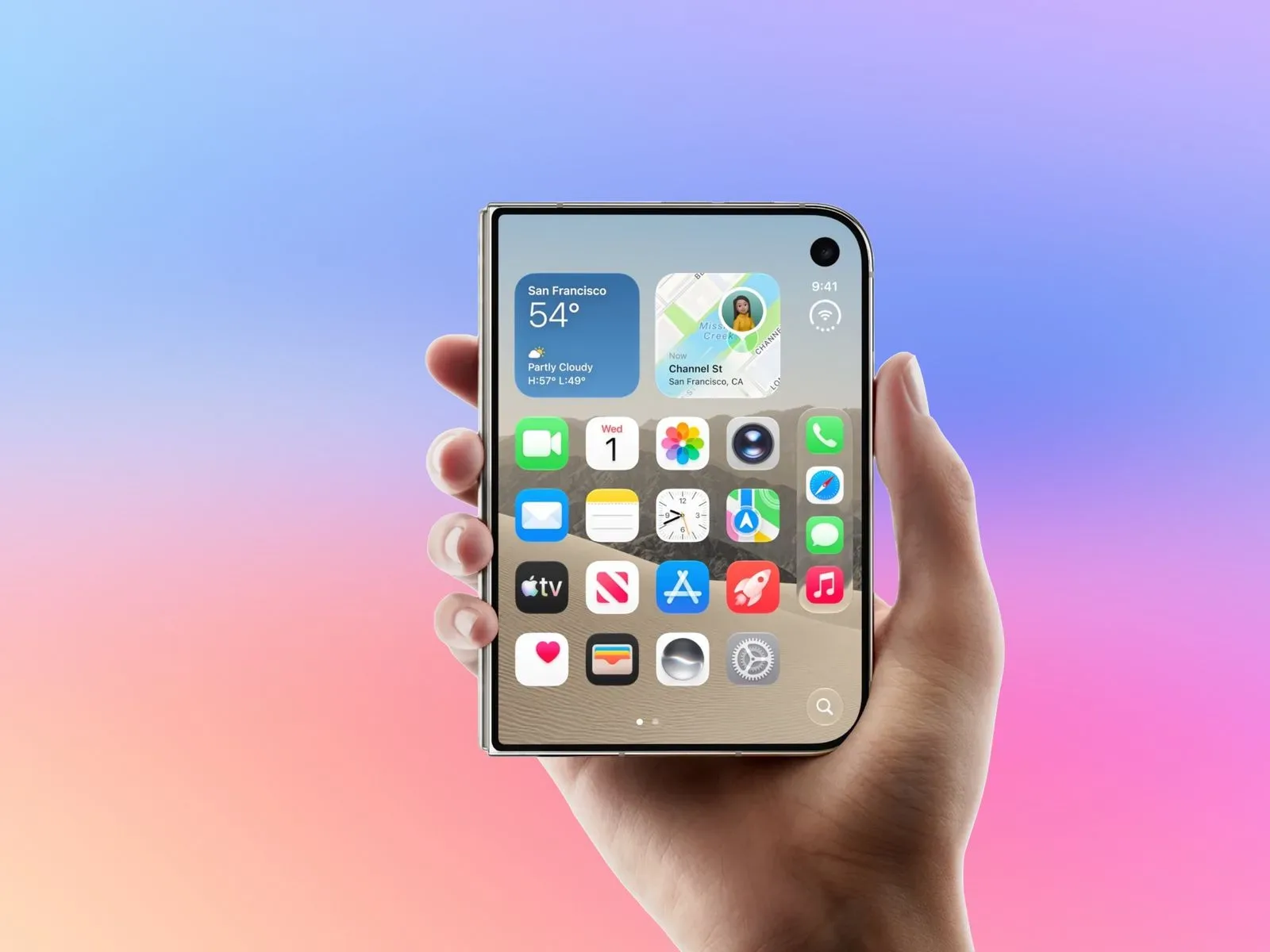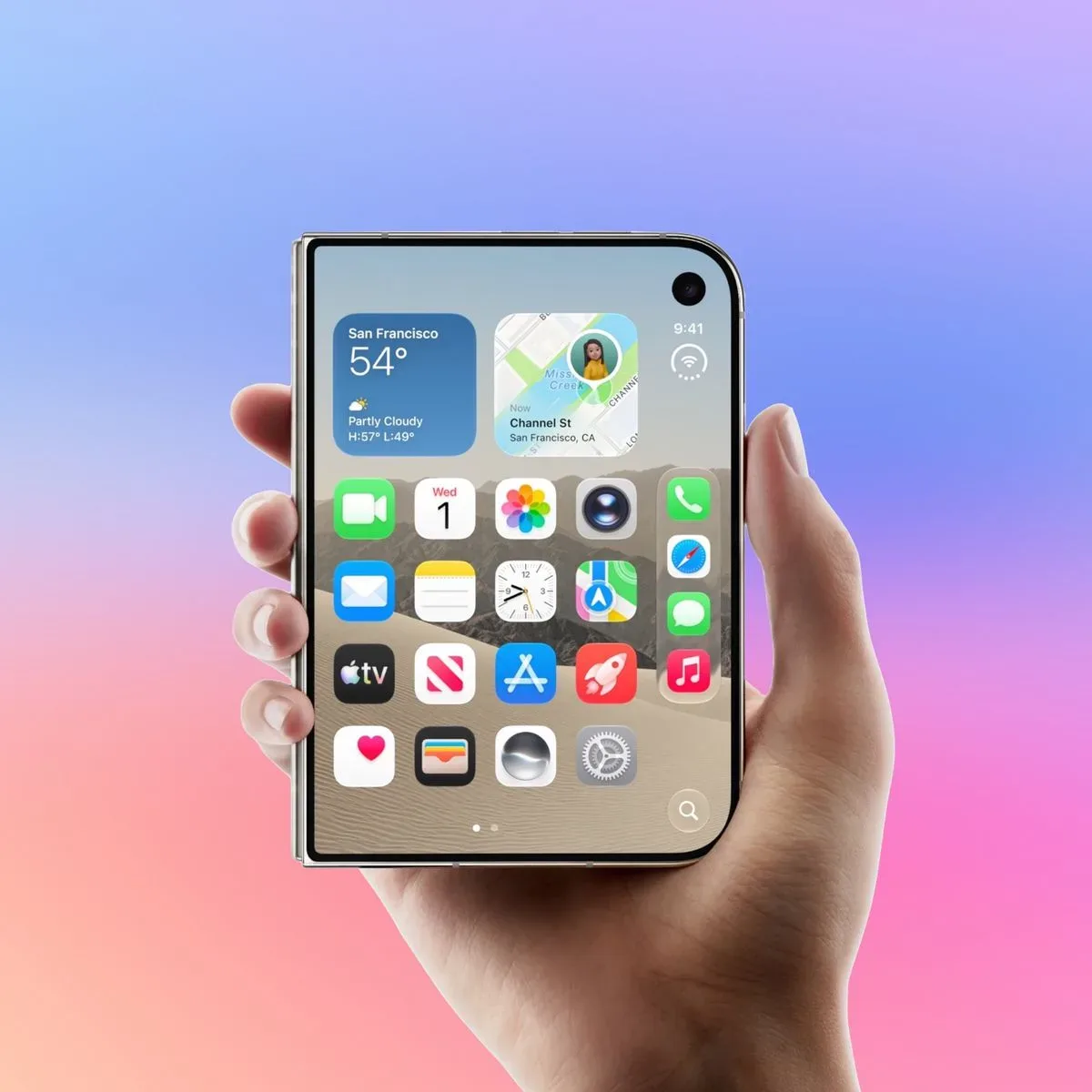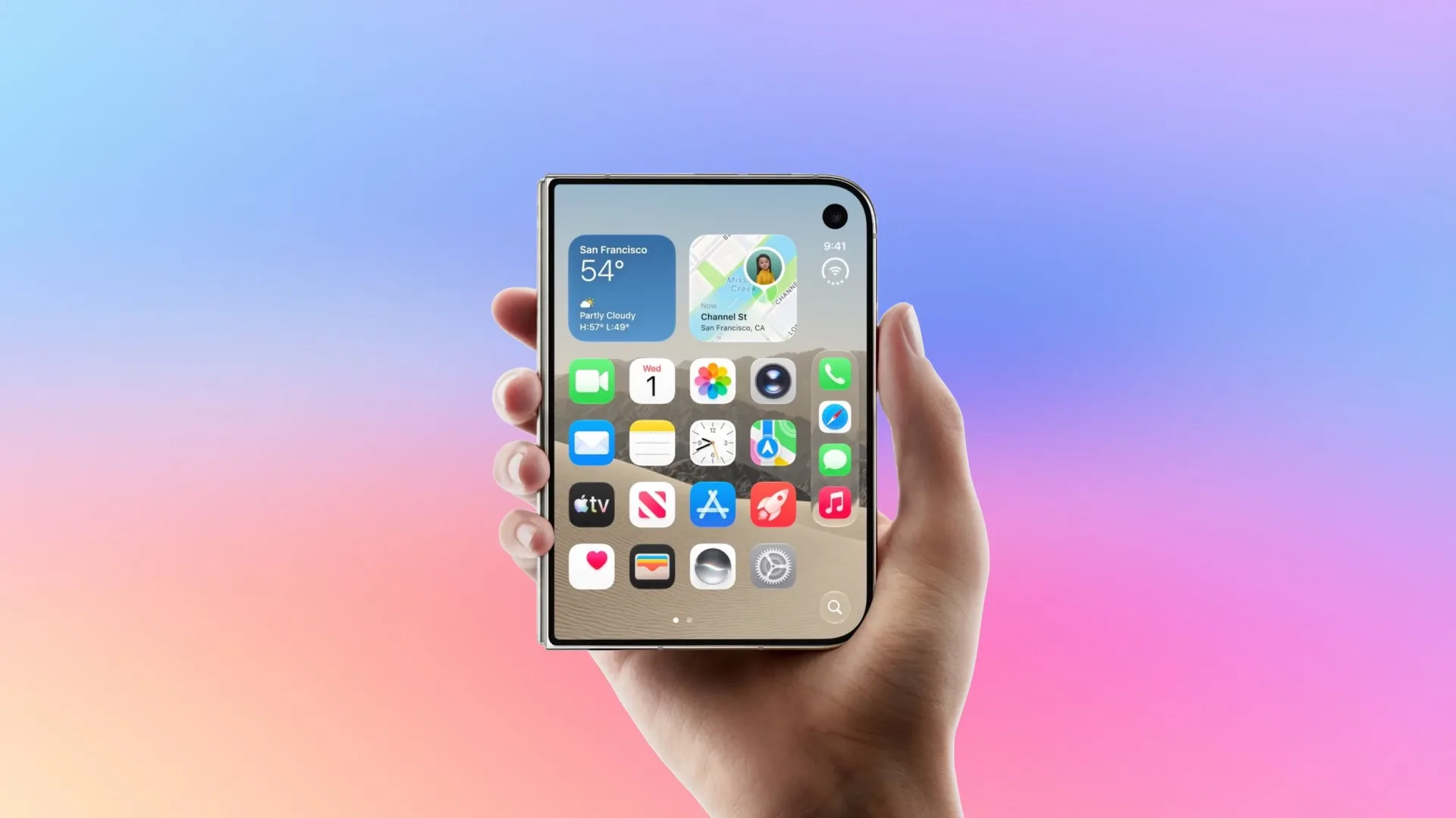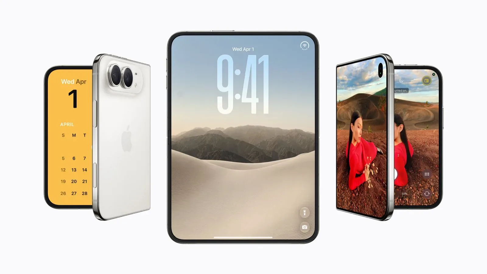

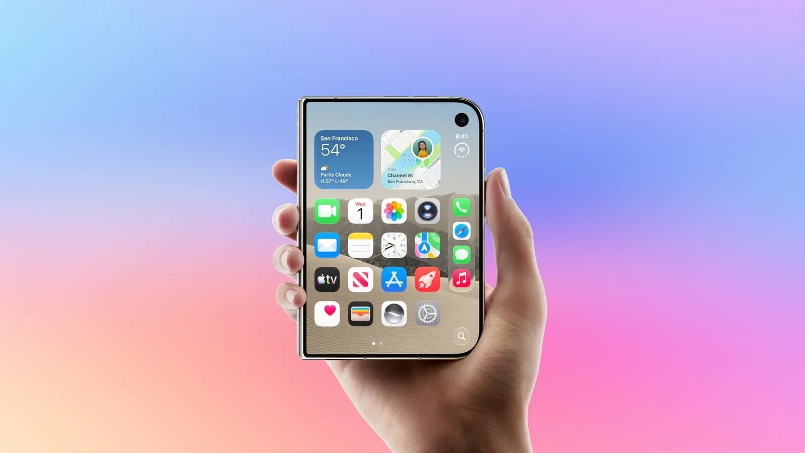
An unreleased iPhone Duo Lock Screen layout could make room for more at-a-glance information without removing the controls already positioned at the bottom of the display. Findings attributed to the leaker known as pdfu describe a disabled interface element called the “Complication Column”: a vertical pair of circular widgets positioned on the right side of the Lock Screen.
The important detail is not simply that another widget area exists. The reported design is said to work alongside the current bottom widget row, rather than replacing it. If it ever becomes a consumer-facing option, the arrangement could let people keep their usual Lock Screen information while adding two more compact data points to an otherwise unused section of the screen.
For now, though, this is firmly an unfinished-software story, not a confirmed feature announcement. The widget column is reportedly disabled, tied to an internal SpringBoard/Ionic setting, and was first noticed in iOS 27.1. No later code changes have reportedly been observed, leaving its status uncertain: it may be an experiment still under consideration, a dormant test, or a concept that never reaches a public release.
What the reported Complication Column looks like
The proposed layout places two round widgets in a vertical stack along the Lock Screen’s right edge. It sits above the customizable shortcut positions normally used for the flashlight and camera. Network-status indicators remain higher on the screen, while the new widgets occupy the space in between.
That placement matters because it suggests a careful attempt to add density while respecting the Lock Screen’s existing visual hierarchy. Status information stays at the top, the new glanceable items would sit in the middle-right, and fast-access shortcuts would remain lower down. The reported design does not imply that every Lock Screen element is being moved around; it instead appears to introduce an additional, bounded zone.
The name “Complication Column” also describes the intended role fairly directly. In interface design, a complication is a small information module rather than a full app view. The leaked name should not be taken as a promise of specific widget types, customization rules, or third-party support—none of those details are established here—but it does indicate that the space is meant for concise, glanceable content.
Why a second widget area could be useful
Lock Screens work best when they answer small questions quickly: information a person may want before deciding whether to unlock the device. A second widget zone could increase the amount of that information visible at once, while the retained bottom row would preserve the value of existing customization.
In practical terms, the reported design could reduce the trade-off inherent in a limited widget layout. A user would not necessarily have to choose between one kind of quick-reference information and another if the screen offered separate regions for both. That is the core potential benefit of the concept—not an entirely new Lock Screen, but more room within the one people already use.
It is also notable that the widgets are described as circular and vertically aligned. A compact, repeated shape can make an added interface zone feel intentional rather than like a loose collection of unrelated controls. At the same time, the format naturally constrains how much can be shown. The likely emphasis, based on the dimensions and placement described, is immediate recognition rather than detailed reading.
That balance is important. Adding more Lock Screen content can be useful, but it can also make a screen harder to scan. A two-widget column is comparatively restrained: enough to make the experiment meaningful, but not so large that it necessarily competes with the status indicators above or the flashlight and camera shortcuts below.
What “disabled in iOS 27.1” actually means
A disabled interface component in an operating-system build is evidence that an idea has existed in development. It is not evidence that the idea has been scheduled, approved for release, or completed. Internal software often contains tests, settings, and interface experiments that are not intended for the public in their discovered state.
In this case, the reported control is associated with SpringBoard/Ionic. The specific internal naming is a useful clue about where the feature was found, but it does not reveal whether the feature is actively being built, which devices it might target, or when it could appear. Those are all separate questions, and the available findings do not answer them.
The absence of spotted code changes after the iOS 27.1 discovery is similarly ambiguous. It may mean work has paused. It may mean the relevant work has not changed in a visible way. Or it may simply mean the test is no longer progressing. Without an official commitment or later supporting evidence, treating the Complication Column as a guaranteed iPhone Duo feature would be premature.
The iPhone Duo angle remains especially uncertain
The interface is described as an experimental iPhone Duo layout, but the current evidence concerns the Lock Screen element itself: two right-side circular widgets, an existing bottom row that can remain active, and the positioning between status indicators and shortcut buttons. It does not establish a final hardware design, an availability window, or a complete list of software changes for a device carrying that name.
That distinction is worth keeping in view whenever a software discovery becomes attached to an unreleased product. A prototype interface can be tested for a particular device class without becoming part of its final shipping experience. Conversely, a concept initially associated with one device may be reconsidered for a broader set of products. The reported code does not settle either possibility.
For readers trying to separate the useful signal from the speculation, the signal is straightforward: a disabled, named Lock Screen widget-column experiment was reportedly found and appears designed to coexist with the current lower widget region. Everything beyond that—including eventual launch, eligible hardware, and exact widget behavior—remains unknown.
What existing iPhone owners should do now
There is no action to take based on this discovery. Because the interface is disabled and unconfirmed for public release, users should not expect to find a Complication Column in settings or rely on it arriving in a future update. It also is not a reason to change a current Lock Screen setup in anticipation of a feature that may never ship.
The sensible takeaway is simply to watch for future, concrete software information. If such a feature does become official, the key questions will be practical ones: whether the two spaces can be customized independently, what information formats are supported, whether the right-side widgets remain circular, and whether the layout is limited to a particular iPhone model or display form factor.
Until then, users looking to get more value from the Lock Screen should focus on settings already available to them. For a separate example of practical iPhone configuration rather than unreleased-feature speculation, see how to reduce iPhone mobile data use with iOS settings that actually matter.
What to watch for next
- Further iOS code changes: revisions to the disabled widget column could indicate that the experiment is still being adjusted, though they still would not confirm a release.
- Official software documentation: a public feature description would be the clearest indication of supported devices, configuration options, and widget behavior.
- Hardware-specific evidence: more information would be needed before connecting the layout conclusively to any eventual iPhone Duo product.
- Changes to Lock Screen controls: the current report places the new area above the flashlight and camera shortcuts; any redesign affecting those controls would help clarify the intended final composition.
For now, the Complication Column is best understood as a small but interesting interface experiment. It points toward a possible Lock Screen with two distinct widget areas and a little more room for glanceable information. But the strongest conclusion is also the most limited one: the code reportedly exists in a disabled state, while the public future of the feature remains unresolved.