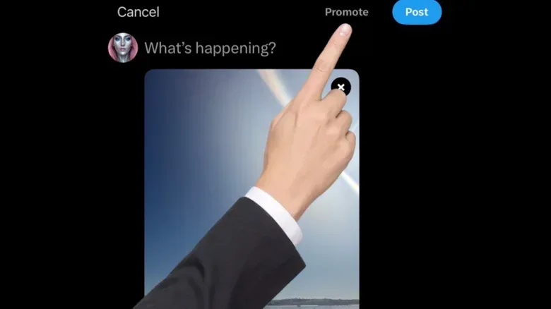

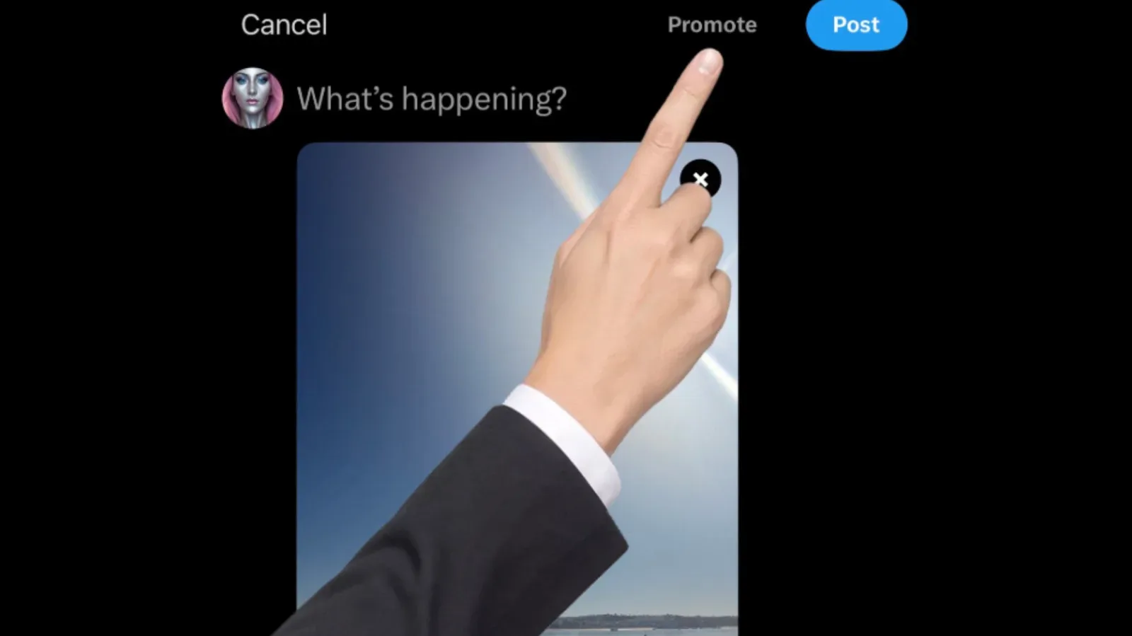
There is apparently a new occupant inside X’s post composer: an unexplained arm that briefly appears and points users toward the Promote button.
Reports and shared screenshots indicate that the animation has appeared for some, but not all, accounts. The button in question is shown in the composer for X Premium subscribers, and it is intended to let a user pay to boost the reach of a post. What remains unclear is whether the arm is a permanent product experiment, a deliberately silly one-off, a seasonal gag tied to Halloween timing, or something else entirely.
X had not publicly explained the animation, and a representative did not immediately respond to a request for comment. That absence of context is the central reason an extremely small interface flourish has become a much larger conversation.
What users appear to be seeing
The reported animation is simple: an arm enters the compose screen, takes over the visual space for a moment, and indicates the Promote control. It is not being described as a new standalone tool, a new posting mode, or a change to what users can write. Rather, it appears to be a prompt aimed at a pre-existing paid action.
In product-design terms, this is a call to action: an interface element intended to draw attention to a next step a company wants a user to take. Buttons, banners, badges, tutorial overlays and animated pointers can all serve that purpose. The unusual part here is not that a platform would highlight a revenue-producing option. It is that the apparent prompt is theatrical, unexplained and selectively visible.
That selectivity matters. The reports do not establish a platform-wide rollout, and the animation does not appear to have reached every account. Limited exposure can mean many things: an A/B test, a staged release, an experiment confined to certain account types, or a short-lived joke. None of those possibilities has been confirmed.
Promotion is the obvious commercial explanation
The most direct reading is also the least mysterious. X may be trying to nudge eligible users toward paying to distribute a post more broadly. “Promote” is a plain-language label for a paid amplification feature: instead of relying only on ordinary distribution, a user pays for additional visibility.
For a service with a subscription tier, placing that option directly in the composer gives it a prominent position at the exact moment a person is preparing to publish. An animated gesture can make the control harder to overlook than static text alone. From that perspective, the arm functions like an aggressively literal guide: it points to the place where a transaction can happen.
But an interface prompt is not automatically evidence that a feature is succeeding, failing or being pushed out of desperation. The currently available evidence shows only that some users have encountered an animation pointing at a promotional control. It does not reveal how many accounts saw it, whether it affects purchases, how long it will run, or whether it is part of a formal test.
The distinction is worth making because social platforms routinely test small variations in copy, placement and visual emphasis. An A/B test is a comparison in which different users receive different versions of a product element so a company can measure behavior. If that is what is happening here, the arm might be compared against a composer with no animation or a different prompt. Yet there is no confirmation that an A/B test is underway, so it should remain an explanation—not a conclusion.
Why the randomness is doing most of the work
A conventional prompt would likely have gone largely unnoticed. The mystery arm, however, has the qualities that make an interface detail spread: it is visually odd, appears to be inconsistent across accounts, and arrives with no stated rationale.
That combination turns a piece of UI into a tiny online riddle. Users cannot easily tell whether they have stumbled into a test, a bug, an Easter egg or a joke. The moment is also brief enough to feel almost like a jump scare rather than an instructional screen, which helps explain why people are sharing screenshots and trying to identify its intent.
Calling it an Easter egg would also be premature. An Easter egg is generally a concealed, optional reference or surprise included for discovery. This animation is reported to be directing attention to a commercial feature, which would make it more like a promotional nudge than a hidden bonus—unless X says otherwise.
Grok, X’s AI chatbot, offered uncertain responses to users asking about it. In one answer, it said the hand was real and that many users had seen the same surprise, while also acknowledging there was no official clarity on whether it was intentional design or connected to Halloween timing. That answer confirms little beyond the bot’s own uncertainty. AI-generated replies are not a substitute for a statement from the company or its product team.
A product-team change adds context, not an answer
The timing also overlaps with Peter Sellis joining X as head of product, taking over from Nikita Bier. Sellis previously held comparable product roles at Discord and Snap. He announced the move with a characteristically irreverent line about making “shitposting multiplanetary.”
That tone has encouraged speculation that the arm could be related to a product culture willing to turn a growth prompt into a bit. But there is no public comment from Sellis linking him to the animation, and timing alone cannot establish authorship or intent.
His prior work at Discord is relevant only as career context, not as evidence for why X’s composer looks this way. For more on a separate Discord-facing platform change, see Discord’s plans for web-searchable public server posts.
The same restraint applies to Halloween theories. The appearance of the arm around the holiday makes a prank plausible, especially given the deliberately eerie, inexplicable quality users have described. Plausible is not proven. Without an official explanation, it is just as possible that a marketing test happened to land at a moment when audiences were primed to read a disembodied arm as seasonal humor.
What this means for Premium users
For X Premium subscribers who encounter the animation, the immediate practical effect seems limited: it directs attention to the promotion option while composing a post. It does not, based on the available information, establish a new requirement to promote posts or indicate a change to the basic act of publishing.
Still, even a short-lived prompt can shape how users interpret a platform’s priorities. A composer is the place where people expect to create and send a message. When monetization is made unusually conspicuous there, it can feel less like a menu option and more like an interruption. Whether that is effective depends on what X is optimizing for: awareness of the tool, completed promotions, amusement, discussion, or some combination of all four.
There is also a communication lesson in the reaction. Experimental UI can be valuable precisely because it produces measurable feedback, but unexplained experiments invite users to supply their own story. In this case, the available stories range from a Halloween prank to a newly hired product leader’s joke to a forceful sales prompt. The evidence does not settle among them.
What remains unknown
- Whether the animation is an intentional test, a temporary joke, a Halloween-themed element or a permanent interface change.
- Which accounts are eligible to see it and why some users do not.
- Whether only X Premium subscribers are seeing it, or whether the animation is tied to another account condition.
- Whether the animation changes promotion usage or is being measured against another version of the composer.
- Whether Sellis, Bier, Elon Musk or any particular team had a role in the idea.
- How long the animation will remain in the app.
For now, the most accurate description is also the oddest: some X users appear to be receiving a fleeting in-app pointer toward a paid boost button, and neither the company nor the newly installed product lead has publicly explained it. Until that changes, the arm is less a confirmed strategy than a highly visible question mark with a sleeve.