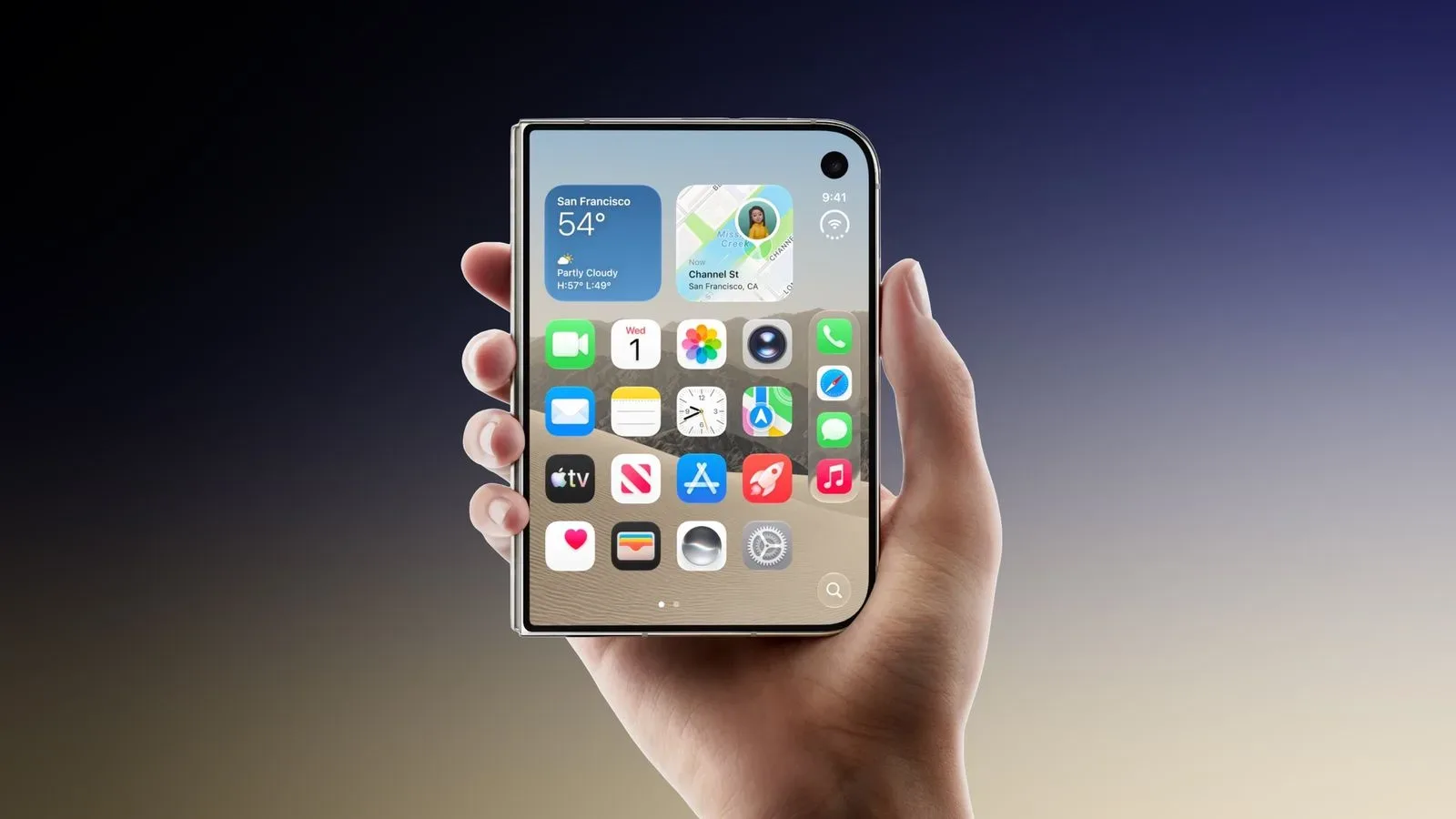
Google Maps has received a practical, long-overdue-looking layout adjustment for the iPhone Duo: version 26.44.4 now properly fills the foldable handset’s inner and outer displays.
That may sound like a small visual polish pass, but mapping is one of the clearest cases where a screen-size mismatch is immediately noticeable. A map app is meant to show terrain, roads, routes and points of interest at a glance. Giving part of the display over to a blank black strip is rather like bringing a paper atlas and leaving the right-hand third glued shut.
In the previous Google Maps version, 26.43.1, the app was only partly adapted to the iPhone Duo. A vertical black border remained along the right edge of both displays, in the area occupied by the phone’s circular status bar. The updated app instead extends its usable layout across the available screen space.
What changes in Google Maps 26.44.4
On the iPhone Duo’s inner display, Google Maps now uses a more considered large-screen arrangement. The search field sits at the upper left. The app’s Explore, You and Contribute tabs occupy a panel down the left side, while map controls appear on the right.
That structure matters because it separates navigation tools from the map itself. On a larger unfolded display, placing every control in one floating pile would eat into the very view a person opened Maps to see. The new arrangement puts primary destinations and account-oriented sections to one side, leaves controls accessible at the other, and preserves the central area for the map.
Explore is the part of Maps used for finding places and browsing nearby options. You is associated with a person’s saved and personalized map material. Contribute is where users can participate in improving map information. Keeping those destinations visible in a side panel is a sensible response to the additional room available when the phone is open.
The important distinction is that this is not merely an interface being stretched wider. A stretched app can technically fill pixels while still feeling as if its controls were designed for a narrower screen. The described placement of the search field, left-side panel and right-side controls suggests a layout that has been rearranged to make use of the larger canvas.
Why the empty border was more than cosmetic
The removed black border was an obvious sign that an app had not fully adjusted to the Duo’s display geometry. The circular status-bar area creates a hardware constraint, and applications need to account for that shape when deciding where content can safely appear. In app-design terms, the usable region that avoids interruptions from hardware or system interface elements is often called the safe area.
A safe area is necessary; placing a critical button beneath a status element would be worse than leaving some room unused. But a well-adapted app can respect that constraint without treating an entire edge of the display as dead space. Google Maps 26.44.4 appears to do just that, allowing the map to extend further while positioning interface elements around the display’s particular shape.
For a mapping app, the difference has straightforward practical value. More visible map area can mean more route context without an extra pan or zoom. It can also make the unfolded mode feel intentional rather than provisional. This does not change Maps’ underlying navigation or discovery functions, but it changes how much of the map can be seen while those functions remain within reach.
A growing iPhone Duo app-optimization list
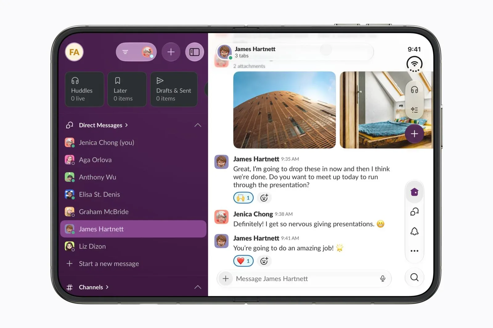
Google Maps joins a growing group of applications adapting their interfaces for Apple’s foldable iPhone. Earlier in the week, Zoom and several Microsoft apps received iPhone Duo optimizations, including Word, PowerPoint, Excel and OneNote.
Those apps illustrate why adaptation cannot be reduced to a simple one-size-fits-all screen expansion. A video-call app, a word processor, a presentation tool, a spreadsheet and a note-taking application all organize work differently. Google Maps has its own priorities: the map needs prominence, search must remain easy to reach, and secondary controls need a home that does not obscure the view.
The presence of optimization work across communication, productivity and mapping software is notable because these are applications people may expect to use in both folded and unfolded states. It also establishes a more useful standard than basic compatibility. An app can launch on a foldable device without being designed particularly well for it; a dedicated layout aims to make the larger display feel useful instead of incidental.
Google has not called out the Duo-specific changes in its release notes. The changes are nevertheless visible in the updated interface. For users, that means the version number is the key detail: Google Maps 26.44.4 is the build associated with the improved display support, and it is available through the App Store.
What iPhone Duo owners should take from the update
The immediate takeaway is simple: anyone using Google Maps on an iPhone Duo should look for version 26.44.4 if the app still displays the old right-edge black border. Updating should bring the fuller-screen presentation on both the inner and outer displays described here.
It is also a reminder that foldable-phone support is often delivered incrementally. A first version may run but leave awkward unused regions or retain a phone-first interface. Later updates can refine how the app handles unusual display shapes, wider canvases and screen transitions. Maps’ progression from partial adaptation in 26.43.1 to a full-screen layout in 26.44.4 is a compact example of that process.
For the broader Apple device conversation, see also Apple’s updated policy language around prediction markets. It is a separate subject, but another indication that Apple-related platform news can range from conspicuous hardware interface changes to quieter policy revisions.
Google Maps’ change is not flashy in the way a major feature launch would be. There is no newly described navigation mode, no announced overhaul of place discovery, and no promised new capability. Instead, it fixes the less glamorous but very tangible problem of an app leaving visible display space behind on a device built around having more of it. For an app whose main job is putting the world in view, that is a fairly appropriate improvement.