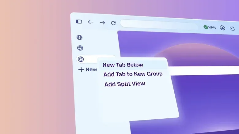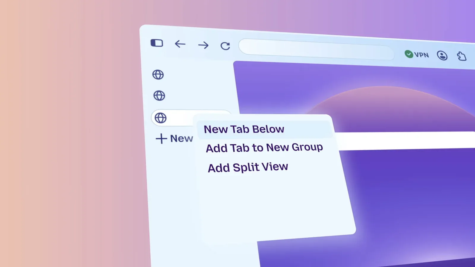
Firefox has entered a fresh visual phase across desktop and mobile, with Mozilla rolling out a redesigned interface to its wider user base. The update refreshes the browser’s themes, icons and colors, but it is not strictly a coat of paint: it also returns compact mode, introduces a theme picker with wallpaper options and makes New Tab shortcuts easier to organize.
The redesign had already been available to people using Firefox Nightly, the browser’s experimental testing channel, for several months. That earlier access matters because a browser redesign is rarely just about whether new icons look nice. Browsers are workspaces. Their tabs, toolbars, menus and settings can be in front of users for hours at a time, whether they are researching a game, keeping a guide open beside a PC title, managing a collection spreadsheet or simply juggling the usual glorious pile of weekend tabs.
Mozilla’s stated aim is to modernize Firefox’s appearance in step with features it has added recently, including a single master switch for generative AI tools. The company also says it has kept performance intact while making privacy controls easier to locate. The practical test for users will be less philosophical: can they find the controls they use, keep the browser out of the way when they do not need it, and still reach power-user features without embarking on a settings-menu expedition?
Compact mode returns after user demand
The most immediately meaningful change for many desktop Firefox users may be the return of compact mode. Mozilla had previously removed the option, but it is now back in the redesign.
For more context, explore Ringo Starr, David Byrne and Joan Baez Items Join Housing Works’ Turn It Up! Auction.
Compact mode reduces the amount of screen space used by the browser’s tabs and toolbar. Put simply, it tightens the upper portion of the window so more of the webpage is visible below it. That can be useful on smaller displays, in windowed multitasking setups, or for anyone who prefers their browser chrome—the interface around the webpage—to occupy as little room as possible.
It is a modest option with an outsized everyday effect. A browser interface may only take a limited strip of the display, but it is permanently present while browsing. Reclaiming some vertical room can help when reading a long strategy page, comparing listings, following a live event, or keeping documentation visible while working through something else. It also acknowledges that “modern” does not always mean “larger.” For some users, a cleaner experience means fewer pixels devoted to the frame around the content.
The return is also a useful reminder that customization remains a major part of browser comfort. There is no universally ideal toolbar height. One person may want large, forgiving controls; another may value density and information on screen. Restoring the choice lets those preferences coexist rather than treating one layout as the answer for everyone.
Related coverage includes Firefox Redesign Rolls Out Across Desktop and Mobile With Compact Mode Return.
A new theme picker and a more personal New Tab page
The redesign adds a theme picker, including wallpaper choices, and the ability to arrange shortcuts on the New Tab page. These are personalization features rather than changes to how the web itself works, but they can shape how approachable and useful the browser feels at launch.
A theme generally changes the visual treatment of the browser interface, such as its colors and styling. Wallpapers add another visual layer to the New Tab experience. Neither has to be essential to browsing, of course, but choice can be valuable in a tool opened repeatedly throughout the day. Some users will want a low-distraction look; others may prefer something with more character. The important detail is that Firefox is putting those decisions into a dedicated picker instead of making them feel like an obscure, advanced tweak.
Organizable shortcuts may be more functionally significant. The New Tab page is often a browser’s starting point, and shortcuts can turn it into a compact launchpad for frequently used destinations. For game fans, that could mean a favorite community hub, storefront, build planner or tournament page. For collectors, it might be a marketplace search, price tracker, database or inventory document. Firefox is not prescribing those destinations; it is giving people more control over the order in which they appear.
Privacy and AI controls are part of the redesign’s bigger purpose
Mozilla says privacy settings are now easier to find. This is an interface change with potentially greater importance than a new color palette, because a setting is only useful if people can discover it and understand where it lives.
Privacy controls cover the options that affect how a browser handles a user’s activity and data. The update does not specify individual controls or changed defaults, so users should not assume that a visual refresh alone has altered their existing choices. What Mozilla is claiming is improved access: the relevant settings should be less hidden for people who want to review them.
Firefox’s recently added single switch for generative AI tools fits the same broad design philosophy. A master switch is one control intended to manage a whole category of features, rather than requiring people to hunt down several separate toggles. In an era when AI features can become scattered across products, a plainly available off switch gives users a clear way to state a preference.
That does not make every preference decision effortless, but it is a more legible model than burying capability controls behind a chain of menus. People who want such tools can keep them available; people who do not can use a single control to disable them. The value lies in the clarity of the choice.
Power features remain available without taking over the interface
Mozilla says tab groups, split view and vertical tabs are not being pushed to the center of the new Firefox experience, though they remain close at hand for people who want them. That is a deliberate balance between approachability and depth.
Tab groups are a way to organize related tabs together. They can be useful when a browsing session spans several subjects—perhaps news, shopping research and a game guide—without requiring every open page to live in one long, undifferentiated row.
Split view refers to showing more than one page at once within the browser environment. Its appeal is straightforward: it can reduce the back-and-forth involved in comparing information, reading instructions while filling out a form, or keeping a reference page visible alongside another site.
Vertical tabs move the tab list from the usual horizontal strip at the top of the browser to a side panel. This can make tab names easier to read and can be especially appealing to people who maintain many open pages.
Not making these features the visual centerpiece may help prevent the browser from feeling overloaded for people who simply want an address bar and a few tabs. At the same time, keeping them readily accessible avoids treating advanced organization as a hidden secret. It is a sensible distinction: useful tools do not need to be mandatory furniture.
Accessibility is central to customization, not separate from it
Mozilla says it designed the customization options with accessibility in mind. Accessibility in interface design means ensuring that a product can be used by people with differing needs and preferences. The supplied details do not list particular accessibility adjustments, so it would be premature to claim specific changes. Still, the design intent is notable.
Customization can support accessibility when it allows people to make an interface more comfortable and manageable for their own use. The needs behind that can vary widely: visual clarity, lower distraction, predictable placement of often-used controls, or a layout that better suits an individual workflow. A compact layout will not be ideal for everybody, just as a larger, roomier interface will not be ideal for everybody. Offering choices is more valuable than declaring one visual density universally correct.
For existing Firefox users, the rollout means the familiar browser may soon look noticeably different while retaining access to its deeper organization tools. For users who tried the Nightly version, the wider release makes the changes less of a preview and more of the standard Firefox experience. The headline additions are straightforward—compact mode, themes, wallpapers and organized shortcuts—but the broader point is that Firefox is trying to make its choices more visible without putting every feature in everyone’s face.
That is a quietly practical direction for a browser. The web is already noisy enough. A browser should give people room for the sites, communities and projects they actually came to see.