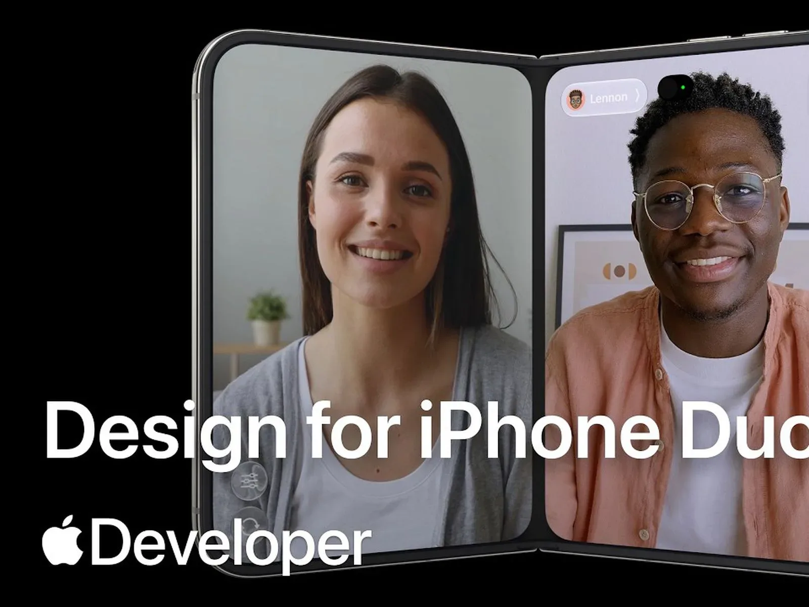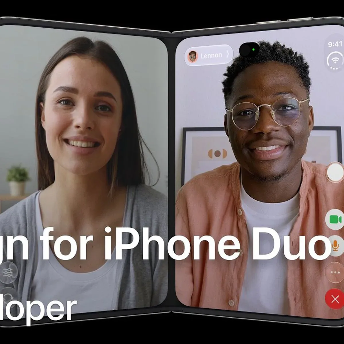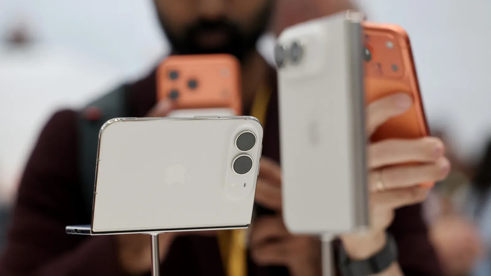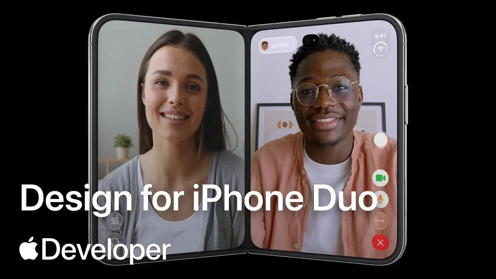
Apple has published a six-part developer video playlist centered on iPhone Duo, the company’s first foldable iPhone. The series is aimed at software creators preparing applications for the new device and its changing screen configurations. It arrives well before the phone’s stated preorder date of October 16 and availability date of October 23, giving developers a defined set of topics to work through before iPhone Duo reaches customers.
The playlist is called Get ready for iPhone Duo and lives on the Apple Developer YouTube channel. Rather than treating the foldable form factor as merely a bigger phone screen, the video lineup indicates that iPhone Duo’s software model asks developers to consider layout, interface placement, display changes, multiple scenes, and camera behavior as parts of the same experience.
That is the practical challenge behind a foldable: an app must make sense while the hardware is closed, remain usable as the device opens, and feel intentional when the larger internal display is available. A badly prepared app could make the transition feel like moving a living-room setup from a small table to a ballroom without bringing any extra furniture. The device may be premium; the interface still needs to know where to put the sofa.
The six iPhone Duo developer videos
Apple’s playlist contains the following six videos:
- Design for iPhone Duo
- Prepare your app for iPhone Duo
- Raise the bar with iPhone Duo
- Strike a pose with adaptive layouts on iPhone Duo
- Leverage multiple displays and scenes on iPhone Duo
- Build a great camera experience for iPhone Duo
The names sketch out the company’s priorities. Some are broad introductions to designing and readying an app, while others point to specific technical and interaction questions. “Adaptive layouts,” for example, puts the emphasis on interfaces that can respond to the available space instead of remaining rigid. “Multiple displays and scenes” signals that developers need to account for more than one screen context. The camera-focused entry similarly identifies photography and camera-driven apps as an area requiring deliberate work.
For games, those categories can matter even when an app is not trying to turn the inner display into a tiny arcade cabinet. Menus, inventories, social spaces, maps, chats, character-build screens, companion tools, streaming overlays, and store pages all have interface demands that can change with screen size and orientation. The playlist does not identify any individual games or promise particular game features, but the design subjects are broadly relevant to any developer whose app has information to arrange.
A software design built around changing displays
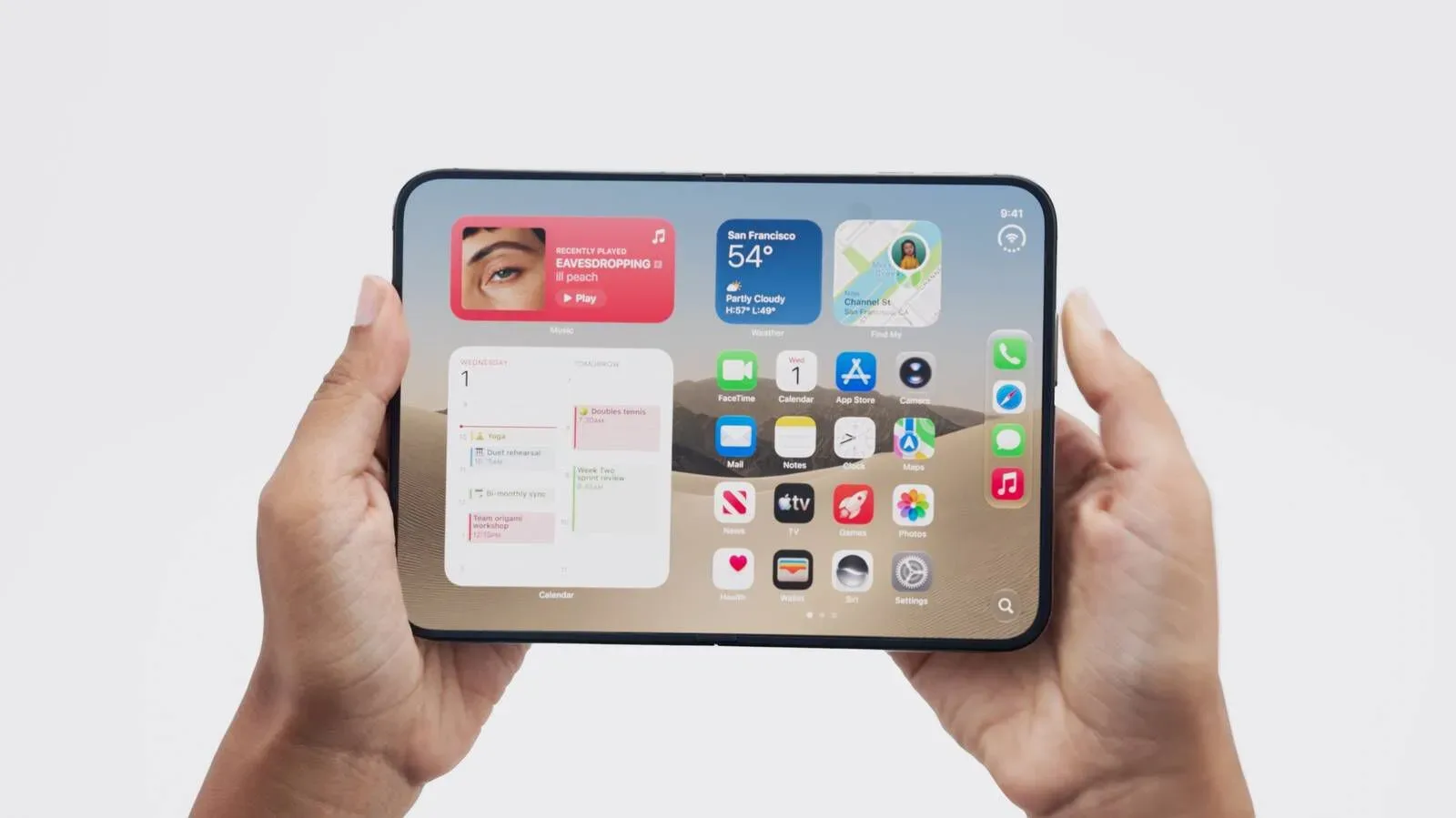
iPhone Duo has several interface changes intended to suit its foldable design. Essential controls have been moved to the sides of the display, placing them within thumb reach. The Home Screen dock is vertical rather than horizontal, and the status bar has been reworked to fit into a corner of the display.
Those choices are notable because a larger screen does not automatically make every on-screen element easier to reach. If the important buttons drift too far from where a hand naturally rests, extra display area can become extra travel. Moving essential controls to the sides aims to keep key interactions closer to the thumb, while the vertical dock and corner-oriented status information show that iPhone Duo’s system interface is not simply treating the inner panel as a standard enlarged iPhone canvas.
Apple also describes software moving between the outer and inner displays as the handset opens. Controls are intended to remain in a consistent position while content expands. That continuity is central to the experience the developer material appears designed to encourage: the application should not feel as if it has shut down one version of itself and launched another every time the hinge moves.
Consistency does not mean every visual element must stay identical in size. The supplied details specifically say content scales up while controls retain their positions. For app makers, that distinction is important. A user may expect familiar interaction points to remain predictable, even as the space around them grows and the content can be shown at a larger scale. The developer videos are positioned as guidance for preparing applications around those conditions.
Why adaptive layouts have their own lesson
One of the most revealing titles in the playlist is Strike a pose with adaptive layouts on iPhone Duo. Adaptive layout work is where foldable hardware becomes a day-to-day software issue rather than a glamorous product-category label. An interface designed only for one narrow, fixed shape can look cramped, oddly empty, or structurally confused when its available display area changes.
The video title does not provide a list of required app behaviors, so developers should not read it as a public checklist of guaranteed features. Still, its inclusion makes clear that layout adaptation is a named focus of Apple’s iPhone Duo preparation material. A well-organized application can potentially use added room to give content more breathing space while preserving the familiar placement of controls described for the device’s software transitions.
That theme has relevance beyond games. Reading apps can display more material without losing navigation. Creative tools can reconsider how controls and work areas coexist. Communication apps can plan around conversation content and surrounding navigation. Media apps have to think about how viewing space changes when a customer opens the device. The common point is not that every app should fill every spare pixel with panels. It is that screen-space changes deserve a layout designed for them.
Multiple displays, scenes, and the camera question
The playlist separates “multiple displays and scenes” from general adaptive layout discussion. That suggests Apple sees display handling and scene management as a distinct area for developer attention on iPhone Duo. The exact implementation details belong in the videos themselves, but the framing is straightforward: foldable hardware introduces more display circumstances than a conventional single-screen iPhone.
Camera functionality also receives its own session, Build a great camera experience for iPhone Duo. That is a useful reminder that camera apps are not only about the final image. On a foldable device, framing, controls, and the broader interface around a camera view can all be affected by the device’s physical state and display arrangement. Apple has identified this as a dedicated preparation topic, without the supplied information specifying individual camera modes, app requirements, or new photographic capabilities.
Developers who want the wider Apple hardware context may also want to note that iPhone Duo battery estimates can vary significantly based on which display is in use. That display-dependent battery discussion adds another reason app efficiency and thoughtful interface behavior may be relevant as the platform takes shape, though the new video playlist itself is focused on app preparation rather than battery claims.
Timing, price, and what the playlist does—and does not—mean
iPhone Duo starts at $1,999 in its 256GB configuration. Storage capacities extend as high as 2TB. Preorders are scheduled to begin October 16, and availability is scheduled to start October 23.
At that starting price, iPhone Duo is positioned as a high-end device, and Apple’s early developer guidance gives app teams a chance to address its particular interface before the retail launch window. The availability of six focused videos does not establish that every app will be updated in time, nor does it reveal which developers are participating. It does, however, give the development community an official set of starting points that correspond directly to the foldable’s documented software behavior.
For players and general users, the immediate takeaway is less about an individual app announcement and more about what Apple considers important to the device’s day-one software feel. Thumb-reachable side controls, a vertical dock, a corner-adapted status bar, continuity between outer and inner displays, adaptive layouts, multi-display and scene considerations, and camera experience design are all now explicit parts of the iPhone Duo developer conversation.
For developers, the message is equally clear: iPhone Duo is approaching as a device with its own interface assumptions, not just a phone with a larger unfolding panel. The playlist gives those assumptions names and categories. What apps ultimately do with that guidance will determine whether opening the phone feels like a seamless expansion of a task—or the digital equivalent of a game menu realizing halfway through a boss fight that it was designed for a different screen.