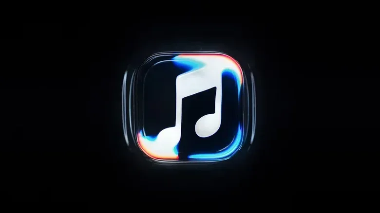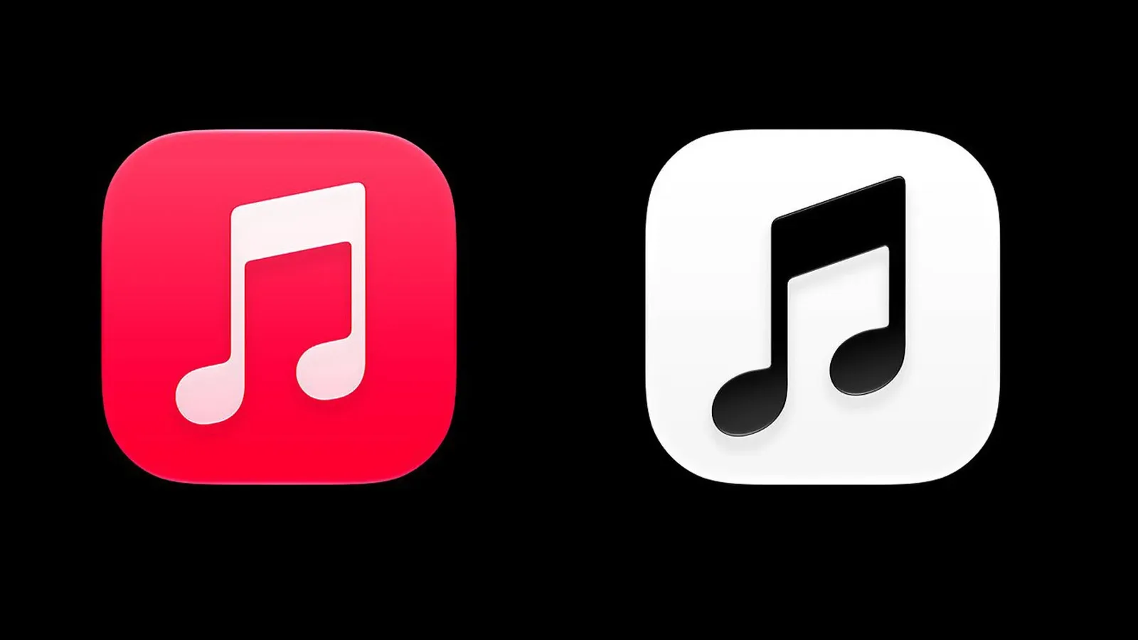

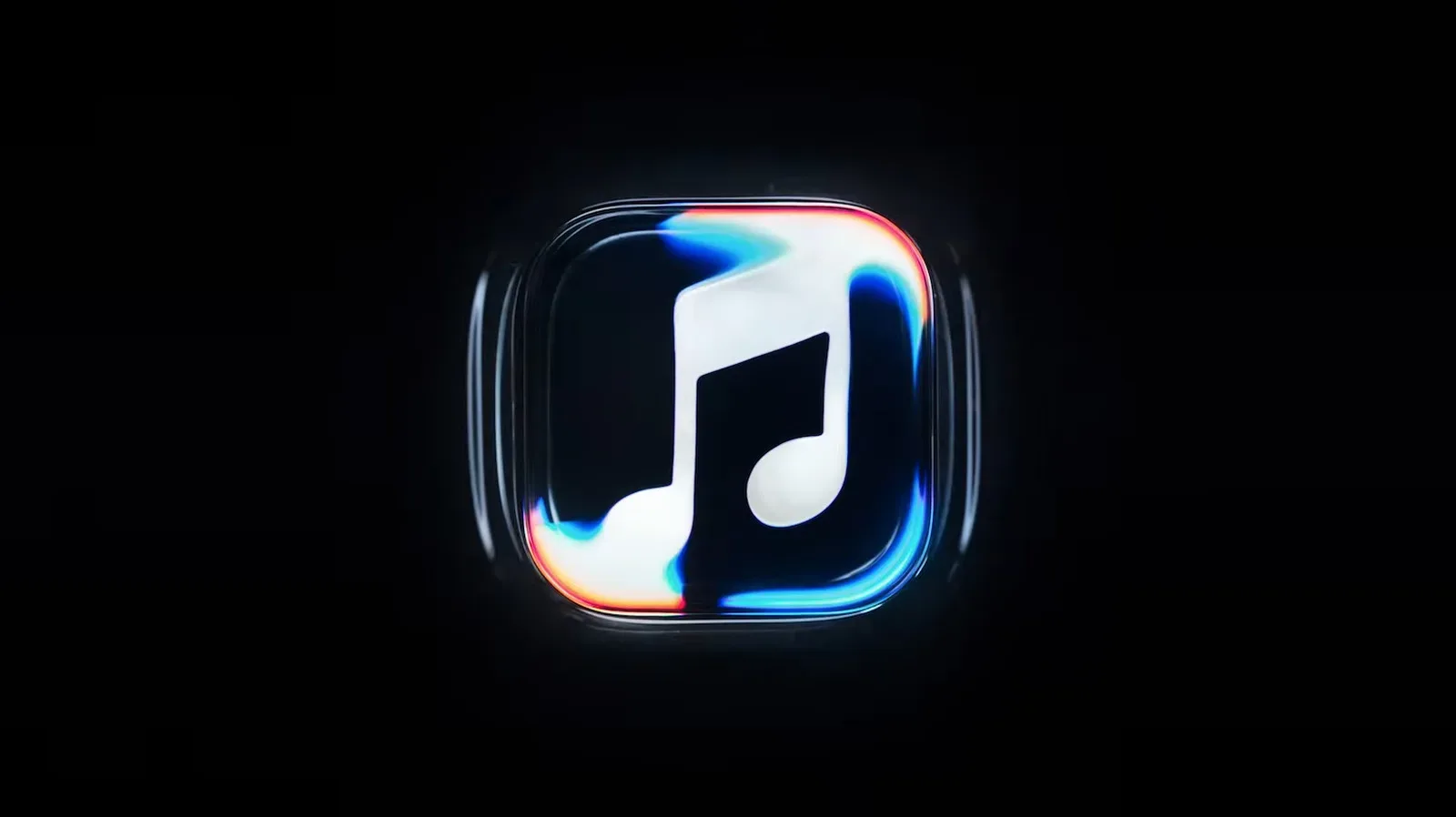
Apple Music is preparing a visual reset built around an unusually literal interpretation of music: make sound visible. Its new motion identity depicts a musical note beneath concentric ripples, an image designed to suggest that audio is disturbing a surface like drops of rain on water. The branding is intended for the openings of Apple Music videos and concert footage, while the service’s familiar red app icon is set to shift to a black-and-white look.
The most interesting detail is not simply the finished logo, but the method used to create it. Rather than beginning with an entirely computer-generated animation, Apple says the visual was produced through practical effects. The mark was etched into the glass floor of a small tank, mineral oil was added, and a transparent cover sat over the logo. An instrument then played a brief sequence of tones, causing the liquid to move. That movement was filmed and became the basis of the ripple effect.
It is a small branding change with a surprisingly broad ambition. A music service cannot show listeners the song itself, so its visual language usually leans on album artwork, artist photography, equalizers, or abstract motion. Apple Music’s new system instead makes vibration—the physical consequence of sound—the central image. It is the sort of concept that sounds almost too tidy in a marketing meeting, but the practical construction gives it a material quality: the waves were not merely illustrated to look reactive; the oil was actually set in motion.
A logo built from vibration rather than decoration
A motion logo is a logo designed to be seen over time instead of only as a fixed symbol. It can serve much the same role as a studio ident before a film or a familiar audio sting before a show: it establishes who is presenting the material before the main video begins. In this case, Apple Music plans to use its rippling mark at the beginning of videos and in concert-related footage.
That use matters. A static app icon must remain readable at a glance, often at very small sizes. Video branding has a different job. It can introduce texture, rhythm, and anticipation over a few seconds. The ripple animation makes the Apple Music symbol feel less like a badge stamped onto content and more like an event that happens because of music.
The concept was developed with producer Fred Again and NEST Acoustics. The guiding objective was to let sound generate the imagery rather than merely accompany it. That distinction explains the tank experiment. The visual is not just water-like because water looks attractive on screen; its movement is tied to a short set of played tones.
There is no reason to read this as a claim that every waveform in the final animation maps directly to a precise musical frequency. The material provided describes an instrument being used to create ripples in mineral oil, not a technical visualization tool or a new playback feature. Still, the process is meaningful as a design choice. It gives the identity a physical origin and connects the logo’s movement to the activity it represents: making sound.
Why mineral oil and a tank are important to the story
Calling something a practical effect does not mean computers were absent from the finished work. It means a real-world process supplied at least part of what the viewer sees. Here, the etched glass, the tank, the oil, the cover, and the tones all formed a miniature setup that could be filmed.
That approach can produce irregularities that digital animation often has to imitate deliberately: slight shifts in wave shape, changing overlaps, and motion with a less perfectly uniform feel. Apple has not detailed the subsequent editing or finishing process, so it would be wrong to assume the footage was used untouched. What is clear is that the raw idea begins with physical liquid responding to sound.
The use of mineral oil is similarly part of the setup rather than a consumer-facing feature. Viewers will encounter the result as branding, not as an interactive experiment. Yet it helps explain why the new identity has a more tactile premise than a conventional animated icon. The logo is effectively a filmed object before it becomes a digital asset.
How the ripples fit Apple’s Liquid Glass direction
The new Apple Music identity is positioned to complement Apple’s Liquid Glass software interface. The pairing is intuitive: Liquid Glass invokes transparent, glossy, layered surfaces, while the Apple Music animation uses a liquid surface responding to vibration. Both approaches put emphasis on light, depth, translucency, and movement rather than flat blocks of color.
That does not mean the music service is being described as a new interface in its own right. The available information identifies a visual rebrand and app-icon change, not a detailed list of Apple Music controls, menus, recommendation tools, or playback additions. The safer reading is that Apple is aligning the service’s presentation with a broader software aesthetic.
For users, that distinction is practical. The animated mark will primarily appear around video and concert content. The app icon, meanwhile, is the everyday touchpoint: it is what sits on a home screen, in a dock, or among search results. Moving from a saturated red icon to black and white is a much more immediately visible change than a short video ident, even if the elaborate ripple animation is the more technically distinctive piece of the rebrand.
The icon change has already drawn an unfavorable response from some people online. That reaction is understandable even without treating it as a definitive verdict. Red had offered strong contrast and instant recognition; monochrome places more weight on the note silhouette and the icon’s surrounding operating-system context. Minimalism can make a group of apps look cleaner, but it can also reduce the visual shorthand people rely on when they want to find a service quickly.
What is changing—and what has not been established
The confirmed changes are visual. Apple Music is getting a rippling motion logo for video and concert contexts, an app icon moving from red to black and white, and an identity created with Fred Again and NEST Acoustics. The rollout is tied to upcoming iOS 27.2 and macOS 27.2 software releases.
- Motion branding: a musical note appears below wave-like ripples generated through a filmed practical-effects setup.
- Video placement: the motion logo is intended for Apple Music videos and concert footage.
- App icon: the existing red treatment is changing to black and white.
- Software timing: the changes are coming with iOS 27.2 and macOS 27.2.
Just as important is what has not been specified. There is no supplied evidence of a new subscription tier, a change to Apple Music’s catalog, altered audio quality, an artist-payment revision, or a new listening feature. A dramatic-looking rebrand can invite assumptions that a larger product overhaul is underway, but a brand refresh should be judged first as a brand refresh unless more is confirmed.
That restraint is especially useful in services where visual changes can feel personal. Music libraries, playlists, and listening habits live on phones for years; even a color change can produce a strong reaction because it alters an object users see constantly. The black-and-white icon may be a minor technical change, but its visibility makes it a major perceptual one.
The branding strategy: make music feel physical
The new identity’s central promise is not that music can be perfectly translated into a picture. It is that sound has tangible effects. A struck note creates vibration; vibration can move liquid; the liquid’s motion can be recorded; and that recording can become the recognizable opening gesture for a music platform. It is a compact chain of cause and effect.
That is more specific than generic audio visualization. Equalizer bars and pulsing circles often communicate “audio is happening,” but they can be applied to almost any song, device, or service. Apple Music’s etched note under oil gives the visual a proprietary object and a clear ritual. The musical note is present before the liquid moves, so the brand mark is not lost inside abstraction.
The collaboration with Fred Again also reinforces the project’s producer-led angle. Rather than presenting sound as a file or an interface input, the rebrand frames it as something made, played, and capable of affecting a physical environment. NEST Acoustics’ participation further keeps the focus on acoustics and the experiment-like construction of the visual.
For Apple, the practical-effects element may be as valuable as the final clip. It creates an easily understood behind-the-scenes story: sound made the image. That is a more memorable explanation than a generic account of software animation, and it gives the company material that can work across launch videos, concert footage, and social clips.
A small icon, a larger question of recognizability
There are two audiences for this redesign. One will see the polished ripple animation around premium video programming and likely read it as a refined extension of the Liquid Glass aesthetic. The other will mostly notice that the red Apple Music icon they recognize has changed. Both responses are valid because the elements serve different functions.
The motion mark seeks emotional association. It turns sound into an image of flowing energy. The icon seeks utility. It must be found fast and understood at a tiny scale. A successful brand system needs both, but the criteria are not identical. An elegant animated ident does not automatically make a monochrome app tile easier to recognize, and the current online criticism appears focused on that everyday usability and familiarity rather than the oil-tank craft behind the video logo.
The broader technology world regularly treats interface design as identity design: a palette, an icon, and a few seconds of motion can signal that a product belongs to a new software era. That kind of change carries consequences beyond visual novelty, including how people orient themselves within their devices and how quickly they adapt to updated symbols. The stakes are different from the industry concerns surrounding platforms and privacy, but the common thread is that product decisions shape daily digital habits. For a separate look at the policy pressures facing major platforms, see the Meta privacy-case ruling.
Apple Music’s ripple logo will ultimately be remembered less for the novelty of liquid in a tank than for whether the company can make its visual idea feel native to the service. The underlying thought is clear and unusually cohesive: music produces waves, waves become imagery, and the imagery identifies the music platform. With iOS 27.2 and macOS 27.2 set to carry the changes, listeners will soon get to judge whether the monochrome icon and the more theatrical video identity feel like two parts of the same design—or like a beautiful splash paired with an unexpectedly muted home-screen tile.