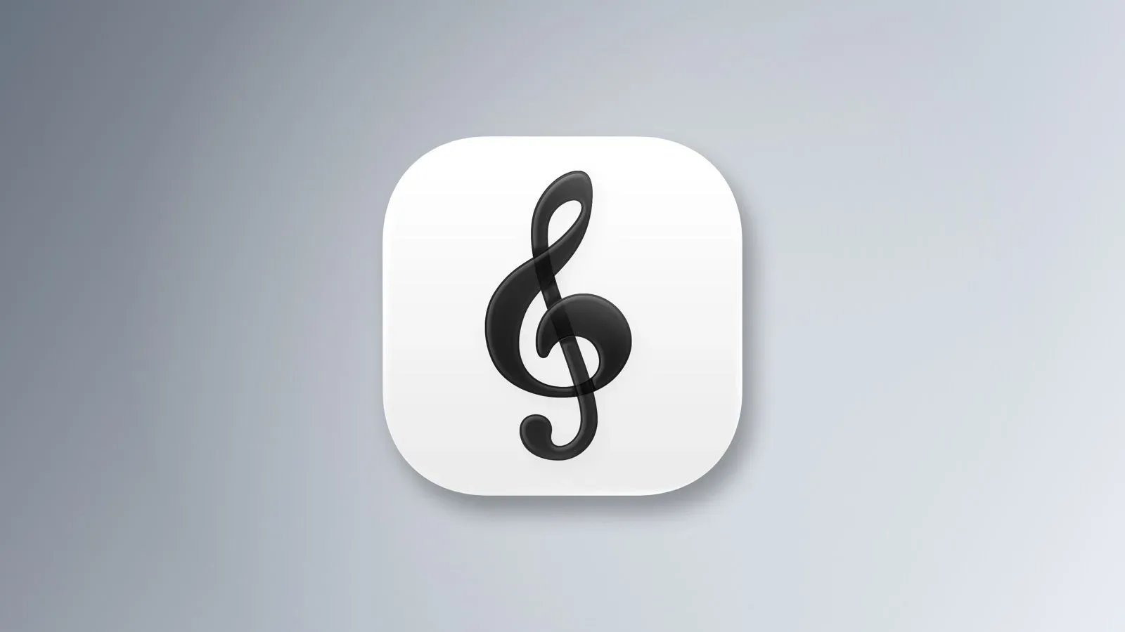


Apple Music Classical has received a quieter piece of Apple’s broader visual rework: its app icon is now black and white. The change replaces the service’s previous red-and-white G-clef mark and brings the standalone classical app in line with the recently revised Apple Music identity.
There is a small but meaningful distinction between the two redesigns. Apple Music’s new monochrome icon has been criticized for looking flat and stripped down. The Classical version also moves away from red, but it retains a degree of translucency and dimensionality in its G-clef design. In plain English: it is still a black-and-white icon, just not one that appears to have been pressed through the world’s most severe printer setting.
For people who use the service, this is an interface and branding change, not an indication of a new music tier or a separate payment. Apple Music Classical remains included with an Apple Music subscription. In the United States, the individual subscription is listed at $12 per month, while the Family plan costs $20 per month and supports up to six people.
A visual alignment, not a new subscription
The logo switch follows Apple’s decision last month to retire the familiar red Apple Music logo in favor of a black-and-white design. Apple subsequently described that broader rebrand as defining the service’s new identity. Updating the Classical icon makes sense within that program: two related applications now share the same basic color approach rather than occupying noticeably different visual territories on a home screen.
That does not mean Apple Music Classical has stopped being its own app. It is separate from the primary Apple Music application, and that separation is central to what it is meant to do. The catalogued music itself is also available in the main Apple Music app, but Classical is built to make discovery and searching more useful for this particular genre.
That distinction matters because classical recordings can be unusually difficult to identify with a simple song-title search. One composition may exist in many recorded performances, with different conductors, orchestras, soloists and vocalists involved. A listener looking for a specific rendition of a work is not necessarily just looking for the composition; they may be looking for that performance of it. Apple Music Classical is positioned as the more focused route for navigating those variations.
Why classical music benefits from a dedicated search experience
In a conventional streaming interface, music is often approached as a track attached to an artist and album. That model can still apply to classical music, but it is less complete. The same piece may be performed by numerous artists over many years, and a search system has to help a listener distinguish among versions rather than treating every result as an interchangeable copy.
Apple Music Classical’s specialized discovery and rendition search are therefore practical features, not just genre-themed decoration. Someone who already knows the name of a piece may want to compare recordings; another listener may be trying to find a performance associated with a particular singer or instrumentalist. The service’s separate app gives Apple a place to emphasize those needs without redesigning the entire main Music experience around them.
It is also why the old G-clef imagery made intuitive sense. A G clef is the formal name for the musical symbol commonly called a treble clef. It signals the app’s subject immediately, even at icon size. The redesigned icon preserves that familiar identifier, despite abandoning the original red-and-white palette.
Monochrome does not have to mean completely flat
Apple’s new logo direction has prompted a negative response in some corners, particularly around the primary Music app icon. Criticism has largely focused on the loss of the old red identity and the more one-dimensional appearance of the replacement. Branding reactions are inherently subjective, but app icons do have a practical job beyond looking fashionable: users need to recognize them quickly among a dense grid of software.
The Classical icon’s retained translucent treatment could make the transition easier for that reason. It keeps a visible sense of layered form while still matching Apple Music’s black-and-white family resemblance. Rather than duplicating the main app’s exact visual flatness, it adapts the monochrome direction to a symbol that has long been associated with the Classical app.
That is a restrained approach to brand consistency. The applications can look related without becoming visually indistinguishable. For an ecosystem with a main service and a specialized companion, that is arguably the sensible middle ground: consistent enough that the connection is obvious, distinct enough that each icon retains a recognizable role.
What changes for listeners
The immediate user-facing change is simply the icon: those with Apple Music Classical installed should see a black-and-white G clef rather than the prior red-and-white version as the update reaches their devices. Nothing in the update indicates that the app’s core purpose has changed. It remains a way to browse classical music and locate particular renditions from within the Apple Music subscription.
For subscribers deciding whether to use the dedicated app at all, the useful question is not whether it contains a separate vault of songs. The same tracks are available through the main app. The differentiator is the way Classical helps organize discovery and searches around a genre where performer and rendition details can carry exceptional weight.
And if the refreshed branding has anyone thinking more broadly about phone audio, an icon swap alone will not change playback quality. Hardware and listening setup remain separate considerations; an external DAC only makes sense in specific phone-audio situations, rather than as an automatic upgrade for every streaming subscriber.
A modest redesign with a clearer fit
There is no evidence here of a new feature set, catalog expansion or price change. This is Apple bringing a companion app into its current design language. Yet it also shows that a system-wide visual push can leave room for a little product-specific character.
Apple Music Classical’s monochrome icon gives up its red accent, but it has not abandoned the G clef or its slight sense of depth. For an app designed to help users sort through the many interpretations of a musical work, that may be an apt outcome: the central theme is familiar, but the presentation is not exactly the same as the one beside it.