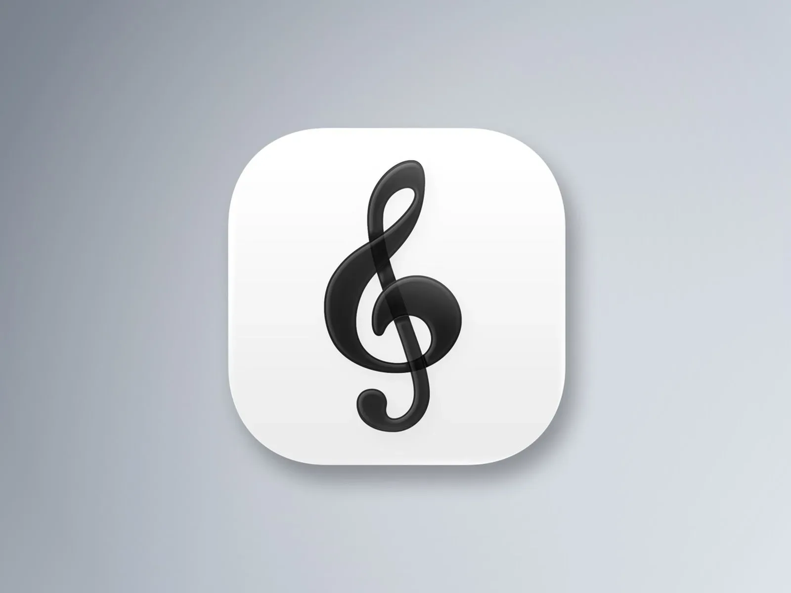

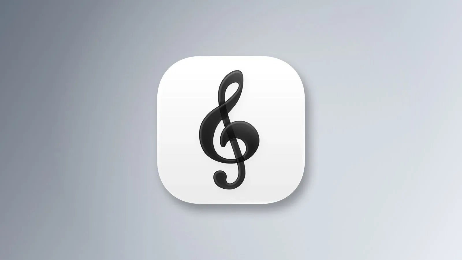
Apple Music Classical version 4.1 is now available for iPhone and iPad, bringing a quiet but noticeable visual refresh to the dedicated classical-music app. The update changes the app’s icon to a black-and-white design and replaces several red interface highlights with blue ones.
The release notes themselves only identify stability and performance enhancements, so Apple has not set out a detailed changelog for the design work. Still, the visual differences are clear: the app is moving closer to the newer look adopted by Apple Music.
A treble clef, minus the red
The revised Apple Music Classical icon keeps its familiar treble clef. Its presentation has changed, however, with a shaded black clef set against a white background. That is a substantial shift from the app’s earlier red-led appearance.
The redesign is part of a broader visual alignment. Apple introduced a monochrome identity for Apple Music last month, replacing the service’s familiar red branding. Apple Music Classical now follows that same direction rather than standing apart as a red-accented sibling application.
For users, an app icon can sound like the smallest possible update, and in practical terms it is. It does not change a library, add a recording, alter subscription access, or improve a search result by itself. But icons are also the most persistent part of a mobile interface: they appear on the Home Screen, in search, in notifications, and anywhere an operating system surfaces an installed app. A black-and-white treatment makes Apple Music Classical immediately legible as part of the current Apple Music visual family.
Blue becomes the active interface color
Inside the app, version 4.1 uses blue accents for selected tabs, playback controls, and links. Those elements previously used red. This is a functional change in the limited sense that an accent color is the color used to draw attention to an active choice or interactive control; it signals what is selected and where a tap may lead. It is not evidence of new playback functionality.
That distinction matters because a refreshed interface can make an update feel larger than it is. The supplied release information does not identify new listening features, changes to the catalogue, or revised subscription terms. The documented changes are visual, while the official notes also point to general stability and performance work.
Blue highlights may nevertheless affect the app’s day-to-day feel. Selected tabs need to stand out from unselected ones, playback buttons need to be easy to identify at a glance, and links need to look distinct from ordinary text. Moving those cues from red to blue changes the hierarchy of the screen without changing the basic jobs they perform.
What Apple Music Classical is for
Apple Music Classical is included with an Apple Music subscription at no additional cost. It is a separate app geared toward the particular metadata and discovery needs of classical recordings.
Classical catalogues can be difficult to navigate when a listener is trying to distinguish among composers, performers, ensembles, conductors, works, and individual recordings. Apple Music Classical addresses that with search tailored to classical recordings. Rather than framing this as a newly introduced capability, it is part of the service’s existing feature set that remains relevant after the 4.1 design pass.
The app also includes composer biographies, album booklets, time-synced listening guides, and curated stations. Each has a different role:
- Composer biographies provide background on the person credited with writing a work.
- Album booklets are accompanying materials for an album, offering context beyond the track listing.
- Time-synced listening guides present guidance that follows playback timing, helping listeners connect commentary with the moment they are hearing.
- Curated stations organize music into programmed listening selections rather than requiring every session to begin with a specific album or search.
Those tools explain why the app exists independently from Apple Music even though it is included with the same subscription. Its focus is not simply on placing classical albums in a separate visual bucket. It is on presenting recordings with discovery and reference features intended for the genre.
What version 4.1 does—and does not—confirm
It is useful to separate confirmation from inference with small interface updates. Version 4.1 confirms a new monochrome icon, blue accents across selected tabs, playback buttons, and links, plus Apple’s stated stability and performance enhancements. It also confirms that the application remains available through the App Store on iPhone and iPad.
It does not establish a new feature roadmap for the app. There is no stated change to the included subscription benefit, no stated revision to classical search, and no listed addition to biographies, booklets, listening guides, or stations. Likewise, the performance note does not specify which parts of the app have been improved, so it should not be read as a promise about any particular issue or behavior.
For listeners who prefer the old red-led palette, the update represents an aesthetic transition rather than a choice of theme described in the available information. For everyone else, it is a consistency update: Apple Music Classical now looks more closely connected to Apple Music’s current monochrome branding while keeping the genre-specific experience intact.
Availability and device requirements
Apple Music Classical 4.1 is available now from the App Store for iPhone and iPad. It requires iOS 18 or later on iPhone, or iPadOS 18 or later on iPad.
That operating-system requirement is the practical checkpoint for subscribers looking for the new design. A qualifying device can install the updated app; an older OS version does not meet the listed requirement. The app remains included with Apple Music subscriptions at no extra cost, rather than being presented as a separate paid service.
Apple’s Apple-focused activity has also extended beyond music software, with the company linked to a broader hardware stretch in recent Apple platform coverage. Apple Music Classical 4.1 is much smaller in scope, but it illustrates how a company-wide branding shift can reach even a specialized companion app through its iconography and interaction colors.
In short, 4.1 is an update for polish and cohesion, not a reinvention. The treble clef remains, the classical-focused tools remain, and the app’s inclusion with Apple Music remains. What changes is the visual language around them: black and white on the Home Screen, blue where the interface needs to direct attention, and a closer match to Apple Music’s newer identity.