A Roku TV can be perfectly watchable straight from the box and still leave a surprising amount of image quality on the table. The default look is often designed to grab attention in a bright retail environment: punchy colors, forceful contrast and conspicuous brightness can appear impressive at a glance. At home, however, that same approach can make movies, television and game worlds appear less natural than intended.
The useful news is that a major improvement does not require professional calibration equipment. Roku TVs expose the controls that matter most through their Picture Settings menu. A more restrained picture preset, a few cautious adjustments and a look through the advanced processing options can produce a more balanced image without turning setup into a weekend-long science project.
For players, this is also a practical per-input task. Roku TV picture settings apply separately to each connected input. In other words, an adjustment made while using one HDMI-connected device will not necessarily carry over to another. That may be mildly inconvenient, but it is valuable control: a user can tune each source deliberately rather than assuming one setting suits everything. The menu also includes an option to apply settings across all inputs for anyone who prefers a single consistent baseline.
Start with the right Roku TV picture mode
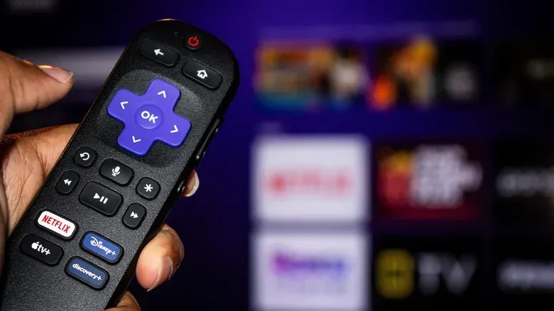
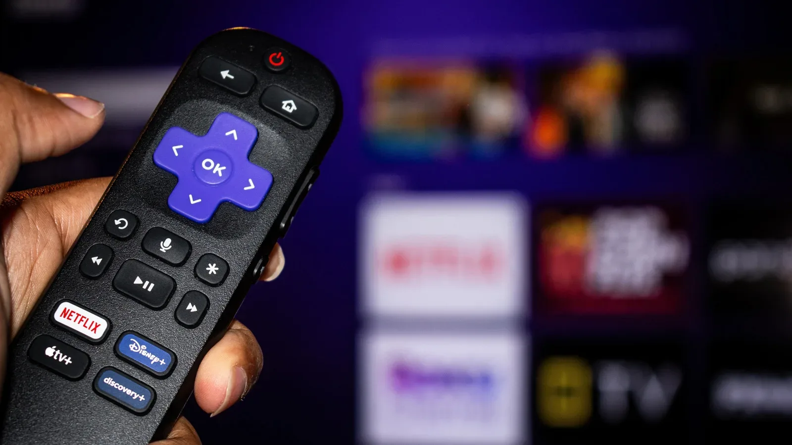
Begin playback first, then press the star button on the Roku remote and open Picture Settings. If Picture Settings does not appear immediately, starting a show, movie or other video should make the option available. The key controls are Display Brightness, Picture Mode and Customize picture.
Picture mode is the fastest, highest-impact place to start because it changes several image decisions at once. On Roku TVs, Standard or Movie are the sensible starting points for a more accurate image. Movie mode generally uses less image processing and trends warmer in color temperature than Standard.
That word, warmer, describes the balance of color in the image rather than its brightness. A warmer color temperature shifts the image away from a cooler, bluer cast. There is no universal subjective winner for every viewer and room, but Movie’s reduced processing makes it an especially useful baseline for people who want the display to interfere less with the picture.
Vivid takes the opposite route. It increases color saturation, brightness and contrast. Saturation is the intensity of colors; driving it higher can make a green field, red costume or neon-lit game scene look louder. Contrast concerns the separation between bright and dark portions of the image. These changes can be effective in a showroom, where a TV is competing with many others under strong lights, but they can turn an image into an exaggerated version of itself in a normal room.
Roku Smart Picture takes a more automated approach by attempting to identify what is on screen and select a suitable picture mode. That can be convenient, but users seeking a predictable, stable image may prefer selecting Standard or Movie themselves and making small deliberate changes from there.
A sensible baseline, not a dare to copy numbers
There is no single set of numerical values that can responsibly be declared ideal for every Roku TV. Models differ, rooms differ, and a setting that works in a sunlit living room may be inappropriate at night. The productive approach is to choose Standard or Movie, watch familiar material, then alter one control at a time in small increments.
- Choose Standard or Movie as the initial picture mode.
- Use Vivid only if its deliberately amplified look is actually what you prefer, rather than mistaking it for a neutral reference.
- Give Roku Smart Picture a chance only if automatic switching is more important than having a fixed, known baseline.
- Make gradual adjustments and return to actual viewing between each change.
The last point matters. A large pile of adjustments made in quick succession makes it hard to know which one helped and which one created a new problem. Small changes, assessed with familiar scenes or games, make the process easier to reverse and easier to understand.
Customize picture: what the main controls really change
After selecting a mode, open Customize picture. The most direct room-dependent option is the Backlight control. It governs the display’s light intensity. A brighter room generally calls for a higher Backlight setting so the picture can hold up against ambient light. In a darker room, excessive light output can be uncomfortable or unnecessarily harsh.
Brightness, contrast and sharpness deserve a more cautious touch. Their names make maximum values sound desirable, but that is not how they work in practice. A higher sharpness setting does not simply uncover hidden detail; it can make the picture look processed. The better goal is not the most obviously altered image, but an image that looks coherent and comfortable over time.
Contrast should likewise be adjusted carefully. More contrast can initially seem dramatic because it emphasizes the gap between dark and bright areas, but “more” is not automatically “better.” The source material is meant to contain its own range of tones. A moderate, incremental approach gives a viewer the best chance of preserving a natural-looking result rather than chasing instant showroom impact.
For gamers with multiple connected devices, it is worth remembering that a console, PC or streaming device may sit on its own input. Treat the input you actually use as the one to tune first. If the desired look is consistent across the household’s connected hardware, use the Apply settings to all inputs option at the bottom of Customize picture rather than repeating every adjustment manually.
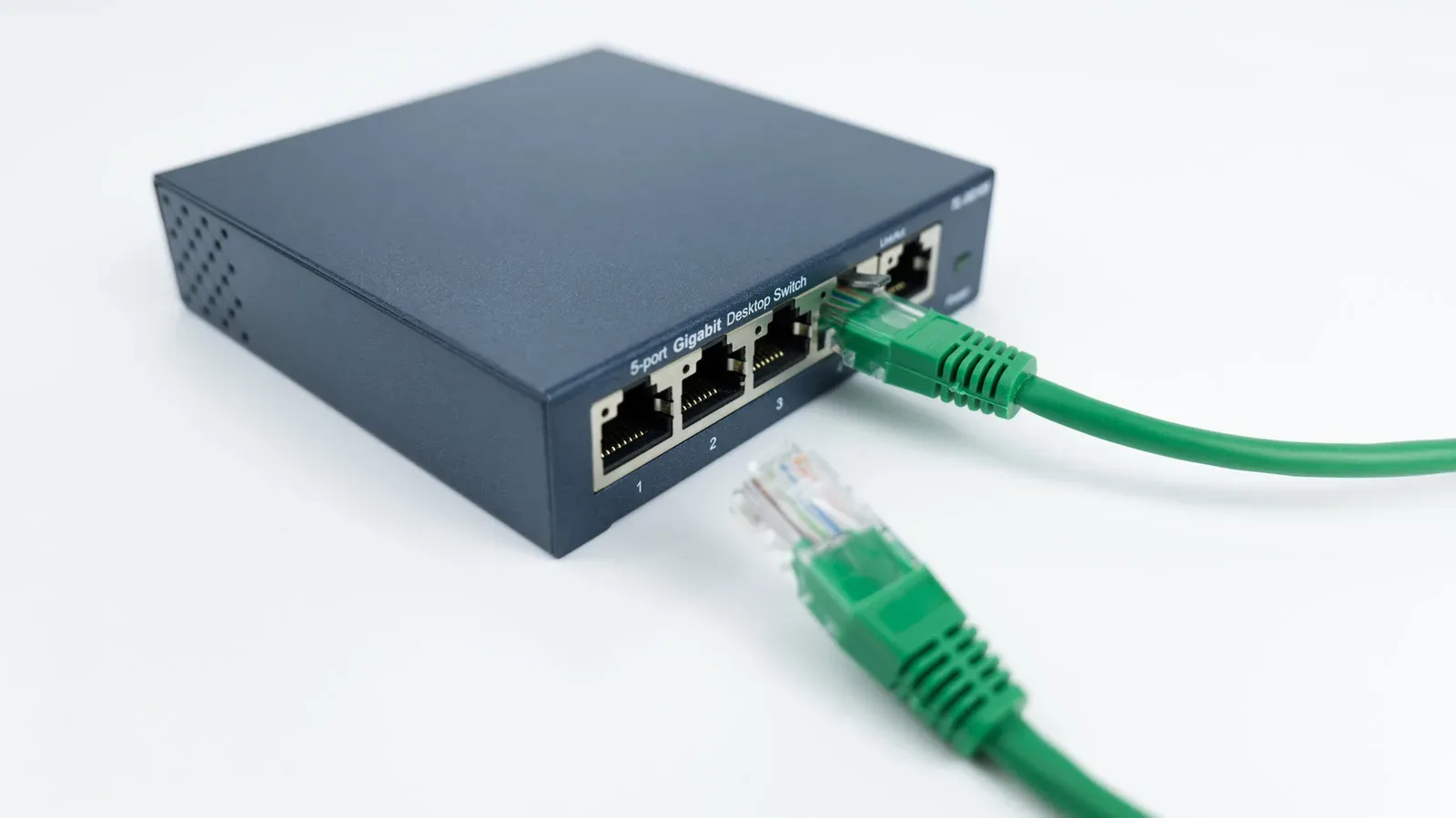
Picture quality is only one component of a smooth home setup, of course. Players sorting out the connectivity side of a multi-device room may also find this guide on expanding a gaming setup with a simple Ethernet switch useful.
Check advanced processing before blaming the panel
The Expert or Advanced section inside Customize picture is where a Roku TV may apply extra processing intended to “improve” the signal. These controls can be helpful in particular circumstances, but they are also where an image can acquire a distinctly artificial personality.
The first item to inspect is motion processing. Depending on the Roku TV model, it may be named Action Smoothing, Action Clarity or LED Motion Clarity. Motion interpolation—often simply called smoothing—attempts to make fast-moving material look more fluid. It can be useful for sports, where the desired presentation often favors highly smooth movement.
For films and much other content, however, strong smoothing may create the familiar “soap opera” look: movement seems overly slick and video-like rather than retaining the presentation viewers expect from filmed material. If that effect is distracting, disable the setting or select Low. This is not a claim that smoothing is inherently broken; it is a matter of the processing producing a look that does not suit all types of content.
Noise Reduction and Dynamic Contrast are two other controls to handle conservatively. Noise reduction is post-processing that aims to reduce visible noise in an image. Dynamic contrast is a processing approach that changes contrast behavior as the image changes. For the most accurate picture, reducing or disabling both is the preferred direction.
Color Temperature, meanwhile, is a preference-led choice within the available settings. Movie mode already tends warmer than Standard, but the individual control permits further selection. The most useful rule is simple: pick the option that looks best to your eyes after giving it a fair viewing period, rather than judging from a single unusually colorful frame.
Why less processing often means a more convincing result
Post-processing is not automatically bad, and the menu labels should not be treated as villains. The issue is that every additional intervention can alter the relationship between the original picture and what reaches the screen. More sharpness can look processed; too much motion smoothing can make cinematic material look artificial; noise reduction and dynamic contrast can move the presentation away from accuracy.
That is why Movie mode and subdued expert settings make a strong general-purpose recipe. They aim for an image that is not constantly announcing the TV’s presence. The display should serve the material, whether that means a shadowy game environment, an HDR scene with bright highlights, or a film with a deliberately muted palette.
Low Power mode can undercut brightness and HDR
One setting deserves special scrutiny: Low Power display mode. Many Roku TVs ship with it enabled because electronics makers must satisfy power-consumption limits in many regions. It improves energy efficiency, but the trade-off is a lower maximum brightness level—and that reduction can visibly affect picture quality.
When maximum brightness is reduced, bright scenes can lose some of their impact and the whole image may look flatter than it does in another picture mode. Dark scenes can suffer too. Lower brightness can compress the visible distinction between dark shades, making fine details harder to see. Color vibrancy can also decline on many displays.
This has particular relevance for HDR, or High Dynamic Range. HDR content is designed to use high brightness for intense bright highlights while retaining detail in darker portions of the image. A specular highlight is a concentrated bright reflection or glint—the sort of striking highlight HDR is built to reproduce. Limiting display brightness therefore affects one of HDR’s central strengths: the coexistence of impactful bright elements and readable shadow detail.
This does not mean power efficiency is unimportant. It means the decision should be intentional. Low Power mode may be appropriate when reduced electricity use is the priority. When image quality is the priority, especially in a room where the image already has to compete with ambient light, it is worth evaluating a different display mode and seeing whether the improvement is worth the additional energy use.
A practical Roku TV tuning order
- Start playing content, press the star button, and open Picture Settings.
- Select Standard or Movie under Picture Mode.
- Open Customize picture and set Backlight to suit the room’s brightness.
- Adjust brightness, contrast and sharpness in small steps only, viewing real content after each change.
- Open Expert or Advanced settings. Disable or set motion smoothing to Low if the artificial smoothness is unwelcome.
- Turn down or disable Noise Reduction and Dynamic Contrast when accuracy is the goal.
- Check the Color Temperature choices and keep the one that looks right to you.
- Evaluate whether Low Power mode is making the image too dim, flat or less effective with HDR material.
- Repeat the process for the inputs that matter, or use Apply settings to all inputs for a shared baseline.
The important expectation is improvement, not perfection from a checklist. A Roku TV’s panel still has its own limitations, and lower-priced displays differ from more expensive sets in important areas including HDR brightness. But picture mode, brightness behavior and processing choices are meaningful levers. Setting them thoughtfully is one of the simplest ways to replace a retail-friendly image with a clearer, more natural one that better suits the room and the material on screen.