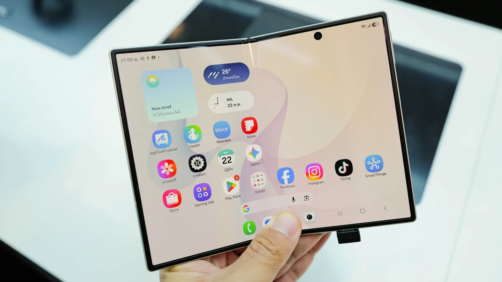


The Galaxy Z Fold 8’s unfolded screen provides substantially more room than a conventional phone display, which can make it appealing for games, video, reading and multitasking. That extra space comes with a catch: the device changes screen shape when it opens, and not every app adapts gracefully to the inner display’s 4:3 format.
For players, the result can be a game or companion app that looks oddly positioned, leaves unused space, or crops its interface in an unhelpful way. The useful part is that the Galaxy Z Fold 8 offers per-app aspect-ratio controls. Rather than applying one display behavior to everything installed on the phone, owners can choose a default presentation for each troublesome app.
This is not a magic compatibility patch. An app that has not been built or updated to handle the Fold 8’s inner screen can still behave imperfectly. But the setting gives users a practical way to test which layout makes a particular game, streaming app, reader or social app most usable.
What aspect ratio means on a foldable
Aspect ratio is the relationship between a display’s width and height. It is written as two numbers separated by a colon. A 1:1 screen is square because its width and height are equal. A 16:9 display is wider than it is tall, a shape commonly associated with widescreen video. The Galaxy Z Fold 8’s open inner display uses a 4:3 ratio.
This matters because an app’s layout has to decide what to do when its available space changes. A game designed around a tall phone screen may place menus, buttons, maps or chat panels according to that narrow shape. Open the Fold 8 and the app suddenly has a much broader workspace. If the software understands the new dimensions, it can rearrange its interface appropriately. If it does not, the result may be stretching, empty borders, an unusual composition, or content pushed into a less convenient part of the panel.
The device’s App Continuity feature is intended to let users move between the phone’s displays without interruption. Continuity, however, does not guarantee that every app will make ideal visual use of every screen shape. It keeps the experience moving; the per-app setting gives users a measure of control over how an app opens on the larger display.
Set an app’s default ratio from Settings
Start with the Fold 8 unfolded. Then open the aspect-ratio controls using one of the available menu paths:
- Open Settings.
- Go to Display.
- Select Aspect ratio.
- Choose the app that needs adjustment.
- Select Full screen, 4:3 or 16:9.
On some One UI menu arrangements, the relevant screen may instead be reached through Settings > Apps. If the expected control is not visible under Display, look there rather than assuming the feature is unavailable.
Once selected, that choice becomes the app’s default aspect ratio when it opens. The menu may also indicate that an app currently running in the background needs to restart before the new setting takes effect. That is an important troubleshooting step: close and reopen the affected game or app after changing the ratio, then check the unfolded layout again.
Choosing between Full screen, 4:3 and 16:9
There is no universal best option, because the right choice depends on how the specific app was designed.
- Full screen is the setting to try when making use of the entire inner panel is the priority. It may be especially attractive for apps whose interfaces adapt well to the Fold 8’s larger canvas.
- 4:3 aligns with the unfolded internal display’s stated ratio. It is a sensible option when an app behaves better in the Fold’s native open-screen shape than when forced into a wider presentation.
- 16:9 may make more sense for apps or content built around widescreen framing. It can be worth testing for video-oriented software and games whose interface looks more natural in a wide rectangle.
Think of these as layout preferences rather than performance settings. Changing the aspect ratio controls the presentation shape used for that app; it is not described as a way to raise frame rate, alter graphics quality or fix a software bug inside the app itself. Players interested in the separate question of frame-rate limits can read when a frame-rate cap makes sense in PC games.
A faster route from the app icon
There is also a direct route for changing a single app without navigating through the main Settings menus. Press and hold the app’s icon, then tap the small information button in the upper-right area of the shortcut panel. From the app-information screen, choose App aspect ratios. The same default layout choices are available there.
This shortcut is useful when the problem is limited to one title. It turns the process into a focused adjustment: identify the app that looks wrong, open its information page, select a ratio, restart it if needed, and compare the result on the unfolded screen.
A practical way to troubleshoot a game layout
When a game is playable but visually awkward, avoid changing several variables at once. Pick one ratio, reopen the game, and assess the areas that affect actual use: whether the image is cropped, whether important controls remain reachable, whether text is readable, and whether menus sit where they can be comfortably tapped.
Start with the ratio that matches the type of experience you want. Full screen is the logical first experiment if the aim is maximum use of the inner display. If the app’s design feels too expanded or its elements appear badly arranged, try 4:3. If the game is structured around a wide view, 16:9 is the alternative to compare.
It is also worth separating letterboxing from an actual scaling problem. Letterboxing is unused space around content that preserves a different shape instead of stretching it to fill the display. It can look inefficient, but it may preserve the intended image rather than distort it. Cropping is different: it removes or hides part of the visible image. Awkwardly located buttons, clipped menus and missing interface areas are also more serious usability issues than borders alone.
The Fold 8’s 4:3 inner display has been noted for reducing letterboxing around widescreen content compared with the squarer inner panels used on earlier Galaxy Z Fold models. That does not mean every piece of widescreen material will fill the display edge to edge, nor does it guarantee that every app interface is optimized. It does mean the underlying screen shape can be a better fit for such content while individual software still catches up.
What this setting can and cannot fix
The aspect-ratio menu is best understood as a compatibility tool, not an app redesign tool. It can establish how an app opens and may improve the experience where the app can work acceptably in more than one display shape. It cannot ensure that an app has a tailored tablet-style interface, properly moved controls, or a cleanly redesigned view for the Fold 8.
Reports from owners indicate that some software may still show odd placement or cropping after a preference has been set. That limitation points to the app’s own optimization. A foldable asks software to account for multiple usable states: the narrower outer screen and the larger unfolded panel. If the developer has not accommodated the latter well, the phone-level choice may reduce the annoyance without eliminating it.
For that reason, judge the result app by app. A ratio that improves one game can be a poor fit for another, and changing a default for one title does not require changing every installed app. The individual setting is the key advantage here: tune only what needs tuning, retain a different default elsewhere, and restart background apps when prompted.
Why the compromise may still be worthwhile
Foldables offer a distinctive trade-off. The larger display can improve the comfort of reading, viewing and playing, but an app ecosystem built around ordinary phone shapes will not always transition perfectly. The Galaxy Z Fold 8 gives owners a clear set of choices—Full screen, 4:3 and 16:9—so an imperfect automatic decision is not necessarily the final word.
For apps that already adapt well, the broader inner screen can simply be more useful space. For the ones that do not, the quickest response is to set a per-app ratio through Settings or the app icon’s information screen, restart the app where required, and compare the available layouts. If none of them resolves poor cropping or misplaced interface elements, the remaining issue is likely the app’s own lack of optimization rather than a setting the user has overlooked.