

Clayface is heading to Gotham City without bringing its most famous vigilante into the room. Director James Watkins has said he deliberately avoided obvious Batman references in the upcoming DC horror film, choosing instead to make the story about Matt Hagen: an aspiring Hollywood actor whose life is upended after a mobster horrifically disfigures him following a drunken mistake on a night out.
That is a useful creative boundary for a character whose premise already has plenty to carry. Hagen’s injuries lead him to Caitlyn Corr, a doctor played by Naomi Ackie, whose treatment inadvertently gives him shapeshifting abilities. The movie is therefore rooted in one man’s trauma, transformation, and place within a hostile city—not in the expectation that every trip to Gotham must eventually lead to a caped cameo or a signal in the sky.
Watkins compared the intended approach to Joker: a story set in an enormous, recognisable fictional city while staying attached to one person’s experience of it. Gotham has millions of inhabitants, and Clayface is meant to be Matt Hagen’s corner of that population. For Watkins, loading the film with winks toward Batman risked distracting from that purpose.
Gotham is present, Batman is not the point
The distinction matters because Gotham is not being treated as a blank backdrop. Clayface establishes the city in the DCU, but Watkins’ description suggests that the film wants its setting to exert pressure on the protagonist rather than serve as a checklist of familiar superhero imagery.
Watkins calls Gotham a character in its own right: overbearing, dirty, corrupt, and difficult to escape. The visual conception involved production designer James Price and cinematographer Rob Hardy. Their reference points included German Expressionist cinema from the 1930s, especially architecture that seems to loom over people, as well as photography and cinematography associated with New York across the 1970s, 1980s, and 1990s.
German Expressionism is a film style associated with heightened, often distorted design and dramatic shadow. In practical terms, the reference helps explain Watkins’ emphasis on buildings that dominate the frame and make people appear small. Rather than presenting Gotham simply as a familiar comic-book location, the production seems to use scale, blocked-out daylight, texture, and crowded urban detail to make the city feel physically imposing.
Watkins has described a place where rubbish goes uncollected, corruption is embedded, and ordinary people struggle to get a break. Neon and grime are part of the atmosphere, but so is a kind of lived-in visual poetry. The intended contrast is Coast City, where Matt begins: sunny, golden, close to the sea, with blue sky and greenery. Gotham, by comparison, has little visible vegetation and barely any sky. The framing frequently lets its buildings shut that sky out.
For viewers, that contrast should give Hagen’s movement between locations a narrative function. Coast City is described through openness and colour; Gotham through enclosure and pressure. It is an environmental way of reinforcing the film’s horror trajectory before a character says a word about it.
A new version of a city that has had many versions
Watkins did not approach Gotham as though there were one definitive screen blueprint to reproduce. He looked at prior interpretations and noted how differently they operate: Joel Schumacher’s Gotham is vivid and dayglow, Christopher Nolan’s is grounded, and Tim Burton’s is defined by striking production design. All are valid versions of the same imaginary city.
That acknowledgement is important for a DCU film arriving in a territory viewers know extremely well. Continuity can mean shared institutions, objects, and names, but it does not necessarily require every filmmaker to use the same visual grammar. Clayface appears to be building a Gotham compatible with a wider universe while giving it an identity designed for a horror story about bodily transformation.
There is also a notable decision to show the city in daylight. Ackie said the film includes daytime scenes with neighbourhoods, people enjoying themselves, and routine life. Gotham is often remembered as a place of rain, darkness, rooftops, and crime scenes. Showing ordinary residents in ordinary spaces gives the setting social texture: people do not merely survive there between superhero plot points; they have lives, communities, and reasons to keep going.
That does not make Watkins’ Gotham less oppressive. It makes the oppression more specific. A city feels more credible when it contains both the places where residents try to have normal days and the structures that make those days precarious.
The props are doing quiet continuity work
Much of a fictional city’s credibility comes from details that do not need explanation. Tom Rhys Harries, who plays Matt Hagen, recalled finding seemingly minor set dressing that carried its own tiny pieces of local history: a Gotham-branded soda can, a crumpled sticker, and a ticket for a gig happening in the city that night. Those objects may occupy only the edges of a shot, but they imply businesses, events, habits, and people beyond the immediate plot.
This is the job of production design: the combined visual environment of sets, architecture, signage, props, colour, and material detail. It differs from a flashy Easter egg because it does not require an audience member to recognise a reference in order to work. A fictional soda brand can make Gotham feel inhabited whether or not anyone pauses the frame to read its label.
Some references will be there for attentive DC viewers, though. Watkins said that the graphics and production-design departments slipped in several Easter eggs, including some he does not know about himself. That makes a distinction worth preserving: the film contains hidden nods, but its director’s stated approach is not to turn the main story into an exercise in reference-spotting.
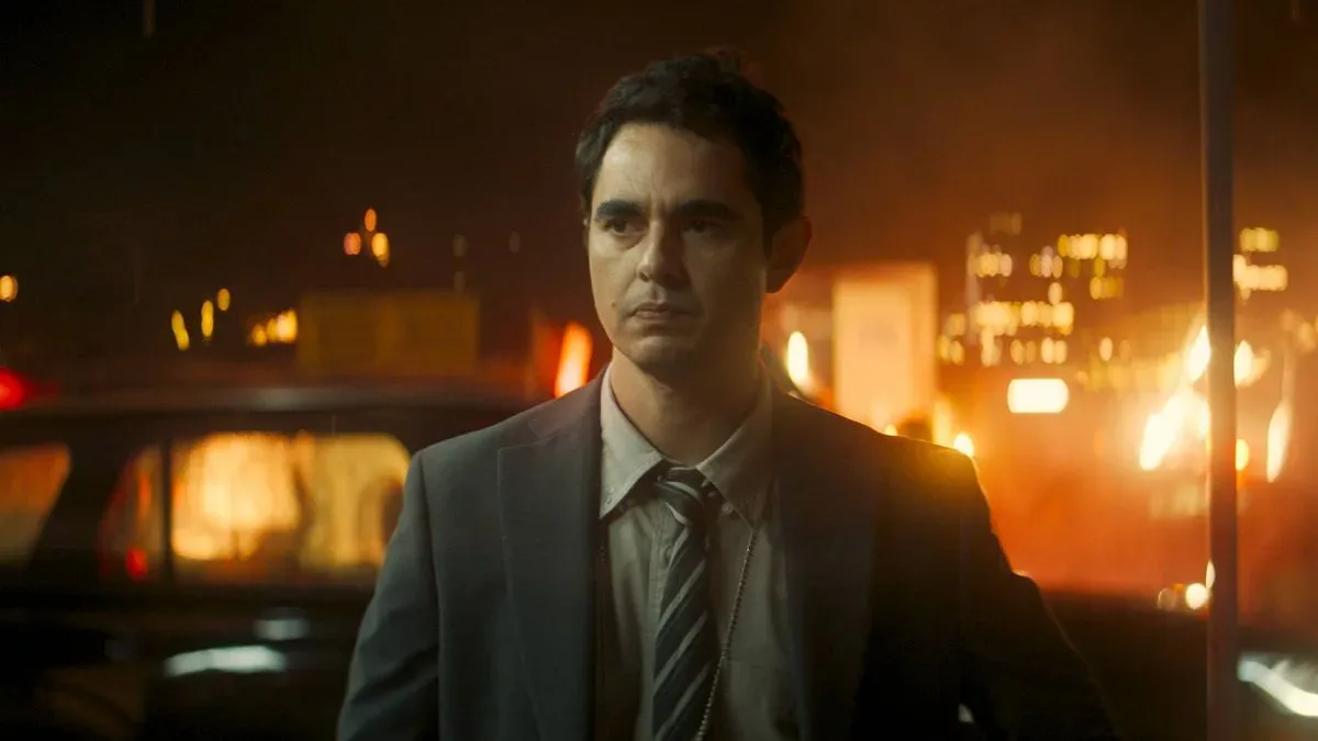
Max Minghella, who plays GCPD officer John Borrelli, encountered a more overt piece of DCU connective tissue. He had watched James Gunn’s Superman before joining the production and later found himself holding a Jitter’s Coffee cup, a prop brand that appears in that film. For Minghella, the experience made the shared world suddenly tangible: an item he had just seen on a cinema screen was now part of the set around him.
The GCPD—Gotham City’s police department—also gives the movie an immediate institutional connection to the city without demanding Batman’s presence. Borrelli is a cop, but the film’s core is still Hagen and the consequences of his transformation. That is a more restrained kind of universe-building: a shared coffee brand, a police force with an established name, and a city full of visual history rather than a detour into someone else’s franchise lane.
Why avoiding Batman can make the horror premise clearer
Batman is so closely tied to Gotham that excluding him can sound counterintuitive. Yet it can also be a way of protecting the scale of Hagen’s story. Once Batman becomes the centre of a Gotham film, his mythology naturally attracts attention: his rules, gadgets, enemies, and role as the city’s protector can reshape the audience’s expectations. For a horror film, that could pull focus away from fear, vulnerability, and a protagonist experiencing an unwanted physical change.
Watkins’ choice does not deny Gotham’s larger mythology. The movie openly uses the city, the GCPD, shared prop design, and Easter eggs. Instead, it treats Batman as part of a world that is bigger than any one resident’s crisis—not as an obligatory participant in it.
That framing also gives Clayface an opportunity to work as a character-driven DC story. The supplied details identify Matt Hagen as an actor who is disfigured and later gains shapeshifting powers. Those elements bring themes of appearance, identity, performance, and altered self-image directly into the premise. They do not need a Batman encounter to be cinematic or emotionally legible.
For people tracking the wider slate, the separate discussion around how a franchise can revisit a character without simply undoing its central stakes offers a useful parallel in storytelling priorities: continuity is most effective when it supports the story being told rather than replaces it.
What to look for when Clayface reaches theaters
Clayface arrives in theaters on October 23. The most revealing details may not be the loudest ones. Watch how the film separates Coast City’s light, greenery, and open skies from Gotham’s dense built environment. Notice the mundane signs of life—packaging, posters, tickets, businesses, and neighbourhood scenes—that make Gotham feel like a place inhabited beyond the plot.
And for those tempted to scan every frame for a Dark Knight allusion, Watkins’ comments suggest a better starting point: pay attention to Matt Hagen. Gotham may be a major character, but this is intended to be his story.