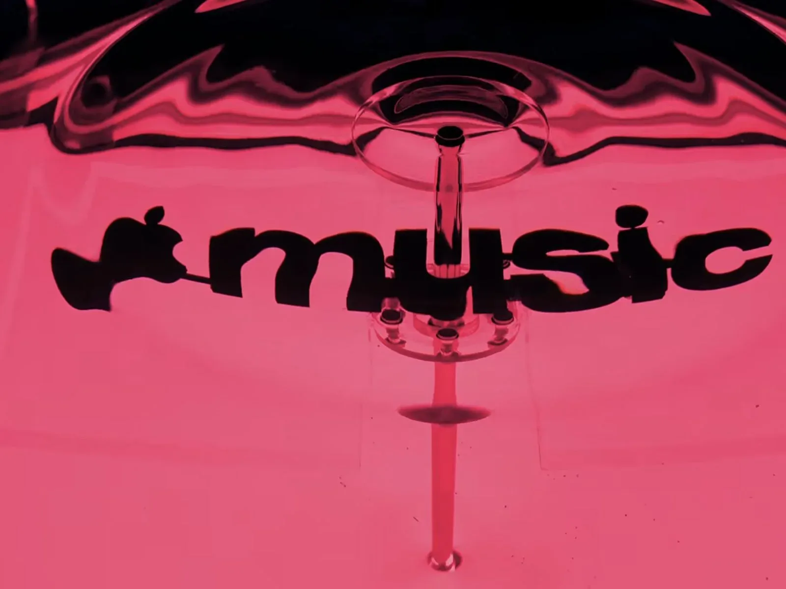


Apple Music has formally presented a new brand identity following the earlier arrival of its revised logo and app icon. The central idea is unusually literal for a music-service refresh: the visuals were created through sound.
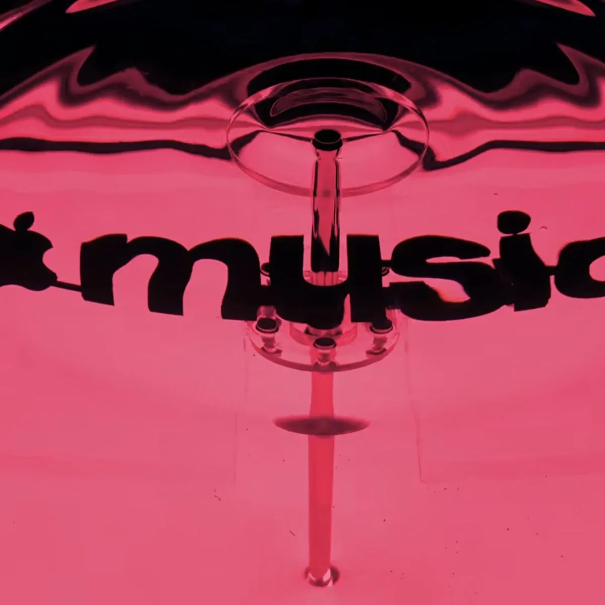
In a newly shared video, Apple describes the identity as “made by sound.” The process involved playing audio through a container of water, allowing the liquid to move in response to the frequencies of the notes. Apple Music visual elements were positioned behind that vibrating water, producing the shifting, fluid treatment that now defines the service’s look.
It is a concise concept, but a useful one. Rather than treating music as an abstract source of inspiration and then applying a generic visual makeover, the project uses a visible physical response to sound as the basis of the imagery. The result frames Apple Music’s identity around movement, resonance and changing form.
What “made by sound” means here
The phrase is not merely a slogan in this case. The project’s reported setup starts with a basic acoustic principle: sound consists of vibrations. When those vibrations are transmitted through or into a medium such as water, they can cause visible motion on the surface and within the liquid. Different note frequencies can produce different patterns of movement.
Apple used that behavior as a visual-making tool. The brand elements placed behind the water were viewed through the motion created by the sound, yielding distortion and fluidity that would be difficult to reproduce in precisely the same way with a static graphic alone.
Frequency refers to how often a sound wave vibrates over a given interval. In musical terms, frequency is closely connected to pitch: changing the frequency changes the note perceived by a listener. Apple’s explanation does not detail the precise audio setup, individual sounds or the full production workflow, so it would be a stretch to infer more than the stated technique. What is clear is that the shifting water was a deliberate part of creating the visual result, not simply a decorative metaphor added afterward.
A design system that fits Apple’s broader liquid aesthetic
The new Apple Music identity arrives alongside a wider visual language already visible in Apple software. It complements the Liquid Glass interface introduced across updates including iOS 26 and macOS Tahoe last year.
That connection matters because an app icon and logo rarely exist in isolation. They appear in operating systems, device home screens, promotional art and product interfaces. A music identity built around refraction, movement and liquid texture can feel consistent with an interface language whose name already points toward glass-like and fluid visual qualities.
“Liquid-inspired” does not necessarily mean every Apple Music screen will act like water, nor does the announcement establish new music playback features. The news is about branding: the visual personality used to represent the service. That distinction is worth keeping clear. A brand refresh can change how a product looks and is recognized without changing its catalog, subscription structure, audio formats or platform support.
For listeners, the most immediate practical effect may simply be recognition. The updated icon and associated graphics establish a different visual cue for Apple Music in a crowded field of entertainment apps. For artists and music-industry partners, a cohesive identity can also shape the backdrop around editorial placements, releases and promotional materials, although no specific new artist tools or campaign formats were announced.
Why water is a fitting medium for a music identity
Water supplies a visual translation of something normally heard rather than seen. Sound itself has no fixed image, but vibrating liquid turns sonic energy into a pattern that can be observed. That makes it a particularly direct route from audio to image.
It also gives the finished work a degree of organic variation. Water does not remain perfectly still once it is responding to sound, and the visual treatment implied by Apple’s process is therefore about transition rather than a single permanent shape. That is an appropriate fit for a music platform, where songs unfold over time and where rhythm, pitch and dynamics constantly change.
The approach avoids relying solely on obvious music symbols such as notes, equalizers or speakers. Those symbols communicate “music” quickly, but they can also be rigid and familiar. Apple Music’s new treatment instead leans into the physical effect of music. It is less about illustrating a track and more about showing that a track can alter its surroundings.
Creative partners behind the project
Apple worked with British record producer Fred Again and NEST Acoustics on the identity project. Their involvement reinforces the sound-led premise: the work was not presented as an isolated corporate graphics exercise, but as a collaboration built around audio and acoustic behavior.
The announcement does not provide a breakdown of each collaborator’s responsibilities, so their individual contributions should not be overstated. Still, the choice of partners aligns with the stated production method. A producer brings a relationship to sound as creative material, while acoustic expertise is directly relevant when a design process depends on sound producing a visible physical reaction.
It is also an example of music branding moving beyond album-art conventions. The visual system is tied to an experiment involving actual sound and water rather than simply being inspired by a musical genre, performer image or color trend. The important claim is not that the identity is scientific in a laboratory sense; it is that a physical phenomenon was used to generate its creative starting point.
What has changed—and what has not been announced
The confirmed changes are the new Apple Music logo, app icon and the newly formalized brand identity surrounding them. The visual language was developed from sound passing through water, and it is intended to sit comfortably alongside Liquid Glass in iOS 26 and macOS Tahoe.
There is no indication in this announcement of a new Apple Music tier, a revised price, a new device requirement, a feature rollout or changes to the service’s music library. Readers should be careful not to read interface compatibility as proof of new functionality. The stated story is a visual redesign and the process behind it.
That narrower scope does not make the change insignificant. Entertainment services increasingly communicate through icons and motion as much as they do through text. A recognizable visual system has to work at tiny app-icon size, within software surfaces and in advertising. Building the identity around liquid movement gives Apple Music a unifying idea that can potentially be interpreted across those settings without abandoning the music-first premise.
For a broader look at creative leadership in the music business, see this report on leadership changes at Interscope Geffen A&M.
The main takeaway
Apple Music’s updated identity is built around a straightforward but distinctive production idea: make sound visible through water, then use the resulting movement to shape the brand imagery. The refreshed logo and icon are now part of a larger visual system that draws on that process and aligns with Apple’s Liquid Glass design direction.
Beyond the updated appearance, the announcement offers no promise of new listening capabilities. Its value is in the design logic. Apple Music is positioning itself with a visual identity that does not just reference sound—it is presented as having been physically formed by it.