
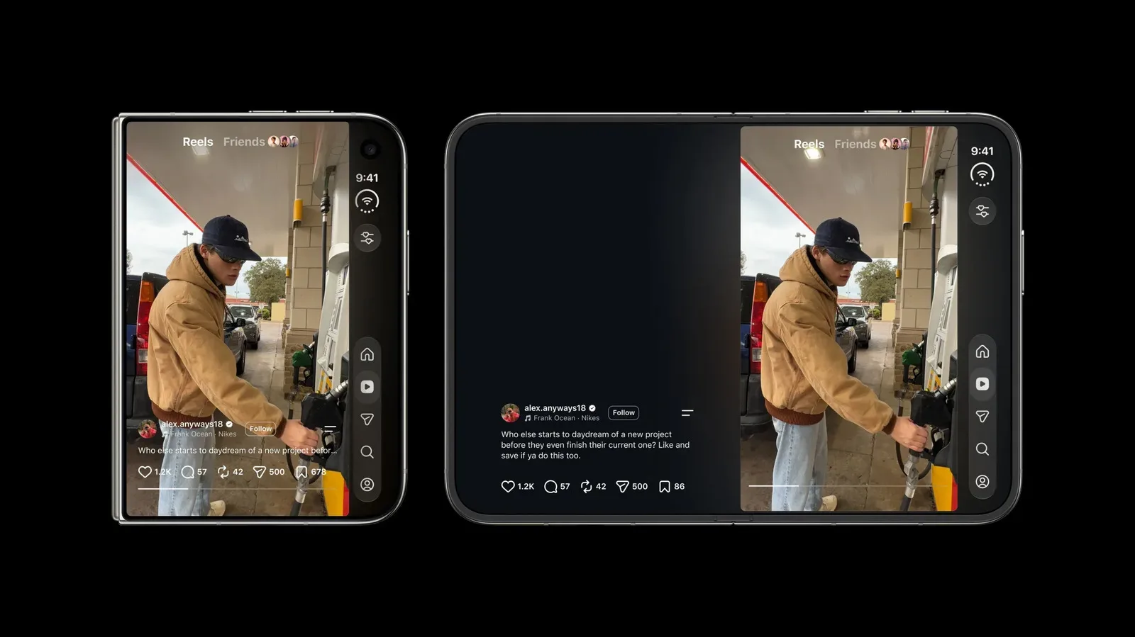
Instagram has spent years behaving as though the smartphone screen is a tall, narrow slice of glass: content rises vertically, controls hug familiar edges, and a thumb can move from one repeated action to the next with minimal thought. The iPhone Duo disrupts that assumption. Adam Mosseri, Instagram’s head, has acknowledged that making the app feel genuinely good on the device will be “pretty challenging,” and the reason is more revealing than a single cosmetic flaw.
The issue is not simply that one screen is larger than another. The Duo’s proportions are unusual even when the device is closed: it is wider and shorter than the conventional phone shape Instagram was built around. When opened, its layout introduces another set of visual and ergonomic choices. That means familiar Instagram components can collide, compete for attention, or end up in places that make sense individually but feel clumsy together.
For a service built around quick scrolling, video watching, reactions and sharing, those details are not trivial. A few buttons positioned badly can change the perceived quality of an entire experience, especially in Reels, where people make repeated, rapid interactions.
The visible problem: two sets of controls want the same space
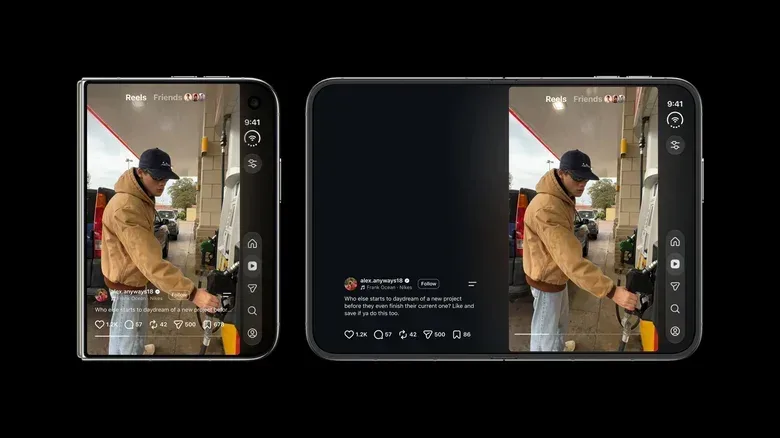
Mosseri highlighted one particularly clear example. On the closed Duo, navigation buttons positioned on the right side make ergonomic sense. But Reels also places its Like, Comment and Share actions on that side. The result is a double stack of buttons—a column of app-level navigation meeting a column of video-level actions.
Each group of controls has a defensible purpose. Navigation helps someone move between major destinations in Instagram. Reels actions let them respond to the specific video currently on screen. On a conventional tall display, interface designers can often separate those roles with enough vertical room and predictable spacing. A wider, shorter display reduces that breathing room and makes the overlap more conspicuous.
In plain terms, interface hierarchy is the visual system that tells a person what matters first, what belongs together, and what an action will affect. A double stack weakens that hierarchy. Two adjacent vertical control groups may look equally important despite serving very different functions. It can also make the screen feel crowded beside a Reel, whose image or video is meant to be the focus.
The criticism is especially understandable because the Instagram app designed for the iPhone Duo has been available globally since October 23, and users have specifically pointed to this doubled-up arrangement. Mosseri’s comments do not promise a particular redesign or timetable. They do, however, show that Instagram recognizes the complaint as a design problem rather than treating it as a purely subjective objection to a new device.
Why portrait mode currently has the clearest case
In discussion on Threads, one user argued that Instagram works best when the Duo is open in portrait orientation because the larger screen allows the image to occupy much of the display. Mosseri agreed that this is the best presentation for Reels on the device, while saying the team is working to improve other orientations.
Related coverage includes Instagram Faces a Design Challenge on the Unusually Shaped iPhone Duo.
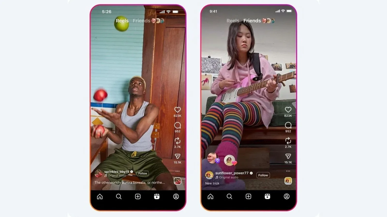
That distinction matters. Reels is fundamentally a vertical-video format. In portrait orientation, a tall video can remain dominant and the interface can preserve the visual rhythm people already associate with the product: full or nearly full-screen media, a clear path downward through the feed, and controls that sit beside rather than interrupt the content.
Orientation simply refers to how a device is held—portrait is taller than it is wide, while landscape is wider than it is tall. An app can technically rotate into either orientation without delivering an equally strong experience in both. The hard part is not rotation itself; it is deciding what should gain space, what should move, and what should disappear when the geometry changes.
On a device whose shape is already outside the usual smartphone pattern, those trade-offs become more acute. If an interface preserves every familiar button in every position, it may become overly dense. If it hides or relocates too much, users may lose the muscle memory that makes an app fast to use. Mosseri’s description suggests Instagram is confronting precisely that kind of problem.
This is a form-factor challenge, not just a foldable-screen challenge
It would be easy to reduce the situation to “apps need to work on foldables.” That misses the more specific point. Mosseri described the Duo as far from typical in its proportions whether it is open or closed. The challenge is therefore not limited to making an existing phone interface expand onto a larger canvas.
A form factor is the physical configuration that shapes how a product is used: its size, proportions and the ways it can be held or opened. Form factor affects more than how much content fits onscreen. It changes reachability, where the eye expects controls to be, and whether an image feels central or surrounded by interface furniture.
For Instagram, an app designed for tall vertical screens, the standard assumptions are deeply embedded. A vertical feed benefits from height. Reels benefit from height. Side controls have a predictable relationship with a vertically framed video. The Duo complicates all three at once. A layout can be sensible in one state and awkward in another; moving controls to improve one state can produce a conflict elsewhere.
That does not mean a satisfying Duo version is impossible. It means a simple stretch of the existing phone design is unlikely to be enough. Mosseri’s comments point toward reconsideration rather than a minor adjustment: the team is looking at how the various orientation choices work and where the competing button stacks need to be reevaluated.
What an improved version needs to solve
Instagram has not detailed planned changes, so it would be premature to claim which solution it will choose. Still, the stated problem makes the design goals relatively clear.
- Keep Reels visually primary: The open-device portrait experience is currently the strongest because the video occupies much of the screen. Changes in other layouts need to retain that sense that media, not controls, is the main event.
- Separate navigation from post actions: Global movement through Instagram and actions on a particular Reel are different tasks. Their buttons need sufficient visual and spatial distinction to avoid looking like one crowded cluster.
- Respect ergonomics: Right-side navigation on the closed device has an ergonomic rationale. “Ergonomic” here means designed around comfortable, efficient physical use. Any alternative must avoid solving the visual clutter by making common actions harder to reach.
- Account for more than one orientation: A layout that performs well only in open portrait leaves a meaningful part of the device’s flexibility underused. Mosseri has indicated that work on the other orientations is underway, but no further details have been provided.
These goals can pull against each other. For example, adding distance between two button groups may make the screen easier to read but could place an action farther from the thumb. Moving a control away from a Reel might preserve the video but make the app’s navigation less obvious. Good responsive design is the work of resolving those conflicts deliberately rather than pretending they do not exist.
A reminder that interface conventions are hardware-dependent
Instagram’s situation is a useful reminder that digital conventions are often shaped by physical hardware more than people realize. A right-side rail of Reels actions can feel natural because it has become familiar on the tall phone screens where the format grew. Familiarity, though, does not automatically transfer to a screen with different width, height and folding states.
That is why a redesign can attract criticism even when every individual element is recognizable. The reactions to the Duo interface appear to center on how those known pieces work together, not on an unfamiliar feature being introduced. The double stack makes the underlying conflict legible: a navigation scheme intended for the device and an interaction scheme intended for Reels are both trying to claim the same territory.
The gaming world regularly faces comparable questions when interfaces move between displays, control methods or viewing distances. A menu that is readable and quick with one setup may be cumbersome with another. That broader tension between established interaction habits and new hardware is also part of the conversation around platform design, as seen in how platform timing can shape the attention surrounding game news. The products are different, but the practical lesson is familiar: context affects how people receive an experience.
What Mosseri’s comments do—and do not—confirm
There are a few firm takeaways. Instagram’s head has said the Duo will be challenging to design for, has identified the closed device’s unusual width and shortness as part of the issue, and has acknowledged that portrait mode on the opened device currently offers the best Reels experience. He has also said Instagram is working on other orientations and cited the double stack of navigation and Reels buttons as something that needs reconsideration.
There are also important limits. No replacement layout has been shown. No release date for an update was provided. And there is no basis yet to say whether Instagram will move its navigation controls, change the Reels action rail, selectively hide elements, or take another approach entirely.
For Duo owners, the practical reality is that portrait mode while the larger display is open appears to be the most favorable option for Reels at present. For everyone else, the episode illustrates why adapting an app to a new device is more than a matter of filling extra pixels. A social app can have years of polish behind it and still run into unexpectedly awkward friction when the screen itself stops obeying the assumptions that polish was built on.
The iPhone Duo interface has already made that friction impossible to miss. Instagram’s next task is to turn the recognition of the problem into a layout where the controls stop competing with one another—and with the videos people opened the app to watch.