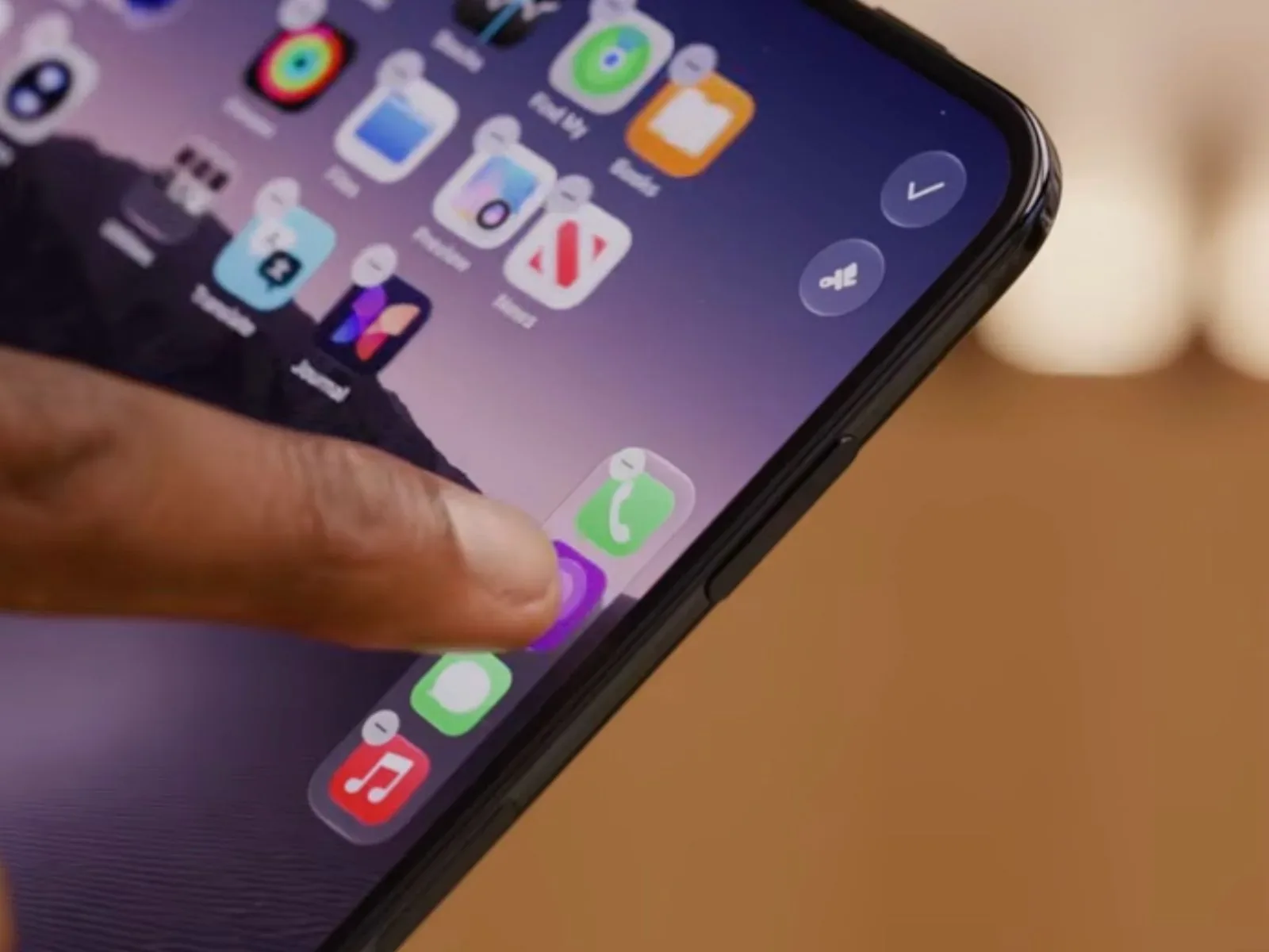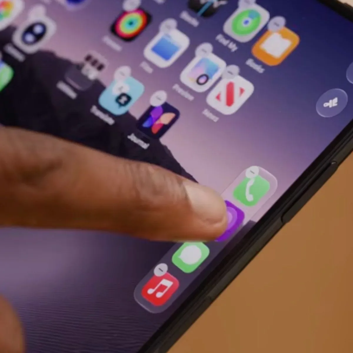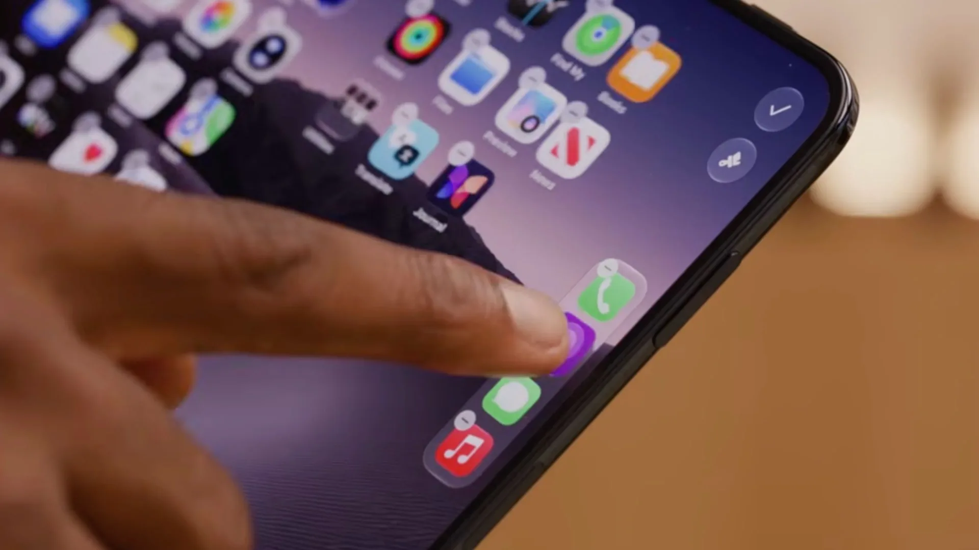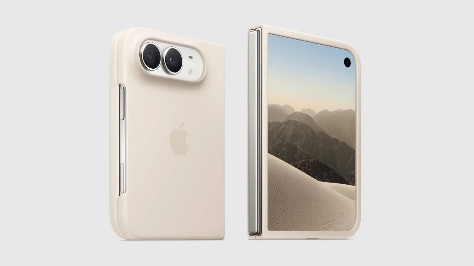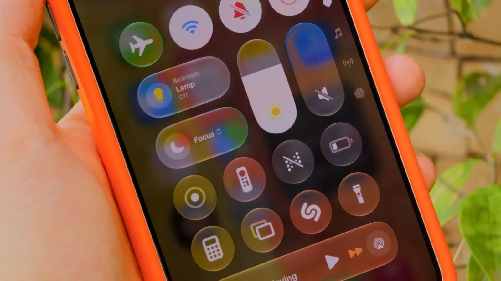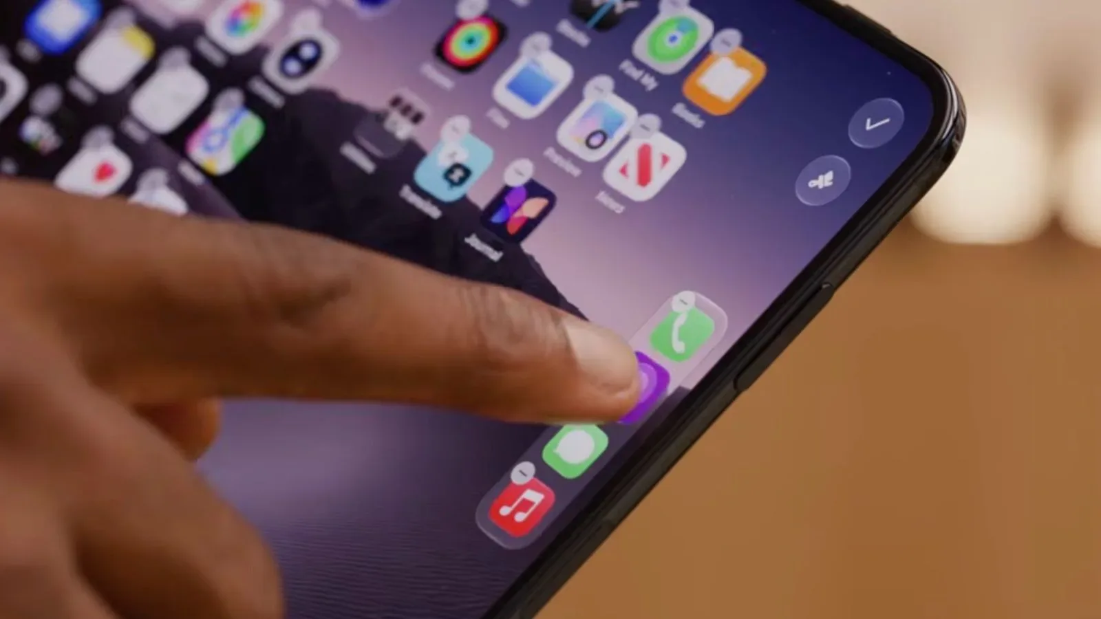
The iPhone Duo’s unusual vertical Dock may come with a notably traditional limitation: it appears to hold no more than four apps.
In a hands-on look at the device, Marques Brownlee attempted to place a fifth app in the Dock and was unable to do so. That makes four icons the current observed maximum, despite the Dock’s move from the familiar horizontal strip at the bottom of an iPhone screen to a vertical rail positioned on the right-hand side.
It is a small interface detail, but it is exactly the sort of detail that can shape daily use. The Dock is meant to be the dependable home for the apps people launch constantly: messages, a browser, music, a camera, a password manager, a game, or whichever app has won the fierce battle for permanent thumb territory. A four-app ceiling means every additional favorite remains a home-screen resident rather than getting a seat in the device’s most prominent shortcut zone.
Apple’s technical documentation does not currently spell out a four-app Dock restriction. As a result, the available evidence supports a careful reading: four is the maximum demonstrated on the iPhone Duo at present, but it is not yet clear whether that behavior is a fixed design decision, a software limitation that could change, or a constraint tied to a particular setup.
A sideways change to one of the phone’s most familiar spaces
The Dock has long been one of the least surprising elements of the iPhone interface. It is an area users learn almost by instinct, sitting at the bottom of the display and offering rapid access to a small group of chosen apps. The iPhone Duo changes that orientation. Its Dock runs vertically along the display’s right edge, and unused space is visible at both the top and bottom of the rail.
That visible breathing room is likely why the apparent four-icon cap attracts attention. On a crowded interface, a restriction can feel like a practical necessity. When empty space is clearly present, users naturally wonder whether the space is intentionally reserved, whether larger icon spacing is part of the visual design, or whether the software simply has not enabled more slots.
There are reasonable interface arguments for preserving generous spacing. A vertical set of app icons needs to remain easy to identify and tap without turning the edge of the screen into a tiny filing cabinet. Fewer icons can make the rail calmer at a glance, reduce accidental taps, and maintain a consistent visual balance alongside the rest of the home-screen layout. A device built around a different screen arrangement may also use those empty zones for gestures, system indicators, future controls, or just a more comfortable visual margin.
Still, a Dock is also an expression of personal habits. Some users are perfectly content with four essentials. Others build a compact workbench of five or six always-ready apps, particularly when a phone serves as a communication device, wallet, media player, navigation companion, and handheld gaming machine all at once. For that second group, the difference between four and five icons is not mathematical trivia. It is one more app that does not require leaving the current screen or hunting through a page of icons.
Four slots make prioritization unavoidable
With a maximum of four, an iPhone Duo owner would have to make quick choices about what deserves a permanent place on the right-side rail. The usual candidates are easy to imagine: Phone, Messages, a web browser, and Music. But plenty of people would replace one or more of those with a camera app, maps, a mail client, a social platform, a task manager, or a favorite game.
For gaming-minded users, the constraint could be especially noticeable. Mobile games frequently rotate in and out of a player’s routine, and a Dock slot is valuable when a game has become the current daily distraction. A four-app limit means placing a game there may require dislodging something more utilitarian. That is not necessarily bad design; a limited Dock can encourage a cleaner home screen and keep people from treating every frequently used app as indispensable. But it does make the Dock feel more curated than expandable.
There is also a practical counterpoint. The modern iPhone experience offers other ways to reach apps quickly, including search and home-screen organization. A Dock does not have to carry every shortcut burden. In that sense, four apps may be sufficient for people who view the feature as a set of emergency buttons rather than a miniature app library.
The important point is that the vertical layout does not, by itself, appear to translate into extra Dock capacity. The new placement changes the physical logic of the interface, but the observed icon total remains conservative.
Right-side placement raises a handedness question
The iPhone Duo’s Dock is set on the right side of the display, a decision that will likely feel natural to many right-handed users. Their right thumb may be well positioned to reach the rail, depending on the device’s overall dimensions and how it is held. But placement is never neutral for everybody.
Left-handed users could find a persistent right-edge shortcut column less immediately comfortable. Reaching across a display is manageable, of course, and people adapt to interface conventions all the time. Yet the Dock is used repeatedly, often for simple one-handed actions. Even a small reach difference can become conspicuous when it is repeated dozens of times a day.
There is no confirmed indication that the iPhone Duo will offer a left-handed Dock setting or a broader left-handed interface mode. That uncertainty matters. If the side position is adjustable, the concern becomes a preference setting. If it is fixed, the device asks left-handed owners to adapt to a layout that is visibly optimized around the opposite edge.
The distinction is also relevant to accessibility and customization more generally. Smartphones become personal through small controls: icon arrangement, text sizing, button placement, gesture behavior, and the location of routinely tapped features. A vertical Dock is a bolder visual departure than a new wallpaper or a revised menu. Flexibility would help make that departure feel like an option rather than a mandate.
What has and has not been established
At this point, the firmest observation is straightforward: an attempt to add a fifth icon to the iPhone Duo Dock did not succeed. The device’s Dock is vertical, resides on the right, and retains empty-looking space at either end even with four apps present.
What remains unknown is nearly everything surrounding the rule. There is no stated explanation for why the fifth icon could not be added. The documentation does not identify a four-app maximum. There is no confirmed setting for moving the Dock to the left, no confirmed left-handed mode, and no established indication of whether later software could alter either behavior.
That leaves room for interpretation, but not for certainty. It would be premature to call the empty space wasted, to assume a fifth or sixth icon will never be possible, or to claim that every user will struggle with the right-edge arrangement. The current picture is narrower: the visible implementation is four apps, and prospective owners who rely on a larger Dock should take note.
Apple interface changes often prompt the same initial reaction: people compare a new arrangement not only with what came before, but with the muscle memory built around it. The iPhone Duo’s Dock gives that reaction a literal new direction. Instead of looking down, users look right. And instead of asking which apps should occupy a broad bottom strip, they may be choosing just four winners for a slim vertical lane.
Anyone following the wider Apple hardware cycle can also see how small usability details sit beside more obvious launch concerns, such as the iPhone 18 Pro delivery windows that have slipped into October. The iPhone Duo Dock question is less dramatic, but it may be more persistent: it is a choice users could encounter every time they unlock the device.
For now, the right-side Dock looks clean, distinctive, and constrained. Four apps appear to be the limit. Whether that is the final intended experience or merely the present state of the software is the unanswered part.