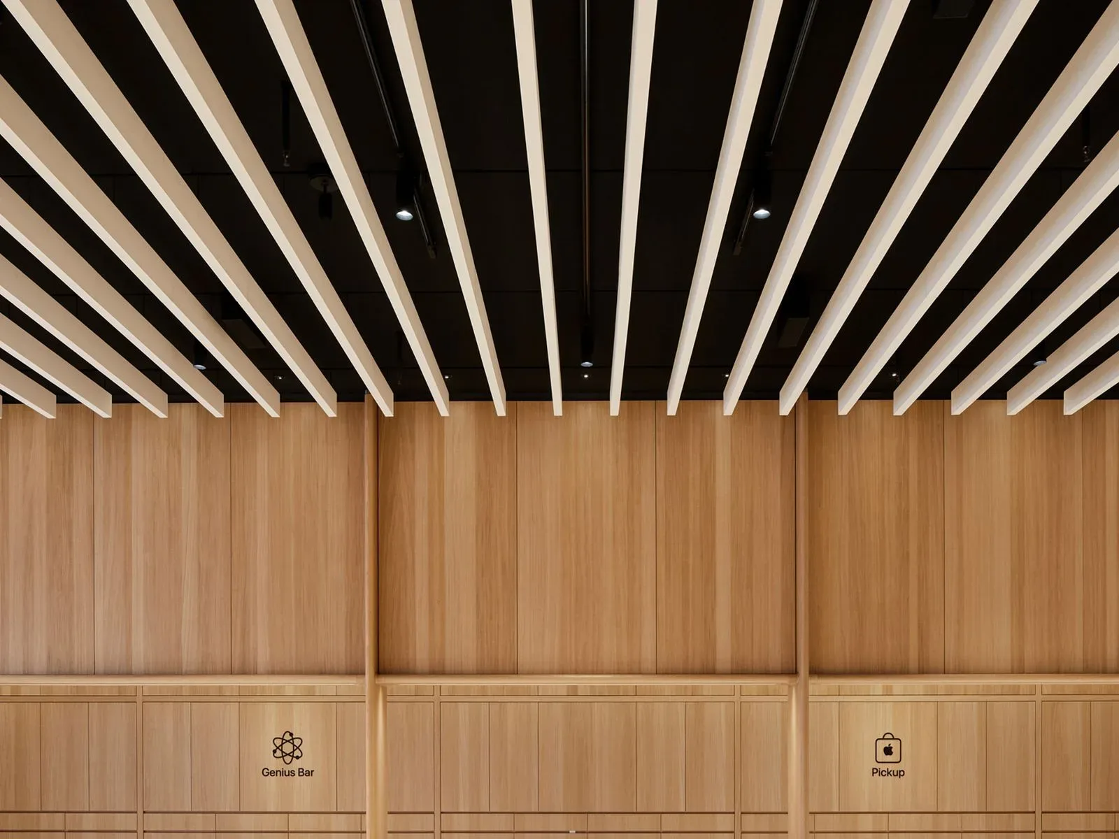
Apple’s retail spaces may be preparing for a notably different next phase: less giant-screen spectacle, more purpose-built counters, drawers, and service stations. A reported renovation plan would restore dedicated Genius Bars, divide order pickup and Today at Apple programming into separate compact areas, and gradually remove the oversized video walls found in many stores.
For anyone who has visited an Apple Store in the past several years, the proposed changes amount to a shift in what the building is optimized to do. The current open layouts often blend product discovery, technical help, pickups, demonstrations, and classes into a single polished-but-busy environment. The reported redesign instead appears to give several of those tasks their own homes, especially along the store perimeter Apple calls the Avenue.
It is a practical change on paper, but it also has a little retro energy. The standalone Genius Bar was once one of Apple retail’s clearest visual signatures: a defined place where a customer could take a Mac, iPhone, or iPad for help. The newer open-plan Genius Grove concept made support feel less like waiting at a counter and more like receiving assistance among the display tables. Bringing a dedicated bar back would signal a return to a more legible service destination—an objective marker on the map for players in the real-world quest called “why is my phone doing that?”
Avenue space is reportedly being reassigned
The Avenue is Apple’s name for the side sections of a store, where accessories, services, and supporting displays have typically lived. Under the reported plan, those sections would be reworked to accommodate two individual bays: one for product pickup and another for Today at Apple sessions.
Each bay is said to measure roughly 10 feet across. That is not a vast footprint, which is important. Rather than constructing entirely separate rooms or consuming the central sales floor, Apple seems to be aiming for compact stations integrated into the existing retail architecture. The result could make a visit easier to parse: buy or collect something in one place, attend a workshop in another, and seek technical support at a dedicated bar.
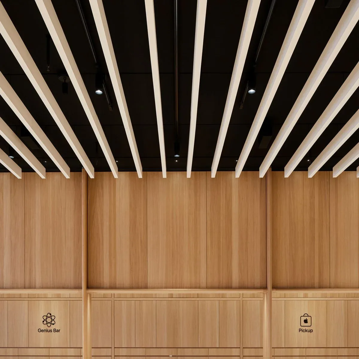
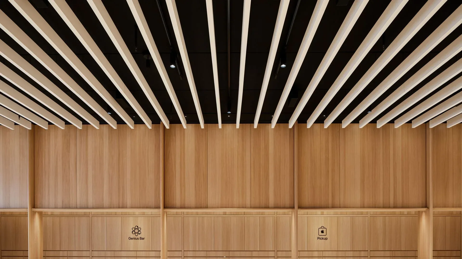
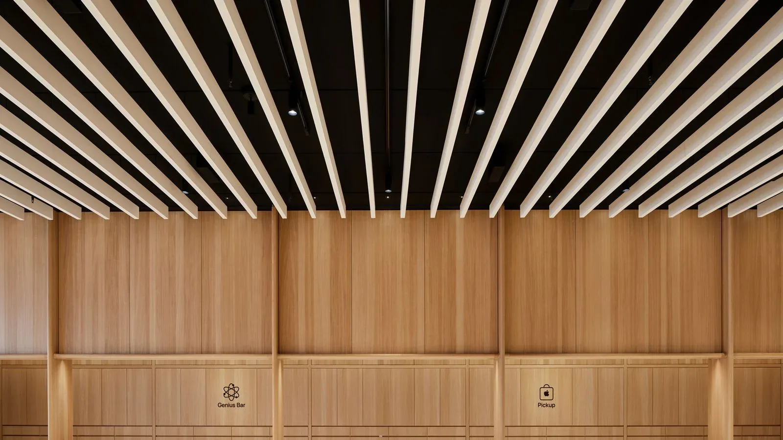
The pickup bay is described as an all-wood installation with a subtle Apple logo incorporated toward the top. Lockable drawers below would hold customer orders, while a counter at the front would give staff a defined handoff point. That arrangement is straightforward, but it addresses a familiar retail friction point. A customer who has already placed an order generally does not need to navigate the whole showroom or join the same interaction flow as somebody comparing devices for the first time. A dedicated counter and secured order storage give that visit a clearer beginning and end.
It also underlines the growing importance of pickup as part of the Apple Store’s day-to-day work. Stores are product showrooms, support centers, accessory shops, repair drop-off points, and local fulfillment locations at once. Online ordering has not eliminated the physical store; it has simply given the store more jobs to perform. The reported bay design acknowledges that fulfillment is a permanent part of that mix, not a temporary side activity tucked into whatever counter happens to be open.
Today at Apple may receive a more defined classroom setup
The Today at Apple bay would reportedly use a related wood-forward look, but with equipment suited to classes rather than order handovers. Plans call for a display resembling a large television above a set of drawers. Those drawers would store class hardware, including iPads and laptops, and a fixed instructor table with stools would sit nearby.
Today at Apple sessions have long represented the store’s community-facing side, covering creative projects and practical skills with Apple hardware and software. In many current stores, that function shares a counter and seating area with pickup activity. Separating the two could make the program feel more intentionally staged without requiring it to dominate the store.
That distinction may matter most during crowded hours. Pickup visitors tend to need speed and clear organization. Class participants need space, equipment, a visible instructor, and enough calm to follow along. Combining both at one counter is efficient from a floor-plan perspective, but not always from an experience perspective. Separate bays could reduce those competing demands while preserving the ability to host sessions in a retail environment.
Apple hardware also remains closely tied to creative and entertainment use, including mobile gaming and portable play. A more organized classroom area could be useful for demonstrations that show what iPad, iPhone, and Mac devices can do beyond a product spec card. On the gaming side of Apple’s ecosystem, the company’s retail presentation is especially interesting as talk continues around rumored iPhone controllers and Apple’s gaming hardware possibilities. No controller rollout is established by this store report, but retail space built around hands-on instruction would naturally complement any effort to make device features feel more approachable.
The big screens could be the major visual casualty
The most conspicuous part of the reported overhaul is the planned removal of large video walls. These screens became closely associated with an era in which Apple Stores were positioned not just as places to purchase hardware, but as civic-style gathering spots where customers could watch presentations, take part in programming, and encounter a more theatrical version of the brand.
That approach was strongly associated with former retail chief Angela Ahrendts. Under that vision, a store could be closer to a public plaza than a conventional electronics shop. Big displays played an obvious role in creating that atmosphere. They were architectural statements, not merely signs.
The proposed renovation direction suggests a recalibration rather than an outright rejection of programming or design. Today at Apple would still have its own bay. Wood finishes and integrated displays would remain. But the reported emphasis has moved toward service, fulfillment, and ordinary shopping needs. In other words, the store may be trading its cinema-sized environmental storytelling for a better-organized list of things customers regularly arrive needing to do.
That is an understandable priority in 2026. Customers can research devices, watch launch videos, and compare technical details almost anywhere. What a physical store can uniquely offer is human help, immediate pickup, repairs, setup guidance, accessories, and a chance to see hardware in person. The retail redesign reportedly leans hard into those advantages.
The Genius Bar’s return would favor clarity and accessibility
Where video walls are removed, many stores are expected to receive a wood-finished Genius Bar that echoes Apple’s earlier retail design. The reported layout includes counters at two heights to support accessibility, a backing wall of storage drawers, and large product images.
Two counter heights are not merely an aesthetic detail. They recognize that a support area needs to work for customers with different physical needs, while also making the service process more comfortable for a wider range of interactions. Support visits can already be stressful: a device may be damaged, locked, unavailable, or holding material that matters deeply to its owner. A dedicated, accessible, visually clear place to start is a sensible response.
The storage-heavy design also fits the operational reality behind technical help. Diagnostics, replacement components, cables, tools, loaner processes, and paperwork all need to exist somewhere. The open Genius Grove model minimized the impression of a traditional repair counter, but a purpose-built bar can make the underlying work more orderly without necessarily making the customer-facing space feel clinical.
Importantly, the reported additions are intended to feel native to each store rather than like temporary fixtures placed into an older layout. That goal is consistent with Apple’s broader retail language, where material choices and integration matter as much as individual furniture pieces. The design may be nostalgic in its reference to older Genius Bars, but it is not described as a simple reinstallation of a past template.
A slow, international renovation cycle is expected
Parts of this approach are already said to be present in a small number of stores worldwide. The broader rollout, however, is expected to unfold gradually over several years, reaching newly opened locations and existing stores as they are renovated. That means visitors should not expect every Apple Store to transform at once.
Renovating a global retail footprint is inherently uneven. Store age, lease arrangements, local building rules, mall schedules, staffing, and the physical dimensions of each location can all shape what is possible and when. A compact storefront cannot absorb the same changes as a major flagship, and an established store may need staged construction to remain open. The reported plan is best understood as a long-term design direction rather than a same-day switch being flipped worldwide.
Back-of-house areas may be part of the work as well. Renovated stores are expected in many cases to receive updates to break rooms and other nonpublic spaces. It is a less glamorous detail than removing a video wall, but it reinforces the idea that this is meant to be an operational overhaul, not only a visual refresh customers see from the entrance.
Staff expectations are reportedly tightening, too
The redesign story is paired with reported changes to pre-opening routines. Staff are said to be more firmly expected to remain standing, keep phones and drinks out of sight, and stay attentive during meetings before the doors open. Stores reportedly open five minutes ahead of their posted time, with every employee on site expected to applaud the first customers entering.
These expectations point toward a more tightly choreographed retail experience, one in which the physical floor plan and employee presentation are both treated as part of the service. The applause ritual is hardly new in spirit for Apple retail, but the reported emphasis on compliance suggests leadership wants it carried out consistently.
Whether customers notice the individual design components or not, the aim seems clear: make the store easier to use. A visitor picking up an online order should know where to go. A class should have its own equipment and focal point. A person with a malfunctioning device should find a recognizable support desk. And the immense wall that once helped make the store feel like an event venue may give way to a layout that handles the everyday business of owning technology with fewer detours.