
Apple appears to be reconsidering one small but conspicuous piece of the iPhone’s Liquid Glass interface: where a navigation bar ends and the page beneath it begins.
A disabled test found in the iOS 27.3 developer beta introduces a softer transition beneath certain navigation bars. Rather than leaving a clearly defined lower edge separating the bar from a scrolling list or other content, the experimental treatment fades more gradually into the screen below. It is a subtle change, but it speaks to the central balancing act of a translucent interface: retaining visual atmosphere without making the structure of an app difficult to read.
The feature is not a user-facing iOS setting. It is currently behind an internal feature flag, which means its presence in the beta should not be treated as confirmation that it will ship. Apple may refine it, abandon it, limit it further, or eventually turn it into an option. For now, it is evidence of an interface experiment rather than a promised iOS 27.3 addition.
What the hidden change does
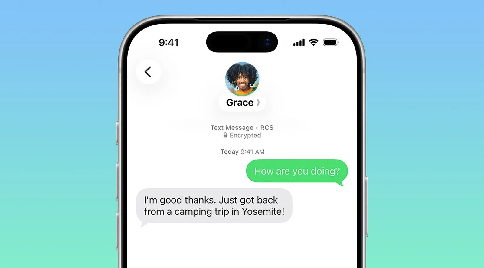
The reported comparison is straightforward. With the experimental behavior off, a navigation bar has a distinct bottom boundary before the content area begins. With it on, that hard visual divide is replaced by a gentler gradient-like transition.
A navigation bar is the persistent top-area UI component that typically establishes an app section and provides controls for moving back, searching, editing, or otherwise managing the current view. Because it sits over or immediately above content, its background treatment is important. A sharply separated bar makes the hierarchy immediately obvious: controls are above, content is below. A soft transition can make the interface feel more unified, but it also has to preserve enough contrast for text and controls to remain legible.
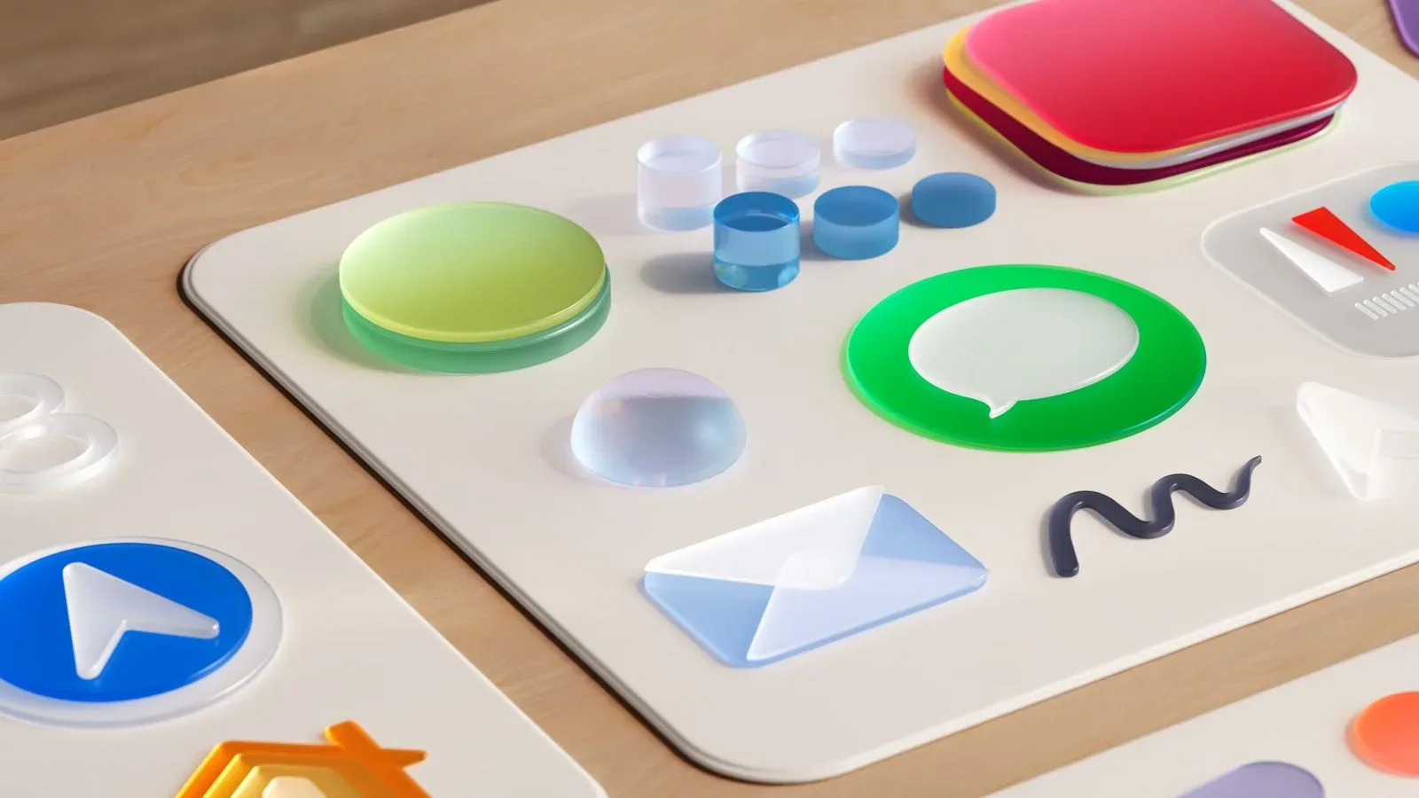
That distinction matters in an interface system built around translucent material. Liquid Glass is designed to let color and imagery inform the appearance of interface surfaces. The more transparent a surface is, the more the content behind it can influence its perceived brightness and contrast. A boundary that is too definite can make the surface feel like an opaque strip pasted onto the page. One that is too faint can make the toolbar’s contents feel untethered from the rest of the interface.
It is tied to low tint and the default bar style
The test has reported conditions. The softer fade is intended to appear only when Liquid Glass tint is set to 25 percent or lower, and only on navigation bars using the default style.
Tint, in this context, is the degree to which the system applies a colored or more solid-looking treatment to Liquid Glass. Lower tint means the material is less colored or less visually dense, allowing more of the underlying content to affect the surface. That is precisely the scenario where a gradual transition may make the most sense: if the bar is already light and transparent, a harsh dividing line can look out of step with its material.
The default-style limitation is just as important. It suggests this is not a universal rendering rule for every top bar an iPhone user encounters. Apple is apparently testing it in a constrained set of standard system-style navigation bars. Such restrictions are normal for interface work, where different layouts, backgrounds and control arrangements may need different readability safeguards.
For users, the practical implication is modest even if the behavior eventually arrives. It would not create a new app function or change how navigation works. It would affect the perceived separation between controls and content, chiefly for people who keep Liquid Glass near its more transparent end. Still, those micro-decisions are cumulative. Navigation bars appear throughout the system and across apps, so a small adjustment can reshape the feel of many routine interactions.
Why this is notable after iOS 27’s readability changes
iOS 27 already altered Liquid Glass with readability in mind. The system moved toward a more uniform background behind content at the tops of apps, reducing some of the visual variability that can occur when content shows through interface material. Apple also replaced the earlier Clear and Tinted choices with a continuous transparency slider.
A continuous slider gives people more granular control than two named presets. Instead of picking between a pair of broad looks, users can position the effect along a range. That makes the reported 25 percent threshold meaningful: it is a specific region of an adjustable visual spectrum, rather than an entirely separate display mode.
The possible return of a softer navigation-bar edge does not necessarily signal a reversal of the readability work. It may be better understood as tuning. A more uniform top background can improve consistency; a softer edge below that background can make the surrounding layout feel less abruptly segmented. Those goals can coexist, provided the controls retain adequate contrast and the app’s hierarchy remains clear.
There is also a useful distinction between readability and visual separation. Readability is about whether text, icons and controls can be seen and understood. Visual separation is about whether a user can quickly identify which elements belong together. A hard line is a strong separation cue. A fade is a softer one. Neither approach is automatically superior; the right treatment depends on the opacity of the material, the content beneath it and the controls placed on top.
Why a feature flag is not an upcoming feature list
An internal feature flag is a software switch used to enable or disable behavior during development and testing. It lets developers keep incomplete or selectively tested work inside a build without exposing it broadly. In this case, the switch being disabled means users cannot simply visit Settings and turn on the softer navigation-bar appearance.
Feature flags are particularly useful for interface experiments because visual changes can require review across many contexts. A navigation treatment that looks polished above a plain list may behave differently over busy content. It may also need separate assessment at different tint levels. The current restrictions—low tint and default bars—indicate that Apple is already treating the effect as context-dependent rather than universally applicable.
That is why the sensible reading is cautious. The beta reveals that Apple is testing a particular visual direction. It does not establish a release date, confirm an optional setting, or guarantee that the implementation will remain the same if it reaches the public.
What iPhone users should watch for
- No Settings toggle yet: the effect is disabled behind an internal flag in the iOS 27.3 developer beta.
- Low tint is the trigger: the reported threshold is Liquid Glass tint at 25 percent or below.
- Scope is limited: it applies to navigation bars using the default style, not necessarily every interface bar.
- The visible difference is structural: the bar’s lower edge shifts from a clear boundary to a more gradual blend into content.
- Its future remains uncertain: Apple could ship it later, make it optional, alter it, or never expose it publicly.
The experiment arrives as Apple continues to fine-tune the look and legibility of Liquid Glass rather than treating the design as fixed. It is also a reminder that customization can extend beyond simple on/off choices: iOS 27’s slider already permits more precise transparency adjustment, while this test suggests the system may adapt some interface details to that setting.
For anyone following Apple’s wider device software work, including recent hardware-service developments, see Apple Opens iPhone Duo Self-Service Repair Parts Sales in the U.S., Canada and Europe. The navigation-bar test, however, remains firmly in the wait-and-see category until Apple enables it in a future build or documents it as a public option.