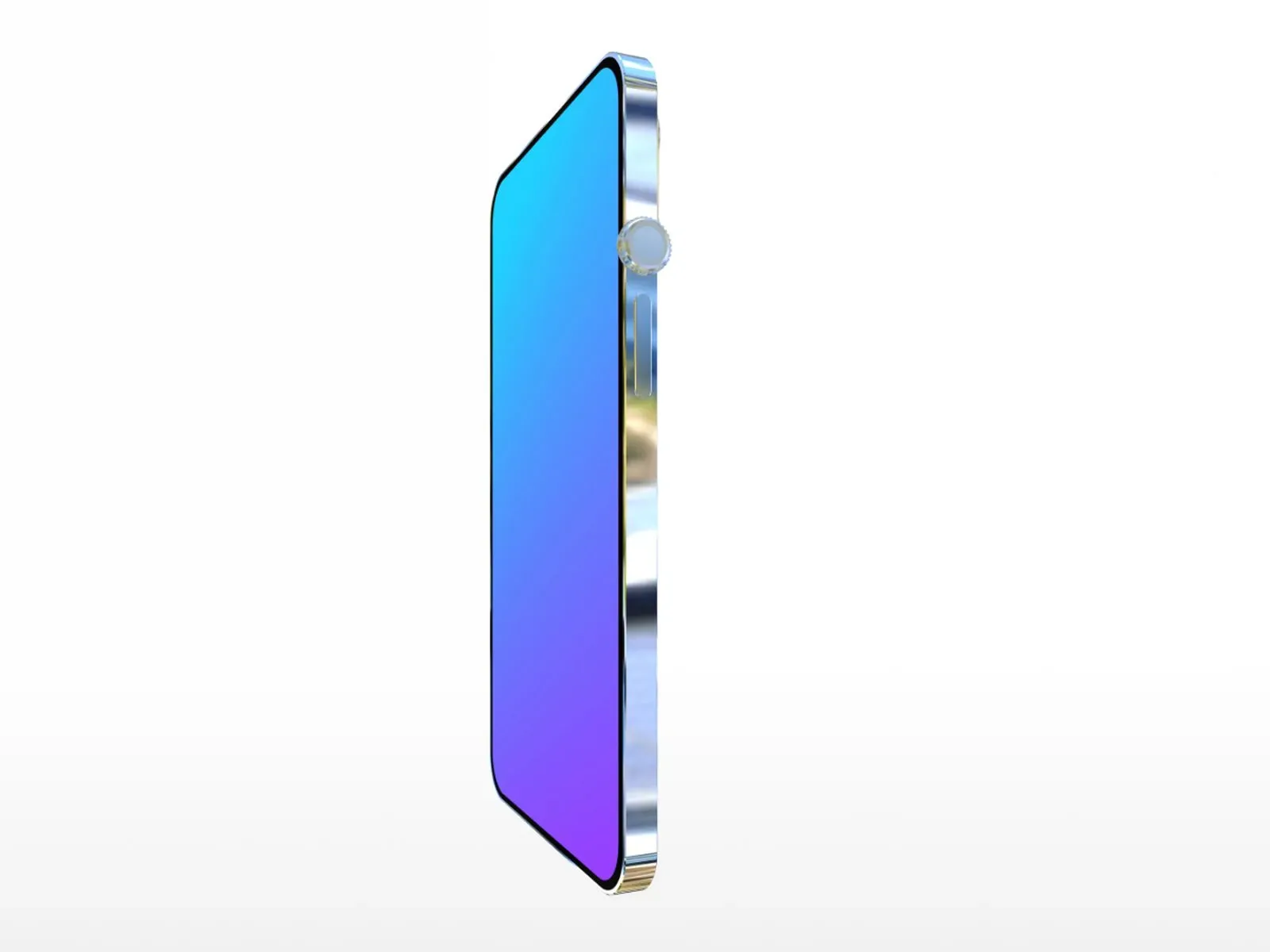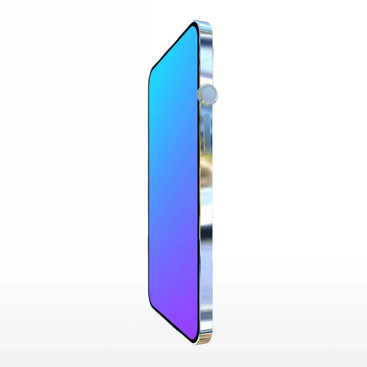
For anyone who has watched a phone reveal and immediately thought, “Yes, but where is the joystick?”, developer Neal Agarwal has made the appropriate digital workshop. Design the Next iPhone is an interactive web toy that hands visitors a bare virtual iPhone and invites them to turn it into something sleek, nostalgic, baffling, or all three at once.
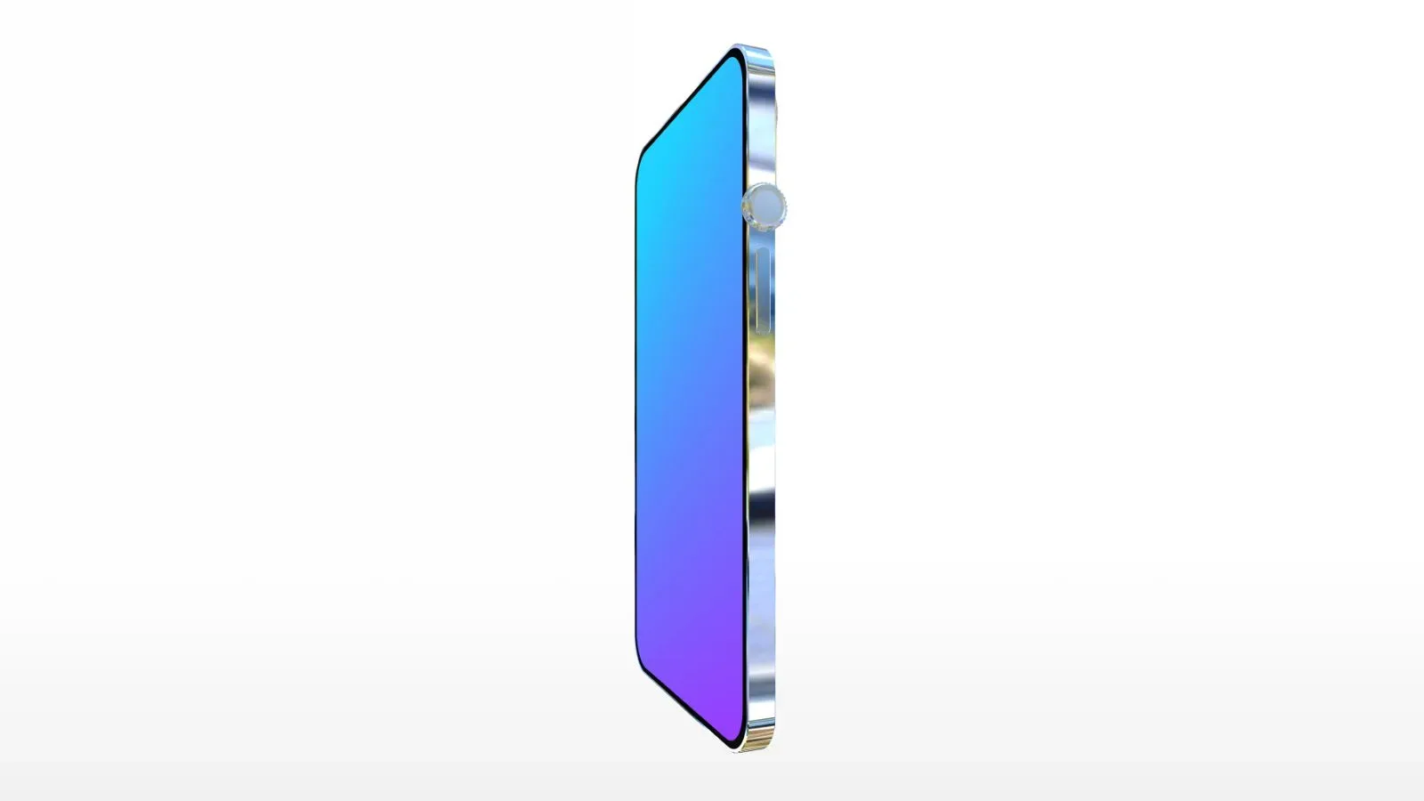
Its premise is simple: rotate a 3D model of the phone, then drag components onto its surface. The resulting device does not need to obey ergonomics, engineering constraints, or the basic expectation that a phone should fit into a pocket. That is the joke, and it is also why the tool is more compelling than a standard color-picker mock-up. It is a tiny, playful design sandbox built around the accumulated visual language of consumer technology.
A phone builder with no adult supervision
The starting handset is intentionally spare. From there, users can attach familiar smartphone parts including cameras, volume buttons, Lightning ports, Home buttons, and Apple logos. Multiple copies of those parts are available, so the exercise can go well beyond a plausible alternate handset. A user can make a camera-heavy slab, scatter logos across the casing, or place basic controls in locations where no sensible hand would ever find them.
That freedom matters because the site is not presenting a realistic product configurator. A product configurator narrows choices toward things a company could manufacture and sell. This tool instead uses the recognizable pieces of a phone as creative building blocks. The 3D rotation helps sell the illusion that these parts occupy real physical space on a device rather than merely sitting on a flat image.
There are also several items that read like alternate-history hardware decisions. A headphone jack, HDMI port, Apple Watch-style Digital Crown, and hinge can all be added. Each has an instantly understandable role in the visual gag. The headphone jack and HDMI port evoke physical connections; a Digital Crown imports a control associated with a different device category; and a hinge suggests a phone that might fold, bend, or otherwise become much more complicated than the original slab.
The site gets even more playful with logos and retro controls. Users can choose an Android logo or a pear logo, alongside an antenna, rotary dial, and classic iPod click wheel. These are not subtle references. They deliberately mix separate eras and ideas of personal electronics onto one imaginary product. A rotary dial and click wheel imply very different input habits, while an antenna changes the silhouette in a way modern phone design generally avoids.
The joystick is the point, even when it makes no sense
For gaming-minded visitors, the joystick is naturally the star component. It converts a familiar phone silhouette into the rough outline of a handheld controller, or at least a device designed by someone who saw a controller once and remembered only the stick. There is also a steering wheel and a Mac Pro “Pro Wheel,” expanding the selection from questionable phone hardware into unapologetically impractical accessories.
Those objects are useful because they clarify the site’s tone. This is not an attempt to predict the next iPhone, and it does not claim that any of these parts are forthcoming. It is a satire-friendly toy about the way product design can be discussed in modular terms: add a feature, remove a port, increase a camera count, bring back an old control, and declare the result revolutionary.
The joystick also makes the project a particularly easy fit for gaming culture. Players are used to adapting hardware into strange forms: touch controls try to imitate buttons, dedicated handhelds compress console-style input into small chassis, and accessories frequently promise to make one device behave like another. Putting a joystick directly onto a phone exaggerates that desire for more tangible control until it becomes visual comedy.
It is worth separating that comic idea from a practical gaming recommendation. The site does not establish that its creations work as real devices, and it does not offer evidence that any control, port, wheel, or camera configuration could function. The design is virtual. Its value is in arrangement, presentation, and sharing—not in creating a viable controller-phone hybrid.
What the available parts are really poking at
The component list works because many of the objects carry technical meaning even before they are placed on the model.
- Lightning port: a physical connector that can be positioned on the imaginary handset as though port placement were purely an aesthetic decision.
- HDMI port: a display connection whose presence immediately suggests sending video to another screen, despite the site treating it as one more draggable piece.
- Headphone jack: an audio connector that remains an especially recognizable shorthand for old-versus-new device preferences.
- Home button: a physical navigation control, useful here as both a functional symbol and a visual callback.
- Digital Crown: a compact rotating control associated with Apple Watch-style interaction, made funny by relocating it to a much larger imagined device.
- Hinge: a mechanical joint that implies movement between sections of hardware. In this context, it is an invitation to imagine a foldable—or simply structurally alarming—phone.
- iPod click wheel: a circular control associated with navigating menus and media, now repurposed as a piece of nostalgia-driven phone decoration.
None of that background requires the site to become a lesson in industrial design. The appeal comes from immediate recognition. Visitors know, at a glance, that an HDMI port, an antenna, and a steering wheel do not belong on the same thin handheld object. The more legible the parts are individually, the funnier their collision becomes.
From strange prototype to mock keynote
Once the phone has been assembled, users can customize its color and wallpaper, then give the device a name. These choices do more than make the creation feel personal. They shift the activity from assembling a pile of components to inventing a product identity. A tasteful name and wallpaper can make an absurd design look briefly intentional; an equally absurd name can make the whole thing read as a parody launch device.
The “Present” option completes the bit. It generates a mock product presentation for the invented phone, assigns a fictional price based on the parts that have been added, and displays a pop-up praising the design from a representation of Tim Cook. The pricing is fictional, an important distinction when the screen inevitably starts to resemble a polished announcement slide. This is a performance of a product launch, not information about a purchasable phone.
That final layer is what makes the tool more than a component-placement novelty. In technology culture, a product is often sold through images, names, tiers, and staged presentation as much as through a list of hardware specifications. By wrapping the user’s impossible handset in a presentation, the website lets them play both designer and marketing department. The joke is no longer merely “look at this phone with a wheel”; it is “look at this phone with a wheel being presented with total confidence.”
Finished designs can be downloaded as rotating videos. That export option gives the creation a life beyond the browser window, whether the phone is a relatively restrained throwback design or an all-sides camera monument with a joystick and steering wheel attached. The rotating format also reinforces the object-like quality of the 3D model, allowing viewers to inspect where every unnecessarily placed port and button ended up.
How to make the gag land
The best approach is not to chase realism. A plausible build may be satisfying, but the tool’s strongest ideas emerge when a design has one clear, ridiculous thesis. Start with a normal-looking base, then introduce a single element that changes the entire premise: a click wheel, a rotary dial, a hinge, or the joystick. Add supporting details only after choosing that central joke.
- Choose an era or fantasy: make a retro-control phone, an overbuilt camera machine, a handheld-gaming oddity, or a vehicle-themed disaster.
- Use placement as part of the humor: a component on an unexpected side or surface can be funnier than simply adding more of it.
- Balance recognizable and absurd pieces: conventional cameras and buttons give the model a phone-like foundation; one wildly unsuitable accessory gives it character.
- Match the color, wallpaper, and name to the concept: these details make the mock presentation feel like a coherent fictional product rather than a random inventory dump.
- Use the presentation deliberately: because the price is made up from the chosen pieces, the reveal is part of the punchline rather than a serious valuation.
A gaming build, for example, could begin with the joystick and then make a choice: lean into the handheld idea with an extra control motif, or make the joke that a conventional premium phone has acquired one inexplicable arcade-style appendage. The latter may be more effective. Design comedy often benefits from restraint right up until the moment restraint is abandoned.
A small antidote to feature-list discourse
Speculation around consumer hardware can become strangely literal. Conversations focus on whether a device needs another port, another camera, a revived control, a new shape, or a more expensive accessory. Design the Next iPhone takes that familiar language and removes the practical boundary around it. If a port is good, why not add it anywhere? If a wheel is premium, why not install it on the phone? If a logo is branding, why not multiply it?
That is an analysis of the site’s joke, not a claim about what any manufacturer should do. The point is precisely that hardware design is full of trade-offs the toy does not need to respect. Real products must contend with space, durability, usability, cost, and many other constraints. The web tool gets to skip all of that and jump straight to the visual consequences of unfiltered feature requests.
For a more conventional look at current iPhone demand rather than a phone equipped for a very confused racing game, see this report on iPhone 18 Pro survey intentions and why they are not sales.
Agarwal’s creation is therefore best understood as a compact interactive joke with a surprisingly effective design vocabulary. It lets people build a handset from icons of old and new consumer tech, give the resulting contraption a grand name, and unveil it as if every decision were visionary. Whether the final device has a headphone jack, an iPod wheel, a joystick, or all of the above, it can at least be presented with confidence.