The Witcher 3: Wild Hunt — Remastered has quickly become the setting for a familiar kind of graphics argument: one side sees a dramatic technical upgrade, while the other sees a beloved visual identity being quietly sanded down.
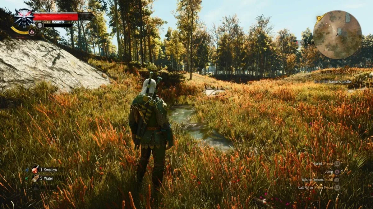
The disagreement is not really about whether the remaster adds detail. Players comparing versions point to crisper environments, more complex foliage, upgraded lighting and ray-traced rendering. In places such as Skellige, that extra environmental density can create scenes that look especially convincing at a glance. The dispute is over what that added fidelity has done to atmosphere. For a vocal group of returning players, the newer image is brighter, more evenly lit and softer than the version they remember—and not always in a good way.
That is an important distinction. A remaster can improve the literal amount of visual information on screen while still changing the emotional read of a place. In a grim fantasy game, darkness, hard shadows and aggressive contrast are not merely technical limitations to erase. They can be central parts of the art direction.
More detail does not automatically mean more mood
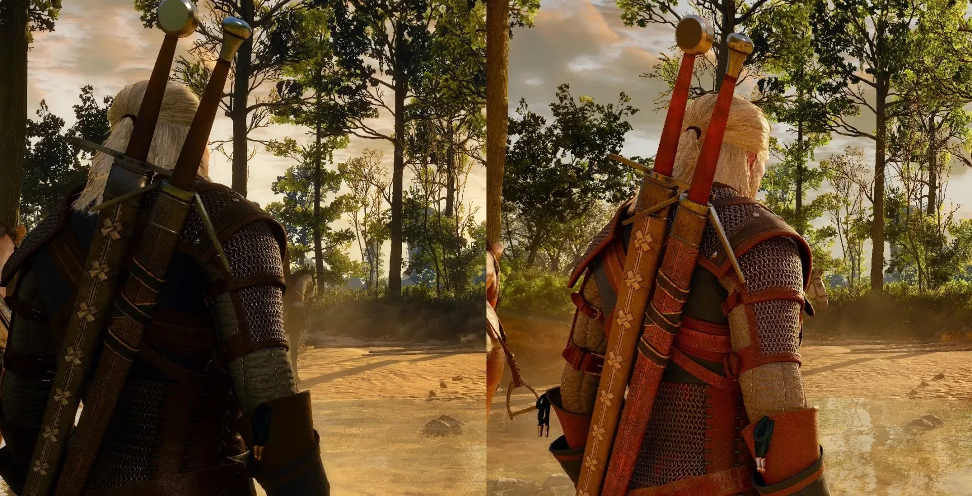
Comparison screenshots circulating among players make the split easy to understand. The older presentation appears markedly darker in many side-by-side examples, with bolder separation between highlights and shadowed areas. The remastered image looks cleaner and reveals additional scene detail, but can also appear more uniformly illuminated.
Neither response is irrational. The image with more visible geometry, sharper surfaces and fuller vegetation can look plainly more advanced. Yet the darker alternative can make a scene feel more dramatic, hostile or mysterious. What is gained in legibility may, depending on the scene and viewer, be perceived as a loss of tension.
One player who shared comparison images preferred the earlier version’s stronger contrast and more forceful highlights, arguing that the remaster’s color grading looked flatter. That player also singled out the heavier bloom effect as a possible reason the newer picture can feel brightened and softened.
Color grading is the overall treatment of color and tonal balance in an image. It influences whether a scene reads as cold, warm, bleak, saturated or muted. Contrast is the difference between bright and dark areas. High contrast can make light sources, silhouettes and shadows feel more pronounced; lower contrast can make an image feel smoother, though potentially less punchy. Neither setting is inherently superior. Their impact depends on the intended mood, the scene and the display.
For players who associate The Witcher 3 with a harsher dark-fantasy atmosphere, the original’s deeper shadows may carry more weight than the remaster’s technical polish. For players prioritizing environmental realism and clarity, the remaster can look like the stronger version. The argument is not simply nostalgia versus progress. It is a disagreement about which visual qualities matter most.
Related coverage includes The Witcher 3 Remastered Graphics Debate Centers on Mood, Lighting and Player Settings.
Bloom, ray tracing and path tracing have become the flashpoints
A substantial share of the criticism has focused on bloom, ray tracing and path tracing. Those terms get thrown around loosely in visual debates, so it helps to separate what they describe from the reactions players are having.
Bloom is an effect that makes bright areas appear to glow into surrounding pixels. It can make sunlight, lamps and reflective surfaces feel intense or cinematic. Used heavily, however, it may make edges appear softer and reduce the apparent depth of an image. Players comparing The Witcher 3: Wild Hunt — Remastered have noted that bloom is enabled by default, and some believe that choice is contributing to a washed-out appearance in certain scenes.
Ray tracing is a rendering approach intended to model how light travels and interacts with surfaces, improving effects such as reflections, shadows and indirect lighting. Path tracing is a more comprehensive light-simulation approach. These techniques can produce richer, more naturalistic lighting, but they do not dictate a single aesthetic outcome. The final result depends on the game’s lighting choices, materials, exposure, tone mapping and post-processing.
Tone mapping is the process of translating a rendered scene’s range of brightness into an image a display can show. It is a crucial but often invisible part of a game’s look. If players say a scene is flatter or less vivid, they may be responding not only to ray- or path-traced lighting, but also to how the game compresses and presents its bright and dark values.
Some community comments have blamed path tracing for draining boldness from the original look. Others have raised broader concerns about inconsistencies in lighting and tone mapping, including with ray tracing disabled. Those are player impressions rather than a confirmed diagnosis of a single technical issue, but they identify the heart of the complaint: the concern is not that the remaster looks low-detail. It is that its lighting treatment may not always preserve the old visual hierarchy.
A screenshot is useful evidence, but it is not the whole game
Side-by-side images are powerful because they force a direct comparison. They can also exaggerate differences that feel less dramatic while moving through an open-world game. A still frame strips away motion, context, weather changes and the player’s attention to quests, navigation and combat. It also turns a game’s art direction into a contest between two isolated rectangles.
Compression adds another complication. Images and short clips shared through social platforms can lose subtle shadow detail, distort gradients and alter how bloom or high-dynamic-range lighting reads. A scene that is nuanced on one display may look muddy, overbright or strangely flat after capture and recompression.
That does not make screenshots worthless. They are valuable for identifying clear shifts in lighting, contrast and palette. But they cannot settle how the remaster feels across a long session or under a particular player’s settings. One player can genuinely prefer the original in a Novigrad waterfront comparison yet find the updated version striking while riding through foliage-heavy Skellige landscapes.
The larger lesson is that visual upgrades are not always globally “better” or “worse.” They can be scene-dependent. A brighter approach may improve one outdoor vista while weakening the menace of a dim interior or a stormy street. When a game’s earlier lighting was part of its personality, consistency matters as much as raw fidelity.
Display and platform differences are part of the story
There is another reason the conversation has become so messy: players are not necessarily looking at the same game in the same conditions. HDR, hardware performance, display calibration and platform-level settings can all affect a player’s verdict.
HDR, or high dynamic range, is designed to present a wider range between dark and bright portions of an image when viewed on a compatible display. In the right setup, HDR can make highlights look more intense and preserve detail across a broader brightness range. On a screen without suitable HDR support—or with settings that do not match the display—the result may not communicate the intended balance.
The available options also vary. PC players may have stronger hardware and more opportunities to adjust settings, while base PlayStation 5 users have more limited customization. That does not mean every PC setup will look better, or that every console presentation will disappoint. It means anecdotes need context. A claim that the remaster is too bright, too dim, too soft or spectacularly detailed can all be sincere observations from different technical circumstances.
It is also why declarations of a single definitive “best” image deserve caution. A player judging an HDR presentation on a high-end display, another using a different screen without equivalent support, and a third examining compressed comparison posts may all be evaluating different-looking versions of the same scene.
What players can reasonably do now
The current debate does not establish that every scene suffers from the same problem, nor does it demonstrate that the remaster’s updated look is a universal downgrade. It does make a practical case for players to judge the game under their own conditions rather than treating any single screenshot as the verdict.
- Check brightness and HDR settings carefully. HDR can change the relationship between shadows and highlights substantially, so it is worth ensuring the game and display are configured in a way that makes sense for the screen in use.
- Compare more than one type of location. A sunny field, an urban waterside scene and a dark interior can respond very differently to the same lighting system.
- Consider bloom and other available visual controls. Players who feel the default image is overly soft or luminous may find that settings options materially change their impression.
- Remember the platform context. A configuration shown in a PC comparison may not map directly onto a base PS5 presentation.
- Use the older PC version if that is the preferred experience. Steam users who strongly favor a previous iteration can select and download an earlier version from their library instead of using the latest overhaul.
The last point is unusually meaningful. It turns a heated aesthetic disagreement into a choice, at least for PC players. Preserving access to an older build acknowledges that a remaster does not necessarily replace every quality people valued in the prior version.
The real remaster question is preservation, not pixel count
The Witcher 3 debate illustrates why “remastered” is an awkward label when visual technology and artistic memory collide. Players generally welcome improved shaders, higher scene detail and modern rendering techniques. But a game’s look is not a checklist of expensive effects. It is the accumulated relationship among darkness, color, texture, weather, visibility and mood.
For some players, the new rendition has made familiar locations more immersive: richer scenery, crisper material detail and landscapes that can look exceptional through the lens of pure graphical realism. For others, the old version’s more forceful contrast better served its bleak world. Both readings can coexist, even when they lead to opposite recommendations.
Whether further visual tuning arrives remains uncertain. For now, the useful framing is not that one camp appreciates graphics and the other rejects them. The real friction is between technical realism and stylistic drama—and The Witcher 3’s remaster has made that trade-off impossible for fans to ignore. Similar arguments over what a major game adaptation should preserve can become just as heated, as seen in this God of War character-design dispute.