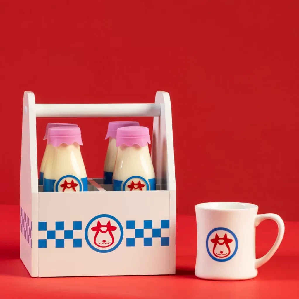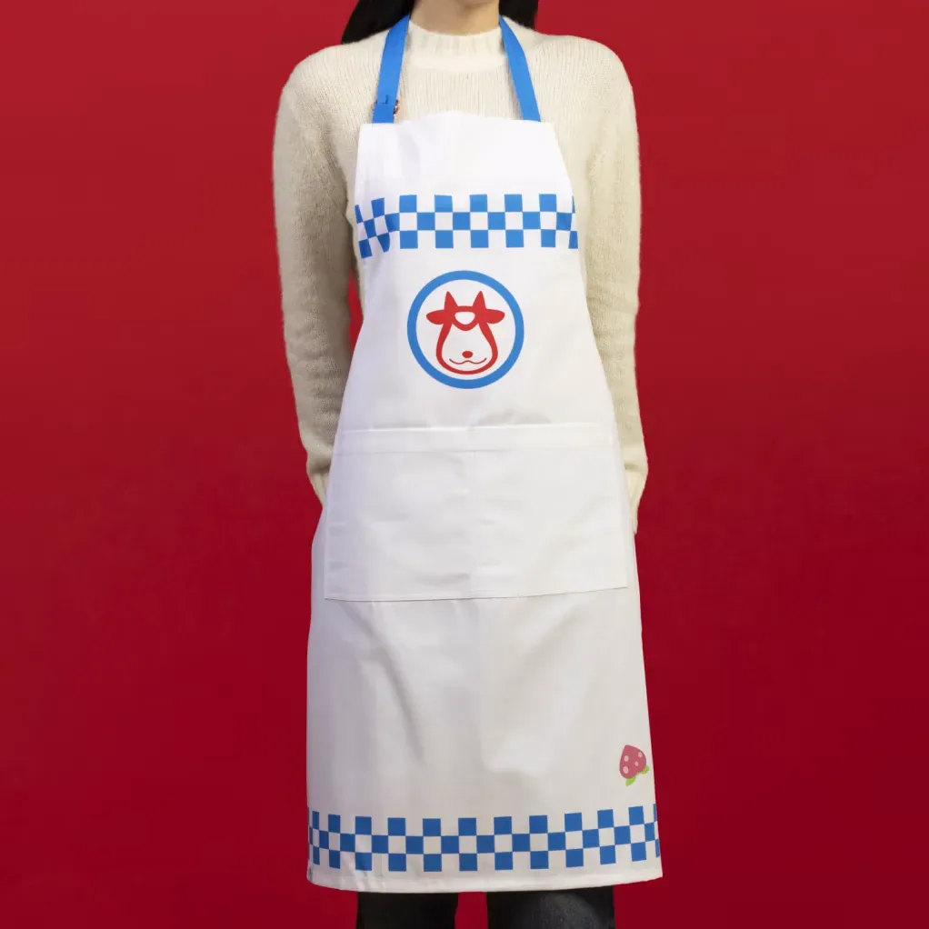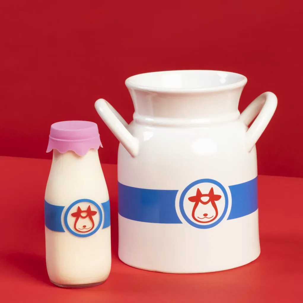

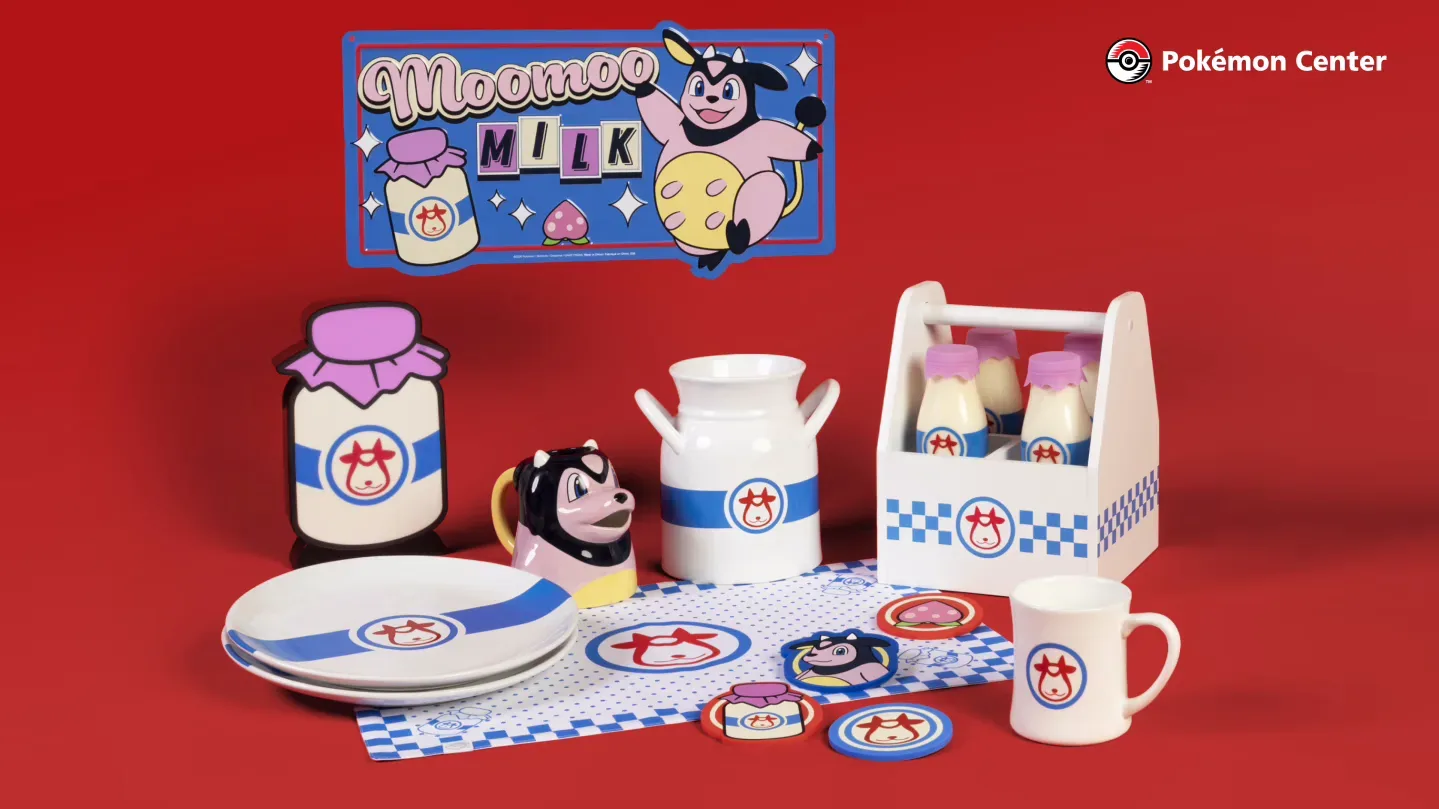
Pokémon Center has turned one of Johto’s most recognizable restorative drinks into a kitchen-and-table collection centered on Moomoo Milk, Miltank and the cheery farm-style identity of Moomoo Farm. Rather than focusing on a single display piece, the range is built as a coordinated set of household goods: a four-bottle caddy, apron, ceramic utensil crock, plates, mugs, placemats, coasters, a ceramic creamer and a metal sign are all part of the lineup.
The common visual thread is the stylized Miltank face used for the Moomoo Milk logo. That is an especially fitting choice for a collection based on an in-game consumable item. Moomoo Milk is known in Pokémon games as a drink used to restore a partner’s HP, or Hit Points—the numerical measure of a Pokémon’s remaining battle health. The real-world collection does not turn the beverage into a functional game item, of course, but it takes the familiar healing-item imagery out of menus and bags and gives it a domestic purpose.
A coordinated kitchen collection, not just a novelty mug
The Moomoo Milk range covers the different stages of setting up, preparing and serving a meal. The apron and utensil crock are intended for the kitchen workspace, while the plates, mugs, placemats and coasters carry the theme to the dining table. The four-bottle caddy adds a drink-serving element, and the creamer brings Miltank directly to the table in ceramic form. A metal sign rounds out the collection as a decorative piece rather than a utensil or piece of tableware.
That breadth matters because licensed kitchen products often arrive as isolated novelty goods. Here, someone interested in the theme can choose one practical item—such as the apron, mugs or crock—or assemble a more consistent Moomoo Milk presentation across several parts of a meal. The collection’s visual focus is also notably narrower than a broad character assortment. It is about one Pokémon, one fictional product and one Johto setting, which gives the pieces a shared identity without requiring a different character on every item.
The items named in the range
- Moomoo Milk four-bottle caddy
- Moomoo Milk apron
- Moomoo Milk ceramic utensil crock
- Ceramic plates and mugs
- Placemats and coasters
- Miltank ceramic creamer
- Miltank metal sign
The bottle caddy is perhaps the clearest expression of the collection’s premise. It uses a four-bottle format and puts the Moomoo Milk logo front and center, allowing everyday drinks to be served with a reference to the game-world beverage. The ceramic creamer takes a more character-led route, positioning Miltank as the tabletop figure in the assortment. Meanwhile, the apron and crock treat the logo as a kitchen motif rather than merely a souvenir graphic.
Why Moomoo Milk is a strong fit for homeware
Moomoo Milk naturally bridges Pokémon’s fictional world and real kitchen imagery. It is already a beverage, is associated with Miltank, and is tied to Moomoo Farm in the Johto region. Those elements give a kitchen range a much more direct thematic foundation than a generic character print would have. A caddy, creamer, mug and coaster all make sense within that framework because the original item is something characters drink.
The Johto connection is important, too. The collection is not simply Miltank merchandise using a farm-inspired look; it points back to the setting associated with Moomoo Farm. For fans, that creates a compact piece of regional world-building in household form. For people less interested in completing a display, it means the collection is designed around recognizable objects with ordinary jobs: holding utensils, protecting a table, carrying drinks and serving food.
It is also a different kind of Pokémon product from a card release, figure or plush. A trading card is primarily handled, displayed, played or stored. Kitchenware is made to live in a routine space where it is repeatedly seen and potentially used. That distinction can make a focused collection like this appealing to people who want their fandom to appear in everyday surroundings rather than remain on a shelf or in a binder.
What the Miltank branding brings to the table
Miltank is not being treated here as a standalone battle mascot detached from its context. The Moomoo Milk logo supplies the collection’s central design language, while the character itself appears in the creamer and is represented by the logo throughout. That approach makes the assortment feel closer to a fictional farm-dairy brand than a general-purpose Pokémon print series.
In practical terms, that focus should help buyers decide how they want to engage with it. A full matching table setup will be most suited to people who enjoy coordinated themed dining. The apron or utensil crock may be a simpler option for someone looking to add a single Pokémon detail to a kitchen. The metal sign has the clearest decorative role, while the caddy and creamer lean into the beverage concept most directly.
There is no need to treat every piece as a must-have for the idea to work. Because the range includes prep items, serving items and décor, it can function in layers. A Moomoo Milk mug paired with coasters makes a small table theme; the plates, placemats and creamer expand it into a meal setting; the caddy and sign make the concept more visible in a kitchen or dining area.
Licensed objects increasingly extend game worlds into daily spaces
The Moomoo Milk collection is another example of game-related design moving beyond screens, controllers and traditional display collectibles. It takes a recognizable part of Pokémon’s item vocabulary and translates it into objects that have a plausible real-world connection to the original fiction. The result is less about reproducing a specific scene and more about making the Moomoo Farm idea feel present at home.
That broader move toward tangible, use-oriented game design can take many forms. For a very different example, a PlayStation archive book uses a physical format to bring gaming history into a home collection. Moomoo Milk kitchenware has a more casual and functional goal, but both illustrate how game brands can build objects meant to be revisited away from the console.
For Pokémon, the central appeal is the specificity. Moomoo Milk is not a vague reference: it is a named in-game drink associated with restoring HP, Miltank and Johto’s Moomoo Farm. That gives the caddy, mugs and creamer a shared joke and a shared setting. The product line’s country-kitchen flavor is therefore rooted in Pokémon fiction rather than added as a random decorative style.
Practical considerations for interested buyers
Pokémon Center is the destination for the collection. Buyers deciding among the pieces may want to start by separating decorative wants from kitchen needs. The metal sign is the dedicated décor option. The apron and ceramic crock are most clearly preparation-focused. Plates, mugs, placemats, coasters and the creamer are suited to a coordinated serving setup, while the four-bottle caddy is the item most closely tied to the Moomoo Milk concept itself.
The available description identifies the materials of the crock and creamer as ceramic and the sign as metal, but it does not provide details such as dimensions, capacity, care instructions, regional storefront availability or pricing. Those are worth checking on the relevant product listings before choosing pieces for a particular space or use case. The same applies to the bottles shown with the caddy: the collection description highlights the caddy’s four-bottle presentation, but prospective buyers should review the listing closely for exactly what is included.
What is already clear is the collection’s goal: make a small, cohesive Moomoo Farm corner of the kitchen or dining room. For anyone whose Pokémon nostalgia leans toward Johto, healing items and Miltank’s dairy-farm iconography, this is a remarkably literal way to put that affection on the table.