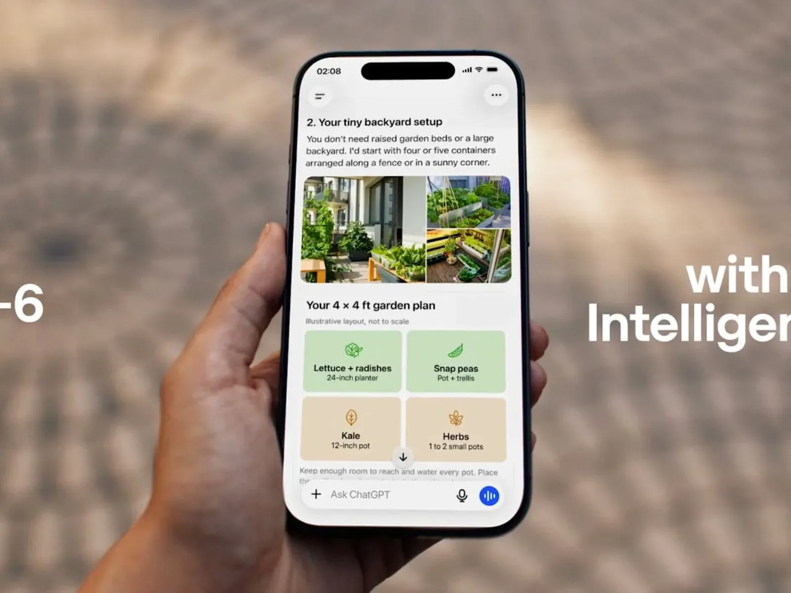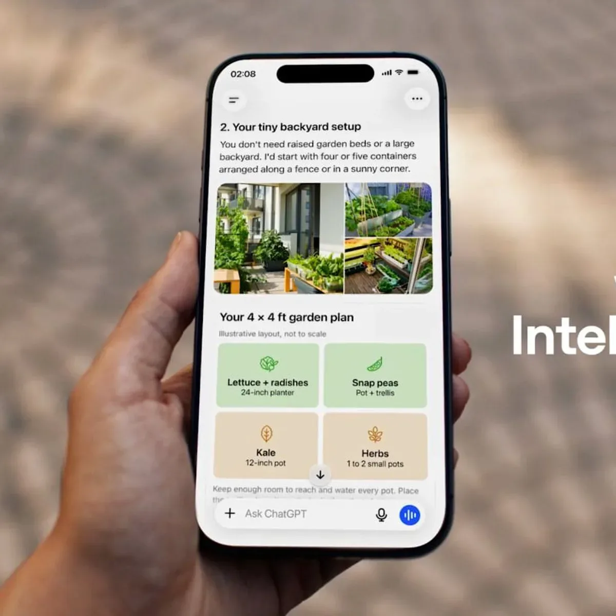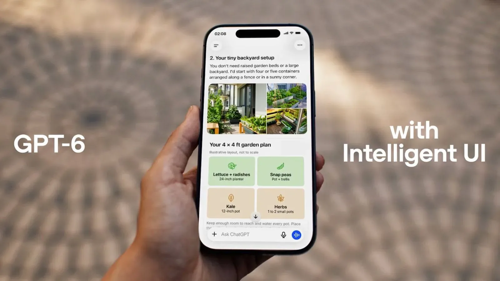
ChatGPT is moving beyond the familiar wall of generated text. Its GPT-6 rollout brings a feature called Intelligent UI, which is designed to turn certain answers into interactive on-screen experiences: graphics, diagrams, charts, tappable controls, forms, checklists, maps and follow-up choices can appear as part of a response.
The important change is not simply that answers may look prettier. The stated aim is to make complicated subjects easier to understand by giving people something they can manipulate rather than a block of prose they must mentally translate into an action. In the supplied examples, that can mean a recipe widget that adjusts ingredient quantities when the number of guests changes, a map embedded in the answer, or multiple-choice prompts that help narrow a request.
It is a notable shift for a product category that has largely trained people to ask a question, read a response, then do the next part of the work somewhere else. A text answer about splitting a restaurant bill may now become a bill-splitting tool. A request that would previously have produced calculator-style instructions can instead surface a calculator. ChatGPT can also generate small games, putting a limited but interesting game-adjacent use case directly inside the conversation.
What Intelligent UI changes in a chat response
An interface, or UI, is the collection of visible controls through which someone uses software: buttons, fields, menus, sliders, graphics and status displays. A conventional chatbot UI is mostly a transcript. The user writes a prompt; the system returns text; the user writes again.
Intelligent UI makes the response itself part of the interface. Rather than describing a choice in text alone, ChatGPT may offer controls that let a user make that choice. Rather than listing locations, it may present a map. Rather than asking the user to calculate revised recipe quantities, it may expose a guest-count control and update the result.
That distinction matters because a good answer and a useful tool are not always the same thing. Text can explain how to divide a bill, but it still leaves arithmetic, data entry and error-checking to the reader. An interactive bill splitter, in theory, gives the user a place to enter the relevant details and receive the result in the same flow. The model’s role becomes broader than drafting an explanation: it helps assemble the task-specific surface used to complete the task.
The announced capabilities include:
- Graphics, charts and diagrams for more visual explanations.
- Tappable buttons and forms for structured input.
- Checklists for tasks with multiple steps.
- Integrated maps when location is relevant.
- Multiple-choice follow-up questions to refine a request.
- On-demand lightweight tools, including a calculator, bill splitter and small games.
Each item has a straightforward practical purpose. Forms reduce ambiguity by asking for information in known fields. Multiple-choice questions can make a vague request more specific without requiring the user to formulate another detailed prompt. Checklists transform advice into something that can be tracked. Charts and diagrams may make relationships clearer than a lengthy written description.
Why this is more than a cosmetic redesign
Visual answers can be mistaken for a presentation upgrade, but the functional promise is more substantial. The system is intended to create an interaction appropriate to the question as it generates the answer. That suggests a response need not be locked into one format. A planning question might suit a checklist; a comparison may suit a chart; a location-oriented query may suit a map; a calculation may suit a dedicated control.
For players and game communities, the small-games example is the clearest direct connection, even though the announcement is not a game-platform release. It points to chat becoming a place for quick interactive diversions as well as questions and explanations. More broadly, the same design logic resembles a familiar principle in game menus and onboarding: show the player the next meaningful action instead of burying it in a paragraph.
That does not mean a generated interface is automatically better. A button can simplify a choice, but it can also conceal assumptions that plain text would state openly. A chart can make a result easier to scan, but it cannot make questionable underlying information reliable. And a checklist is only useful when its steps are appropriate to the user’s actual situation.
The practical value will therefore depend on matching format to problem. A recipe scaler is a strong fit for an interactive widget because the relationship between guest count and quantities is concrete. A calculator is a natural fit because users want an output, not an essay about arithmetic. For more subjective subjects, a visually elaborate response may be less helpful than a transparent written explanation that clearly separates facts, uncertainty and options.
How the system is described as working
The feature uses a library of native, streamable components and a compiler that processes the interface while the model produces its response. In plain language, a component is a reusable software building block, such as a button group, form field, chart or map element. “Native” indicates that these are built-in interface elements rather than merely text pretending to be an app.
“Streamable” is also significant. Streaming is the process of delivering output progressively instead of holding everything until it is complete. ChatGPT’s GPT-6 models can begin answering while they are still thinking, which is intended to make responses feel faster. Applying a similar incremental approach to interface elements means an answer can be assembled and presented during generation rather than only after a fully finished page has been prepared.
A compiler is software that transforms one representation into another usable form. Here, it processes the generated interface as the model creates it. The technical description should not be read as a claim that every answer will become a miniature application. Instead, it describes the machinery intended to let the product select and render interactive pieces within a normal ChatGPT answer.
There is an important user-facing implication: people may need to evaluate two layers of a response. First, is the information correct and suitable? Second, does the interface behave in a way that matches what it appears to do? An interactive presentation can reduce friction, but it should not remove healthy skepticism. Users should still check entries they provide, understand what a calculation includes, and read supporting wording when a choice has consequences.
GPT-6 tiers, timing and limits
GPT-6 with Intelligent UI is rolling out first to ChatGPT Plus, Pro, Business and Enterprise users on October 7, 2026. The rollout is scheduled to extend to the Free and Go tiers the following day.
The model names differ by plan:
- GPT-6 Sol is for Plus, Pro, Business and Enterprise users.
- GPT-6 Luna is for Free and Go users.
Access is not described as a blanket replacement across every part of the service. GPT-6 is limited to the Chat tab. The models used for Work and Codex are not changing as part of this rollout. That boundary matters for anyone assuming that a new ChatGPT model name immediately changes every work-oriented or coding-oriented workflow.
The tiered release also means two people using ChatGPT may not immediately see the same model designation or rollout timing. It is sensible to distinguish the announced availability schedule from a guarantee that every feature will appear identically in every conversation. The supplied details establish the tiers and rollout sequence, but do not promise a particular UI element for every prompt.
What to watch as visual AI answers become normal
The largest question is whether interactive answers remain focused. The strongest uses are likely to be tasks where the interaction removes an obvious extra step: changing an input, comparing structured options, checking a sequence, finding a location or performing a calculation. In those cases, the UI has a job to do.
The weaker uses would be ones where visual elements are added merely because they can be. More motion, more buttons and more panels do not necessarily make an answer more comprehensible. A well-designed response should make the next action clearer, not turn a simple question into a dashboard.
There is also a product-design angle for games and interactive entertainment. Games have long used visual feedback, prompts and selectable paths to make systems legible. Chat systems are now adopting more of that interaction vocabulary for everyday assistance. That overlap does not turn ChatGPT into a full game engine, but it does make the conversation window a more active space than a prompt-and-paragraph exchange.
For readers following how software products are shifting their interfaces, the broader industry context is that features increasingly compete on the quality of the experience around the model, not only on the model label itself. That same pressure toward clearer, more purposeful product design is visible across digital services, including the changing update strategies discussed in this look at Arc Raiders’ update approach.
GPT-6’s interactive response system is ultimately a bet that an answer can be both an explanation and a usable object. Its success will hinge on restraint, clarity and trust: the interface must make a task easier without making the underlying answer harder to inspect.