
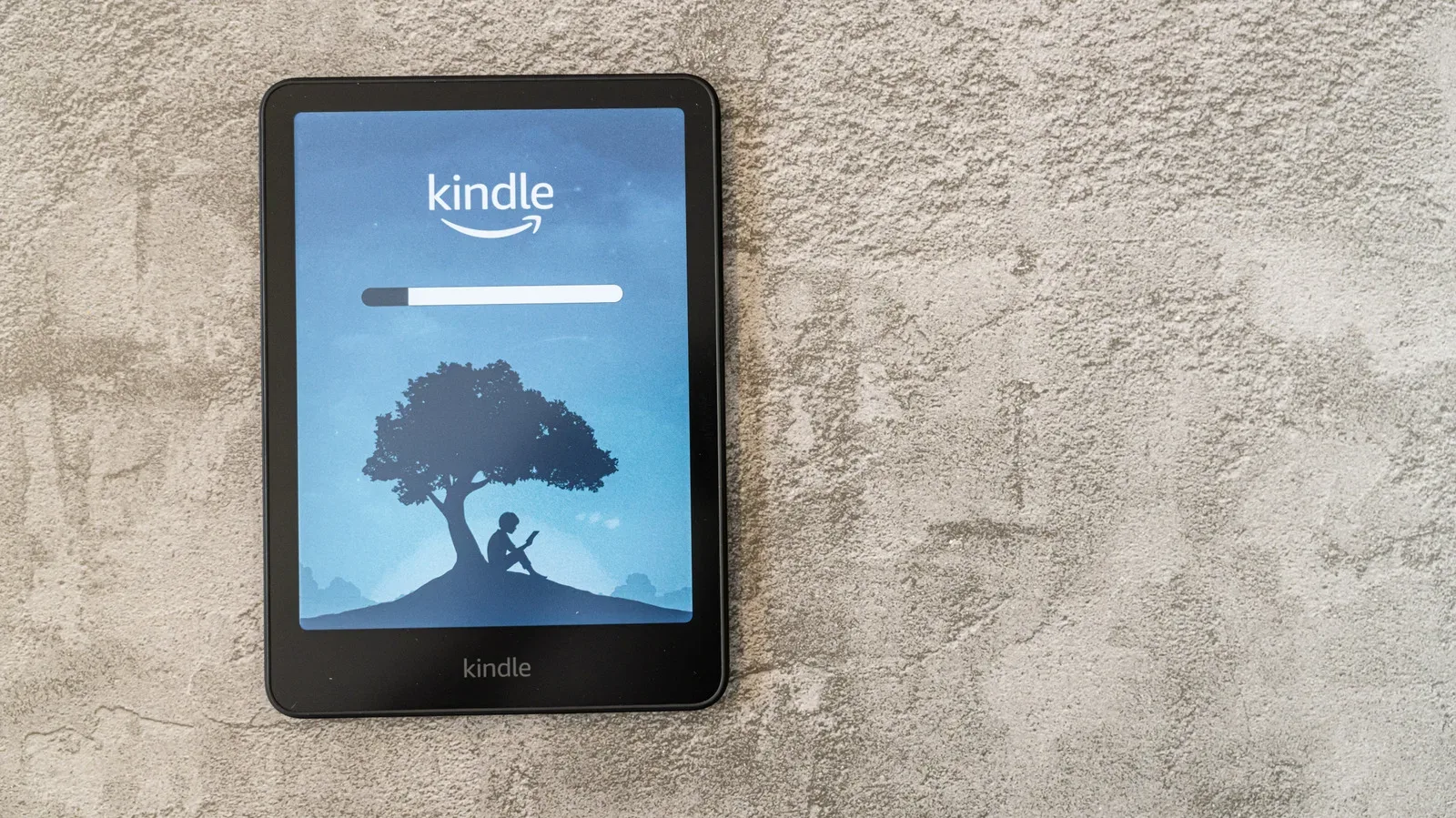
A Kindle is designed to make books portable and adjustable, but those strengths can also make it feel a little detached from the familiar experience of reading on paper. A digital library does not come with the weight, cover texture or visible two-page spread of a print edition. Still, a handful of choices in the device’s settings—and one optional accessory—can change the presentation enough to make a reading session feel more deliberate and book-like.
The useful distinction is that these changes do not turn an e-reader into a physical object. They instead control the visual cues that shape reading: the typeface, the width of a text block, the tone of the display and the transition from one page to the next. That makes the best setup personal. Someone seeking the look of an older printed novel may prioritize a serif font and generous margins; someone who simply finds a bright display distracting may get the biggest improvement from brightness and warmth controls.
Start with the one change outside the screen: a book-style cover
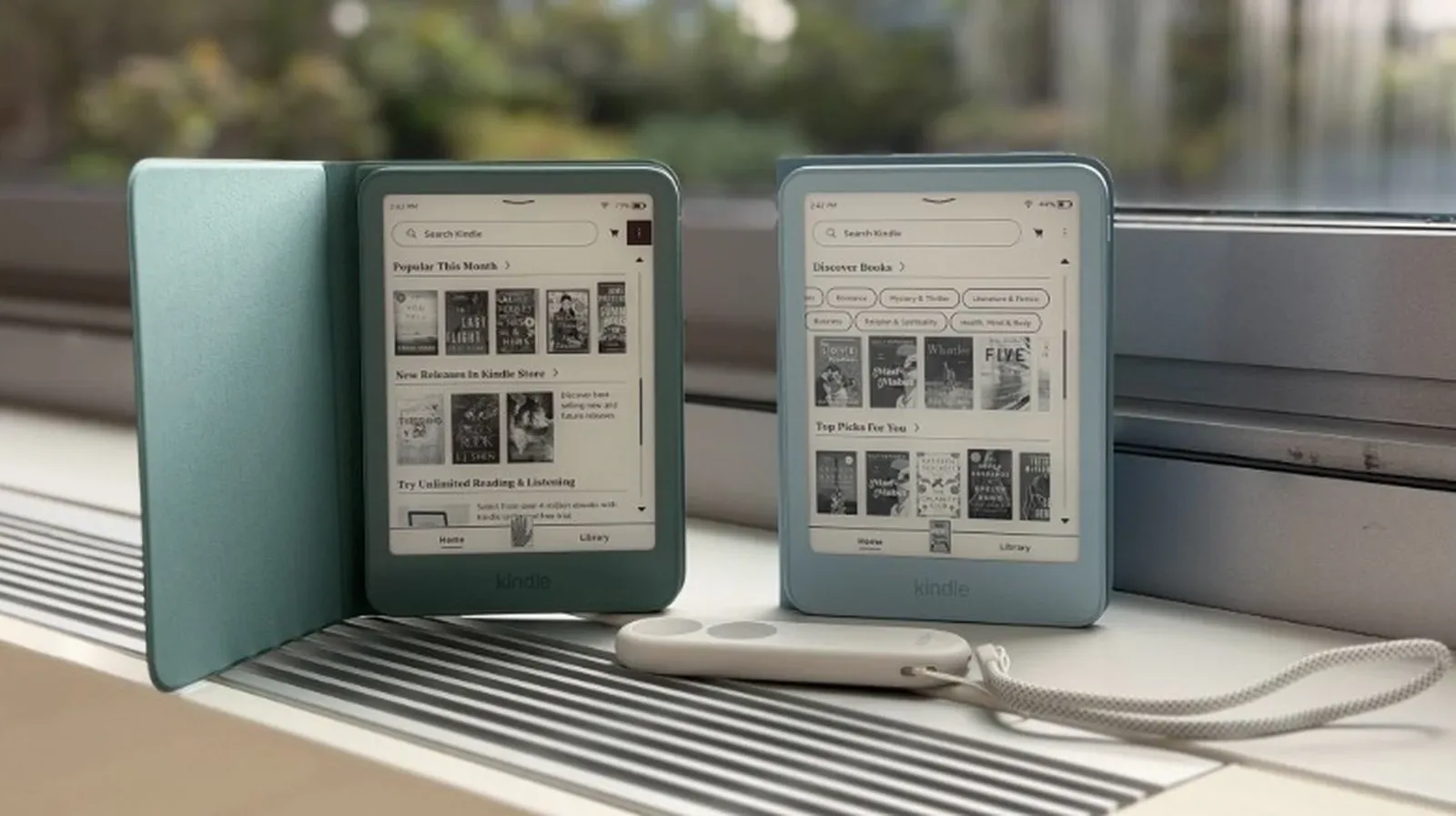
A cover is the most literal way to give a Kindle more of a book-like physical presence. Cases styled to resemble book covers are available in a wide variety of designs, from understated, classic-looking treatments to more decorative options. They can make the device feel less like a bare piece of electronics when it is carried or held.
This is primarily a tactile and visual choice, not a change to the text itself. It will not recreate the thickness or shifting page weight of a print book, but it can establish a different ritual around opening and holding the device. That may matter for readers who miss the sense of picking up a particular volume rather than unlocking a general-purpose screen.
It is also worth treating a cover as optional rather than essential. Kindle customization is not only about buying an accessory. The device’s own reading controls offer the most direct route to changing what readers look at for hours at a time.
Choose a serif font for a more traditional page
Typography is the appearance and arrangement of written characters. On a Kindle, it is one of the most immediate variables a reader can adjust, because the same book can take on a noticeably different personality when its typeface changes.
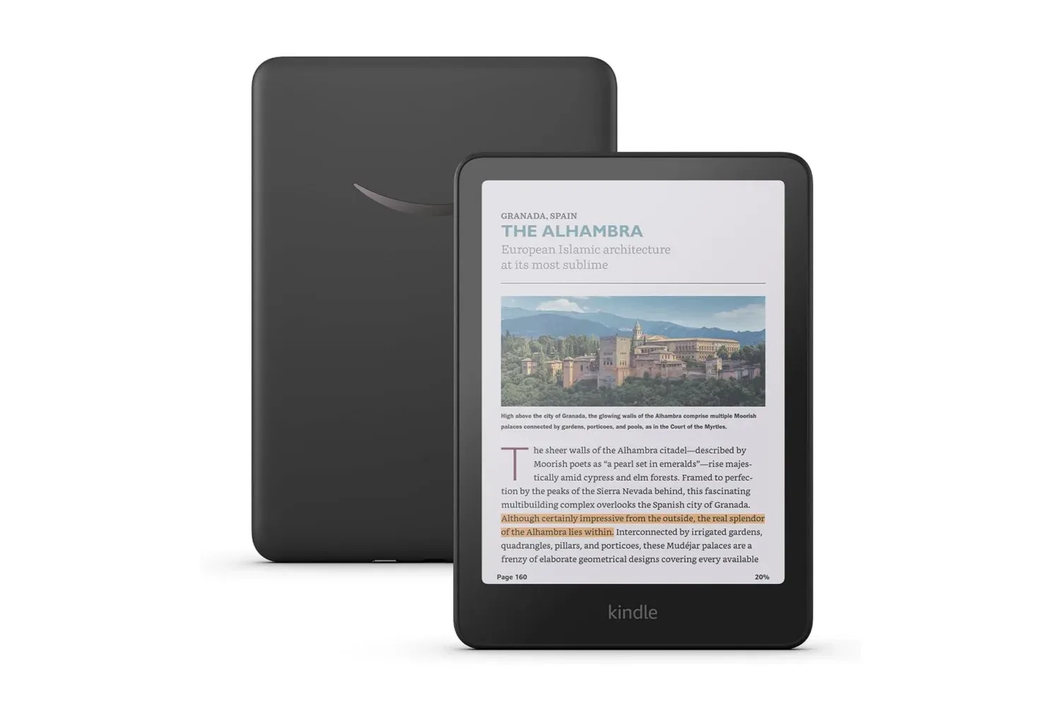
With a book open, tap the top of the display and select the Aa control to open reading settings. In the Font menu, Font Family is where the typeface can be changed. Readers looking for a more conventional printed-book appearance may prefer a serif typeface, such as Baskerville or Palatino. Serifs are the small finishing strokes attached to letterforms; they are a familiar feature of many traditional book pages and can look less overtly digital than a plain, computer-style font.
This is not a claim that one font is universally easier or better. The practical benefit is control. A typeface that appears calm and familiar to one reader may feel cramped or overly formal to another. The sensible approach is to switch fonts while viewing a few paragraphs of the book currently being read, rather than judging a typeface from a single menu sample.
Font choice also works in combination with other settings. A classic-looking font can still feel like a dense wall of text if the margins are narrow, while broader margins can make even a simple typeface feel more page-like. It is the overall composition, rather than a single setting, that creates the effect.
Use landscape and columns to suggest an open spread
Physical books present two facing pages when opened. A Kindle can approximate that visual structure by using landscape orientation together with a two-column layout. Landscape means the device is held horizontally, making its display wider than it is tall. Dividing that width into two columns produces something visually closer to an open book spread than a single portrait-oriented page.
To explore the option, open the book settings through Aa, then go to the Layout tab and find Orientation. The available choices depend on the Kindle and the content being viewed, so it is best regarded as a setting to try rather than a guaranteed choice for every reading situation.
Two columns change more than the look. They make each line shorter, reducing the horizontal distance the eye travels before returning to the start of the next line. For some readers, this can make the page feel more structured. For others, the narrower columns may feel less comfortable, especially when using a larger font size. The point is not to force an imitation of print at the expense of readability; it is to see whether the presentation better suits the book and the reader.
Margins deserve the same attention. Margins are the empty space between the text and the edge of the display. Widening them narrows the active text area and places more breathing room around the words, echoing the framed look often associated with printed pages. It is a small adjustment, but it changes the perceived density of the page.
Text weight can support that effect. In this context, weight refers to how light or bold the letters appear. Increasing it makes the text more substantial. Combined with wider margins, a modest increase in weight can make a page look less thin and screen-like. But moderation is useful: excessive boldness can make long passages feel visually heavy. Adjust one element at a time, then read a page or two before deciding whether to keep it.
Lower brightness and raise warmth for a softer display
The display is often where the difference between digital reading and paper is felt most strongly. A bright, cool-looking screen can pull attention toward the device itself. Kindle reading controls offer two ways to soften that presentation: brightness and warmth.
Brightness controls the intensity of the display light. Warmth changes its color character toward a warmer tone rather than a cooler one. Neither setting adds paper texture, but together they can move the page away from a stark, brightly lit appearance and toward a gentler one.
While a book is open, tap the top of the screen to access Quick Actions. From there, lower the brightness and increase the warmth to taste. The appropriate balance is not a fixed number. It depends on ambient light, personal comfort and the reader’s preference for a crisp white page versus a more subdued visual tone.
It helps to think of the adjustment as matching the display to the moment rather than chasing a perfect universal preset. A reader in a brightly lit room may want a different balance from someone settling in for a quieter evening session. The important thing is that the Kindle does not have to remain at an intense default look simply because it is a digital device.
Turn on page-turn animations when the feature is available
Page turns are a small but meaningful part of reading a physical book: fingers move, paper shifts and a new page appears. A Kindle cannot reproduce that tactile action, but supported models can add a visual transition between pages through page-turn animations.
An animation is a brief on-screen motion used to show a change. Here, it gives taps or swipes a gentler transition instead of an instantaneous jump from one page to another. It is a presentation detail, but presentation is the theme of these adjustments. Readers who want the device to preserve the feeling of progressing through pages may find that animation helps reinforce it.
Compatibility matters. Page-turn animations are not available on every Kindle. The feature is associated with the Kindle Colorsoft, Paperwhite and Scribe, as well as mobile versions. That limitation is a useful reminder not to assume that every device will offer every customization described in Kindle tips. If the relevant option does not appear, it may be a model or platform difference rather than a missed setting.
Even where it is supported, page-turn animation is entirely a preference setting. Some readers may appreciate the sense of motion; others may prefer the quickest possible transition. It does not provide the physical sensation of turning paper, but it can make the digital interaction feel less abrupt.
Build a setup around reading comfort, not imitation alone
The strongest Kindle configuration is not necessarily the one that most aggressively imitates print. A book-like cover, Baskerville or Palatino, landscape columns, wide margins, heavier text, reduced brightness, more warmth and page-turn animation all point in the same aesthetic direction, but readers do not need every option at once.
A practical sequence is to begin with font, margin and display tone, because those affect the page constantly. Then experiment with landscape columns if the two-page impression appeals. Finally, consider animation and a physical cover as finishing touches. That order keeps the focus on the reading experience rather than on accessories or novelty.
There is room for genre and mood to influence the setup, too. A reader working through a suspense novel, perhaps after spotting a new Harlan Coben adaptation, may prefer a warmer, more immersive presentation. A different book may call for a simpler, cleaner layout. Kindle settings are useful precisely because they can be adjusted without altering the book itself.
Digital reading will remain different from print reading. There is no need to pretend otherwise. But by treating font, layout, illumination, motion and the device’s exterior as choices rather than fixed defaults, Kindle owners can make their library feel more intentional—and, for readers who miss the cues of paper, considerably more inviting.
Shop the products
Check current price, model and availability at the retailer.