Keep Joking Joystick in your feed.Choose us as a preferred source on Google.
Add as a Preferred Source on Google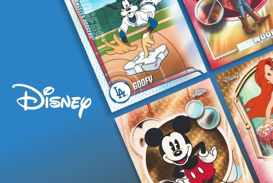
2026 Topps Chrome Disney Sapphire Edition
Last checked
Shop this card release
2026 Topps Chrome Disney Sapphire Edition trading cards
We may earn a commission if you buy through these links, at no extra cost to you. As an Amazon Associate I earn from qualifying purchases.
Opens retailer search results. Check the model, edition, seller, availability and current price before buying.
About this set
2026 Topps Chrome Disney Sapphire Edition pairs Disney’s best-known characters and scenes with a polished Chrome presentation and the Sapphire look. The set’s identity is built on visual appeal: clean metallic shine, colorful variations, and limited-edition inserts that suit Disney artwork. It is a premium non-sport release for collectors who value presentation as much as subject matter.
Premium Disney presentation
This release centers on Disney imagery that is meant to feel familiar but more refined than a standard character set. The Sapphire treatment gives the cards a bright, jewel-like surface, while the Chrome foundation brings the metallic finish associated with the line since 1996. That combination makes the product feel deliberate and display-friendly, with the artwork carrying the experience.
The overall tone is elegant rather than busy. Instead of chasing quantity, the set leans on recognizable characters, memorable scenes, and a polished visual style. That makes it a natural fit for collectors who like Disney cards that feel carefully produced and easy to appreciate as individual pieces.
Chrome history in a Disney setting
Chrome has long been a defined collecting identity because of its chromium finish and the role Refractor parallels have played in the brand’s history. Those traits matter here because they shape expectations around shine, color, and surface presentation, even when the subject is non-sport instead of athletics. The Disney theme gives that familiar Chrome language a softer, story-driven look.
The key point for this edition is that the Chrome name is the framework, not a promise that every earlier Chrome release looked the same. What carries over is the premium feel: reflective surfaces, bold color effects, and an emphasis on cards that stand out visually. In a Disney product, that approach helps the characters and scenes read as collectible art rather than simple character portraits.
What to focus on while collecting
Collectors may want to decide early whether they prefer broad character coverage or a tighter focus on favorite Disney properties. Since the set is described around iconic characters and memorable scenes, the visual appeal of a card may matter as much as the character itself. Sapphire styling can make even familiar imagery feel different from card to card, especially when color variation is part of the chase.
The mention of limited-edition inserts and color variations suggests a collecting experience built around design choices rather than sheer checklist length. That makes it reasonable to collect by theme, by character, or by visual effect. If you enjoy sets that reward sorting and side-by-side comparison, this kind of release gives you a clear reason to build around presentation.
How the set fits a Disney collection
For a Disney-focused collection, this edition works as a premium companion piece. The subject matter is broad enough to connect with classic characters, but the Sapphire finish pushes the cards toward a more modern display style. That balance can make the set feel both nostalgic and current, which is useful if you like your collection to span different moods within the same theme.
Because the release is built around a refined look, it may appeal most to collectors who enjoy singles, visual runs, or display-oriented albums. The cards are described as luxurious and colorful, so the strongest collecting choice may simply be to pick the images that mean the most to you. In a set like this, the artwork and finish do a lot of the work on their own.